You are using an out of date browser. It may not display this or other websites correctly.
You should upgrade or use an alternative browser.
You should upgrade or use an alternative browser.
10 World Trade | BGI Office Tower (Massport Parcel A2) | Seaport
- Thread starter Equilibria
- Start date
stick n move
Superstar
- Joined
- Oct 14, 2009
- Messages
- 12,148
- Reaction score
- 19,081
They do this a lot. The soccer stadium had the skyline backwards.
stick n move
Superstar
- Joined
- Oct 14, 2009
- Messages
- 12,148
- Reaction score
- 19,081
Suffolk 83
Senior Member
- Joined
- Nov 14, 2007
- Messages
- 2,996
- Reaction score
- 2,403
The ground floors look decent enough but the rest looks like that star wars transport where they keep all the androids
Equilibria
Senior Member
- Joined
- May 6, 2007
- Messages
- 7,087
- Reaction score
- 8,325
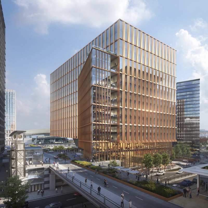
Just to be clear - this was a losing bid.
https://handelarchitects.com/project/parcel-a2
It does a nice job, however, of showing some of the context with current designs.
For the record, here's Sasaki's page for the winning design:
http://www.sasaki.com/project/478/401-congress-street/
BTW, there's more info coming later this month (though to a select few...)
http://buildingcongress.org/events/details/parcel-a2-seaport-development-45
Last edited:
stick n move
Superstar
- Joined
- Oct 14, 2009
- Messages
- 12,148
- Reaction score
- 19,081
Ok nice I just saw it was shared last month by them on IG and was like wtf is this. False alarm.
bigpicture7
Senior Member
- Joined
- May 5, 2016
- Messages
- 3,906
- Reaction score
- 9,547
Just to be clear - this was a losing bid.
https://handelarchitects.com/project/parcel-a2
It does a nice job, however, of showing some of the context with current designs.
For the record, here's Sasaki's page for the winning design:
http://www.sasaki.com/project/478/401-congress-street/
BTW, there's more info coming later this month (though to a select few...)
http://buildingcongress.org/events/details/parcel-a2-seaport-development-45
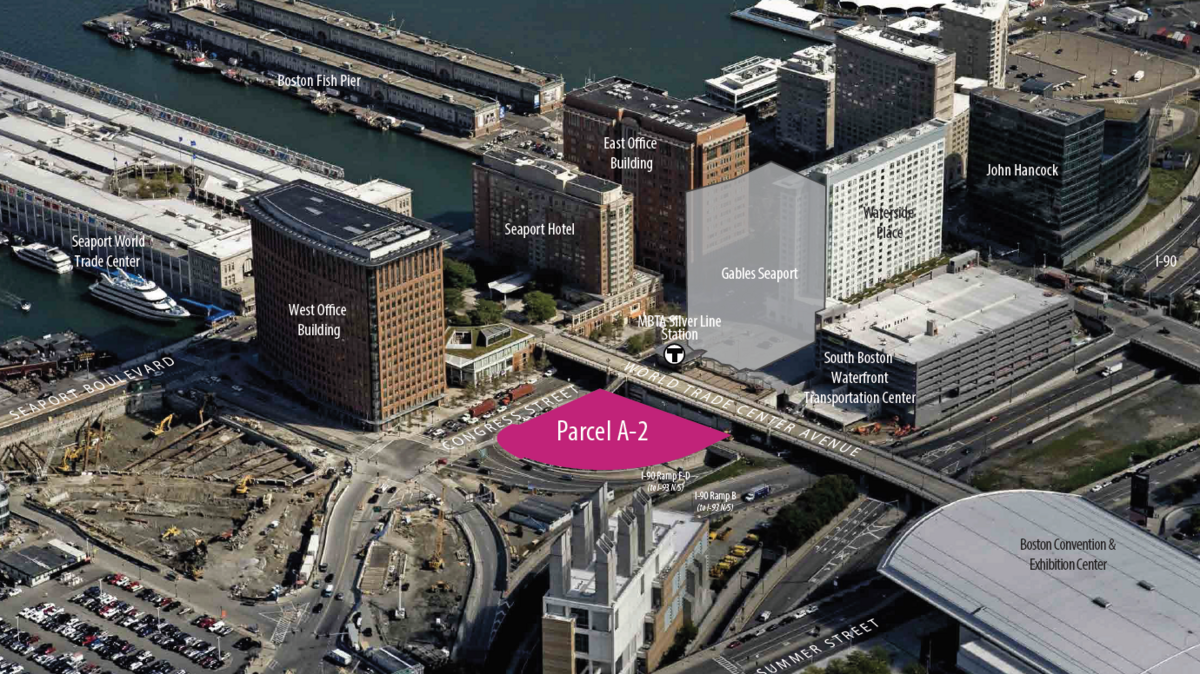
^Thanks, and now we're finally seeing the spatial-orienting shot I'd craved when Sasaki's design was first revealed:

FitchburgLine
Active Member
- Joined
- Nov 5, 2013
- Messages
- 666
- Reaction score
- 403
Finally a perspective that makes sense. Disappointing that it's not using the optional air-right above the pike onramp.
Equilibria
Senior Member
- Joined
- May 6, 2007
- Messages
- 7,087
- Reaction score
- 8,325
Finally a perspective that makes sense. Disappointing that it's not using the optional air-right above the pike onramp.
I'm a little sad that Sasaki couldn't have hired Handel's render artist. They do a fantastic, honest job with context.
Beton Brut
Senior Member
- Joined
- May 25, 2006
- Messages
- 4,382
- Reaction score
- 338
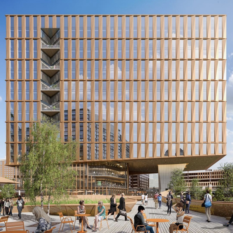
Handel's losing bid for this site is interesting and a bit humorous. The cladding and articulation of the facade seems to have been left over from their repulsive revision to the Winthrop Square tower, just a year ago. At this scale and location, it's somewhat less awful. The giant piloti and the regular grid of the facade remind me of Marcel Breuer's work, mainly the Pirelli/Armstrong Rubber Building in New Haven.
stick n move
Superstar
- Joined
- Oct 14, 2009
- Messages
- 12,148
- Reaction score
- 19,081
^Thanks, and now we're finally seeing the spatial-orienting shot I'd craved when Sasaki's design was first revealed:

Its pretty nice and definitely unique. So it looks like the spiral staircase in the lobby brings you up to wtc ave, nice touch. Then the first floor of the lobby has an exit that leads to a bridge over the enter/exit ramps at the triangle parcel next door. Whats going there again a community center? Its great that its being developed thats a very restrictive parcel with only a couple of feet between ramps for an entrance. Thats awesome that its going to be developed and it wont just be a grass triangle forever.
Interior


The good thing is the garage will basically be invisible soon too.
 https://postimages.org/
It was honestly a good thing to add, because whether we like it or not the transit still sucks and people drive here. Its in a great spot atleast where you pull out of the tunnel, take a right, then your in the garage. It should help vs before where people had to drive around looking for a spot. Its going to be damn near invisible soon too so it worked out well.
Last edited:
Brad Plaid
Senior Member
- Joined
- Jan 17, 2013
- Messages
- 1,310
- Reaction score
- 1,559
The Sasaki is original and interesting but I'd rather have elegant bold versus cartoon bold. Hopefully it turns out well but it could easily end up looking like an unfunny joke.
DigitalSciGuy
Active Member
- Joined
- Apr 14, 2013
- Messages
- 670
- Reaction score
- 421
It feels contrastingly organic, especially compared to all the existing and impending boxes descending upon the Seaport.
Still hate that parking garage - build it and they will come...poor transit service today is a terrible excuse for building just-as-expensive car infrastructure that will induce driving demand for the decades that it'll exist - but at least as a fully separate structure, there's a possibility of replacing it in the future... and will hopefully keep this building from having any on-site parking so the lobby and street interface are ped friendly.
BTW, the spiral staircase appears to be on the WTC Ave level since the hulking garage is hanging out in the distance, but with the debate about the impossible angles of the renderings... ¯\_(ツ)_/¯
Its pretty nice and definitely unique. So it looks like the spiral staircase in the lobby brings you up to wtc ave, nice touch. Then the first floor of the lobby has an exit that leads to a bridge over the enter/exit ramps at the triangle parcel next door. Whats going there again a community center? Its great that its being developed thats a very restrictive parcel with only a couple of feet between ramps for an entrance. Thats awesome that its going to be developed and it wont just be a grass triangle forever.
Interior

The interior looks extremely similar to the new ISEC building at Northeastern. The spiral staircase, the wide open cafe, the wooden elements...nearly identical.
OK FWIW that Hipster Juice Barista is my new favorite Scalie ever.
Beton Brut
Senior Member
- Joined
- May 25, 2006
- Messages
- 4,382
- Reaction score
- 338
OK FWIW that Hipster Juice Barista is my new favorite Scalie ever.
I want to hit the "pointing guy" with a fungo bat.


