10 World Trade | BGI Office Tower (Massport Parcel A2) | Seaport

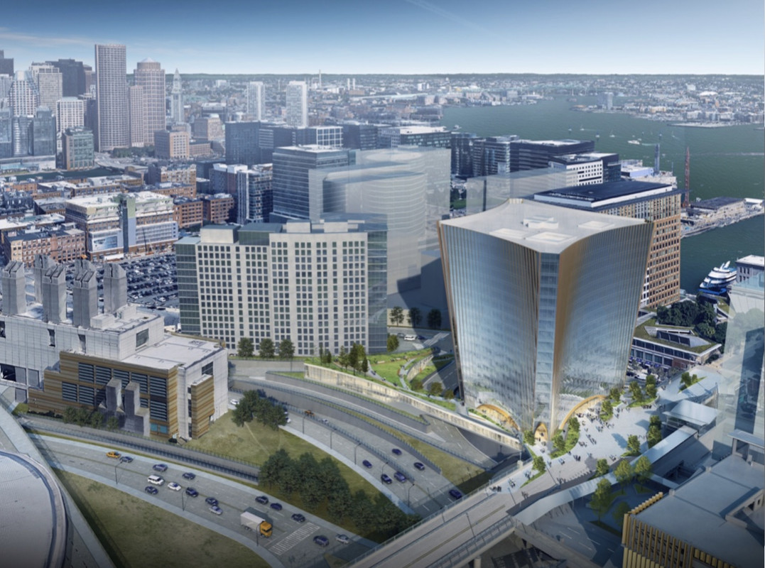
^This looks fantastic, IMO. I love the integration of the main building with the low-rise cultural space; the graceful connection between that odd-shaped island parcel and the main parcel.

This may just be the boldest piece of architecture we've seen in the Seaport thus far - I know, perhaps not saying much - but I mean this not just in terms of the aesthetic, but in terms of the scope of what it aims to accomplish by weaving together these otherwise very awkward parcels.

I didn't realize they were building across the street on that triangular parcel. That's tremendous and will really help with what would otherwise be a weird dead zone. Build build build.
 
I wish there was more of an attempt at an active streetwall with retail on the WTC Ave side, but other than that, build this yesterday. A-2 and P will be the keys to linking the two elevations of the Seaport together
 
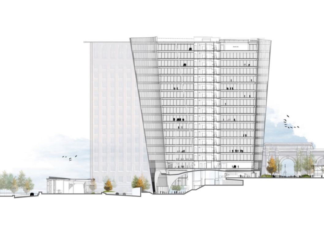
It looks like 252'. Page 61 shows it going up to 271'6" and the pages just before, 57-60, show the ground elevation at 19'6".

In case anybody gets this onto the Skyscraperpage diagrams before I do, please use that height and cite those pages.

(as an aside the diagrams are still missing a lot, including the 3 Echelon towers and all the MIT buildings!)
 
Lol thats how it always has worked and always will. The render game is not perfect, its a mishmash of old and new if you want to have anything comprehensive to look at. Things are changed as time goes on and they usually only release a couple and dont go back and re-release every angle, so you just have to use some imagination with what you do have. As long as its not an entirely new design thats what you have. You get the whole spectrum from placeholders, massing models, all the way to photorealistic representations... just the way it is.

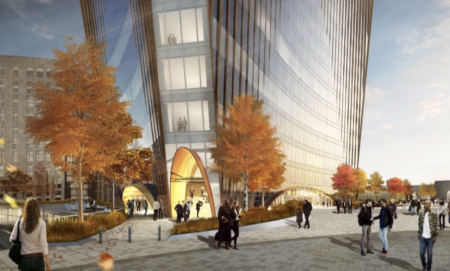
They even used one of the older renders themselves on the cover page there because they dont have a new one showing the lobby to put up there, so they just used an older one and itll be close enough. I do like the changes though and Im glad theyre integrating that triangle lot because its pretty weird dimensions and idk if it would have been anything but grass otherwise if it had not.
 
This has a better great hall than Winthrop Square and we didn't even have to sacrifice an skywalk to get it.
 
00000016561.jpg
"Pour my orange juice a little faster you hipster douchelord."

^Let me fix this for you:
"Pour my craft curated organic hand-squeezed dragonfruit nectar a little faster you hipster douchelord."
 
The way the glass fades from bare to vertical striping in the corners is a very nice touch. Also the amount of park space theyre fitting on the roof of the triangular lot is awesome, its a very weird shaped parcel that didnt have much potential. All in all this version looks really good imo, and I think this would be a great addition to the area. Theyre really making the most out of some oddly shaped parcels and they get bonus points for making a boxy shape... pretty non boxy and unique.
 
I want to hate it because it's just another glass box but honestly that's pretty sexy.

I want to hate it because it's a monolith with terrible street presence, but it's a really good looking monolith.

Glad we can agree for a change.
 

Back
Top