You are using an out of date browser. It may not display this or other websites correctly.
You should upgrade or use an alternative browser.
You should upgrade or use an alternative browser.
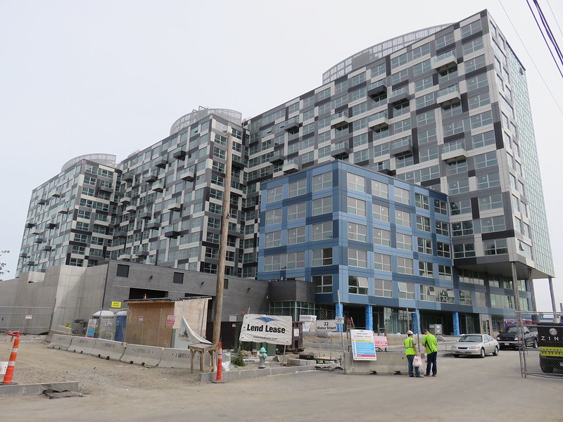
22 Water St | North Point Area | Cambridge
- Thread starter BeeLine
- Start date
- Joined
- Sep 15, 2010
- Messages
- 8,894
- Reaction score
- 271
Is anyone else vexed by this building. I really want to like it .. but it makes my eyes go crazy when I look at it for any period of time.
cca
I absolutely love it. I love how the panels quite literally pop out of the facade to create balconies. I think it's a great design decision to have the balconies use the same language as the facade itself. It creates this monolithic jagged sculpture rather than a box with balconies speaking a different language tacked on.
Almost like a studio project come to life. It has that singular conceptual drive/parti behind it.
Brad Plaid
Senior Member
- Joined
- Jan 17, 2013
- Messages
- 1,310
- Reaction score
- 1,559
I like it but there is a lot going on. Mosaic would have been a good name for this.
Is anyone else vexed by this building. I really want to like it .. but it makes my eyes go crazy when I look at it for any period of time.
cca
I agree. I want to like it but it hurts.
coleslaw
Active Member
- Joined
- Oct 3, 2013
- Messages
- 596
- Reaction score
- 0
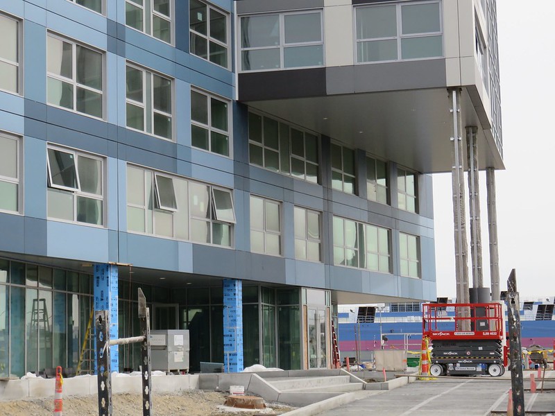
The blue section should have been all glass with some curves to offset the consistent sharp angles of the building
I totally agree, imagining that is a vast improvement.
Nice! I noticed a rendering in the blog which shows an elevated Green Line. Is that a developer decision or is the extension actually going to elevate the Green Line?
That's for real. The viaduct will be extended as part of the Green Line Extension. The tracks come down to grade somewhere between this building and Brick Bottom.
- Joined
- Jan 7, 2012
- Messages
- 14,062
- Reaction score
- 22,729
Charlie_mta
Senior Member
- Joined
- Jul 15, 2006
- Messages
- 4,556
- Reaction score
- 6,478
I like it overall, but it does look somewhat like a building that took too much acid.
- Joined
- Jan 7, 2012
- Messages
- 14,062
- Reaction score
- 22,729
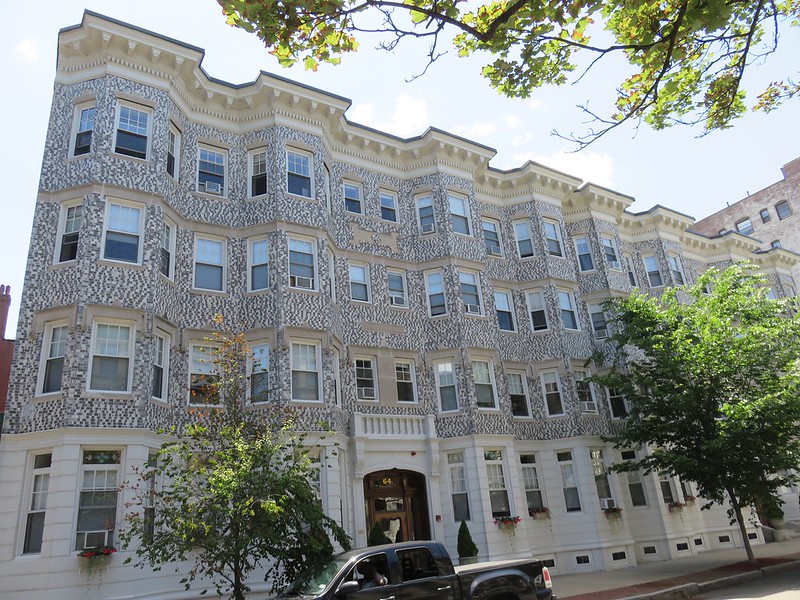
Last week I found the great grand father of Zinc in the Fenway neighborhood.
 https://flic.kr/p/vbCSnE
https://flic.kr/p/vbCSnEcca
Senior Member
- Joined
- Aug 19, 2008
- Messages
- 1,408
- Reaction score
- 12
Almost like a studio project come to life. It has that singular conceptual drive/parti behind it.
I know it is a trend, but I am afraid I have to say that being anything like a "studio project" is not a positive in my book. OMA/BIG/REX (and others) have really paved the way for this kind of architecture to make it "into the wild" I have to say that I do not think we are better off for it.
Design is hard. We should not pretend that building a diagram is good design. It is a disservice to everyone involved including the people living around these places.
cca
We should not pretend that building a diagram is good design. It is a disservice to everyone involved including the people living around these places.
cca
I don't think anyone is.
On the one hand, people complain about the faux feel of Assembly, then the bold design of this place. Too many people go for the middle ground and you end up with most of the city looking like the sea port.
I like this building. Different is good.
cca
Senior Member
- Joined
- Aug 19, 2008
- Messages
- 1,408
- Reaction score
- 12
Different is good.
A agree with your comments about assembly as well. That is another example of bad design to me. Faux anything is a shame. Assembley is like one of those massage chairs in the mall. They are supposed to be comforting ... but all they really are are a grownup version of the plastic ride on toy that rocks back and forth and lights up when you put a quarter in it.
As far as "different is good" not all things different are good. Good things that are different are good.
cca
Last week I found the great grand father of Zinc in the Fenway neighborhood.
That's awesome.