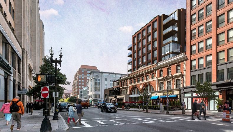
Poor Boston.com. That's an outdated image. David Manfredi presented a new proposal for the upper five floors on Monday that better aligns the upper fenestration with the existing C&B facade, modified the corners, and has a different material treatment on the east and west walls. I old and don't know how to link a pic on my phone, though.
You are using an out of date browser. It may not display this or other websites correctly.
You should upgrade or use an alternative browser.
You should upgrade or use an alternative browser.
761-793 Boylston Street | Back Bay
- Thread starter Equilibria
- Start date
Poor Boston.com. That's an outdated image. David Manfredi presented a new proposal for the upper five floors on Monday that better aligns the upper fenestration with the existing C&B facade, modified the corners, and has a different material treatment on the east and west walls. I old and don't know how to link a pic on my phone, though.
Now I see why you had such empathy for Boston.com.
Last edited:
JumboBuc
Senior Member
- Joined
- Jun 26, 2013
- Messages
- 2,661
- Reaction score
- 1,559
The update you're referring to:Poor Boston.com. That's an outdated image. David Manfredi presented a new proposal for the upper five floors on Monday that better aligns the upper fenestration with the existing C&B facade, modified the corners, and has a different material treatment on the east and west walls. I old and don't know how to link a pic on my phone, though.

2021-05-03_Presentation_761-793 Boylston Street.pdf | Powered by Box
May 3, 2021 Virtual Public Meeting Presentation
As per usual, I preferred the originally-rendered materials. The existing buildings here deserve better than grey alucobond above them.
Joe Lewis's lawyer said it's deliberately set back so they stay within as-of-right so basically, people can nitpick finish and balconies and the like, but they are good to go. The only variance request is the one everyone does when working in the GCOD. That's pretty unusual, in my experience.Kind of feel like they should do something with the empty space on the roof of the existing building. Or make the building bigger.
Or 10 stories, with true penthouses facing the Charles.Yea it's fine. I'd love to see the Capital One building redeveloped at some point. Could be a nice little slim five or six story corner building.
stick n move
Superstar
- Joined
- Oct 14, 2009
- Messages
- 12,133
- Reaction score
- 19,045
Approved
Boylston Street project will preserve historic integrity while adding housing and office space

The project at 761-793 Boylston Street will add nine new units of housing and 26,634 square feet of office space all while preserving the building’s historic facades. All existing facades will remain in place while a five-story, mixed use, building is constructed from the interior. The existing restaurants, Abe and Louie’s and Atlantic Fish, both tenants of space inside the project boundary, will be preserved.
https://bostonrealestatetimes.com/bpda-approves-nine-new-development-projects/
Boylston Street project will preserve historic integrity while adding housing and office space
The project at 761-793 Boylston Street will add nine new units of housing and 26,634 square feet of office space all while preserving the building’s historic facades. All existing facades will remain in place while a five-story, mixed use, building is constructed from the interior. The existing restaurants, Abe and Louie’s and Atlantic Fish, both tenants of space inside the project boundary, will be preserved.
https://bostonrealestatetimes.com/bpda-approves-nine-new-development-projects/
#bancars
Senior Member
- Joined
- Jun 1, 2019
- Messages
- 1,660
- Reaction score
- 6,706
Approved
Boylston Street project will preserve historic integrity while adding housing and office space
View attachment 33154
The project at 761-793 Boylston Street will add nine new units of housing and 26,634 square feet of office space all while preserving the building’s historic facades. All existing facades will remain in place while a five-story, mixed use, building is constructed from the interior. The existing restaurants, Abe and Louie’s and Atlantic Fish, both tenants of space inside the project boundary, will be preserved.
https://bostonrealestatetimes.com/bpda-approves-nine-new-development-projects/
9 units of housing LOL. gotta avoid triggering that IDP threshold
I find it interesting that Tavistock is actively marketing the former C&B retail space, despite the fact that this was approved by the BPDA some time ago. Joe Lewis is worth some $4.3B, but he’s delaying this drop-in-a-bucket project that would hugely expand his retail/restaurant revenue stream at Abe’s and Fish.
Turns out I was wrong...It will inevitably go through a few revisions being in the Back Bay... Could use a cornice, and a better material/treatment of material for that red-orange part.
bigpicture7
Senior Member
- Joined
- May 5, 2016
- Messages
- 3,906
- Reaction score
- 9,547
Not about your last sentence...Turns out I was wrong...
This is atrocious. The fact that at the very least, we cannot get attractive brickwork as a modern nod to its base and its neighbors is borderline criminal.
Life Coach Mike
Active Member
- Joined
- Aug 26, 2019
- Messages
- 317
- Reaction score
- 481
As it stands now, it looks like a cut-rate motel on Daytona Beach. The side facade is all wrong for this spot in terms of hue, pattern, and material. The front facade is tolerable, but needs a crown/cornice that wraps around to the side. And the dumb and over-used alternating windows can also go
What was the building on the corner? Was it transit or electricity related? Those arches look like the Roslindale substation.
BronsonShore
Active Member
- Joined
- Feb 13, 2014
- Messages
- 454
- Reaction score
- 1,350
Pretty sure it was a very early parking garage.What was the building on the corner? Was it transit or electricity related? Those arches look like the Roslindale substation.
