JumboBuc
Senior Member
- Joined
- Jun 26, 2013
- Messages
- 2,661
- Reaction score
- 1,559
This building is a project of said coliving company.Ollie is the name of a coliving company, so I doubt it was ever the name for the building.
This building is a project of said coliving company.Ollie is the name of a coliving company, so I doubt it was ever the name for the building.
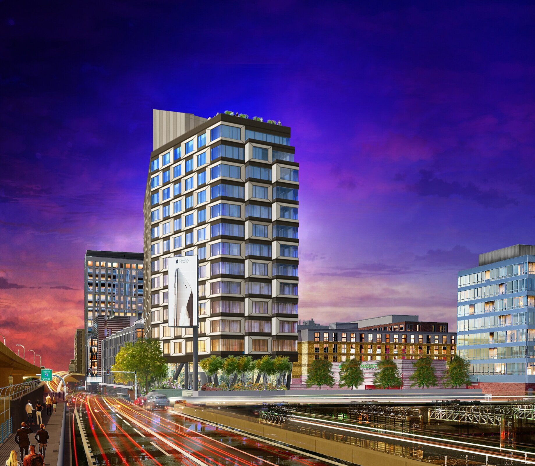
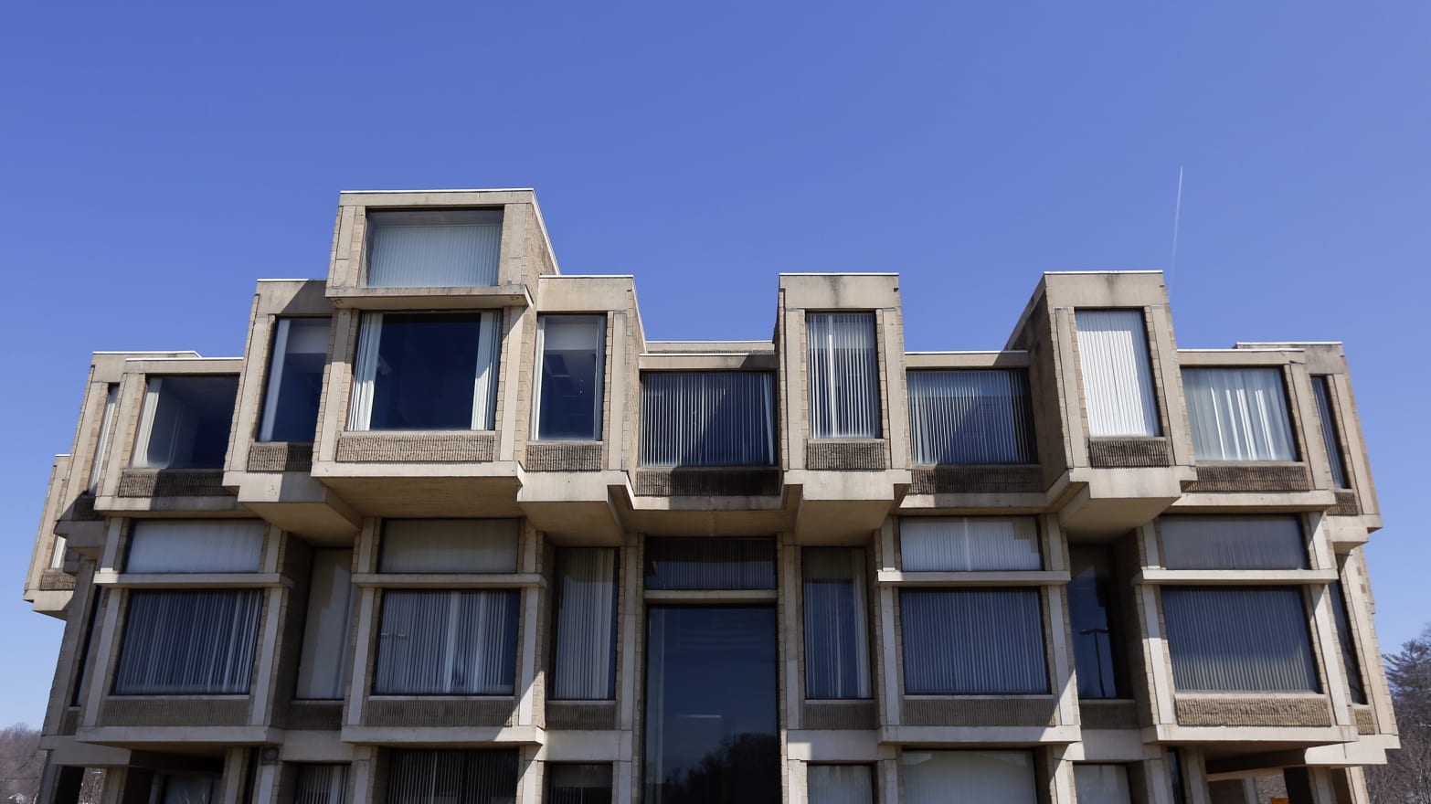
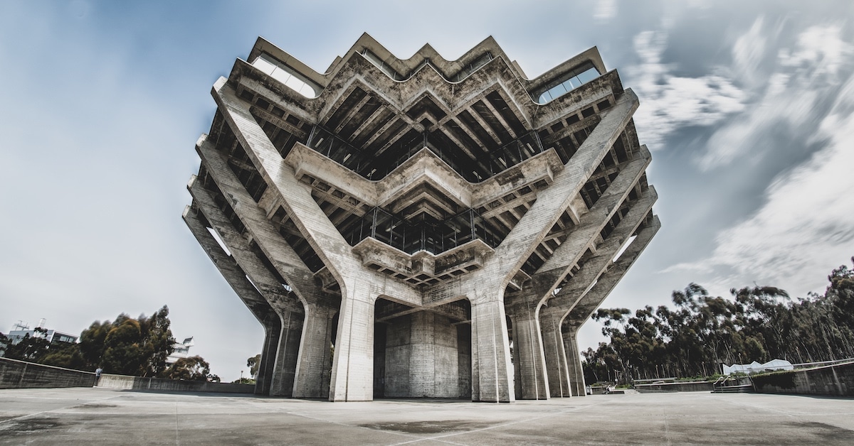
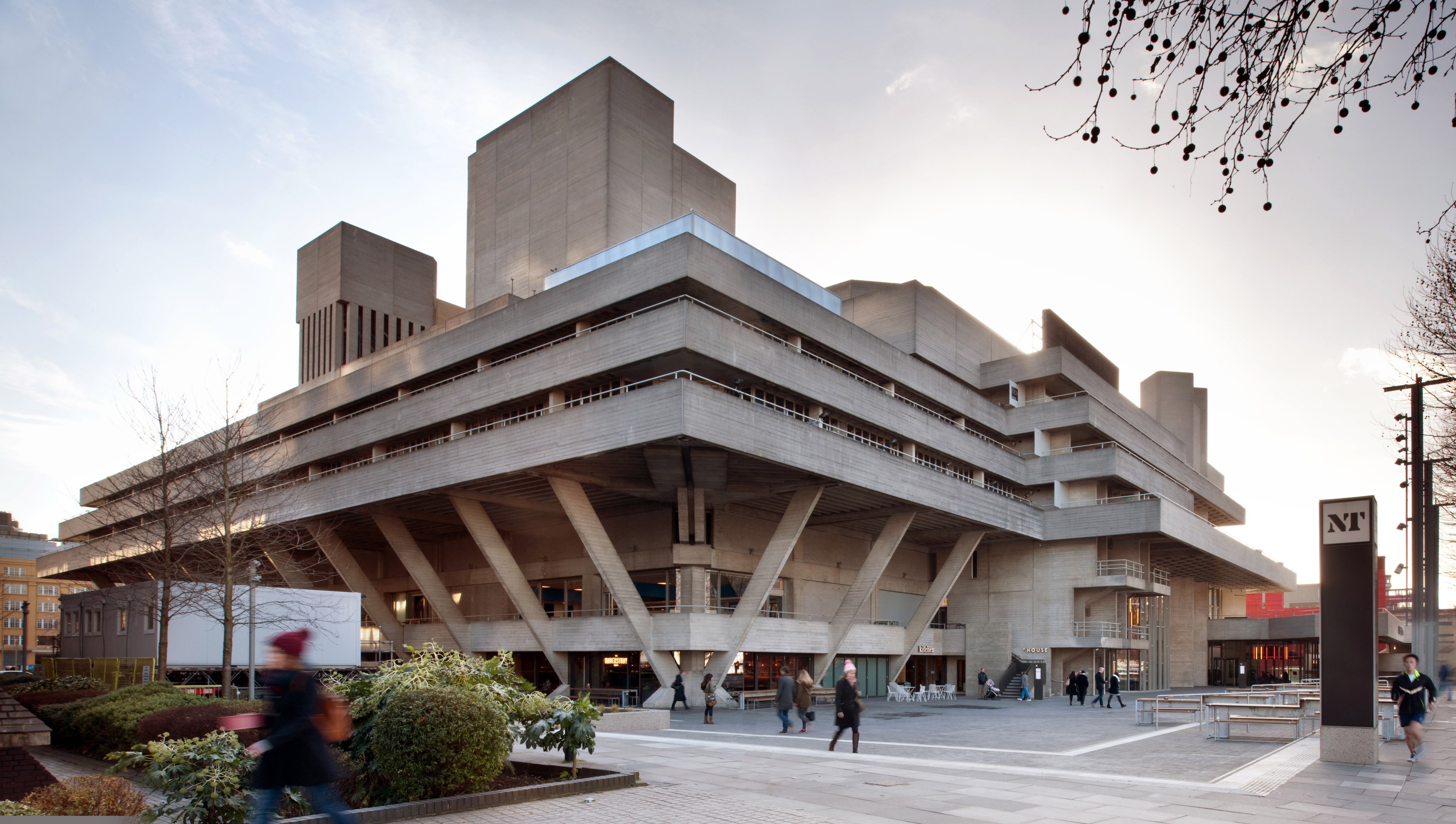
Are they really going to put that billboard back up right next to the building? How incredibly tacky!This facade has a brutalist feel to it but new school with the exposed stilts at the bottom, the concrete looking boxes around the windows, and the large blank mech screen, I like it.

Is that not the name?I read the name as Sink.

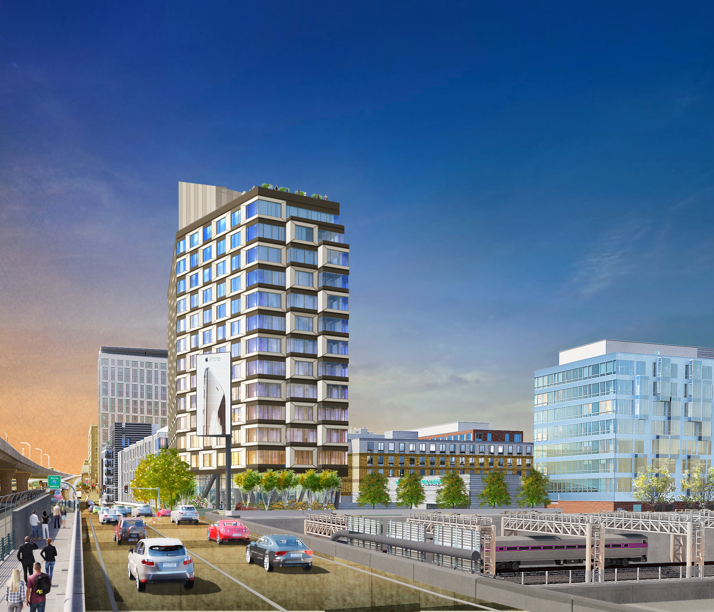
lmao @ all those people walking along Albany or frontage road or whatever that thing calls itself
I was laughing to, but then checked street view. It's not as much of a no-mans-land as I thought.lmao @ all those people walking along Albany or frontage road or whatever that thing calls itself
no idea how ND doesn't get cleaned out with a co-living deal post COVID, but then again, it doesn't matter Alperin already made his money on this one through 2 recaps...
 IMG_7517 by Bos Beeline, on Flickr
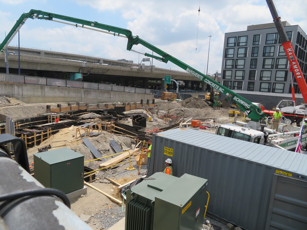 IMG_7524 by Bos Beeline, on Flickr
 IMG_7526 by Bos Beeline, on Flickr
 IMG_7527 by Bos Beeline, on Flickr
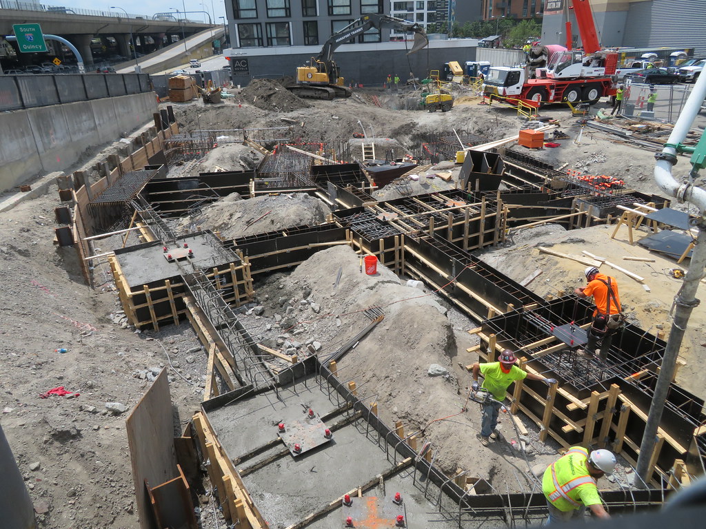 IMG_7528 by Bos Beeline, on Flickr
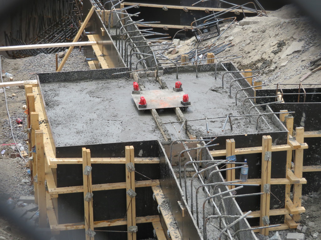 IMG_7530 by Bos Beeline, on Flickr
 IMG_7529 by Bos Beeline, on Flickr
It's remarkable how small and crappy the first building with the whole foods looks in comparison to these others.
The weird structure of 1 and 2 INK is because National Development reused the foundation of the old Herald building (they cheaped out on the start of the site). So that restricted the size of the buildings and created a lot of the layout artifacts.Agreed. Seems like a missed opportunity. Decent street-level experience though.
I also hate the huge parking lot in front of the grocery store. Couldn't they have put that underground and added some more housing?
