Allston-Brighton Infill and Small Developments

Fuck my NIMBY neighbors. Instead of a great local facility, we still have a giant empty warehouse.

With the post indicating the Skating Club was going elsewhere, I did a bit of googling.

Last summer, Harvard solicited proposals for developing this as mixed-use. The link below seems to be from one of the respondents.

show_image.php


Several other renderings on the architect's website.

http://www.howeleryoon.com/projects/lincolnst
 
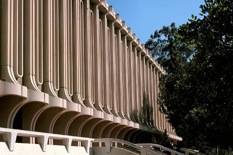
Höweler + Yoon have quickly become the most visionary firm in Boston. This is lovely. I breathes the same rarefied air as William Pereira's work.
 
I think it'll probably look good in real life but these curvy undulating facades always give me the impression of being made of cut-out paper.
 
This is very nice overall, although it gives me a brutalism 2018 edition vibe
 
I think it'll probably look good in real life but these curvy undulating facades always give me the impression of being made of cut-out paper.

Facades are thin. 18-24 inches. So at the scale of a building they are paper thin.

cca
 
This was just one of the responses to the RFP, yes? Not a real proposal?

The history of this site on Lincoln is convoluted. After Harvard bought it, they pitched it to WBZ, the idea being to move WBZ out of its studios on Soldiers Field Rd for 172 Lincoln. Harvard would acquire title to the Soldiers Field Rd. property, which Harvard would have loved dearly to acquire, as it is contiguous to Harvard's main property holdings in Allston.

Change of ownership of WBZ and any sale-related enthusiasm waned with the new owners.. Harvard then reached the outlines of an agreement with the Boston Skating Club to swap the Skating Club's properties (the rink and the motel) on Western Ave. for 172 Lincoln. The Skating Club was apparently unable to raise enough money to build its multi-rink complex, and intends de-camping to the suburbs.

I do not know whether Harvard is still interested in the Club's Western ave. properties. Presumably, Harvard or some developer is because the Club will be relying on the proceeds from the sale of those properties to help pay for its suburban facility.

Coming to full circle, WBZ has sold the property on Soldiers Field Rd. to two Boston developers. The TV studios will remain on part of the eight acre parcel.
https://www.bostonglobe.com/busines...development/e1aPa4I4EmleM6v6noJ17N/story.html

The radio station has moved to Medford.
https://www.bostonglobe.com/metro/2...ad-brighton/qedTgPoTifXBGfg3dcl78O/story.html

Harvard also owns a property almost as large as 172 Lincoln, just to the north of it. The property lies south of Holton, west of Everett, and east of Antwerp. I think part of this property is leased to the Boston Fire Dept.

Pure speculation on my part, but I think Harvard is waiting for the dust to settle with respect to the Skating Club and WBZ properties, before proceeding further to develop 172 Lincoln and the Holton St. property.
 
Like George Orwell meets UCSD.

What could be dreamier for Harvard?
 
^ I'm not sure I see anything explicitly Orwellian about this scheme or Pereira's modern acropolis in sunny California. Can you explain?
 
Thats great.

show_image.php

I completely agree with you and Breton here. This proposal is edgy, different and bold. I love it because it ENHANCES its surroundings.

It is situated in a place/context that is perfect for edgy/bold as opposed to what BU is attempting on Commonwealth Ave that virtually spits on its surroundings of a highly used pedestrian sidewalked, tree-lined boulevard.

THIS jazzes up the Mass Pike and a warehouse area that is increasingly populated by catchy/bold architecture of several different entities.(Bruins/Celtics/NewBalance, WGBH, etc.).

THIS works in the context of its surroundings for the very same reasons that the BU project doesn't.

.........plus it doesn't need a "beard" to shield its windows from its neighbors.

Honestly, if that BU proposed Comm Ave project was in a location more like this it would work better.
 
Last edited:
There's nothing that I don't love about this.

The connection to William Pereira's work at UC Irvine is even more clear after a quick google search...

The only thing I wish it didnt have was the colossal order windows. Its played out now, as it always was. This needs to die and never come back. 1 time was too much, but when it started getting popular that was a rough patch for the city. Luckily its not as popular anymore, but it still gets snuck in here n there especially in height averse areas- like here, where they really need to disguise the height. The first 3 clusters of floors in their colossal order grouping are double height, so the first 3 separate groupings of floors are 2 floors a piece. The next 2 clusters up the tower are triple height, and the final top cluster of floors is quadrouple height. They are reaaaallly trying to hide its height here and unfortunately it works. It doesnt look bad here though, but stop hiding height... embrace it.

This tower is too short for it to work exactly as designed, but the idea is that each cluster appears as 2 floors like at the bottom. As you get further up the tower because of perspective the floors look smaller anyways so they sneak more floors into each one. This tower essentially is trying to look like 6 groups of 2 floors each or 12 floors, but there are really 16 floors there. Its more noticeable on a shorter tower like this tho.

Look:
show_image.php
 
Last edited:
Good observations about the way the tower's facade reads. There are a couple of other things to consider...

I agree, colossal order is a tactic that's overly-used to downscale a tower to passersby. But here, the effect is different because there are lots of these bone-like columns and the areas of glass are narrow. If there were six or eight columns per facade "zone" with wide areas of glass, I'd be right there with you. But these curved, dimensional dinosaur-ribs lead the eye upward. The effect is modulated by the staggered off-set of each zone of the facade. The way that the zones are stretched as the building rises has the effect of acceleration and perhaps dematerialization.

What's most significant isn't that we see different things, but that we see something worth noting and discussing. To look at these renderings (without any expectation that this will ever see the light of day) this is design far beyond the middling crap from Elkus across the Pike, or the snooze-fest at North Station. There's real poetry here, and like all good poems, it's open to interpretation.
 

Back
Top