You are using an out of date browser. It may not display this or other websites correctly.
You should upgrade or use an alternative browser.
You should upgrade or use an alternative browser.
Atlantic Wharf (née Russia Wharf) | Atlantic Ave | Waterfront
- Joined
- May 25, 2006
- Messages
- 7,062
- Reaction score
- 1,976
I have to agree with that article, that is one out of place building. But the thing is, it is only really out of place because of the warehouse buildings at its base. If they were allowed to knock them down it might be nice.
I prefer the warehouse buildings to the tower.
I prefer the warehouse buildings to the tower.
Padre Mike
Active Member
- Joined
- Jan 27, 2007
- Messages
- 681
- Reaction score
- 1
The building appears to be out of place in part because it is being viewed in isolation. Given the street scape and the curve of the street, as well as the height of the brick warehouses, the tower will probably not be prominent unless seen from a distance, and even then it will have a backdrop of many other buildings. Besides, it will hide some of the Intercontinental, which, if allowed to stand alone, does little for the skyline. I like the details of the Russia Wharf building. Could it be better? Of course. There are few buildings that, when finally built, live up to their renderings (which always seem to show more reflectivity to building facades than the actual building, mirrored glass excepted). I wish the original rounded spire/tower were still there.
I don't understand the concern of the article's author about doing justice to the Greenway. If Russia Wharf can come alive 24/7 then it will be doing its job in an area that can be quite dead on weekends and at night.
I don't understand the concern of the article's author about doing justice to the Greenway. If Russia Wharf can come alive 24/7 then it will be doing its job in an area that can be quite dead on weekends and at night.
Joe_Schmoe
Active Member
- Joined
- May 25, 2006
- Messages
- 374
- Reaction score
- 0
I agree that Russia Wharf needs to go back to the drawing board, or at least back to the design with the spire that at least achnowledged the buildings sitting at its base. And he is definately right on about Menino not caring about what buildings look like and only how to maximize revenue, the new South Boston waterfront is testament to that.
stellarfun
Senior Member
- Joined
- Dec 28, 2006
- Messages
- 5,719
- Reaction score
- 1,563
I think the tower resembles an alien spike pounded into the heart of the site. Neither the architectural elements nor the color palette for the tower relate to the wharf buildings that basically serve as a over-sized plinth.
tocoto
Active Member
- Joined
- May 25, 2006
- Messages
- 386
- Reaction score
- 88
When they go back to the drawing board and try to make the tower look like a 19th century building we'll end up with something like the new courthouse, or the Cambridge Marriot. Maybe they'll give us pre-cast concrete since it looks like real stone.
No, I think the modern tower is good. It sits back from the 19th century warehouse facades and does not look likes its part of them, which it shouldn't. Boston desperatley needs modern architecture and materials. It's sickening to look at all the dumps that have been built in the last 10 years that try to fit into the old Boston style of brick and stone. The best buildings in recent times such as 111 Huntington, the Manual life building and the ICA are examples of modern design working in Boston. Russia Wharf as designed when taken in context with the rest of the large buildings in that area will fit fine. The city needs to be much more daring.
No, I think the modern tower is good. It sits back from the 19th century warehouse facades and does not look likes its part of them, which it shouldn't. Boston desperatley needs modern architecture and materials. It's sickening to look at all the dumps that have been built in the last 10 years that try to fit into the old Boston style of brick and stone. The best buildings in recent times such as 111 Huntington, the Manual life building and the ICA are examples of modern design working in Boston. Russia Wharf as designed when taken in context with the rest of the large buildings in that area will fit fine. The city needs to be much more daring.
- Joined
- May 25, 2006
- Messages
- 7,062
- Reaction score
- 1,976
I agree that the city needs to be more daring architecturally, and I agree that whatever tower is built should not look like "Boston Stone" like so many try to. What the problem here is scale. This tower is COMPLETELY out of scale not just in the area but in relation to the buildings beneath. This reminds me of the new Hearst Tower in midtown NYC, and that isn't a good thing (I seriously hate the Hearts Tower)
In order for new buildings to succeed in boston they need to blend (not necessarily match them, but fit in with them) with the old. Many of the more successful ones do this... John Hancock tower reflects the church and Old Hancock tower and surrounding buildings to fit in...
The design above is terrible. the first renderings at least look like they blended with Inter-continental (yeah, not old by any means, but at least they fit), this one looks way out of place.
The design above is terrible. the first renderings at least look like they blended with Inter-continental (yeah, not old by any means, but at least they fit), this one looks way out of place.
tmac9wr
Senior Member
- Joined
- Jun 14, 2006
- Messages
- 1,446
- Reaction score
- 68
I don't see why anybody would be complain about this building...it's a great looking tower in my opinion and I love the fact that it is on top of the older buildings. Why would you want to try and make it look older? The contrast of old and new makes it look awesome in my opinion.
DudeUrSistersHot
Banned
- Joined
- May 25, 2006
- Messages
- 315
- Reaction score
- 0
yeah. stop whining.tmac9wr said:I don't see why anybody would be complain about this building...it's a great looking tower in my opinion and I love the fact that it is on top of the older buildings. Why would you want to try and make it look older? The contrast of old and new makes it look awesome in my opinion.
- Joined
- May 25, 2006
- Messages
- 7,062
- Reaction score
- 1,976
vanshnookenraggen said:What the problem here is scale. This tower is COMPLETELY out of scale not just in the area but in relation to the buildings beneath.
I just want to emphasize this. I have nothing against the design (in fact I do like it) but it does NOT work well with the warehouse buildings beneath it.
Here are older renderings (taken from the archBoston Wiki)


This tower dominates rather than compliments. Yes it is a nice contrast, glass vs. brick, but it's like a fat guy sitting on the shoulders of a midget.
If you were to take the tower and scale some of the elements down, like that huge rectangular bulge on the side, maybe slim it down a bit, it would work well. I especially like what's going on on the roof. It's not the design, it's the scale.
JimboJones
Active Member
- Joined
- Apr 4, 2007
- Messages
- 935
- Reaction score
- 1
I love it!
I love it! I hate mixing old, historic with new, modern, but I can approve of this one. It's weird! It's unique! It is like an alien spaceship!
For some reason it reminds me of the Hearst Tower in NYC. Guess because it's the same idea? Ha ha.
And, yes, it's true, that rendering is in isolation. If you look at other pics, you'll see that Russia Wharf is right up against the InterContinental, which is basically two towers, next to Independence Wharf. It completes the block.
Sometimes I think I just take the contrarian view. Whatever. Guess I did it again.
vanshnookenraggen, i actually like the true color rendering you posted better then the others -- mainly because it makes the base buildings look roughly the same mass horizontally as the tower above. and at least in that view the tower doesn't look horribly fat -- has a kind of golden ratio reasonableness.
here's another thought -- look at the Saltonstall / 100 Cambridge rework. the base along the Beacon Hill side is cheezy, but a very nice idea. Those builds / facades don't complement the not wonderful tower at all, but they do provide a terrific complement to the adjoining neighborhood.
I imagine that the existing Russia Wharf buildings will do something similar vis-a-vis Fort Point. And from the street directly below the tower you mostly won't see it, but you will see the retail commerce in the brick buildings.
Another case in point might be the minor tower diagonally across the square. The tower is debatable (I like it) but the base of original buildings preserves the street wall in a way that the former BankBoston building across the street (the black one with the small base) completely fails to do.
- Joined
- May 25, 2006
- Messages
- 7,062
- Reaction score
- 1,976
Unfortunately the color rendering is the old design. The new one is much fatter. I am not opposed to modern towers above older basses, like your example of 100 Cambridge St. I still think it is a great idea here but I just think it is too out of scale. Perhaps it is just the rendering.
stellarfun
Senior Member
- Joined
- Dec 28, 2006
- Messages
- 5,719
- Reaction score
- 1,563
The tower part is sufficiently set back from the street that it probably could meet the FBI's specs for its new Boston Headquarters.
Rework the facade with a faint rose-tinted (one-way) glass and use a darker cladding (borrowed from SOM's palette for BofA's 555 California St in San Francisco) for the mullion and spandrel elements so the building doesn't try to call too much attention to itself, and it will be fine as the new home of the FBI.
Close to the courthouse too.
statler
Senior Member
- Joined
- May 25, 2006
- Messages
- 7,943
- Reaction score
- 562
^^^
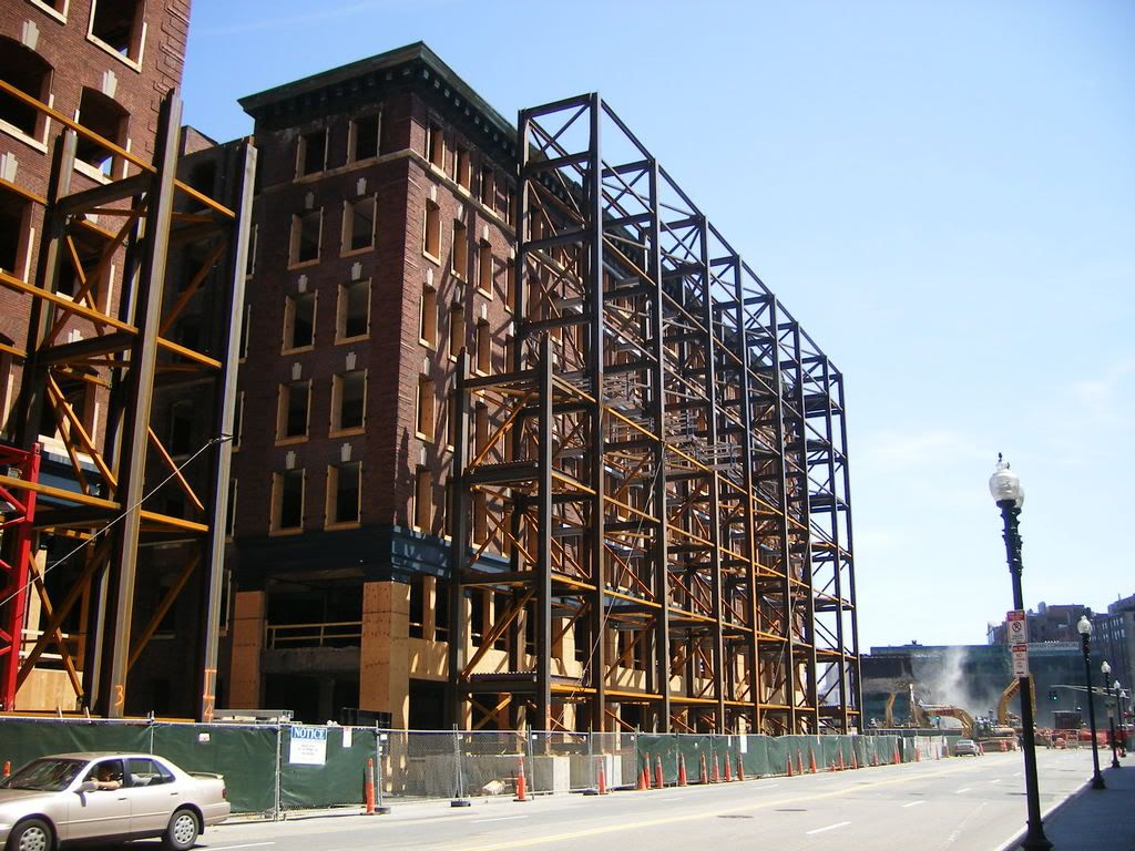
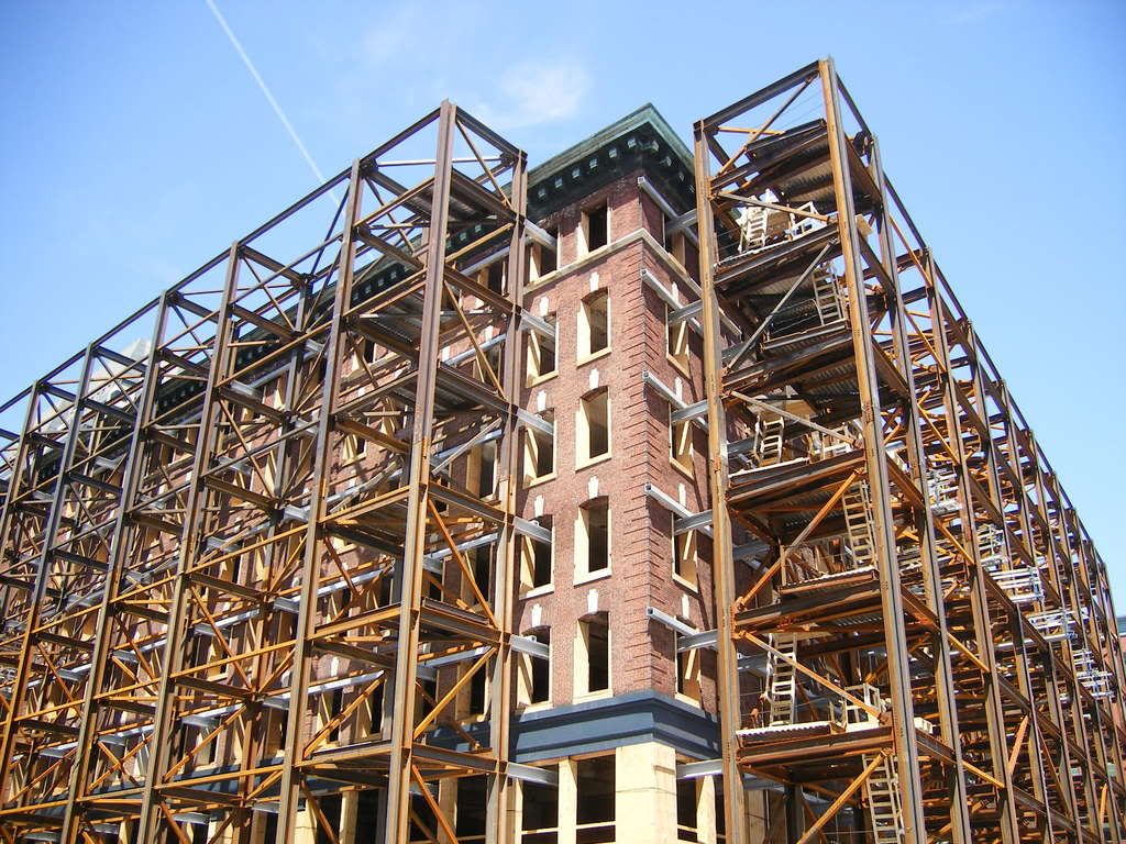
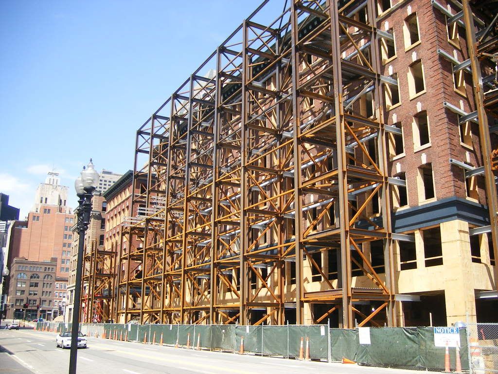
stellarfun said:When they are saving brick or stone facades, that amount of steel caging is typical. Also, the next phase is to demolish the interior space, and excavate for the parking garage, so the walls will essentially be freestanding.briv said:Im no engineer, but if the purpose of all that steel is simply to hold up the facade, its appears to be a bit of overkill to me. Maybe this is part of the new structure?
So when they're done does all that steel go back to the mill to be melted down?statler said:When they are saving brick or stone facades, that amount of steel caging is typical.
Has any noticed the tall building on the other side of Atlantic Ave in the 2nd rendering? Looks to be just under 600 ft and there are two 4 to 5 story buildings on that site now (seen in the 1st rendering).
Is this a real project or just added to make Russia wharf look not quite as tall?


Is this a real project or just added to make Russia wharf look not quite as tall?


