palindrome
Senior Member
- Joined
- Jun 11, 2006
- Messages
- 2,288
- Reaction score
- 140
The rendering in the globe looks alot better.

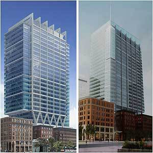
czsz said:I still maintain the first (left) design was more interesting...

stellarfun said:The long-stalled project was about to move forward with its new owner recently when an earlier design of the tower proposed for the site, published in the Globe in April, drew negative reviews for being uninspired.
"There were people who were concerned about the design," said Kairos Shen, director of planning for the Boston Redevelopment Authority. "It could be improved on."
czsz said:
First off, thanks for scanning that in czsz!
GLOBE EDITORIAL
Ugliness on the water
August 8, 2007
IT MAY be too late to prevent another architectural disaster from going up on the Boston waterfront, but let's give it a try. The Russia Wharf project, even in its latest iteration, is an ugly amalgam of 19th-century warehouse and 21st-century glitz. It would increase architectural confusion on the western edge of Fort Point Channel and diminish the appeal of what ought to be a vibrant waterfront district.
The plan has been under discussion for years, and its durability speaks to the combined failure of the Boston Redevelopment Authority, the Civic Design Commission, this editorial page, and many others who care about the shape of the waterfront. None of us raised an outcry against the notion of putting a 20-story glass box atop three brick warehouses.
In response to criticism by Globe columnist Steve Bailey and others, the new owner of the property did tweak the design. But the basic concept remains, and it doesn't work, especially when placed alongside the glassy Intercontinental Hotel, which in turn clashes with the nondescript brick of 470 Atlantic Avenue to the north. If the Russia Wharf high-rise goes just to the south of the hotel, this section of the waterfront becomes a brick and glass jumble. The waterfront is one of the city's great assets. It deserves to look better than this.
The BRA ought to have learned a lesson from the design shortcomings of Exchange Place in the financial district, a 1980s project that squashed the facade of the old Boston Stock Exchange onto the front of a 40-story glass high-rise. Architects cannot combine styles in such an arbitrary way and expect to create an aesthetically pleasing building.
Redesigning Russia Wharf will be difficult, but it might make sense to consider moving the high-rise portion to the back of the site, even if it means tearing down one of the warehouses. These are venerable buildings, but they are not enhanced by serving as the foundation for a modern structure.
For all the talk about its importance, the waterfront is strewn with architectural miscues, among them Harbor Towers and the Federal Courthouse. Perhaps the most notorious is the Marriott Long Wharf, with its ungainly, pedestrian-discouraging design. Mayor Kevin White rammed the design through the BRA in 1978 to compensate the Boston Properties company for its unsuccessful attempt to develop the Park Plaza megaproject in the Back Bay.
That very same company just bought Russia Wharf, and commissioned the slightly revised design. The BRA had given all necessary approvals to the project with the old design, but the revision means that it must undergo one more review. Boston Properties needs to take a fresh look at the site and devise a design that does justice to the site and the city. No more Long Wharfs, please.

consider moving the high-rise portion to the back of the site, even if it means tearing down one of the warehouses. These are venerable buildings, but they are not enhanced by serving as the foundation for a modern structure.