You are using an out of date browser. It may not display this or other websites correctly.
You should upgrade or use an alternative browser.
You should upgrade or use an alternative browser.
- Joined
- Jan 7, 2012
- Messages
- 14,062
- Reaction score
- 22,726

https://www.flickr.com/photos/beelinebos/15504295909/

https://www.flickr.com/photos/beelinebos/15070298854/

https://www.flickr.com/photos/beelinebos/15070287894/

https://www.flickr.com/photos/beelinebos/15690221455/

https://www.flickr.com/photos/beelinebos/15505402220/

https://www.flickr.com/photos/beelinebos/15666482176/

https://www.flickr.com/photos/beelinebos/15688267131/

https://www.flickr.com/photos/beelinebos/15504787098/
JeffDowntown
Senior Member
- Joined
- May 28, 2007
- Messages
- 4,793
- Reaction score
- 3,656
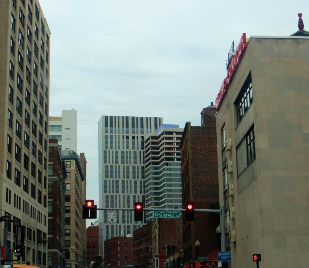
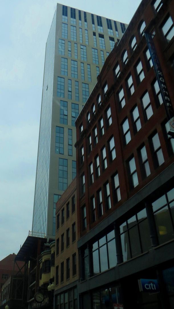
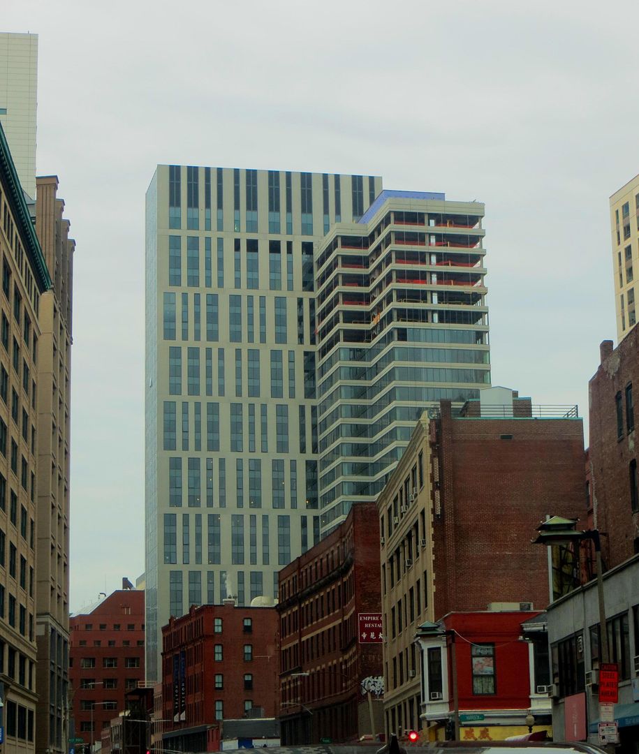
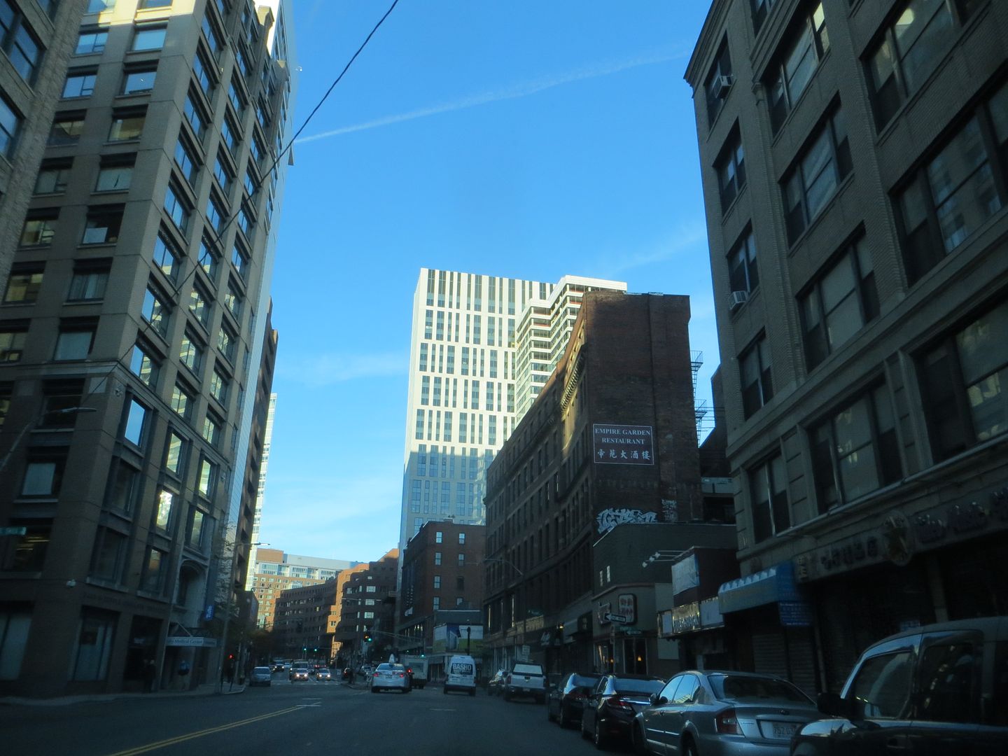
I am liking the way this plays against the Jacob Wirth building and the Dill Building (Boston Hostel). It is rather a fun contrast.
stellarfun
Senior Member
- Joined
- Dec 28, 2006
- Messages
- 5,711
- Reaction score
- 1,544

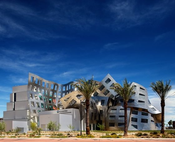
That is simply God-awful. It looks like a poor man's aping of Frank Gehry.
atlantaden
Senior Member
- Joined
- May 31, 2006
- Messages
- 2,604
- Reaction score
- 2,740
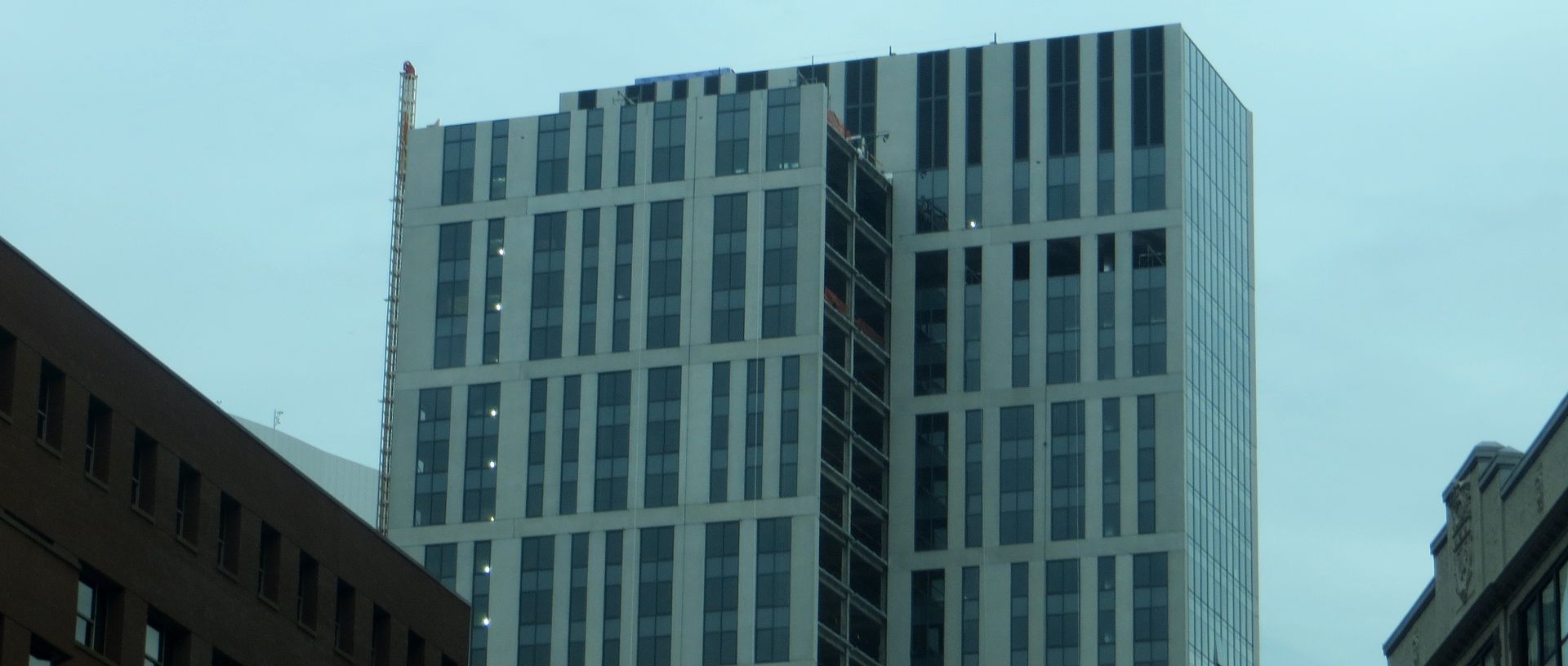
I like how it looks like it's two separate buildings, both of which I like!
- Joined
- Jan 22, 2012
- Messages
- 5,078
- Reaction score
- 1,661
That is simply God-awful. It looks like a poor man's aping of Frank Gehry.

In what universe?
coleslaw
Active Member
- Joined
- Oct 3, 2013
- Messages
- 596
- Reaction score
- 0
That is simply God-awful. It looks like a poor man's aping of Frank Gehry.
Wut?
cca
Senior Member
- Joined
- Aug 19, 2008
- Messages
- 1,408
- Reaction score
- 12

That is simply God-awful. It looks like a poor man's aping of Frank Gehry.

Just ... wow. I am struggling with this post so much I don't know what to say.
cca
- Joined
- Sep 15, 2010
- Messages
- 8,894
- Reaction score
- 271
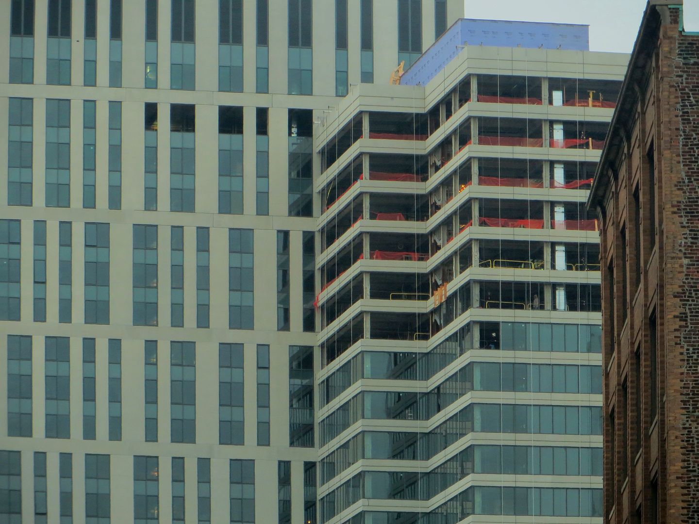
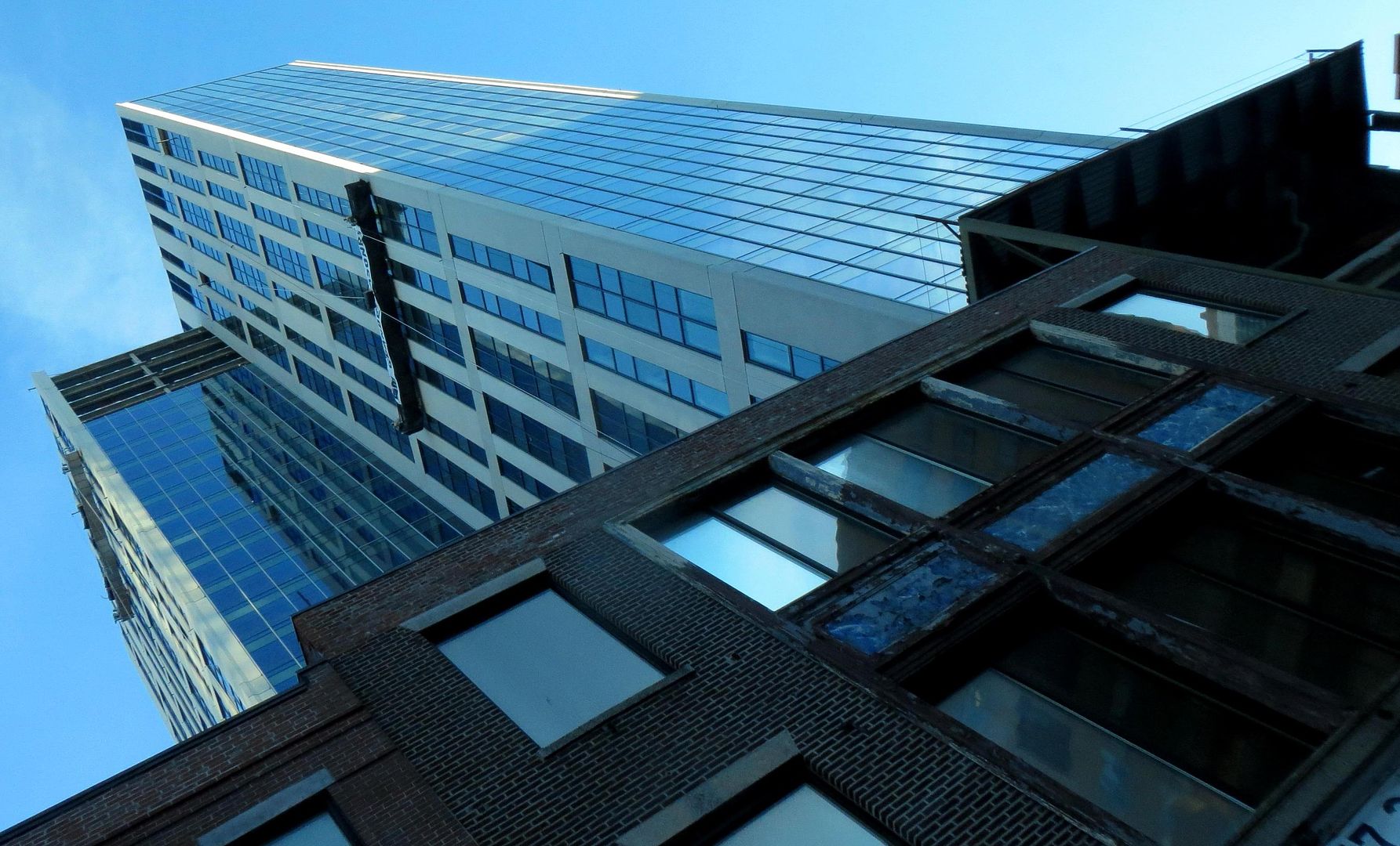
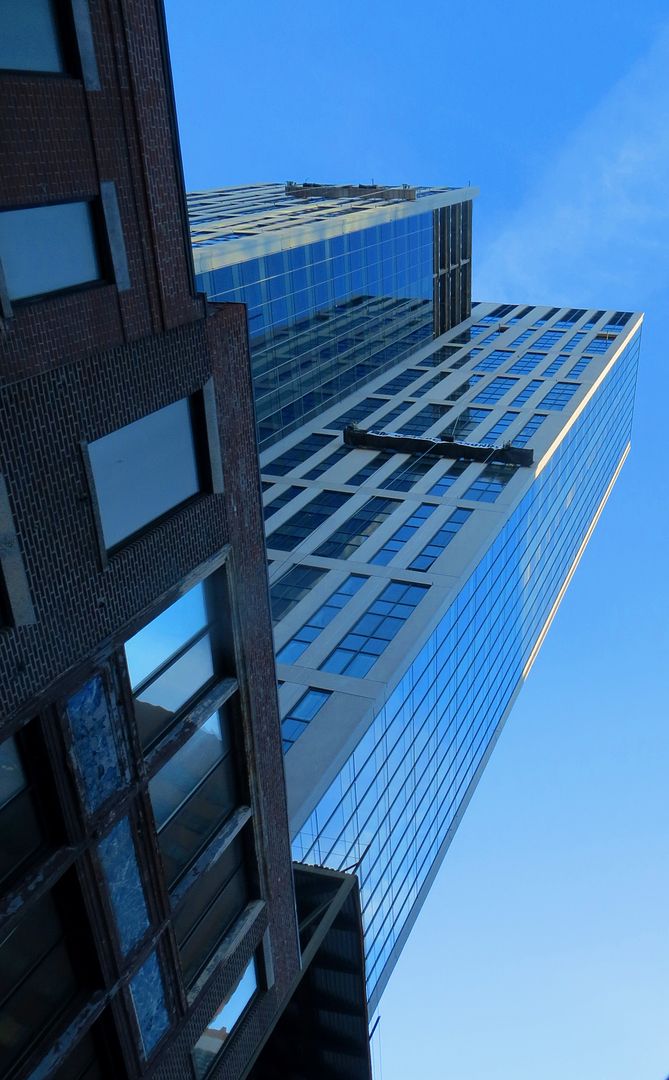
Hmm, the quality and transparency of the glass in the horizontal band portion really helps it achieve the image of floating floorplates. Dare I say, I might actually like it better than the other side.
stellarfun
Senior Member
- Joined
- Dec 28, 2006
- Messages
- 5,711
- Reaction score
- 1,544
My objection to the horizontal band wing is not the horizontal plane, but the lack of a seam makes it appear the annex is 'falling' into the other building. IMO, one wouldn't need a seam if the other building's east facade were also a horizontal band. That way, the west facades would be as now, with a vertical plane, the south and north facades with a glass wall as transition, and the east facades the ribbon bands.Hmm, the quality and transparency of the glass in the horizontal band portion really helps it achieve the image of floating floorplates. Dare I say, I might actually like it better than the other side.
I'll wait to see the finished entrance, but I also object to the building taking no cues from Jacob Wirth.

I believe this was the original, ...before yin and yang.

I'll wait to see the finished entrance, but I also object to the building taking no cues from Jacob Wirth.
I think the waviness is a cue this takes from JW - ultimately, of course, we'll just have to wait and see...
Boston02124
Senior Member
- Joined
- Sep 6, 2007
- Messages
- 6,893
- Reaction score
- 6,639
I wish the crown had a little more going for it. Overall it's a solid building design-wise. I'm hoping the parking garage glass curtain ends up looking good...
On a different note, anyone notice there is no ramp between floors in the garage area (or I just haven't noticed it). Car lift?
On a different note, anyone notice there is no ramp between floors in the garage area (or I just haven't noticed it). Car lift?
JeffDowntown
Senior Member
- Joined
- May 28, 2007
- Messages
- 4,793
- Reaction score
- 3,656
I wish the crown had a little more going for it. Overall it's a solid building design-wise. I'm hoping the parking garage glass curtain ends up looking good...
On a different note, anyone notice there is no ramp between floors in the garage area (or I just haven't noticed it). Car lift?
Car lift/elevator garage -- valet parking only. Correct.
- Joined
- Jan 22, 2012
- Messages
- 5,078
- Reaction score
- 1,661
I wish the crown had a little more going for it.
Agreed, although it comes to to no crown, versus a Kensington crown, I'll take no crown any day.
Boston02124
Senior Member
- Joined
- Sep 6, 2007
- Messages
- 6,893
- Reaction score
- 6,639
- Joined
- May 25, 2006
- Messages
- 7,033
- Reaction score
- 1,865
Wish the architect took an organic approach to massing. Still, looks better than most of these new Kardashian assed buildings.
You are being too kind to these buildings.
I for one really like this and I like the massing.
mdd
Active Member
- Joined
- Mar 14, 2008
- Messages
- 805
- Reaction score
- 170
Wish the architect took an organic approach to massing. Still, looks better than most of these new Kardashian assed buildings.
What do you mean by "organic?"


