citylover94
Senior Member
- Joined
- Oct 27, 2012
- Messages
- 1,140
- Reaction score
- 58
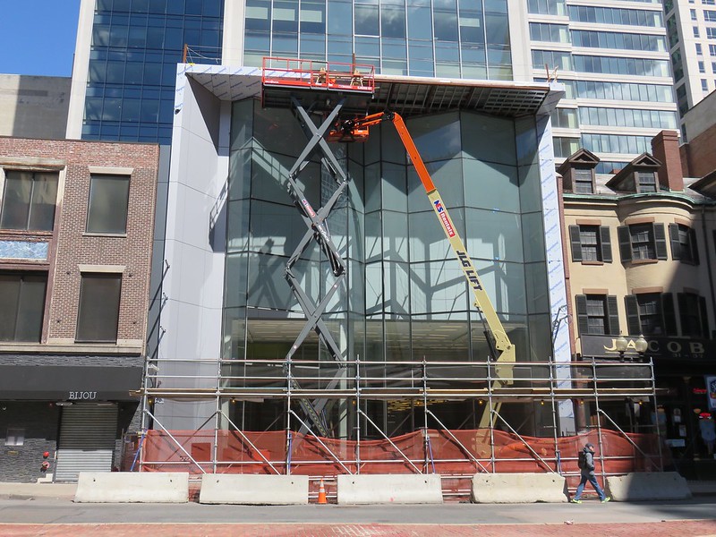
I think it is a little too stretched in that picture I think it would look best if the vertical window section was about another 100 feet.


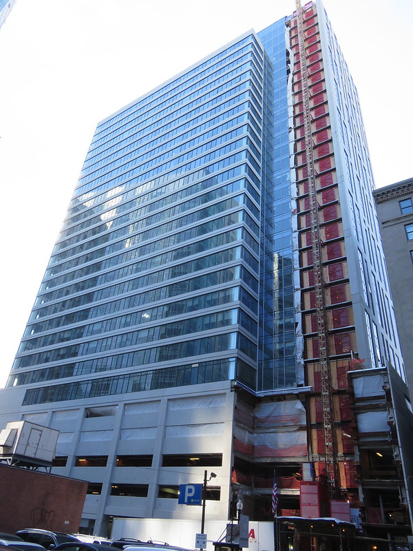
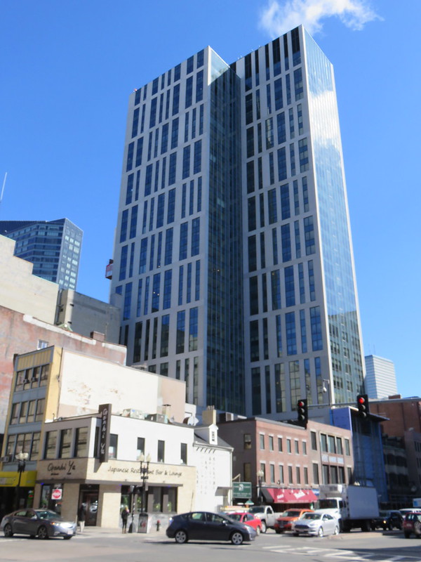


That last photo with the banner makes it look like someone photoshopped a photo of a taller tower and cropped the top off. Where's the rest of it?


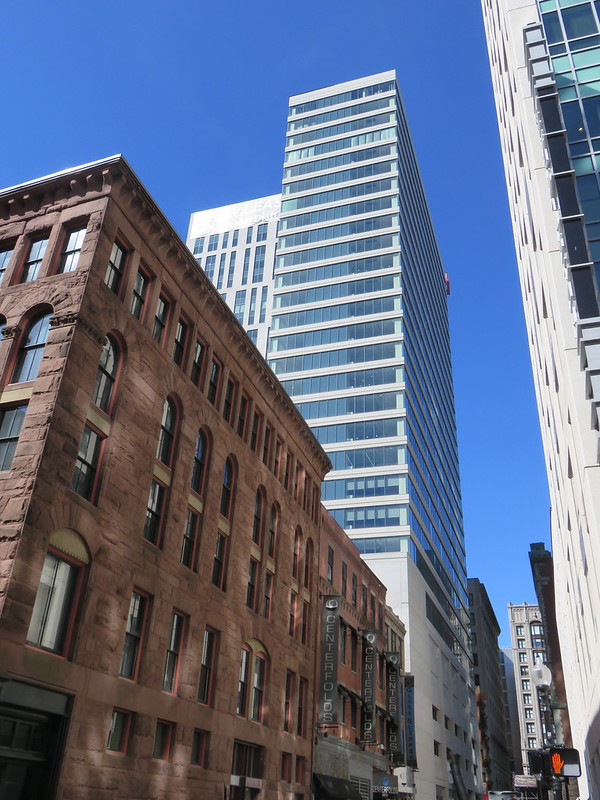
OMG! Manhattanization!