Most buildings in this city get redesigned multiple times before they ever get built. This is the ONE time of all the other times that Im praying this happens. If they follow through with this from beginning to end with no changes it would be a first and also a huge disappointment. This time would be the time to do it of all the other times this has happened. Please, PLEASE Im begging whoever is working on this, redesign this thing, PLEASE. Those white precast residentials are nothing to write home about either.
Every building here is crap but the fat one with the stacked boxes absolutely can not be built like this. They need a redo of the entire site. It blows my mind how although glass boxes are boring they go to even worse and more complicated facades in many cases. Glass boxes get a lot of hate but they pretty much always look good even if they are boring. These towers go out of their way to look horrendous. Those white precast towers would look much better as slim glass boxes and its a win for everyone. They look good and its less complicated for the developer saving some money. If anything make the office a squat glass box, who cares its a background building. But this......this is a tragedy, especially with Copley tower gone. Theres no reason on earth that this can't just be a box. Maybe throw a slanty crown, some set backs, some other little touches, and call it a day. This cannot happen though.
 20171108_143512 by Kent Xie, on Flickr
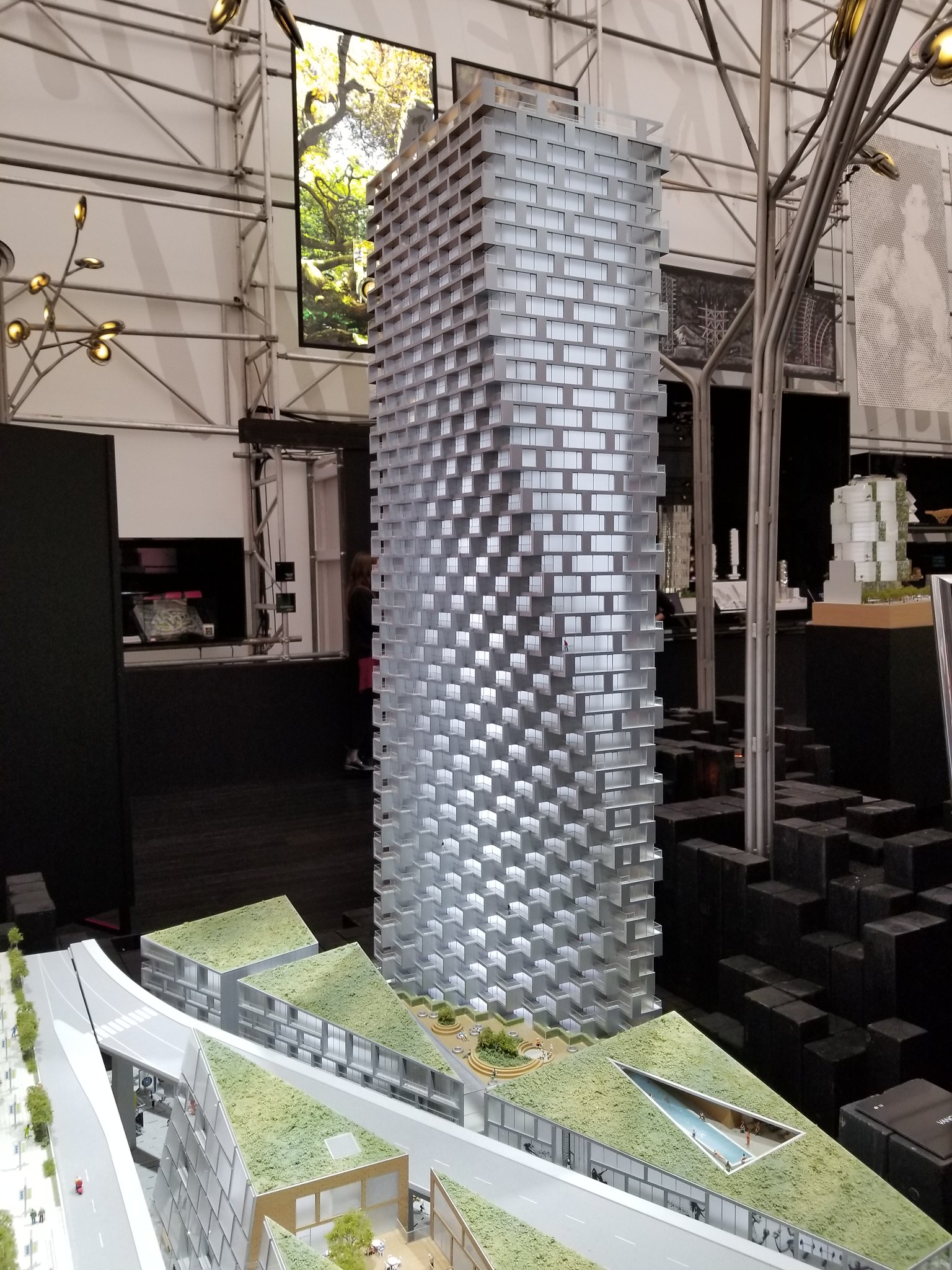 20171108_143023 by Kent Xie, on Flickr
![BBSEGateway_ViewfromSWcorridorA[1].jpg](https://c.o0bg.com/rf/image_960w/Boston/2011-2020/2016/03/30/BostonGlobe.com/Business/Images/BBSEGateway_ViewfromSWcorridorA[1].jpg)
