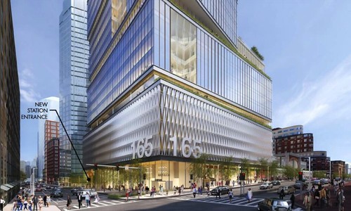
Back Bay Garage Tower | Dartmouth and Stuart | Back Bay

Better than what's there.

How many of you actually live within walking distance of the existing garage vs. complain anywhere from 30 to 3000 miles away?

Yeah but you know what's a better outcome than that? Getting it right the first time. We're basically replacing an eyesore with a slightly better eyesore, one that won't be able to be replaced once completed.
 
Still not sure why folks hate this. We’ve only seen this one angle, it’s more interesting than an a bland box. This could be cool. Maybe don’t be so doom-and-gloom? I think it’s neat.
 
The height crowd wanted something taller than the Hancock here so they are extra mad about what was approved.

I for one love this and don't want to see something taller than the Hancock going up right next door. Hopefully Wayfair takes this and it gets under construction quickly.
 
Sadly Boston can only go "bold" in baby steps. The twisty office box is interesting enough though the lower portion might be a bit overwhelming. There was every possibility this could have been some kind of historicist nightmare like 500 Boylston but that awful bullet has been dodged.
 
In an alternate universe where a couple of office buildings go up every couple of months, no one would even notice this one. But, Boston. So few things to navel-gaze over, it gets unnecessary attention.

Sadly Boston can only go "bold" in baby steps. The twisty office box is interesting enough though the lower portion might be a bit overwhelming. There was every possibility this could have been some kind of historicist nightmare like 500 Boylston but that awful bullet has been dodged.
 
I wish they could put each of the box sections on some sort of track and have them move from time to time. You know, just to mix it up a little bit, keep things from getting boring.
 
Just a quick note 500 Boylston isn't historicist it is Postmodern. It was designed by Philip Johnson and is one of the most extreme examples of the Postmodernist strategy of taking a normal classical architectural element and blowing it out of proportion. In this case the whole building is shaped like a Palladian window and that motif is carried throughout the building's design.

It might be something of an atrocity, but it is a prime example of what postmodern architecture was about.
 
Pardon my architectural ignorance. What is so bad about the design?
From my uninformed point of view, we should be happy it is not brick precast like it's neighbor or white precast like everything else.

See thats the funny part the stack of shoe boxes distracts you from the fact that there actually are 2 white precast towers going up here.


Take a look at the two buildings sticking up above back bay station. White precast. They're not bad at all though. The one poking out above the office building is the Hancock and the one to the right of that is 40 Trinity which is going to be blue glass.

back-bay-tower-1.jpg


Here they are, these towers look fine and they look especially good when built right next to the office building. The thing that I don't like though is that they just leave this end of the Back Bay garage as is when they easily could have knocked it back from the street a little bit and just extended the facade shown above covering the garage at the base of the office tower to cover this side as well. If not knocked it back they at least could have extended the facade all the way to this end. Thats a pretty big oversight imo.

BackBay1200.png


Heres the base of the residential and the new entrance to Back Bay station.

New-Back-Bay-station-1024x626.jpg


Looking down Stuart st. You can see 40 Trinity and the Clarendon just past the office tower. I think it even shows that new Hancock building the one with the rounded off roof that was proposed a while ago.

renderingbackbay11.0.png


This image shows the updated facade but its a pretty small picture. Seems like it is the new Hancock building down there, but not 100% sure.

33368335556_e0746e9b4a.jpg
 
Last edited:
I don't get the hate. I think not only is all the tucked away greenery cool, but the stacked boxes is going to look way cooler in person than on paper.
 
I don't get the hate. I think not only is all the tucked away greenery cool, but the stacked boxes is going to look way cooler in person than on paper.

Need to see the view from Copley and other vantage points.

If this thing looks like a wide fatty from all angles, it's not cool. It will obscure views / create a wall effect.

Right now they have shown us very limited views of this thing, so many of us are fearing the worst.
 
The height crowd wanted something taller than the Hancock here so they are extra mad about what was approved.
.

This project was never going tall. I posted in the Globe in November of '15 that Golden had stated to a small group that Copley Tower would be the final tower allowed to cast shadow upon the Trinity Church and historic Square.

I posted "two 400' towers" on skyscraper city like 5 months before the renders.... then a few weeks later, Beeline confirmed on AB, ending any and all speculation about height. It was not a big disappointment because we were getting the station redone + the needed step-up/mix of height with the welcome addition of Copley Tower. The 300-400' wall of shame punctuated by 500 Beacon vastly improved.

It took many of us, myself included to gradually come to a dislike about what we're getting. It was not 'height fanboys.' It was about getting a great outcome for the site to add to the fantastic Copley Tower -- not subtract from it.

This + the loss of Copley Tower combines for a substancial letdown.

Simon sucks the donkey, and BP too
 
I don't get the hate. I think not only is all the tucked away greenery cool, but the stacked boxes is going to look way cooler in person than on paper.

The greenery is not going to happen, or it will be very lame low profile shrubbery that you won't see from those vantage points. Trees. Don't. Live. on. Buildings. (and don't cite the Cambridge Center Roof Garden)
 
The height crowd wanted something taller than the Hancock here so they are extra mad about what was approved.

I for one love this and don't want to see something taller than the Hancock going up right next door. Hopefully Wayfair takes this and it gets under construction quickly.

I'm not part of the height crowd so I know your comment is not directed at me but let me clarify why I hate this design. It's a box. It's a box stacked on top of boxes.

Having traveled around many major cities across the US, I realize the quality of the architecture in Boston is not reduced because of the height, it's reduced because architects are putting in the minimalest of effort to make anything iconic here and y'all are giving them a pass. Aside from the slanted roof towers we get, which btw is nothing breakthrough (we have 5 of them in the last 20 years, do something new for once) the only proposals that are of quality in the foreseeable future is the office tower at the government center garage and to a lesser extent, 1 Dalton Street only because of it's height.

If you really think a stack of off centered boxes is quality (which is essentially the ICA times 6), then you guys really need to start traveling to other major cities and look at what's being built elsewhere.
 
Last edited:
I'm not part of the height crowd so I know your comment is not directed at me but let me clarify why I hate this design. It's a box. It's a box stacked on top of boxes.

Having traveled around many major cities across the US, I realize the quality of the architecture in Boston is not reduced because of the height, it's reduced because architects are putting in the minimalest of effort to make anything iconic here and y'all are giving them a pass. Aside from the slanted roof towers we get, which btw is nothing breakthrough (we have 5 of them in the last 20 years, do something new for once) the only proposals that are of quality in the foreseeable future is the office tower at the government center garage and to a lesser extent, 1 Dalton Street only because of it's height.

If you really think a stack of off centered boxes is quality (which is essentially the ICA times 6), then you guys really need to start traveling to other major cities and look at what's being built elsewhere.
I agree with your sentiments, but woooooooah now. Don't diss DS+R's fantastic ICA.
 
I agree with your sentiments, but woooooooah now. Don't diss DS+R's fantastic ICA.

I'm not. I'm saying that it's a cheap imitation of the ICA that was copied and pasted 6 times.

I also want to add that when building short towers in Boston, it seems like the architects here go out of the way to make it look as fat, short, and stubby as possible. Some make sense like the office towers at the Seaport, but it's actually possible to give the illusion of being tall for short towers, by you know, making it slim instead of trying to turn it into a landscaper. BU Stuvi, 45 Province One Trinity Place and the Custom House Tower actually do a good job at this.
 
Last edited:
40 Trinity will do this as well also the BU tower by the pike looks really tall even though its not, Im not sure of the exact height but its not tall, but by virtue of it being extremely thin its very imposing.

Sorry to go off topic for a second but this is the tower I'm talking about. Its only 26 stories but looks very tall. Im not sure of the height if someone could fill me in that would be great. Check the view from this thing this has to be one of the best in the city.

BU1.jpg
 
the comment about "you guys really need to start traveling to other major cities and look at what's being built elsewhere" is valid in that, 1) it's good to get exposure to other areas, in general; 2) while there are instances of inspired design pretty much everywhere in virtually every city it is the exception and NOT the rule -- just like in boston. in the past year i've heard gripes about uninspired, poorly thought out developments from residents of shanghai, nashville, san diego, barcelona, london, new york, paris, anaheim, louisville, tampa, and new orleans, to name a few. i'm all for more traveling -- bring it on! -- but i think that's a decent sample size.
 
^ yea that was a sin to go from what was proposed before. The first major mistake was not putting the radome on the spire with the bs excuse its hard to clean...they clean all of the other ones just fine. Then 2wtc going from the best tower in the entire complex to turd salad was mistake 2 in a long list including 3wtcs removal of spires. For spending the most money in history they cut tons of corners.
 

Back
Top