Bay Village Apartment Tower | 212 Stuart St. | Bay Village

From posts in this thread (back in 2017), it is supposed to be limestone. I have a vague memory of someone saying "Indiana" limestone, but that doesn't seem to be in any of the posts.

Dug up why I remember "Indiana". It was in the BCDC presentation


1617662729651.png
 
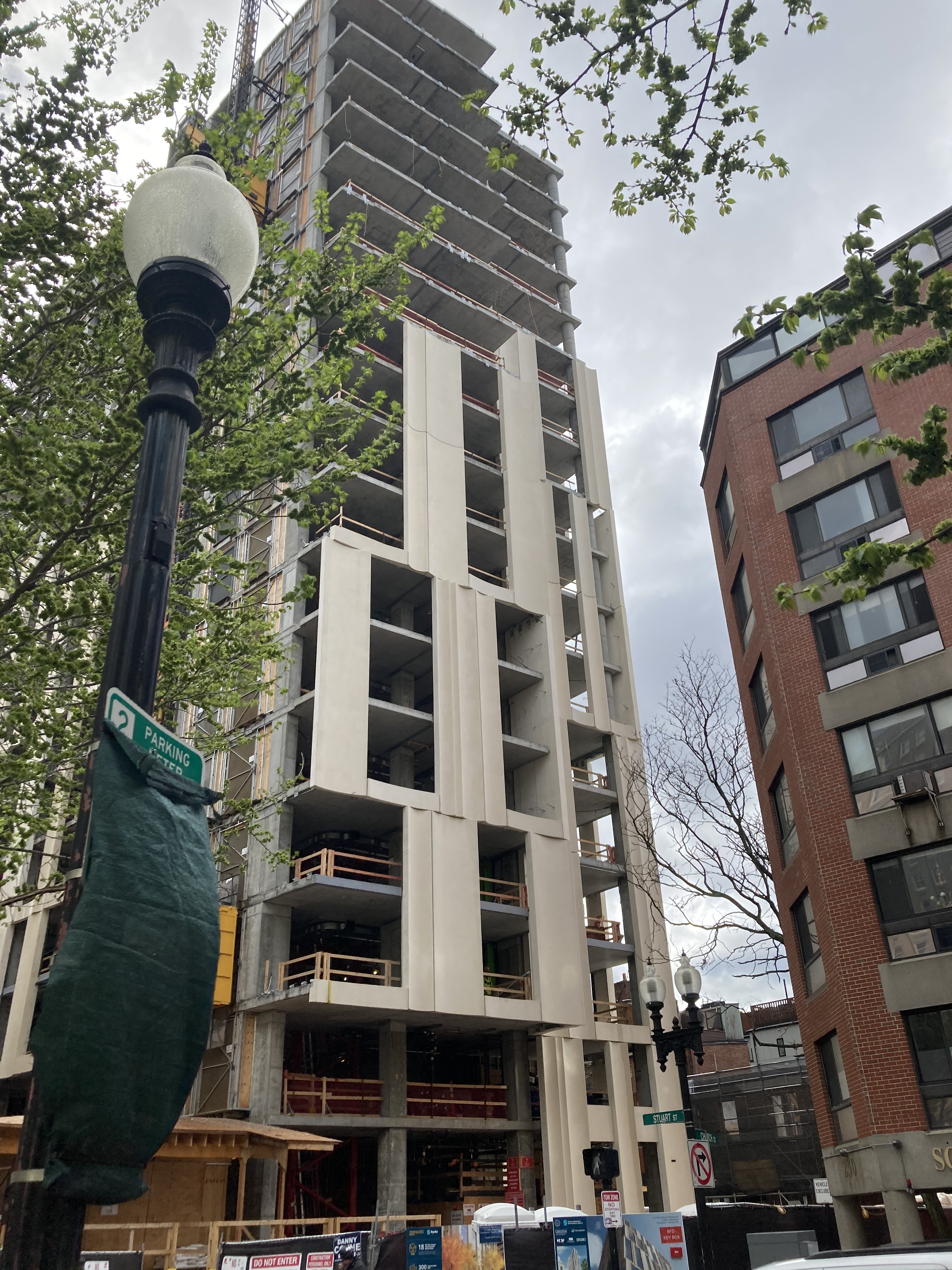
I've always liked this facade concept from the early renders. As I see it being installed, I admit to an initial reaction of "oh no, not another colossal order + offset windows job in Boston." But that negative reaction didn't feel right this time. In exploring it, I think I know the reason: they have kept enough of the windows aligned along the vertical direction to provide some longer lines and senses of continuity and verticality. That seems to have done the trick.
 
I've always liked this facade concept from the early renders. As I see it being installed, I admit to an initial reaction of "oh no, not another colossal order + offset windows job in Boston." But that negative reaction didn't feel right this time. In exploring it, I think I know the reason: they have kept enough of the windows aligned along the vertical direction to provide some longer lines and senses of continuity and verticality. That seems to have done the trick.
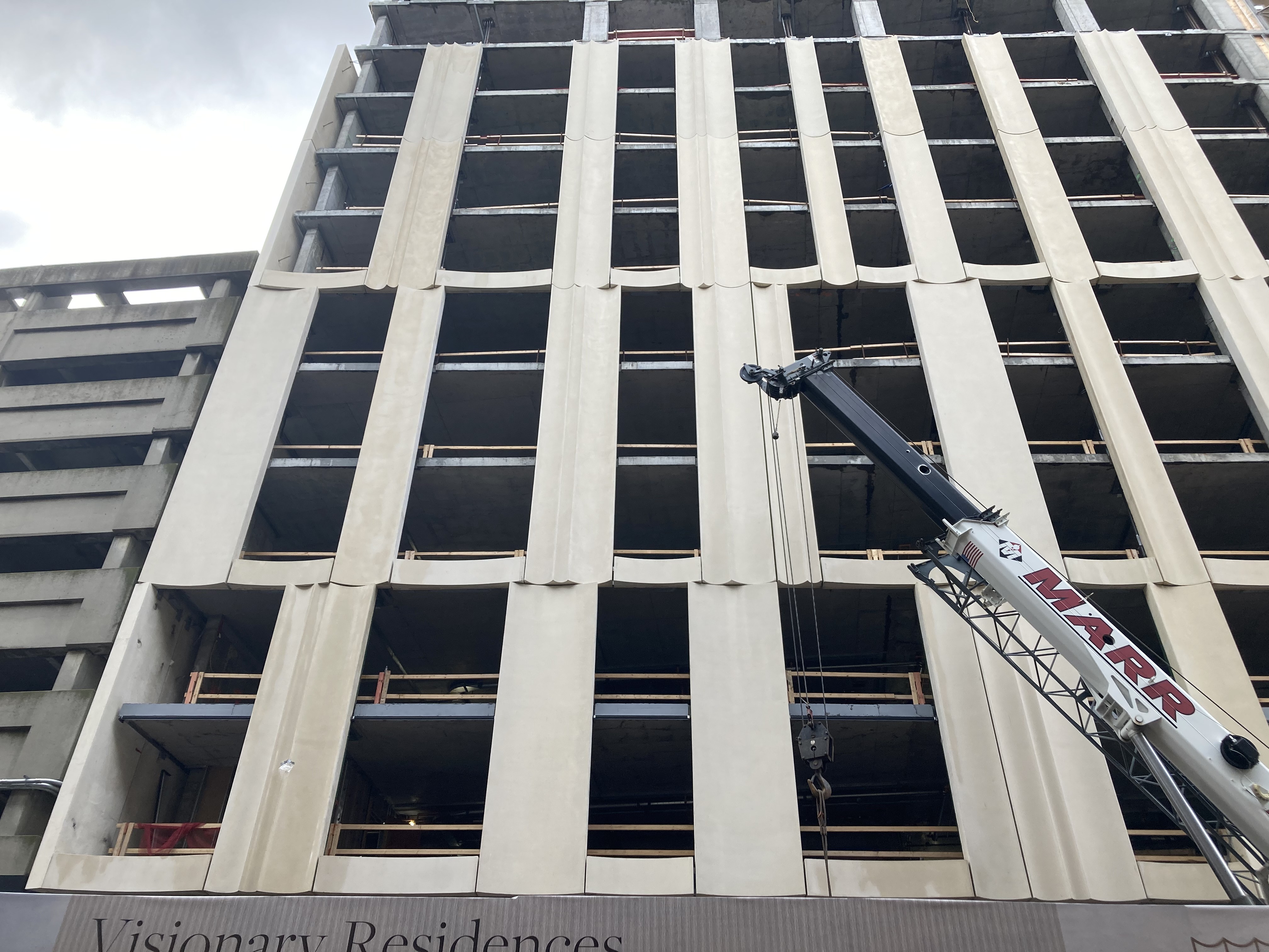
My aesthetics are not liking the misalignment of the grooves in the panels. That disorder is not working for me. I also wonder if it is going to create a waterproofing nightmare.
 
As with many new towers around here, the glass is going to make it or break it. I'm curious when we'll start seeing some windows.
 
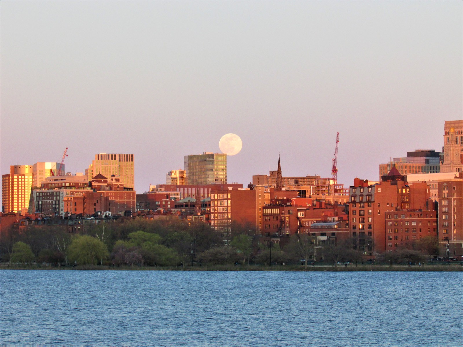
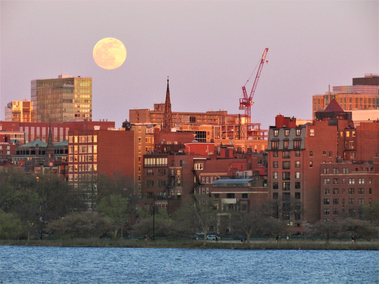
Damn, that moon! DZ, amazing shots of an amazing moon rising over the city.
 
Last edited:
The limestone panels look very much like concrete when dry; they'll be dead ringers for it when wet. No one will care it's limestone, but they'll likely have an opinion on how drab the whole block looks.

The mismatched panels further cheapen the facade's appearance. This looks like the foreman walked off the site and the crane operator just winged it.

The Revere Hotel is a glaring example of how buildings can long outlive a bad idea, and these 'visionary residences' are proof that, fifty years on, we're still building Revere Hotels and patting ourselves on the backs for it.
 
It’s definitely contextually appropriate next to the Revere. The limestone does look nice with the shadow lines from the bright sunshine.

However, those photos highlight how the Revere really ruins the area. Too bad no developer would have the audacity to replace it.
 
However, those photos highlight how the Revere really ruins the area. Too bad no developer would have the audacity to replace it.

A sincere (albeit a potentially daft) question: why wouldn't a developer have the audacity to replace it?
 
A sincere (albeit a potentially daft) question: why wouldn't a developer have the audacity to replace it?
I'll go on a limb and guess a developer is going to see most other undeveloped lots/underutilized lots and neighborhoods having higher returns than whatever they can do at the Revere. That thing's going to demand some high demo costs, and you have to push a new design through, and we've seen lately that developers can't give less of a shit what the architecture is if they're strapped for cash. Even an add/reno on it would be infeasible, likely. Brutalist structures were not built with future alterations in mind.
 
The Revere is a tough one... you could build over the lower half but the actual current tower is there for a long long time. You cant go terribly tall here to offset demo and construction costs due to shadows on the common.
 

Back
Top