stick n move
Superstar
- Joined
- Oct 14, 2009
- Messages
- 12,130
- Reaction score
- 19,037
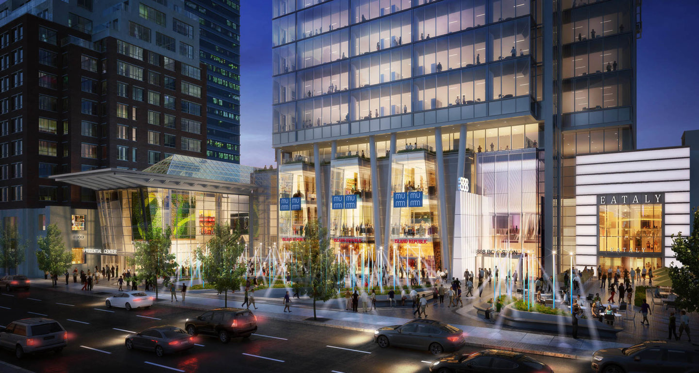
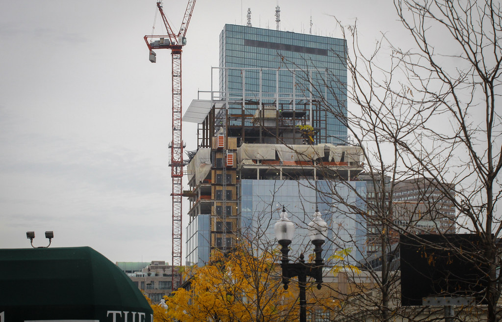
I don't get this building. It's decent but it's so out of place for this long boulevard. Everything else is so finely balanced to convey 'Boston' in their designs. Even the structures with a lot of glass like 395 and 699 Boylston are all broken up into sections, with some parts traditional and others more sleek.
The Apple Store doesn't have any traditional elements but it's so minimal and open, it's harmless. But this is like a giant monotonous wall of heavy glass. I almost wish it would have tried to fit in with the Mandarin.
Hopefully the ground level is nicely done, but it's still not going to fit. Even the old Prudential Mall style style would have been better.
I like it. Sometimes you need something that doesnt perfectly match everything else around it to make things visually interesting. Also anything that draws your eye away from the horrendous red brutalist condo towers is a win. If you think this doesnt match wait till parcel 12, 14, and 15 are built. Also this is no Hancock, but when that was built it didnt fit in and people hated it, now it wouldnt be Boston without it.

