You are using an out of date browser. It may not display this or other websites correctly.
You should upgrade or use an alternative browser.
You should upgrade or use an alternative browser.
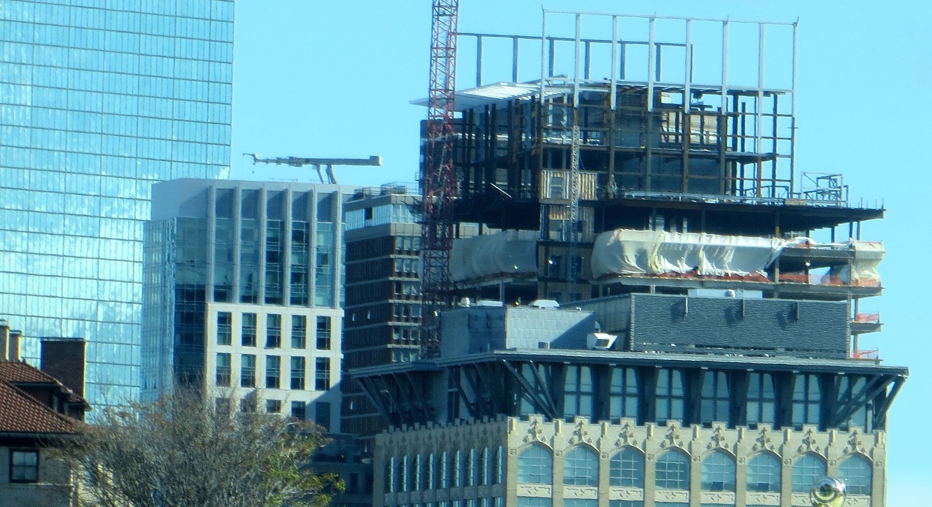
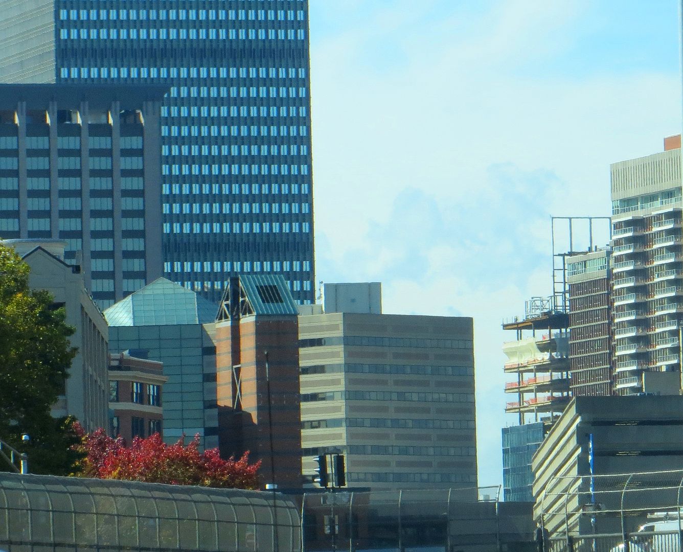
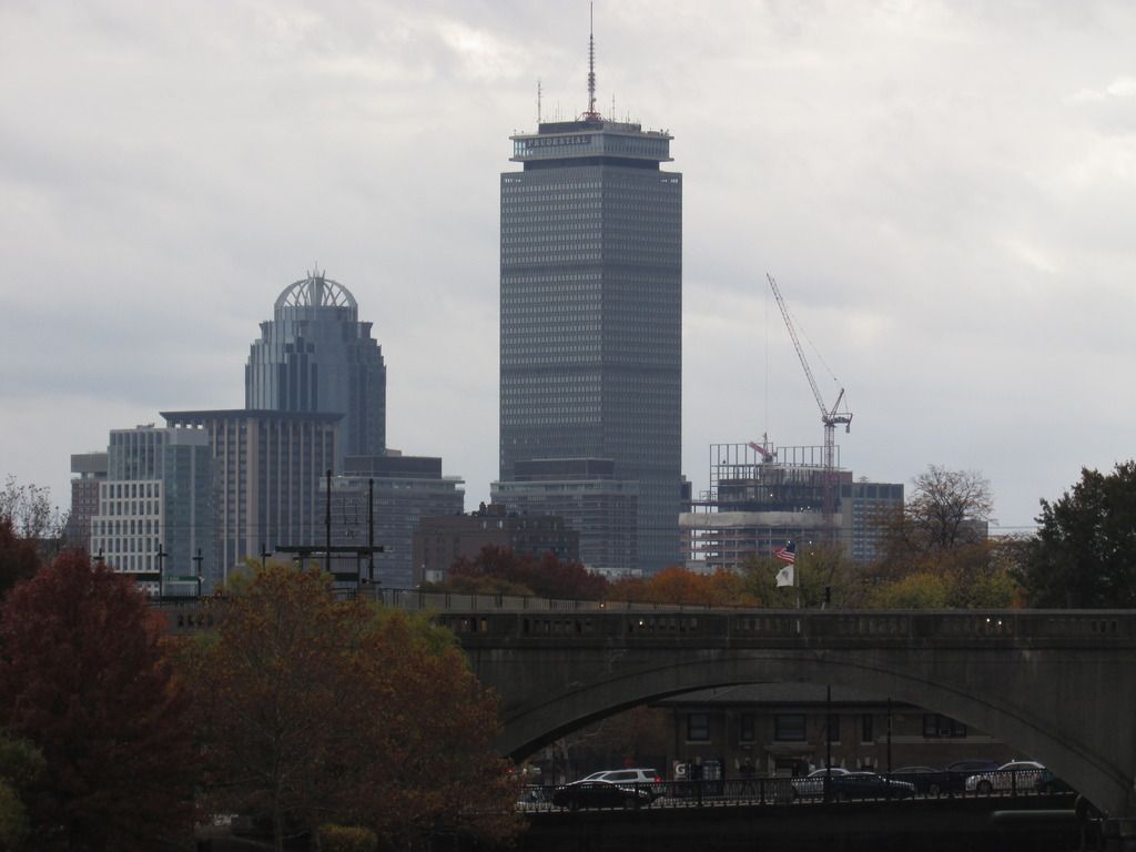
Boston Properties Office Tower | 888 Boylston Street | Back Bay
- Thread starter Rick
- Start date
dshoost88
Senior Member
- Joined
- Apr 14, 2008
- Messages
- 2,168
- Reaction score
- 2,589
Is Bloomingdale's still going in here? Any updates on the arcade additions?
That is unclear still, but unlikely given the announcement of Eataly and all the square footage that will take up.
As an additional question, does anybody know if they are bringing back the mall's food court?
They are not bringing back the mall's food court; Eataly's market stalls and venues will replace it. I think we discussed that ad nauseum in this thread or the new retail thread a while back.
Earl's and a few other new stores are coming in as well. Unfortunately the "quick serve" options may be limited after this is all done. Might not be a bad idea for some quick service places to fill in across the street in the spaces once held by Staples Copy & Print, etc.
Boston02124
Senior Member
- Joined
- Sep 6, 2007
- Messages
- 6,893
- Reaction score
- 6,639
scorpio02150
Active Member
- Joined
- Dec 18, 2014
- Messages
- 206
- Reaction score
- 74
Bos77
Active Member
- Joined
- May 26, 2006
- Messages
- 482
- Reaction score
- 295
Boston02124
Senior Member
- Joined
- Sep 6, 2007
- Messages
- 6,893
- Reaction score
- 6,639
Boston02124
Senior Member
- Joined
- Sep 6, 2007
- Messages
- 6,893
- Reaction score
- 6,639
- Joined
- Jan 7, 2012
- Messages
- 14,062
- Reaction score
- 22,731
Boston02124
Senior Member
- Joined
- Sep 6, 2007
- Messages
- 6,893
- Reaction score
- 6,639
- Joined
- Jan 7, 2012
- Messages
- 14,062
- Reaction score
- 22,731
- Joined
- Jan 7, 2012
- Messages
- 14,062
- Reaction score
- 22,731
dshoost88
Senior Member
- Joined
- Apr 14, 2008
- Messages
- 2,168
- Reaction score
- 2,589
A little slice of Atlanta on Boylston.
How so?
How so?
I think the reference is to 888 Boylston being compared to 1180 Peachtree in Atlanta.
I don't get this building. It's decent but it's so out of place for this long boulevard. Everything else is so finely balanced to convey 'Boston' in their designs. Even the structures with a lot of glass like 395 and 699 Boylston are all broken up into sections, with some parts traditional and others more sleek.
The Apple Store doesn't have any traditional elements but it's so minimal and open, it's harmless. But this is like a giant monotonous wall of heavy glass. I almost wish it would have tried to fit in with the Mandarin.
Hopefully the ground level is nicely done, but it's still not going to fit. Even the old Prudential Mall style style would have been better.

