You are using an out of date browser. It may not display this or other websites correctly.
You should upgrade or use an alternative browser.
You should upgrade or use an alternative browser.
Boston Properties Office Tower | 888 Boylston Street | Back Bay
- Thread starter Rick
- Start date
Sloppy Donut
New member
- Joined
- Apr 23, 2008
- Messages
- 7
- Reaction score
- 0
Been visiting this site since 2007 and I've always found whighlanders post informative and thoughtful, which is much more than can be said about most posts. He's actually one of the more level headed people on this site and despite the claims of some his posts are always in some way related to the topic at hand. I don't find that his posts derail the thread as much as the chide responses he receives back.
-SD
-SD
I understand that I am continuing to derail this thread but I'd also like to say a word in support of whigh's posts. They almost always are informative and never tangential to the discussion. And after apparently losing ablarc with his arch overview posts and Ron with his theater history ones I for one like the fact that whigh is still here.
whighlander
Senior Member
- Joined
- Aug 14, 2006
- Messages
- 7,812
- Reaction score
- 647
I understand that I am continuing to derail this thread but I'd also like to say a word in support of whigh's posts. They almost always are informative and never tangential to the discussion. And after apparently losing ablarc with his arch overview posts and Ron with his theater history ones I for one like the fact that whigh is still here.
Thanks to all for your understanding of my approach -- While I come to the AB as an unabashed ameteur in the primary fields of architecture and city planning -- I hope that my scientific and technical professional background, as well as my avocational interests in local history, including the development of the city, and its technological history -- provides some context and it may indeed occasionally even be interesting to my fellow members of the AB forum
Now -- back to the regularly scheduled discussion of 888 Boylston and the remake of the Pru pedestrian plazas
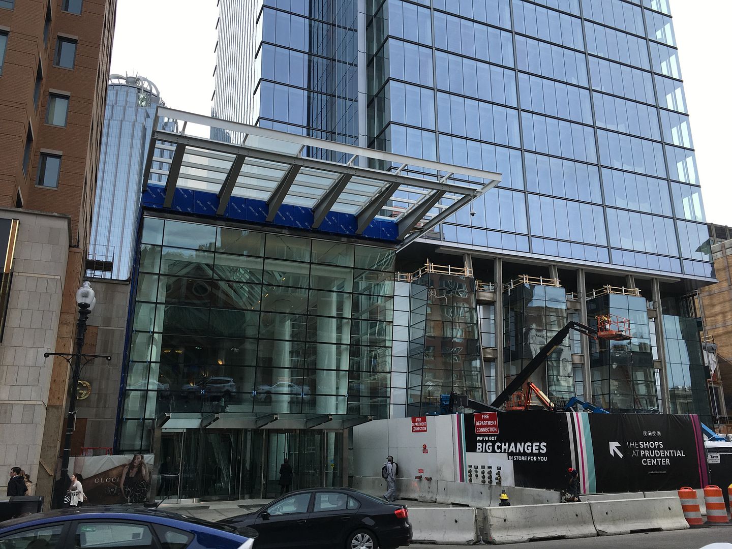
The Boylston entrance has opened!
...and it's already leaking. Walked through on Friday and water was flowing from the recessed lighting inside the revolving doors.
- Joined
- Jan 7, 2012
- Messages
- 14,062
- Reaction score
- 22,728
- Joined
- Jan 7, 2012
- Messages
- 14,062
- Reaction score
- 22,728
 https://flic.kr/p/D7Q9zk
This wallhanging/feature seems to be made up of real plants (Bostons own hanging garden?)
 https://flic.kr/p/DvJDhv
 https://flic.kr/p/DxeNPH
Last edited:
whighlander
Senior Member
- Joined
- Aug 14, 2006
- Messages
- 7,812
- Reaction score
- 647
https://flic.kr/p/D7Q9zk
This wallhanging/feature seems to be made up of real plants (Bostons own hanging garden?)
https://flic.kr/p/DvJDhv
Beeline -- its called a "Green Wall" -- there's going to be a big one with an exhibit explaining how it works as part of the Yawkey Charles River Gallery soon to open at the MOS


stick n move
Superstar
- Joined
- Oct 14, 2009
- Messages
- 12,078
- Reaction score
- 18,845
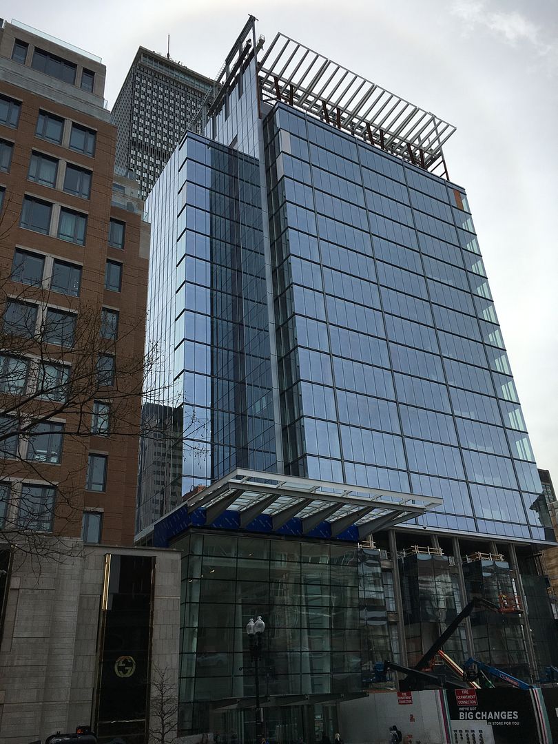
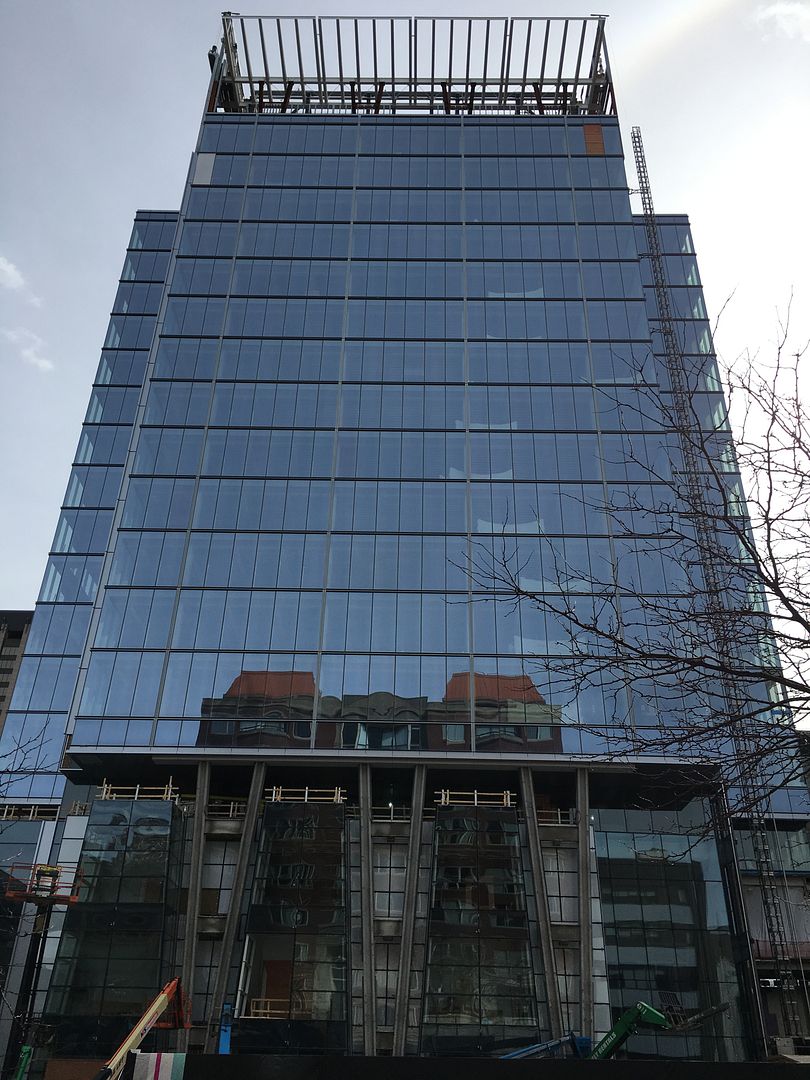
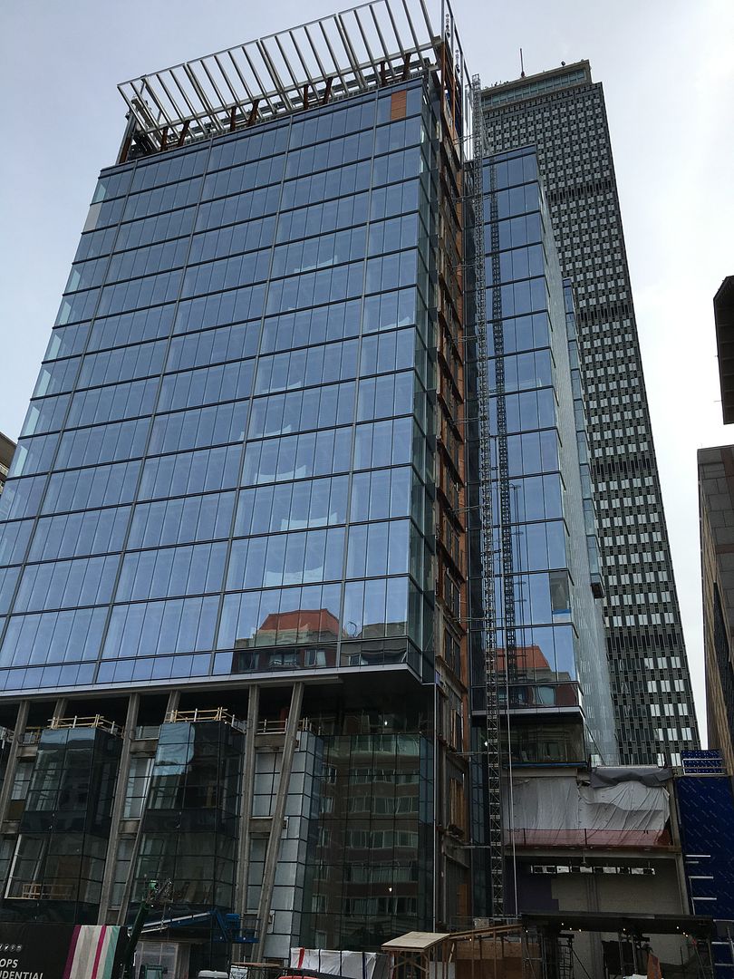
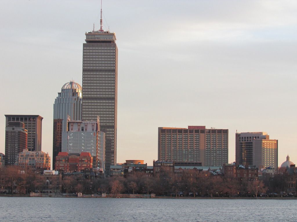
Ground level should turn out pretty good. The rest of the tower IMO is probably the ugliest building in Boston...worse than waterside place and the kensington for sure.
citylover94
Senior Member
- Joined
- Oct 27, 2012
- Messages
- 1,140
- Reaction score
- 58
I personally don't understand how anyone could call this worse than Waterside Place or the Kensington. I don't think it is amazing but the glass appears to be much higher quality than the glass and facade materials used in those projects and while the massing is rather short, fat and somewhat awkward I don't think it is really that bad. Also the ground floor interaction looks really good from the pictures I have seen so I think that is a major plus for this project. I'm just confused as to why people seem to hate this project so much. This wasn't ever going to be a tall thin tower because of location so I think they did the best they could given the limitations this site has.
stick n move
Superstar
- Joined
- Oct 14, 2009
- Messages
- 12,078
- Reaction score
- 18,845
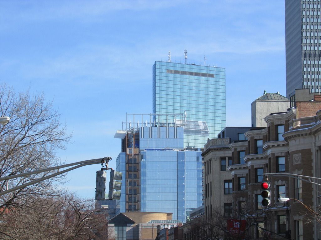
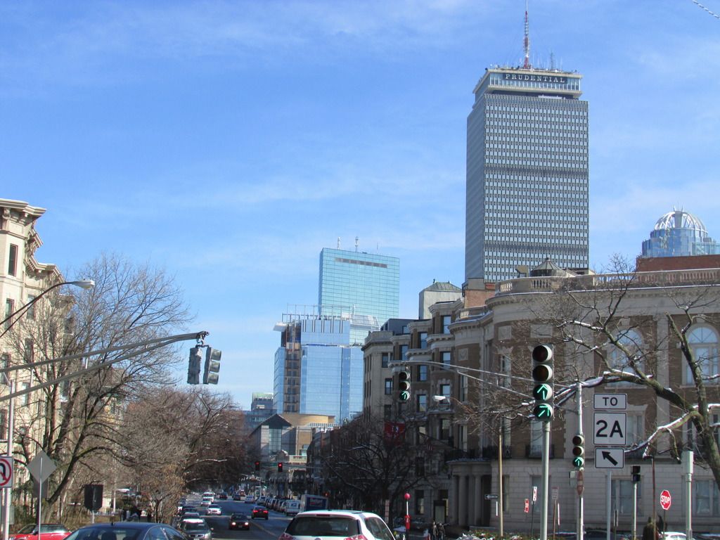
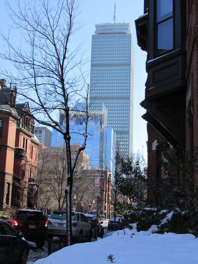
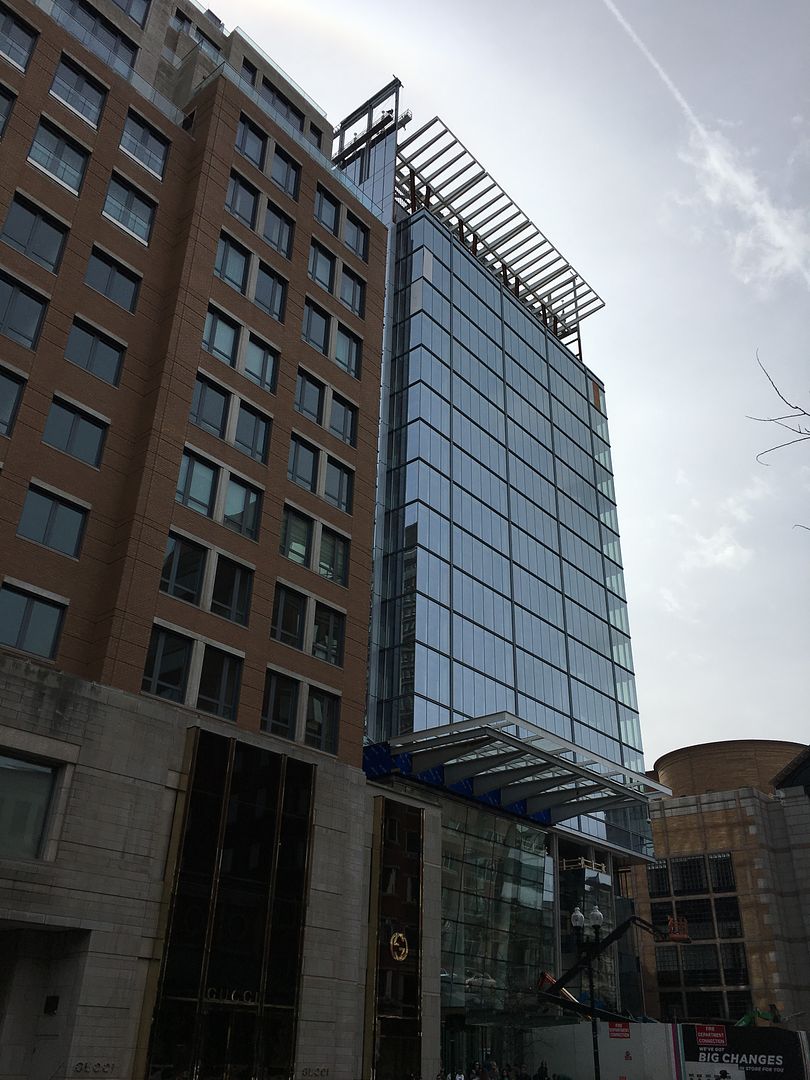
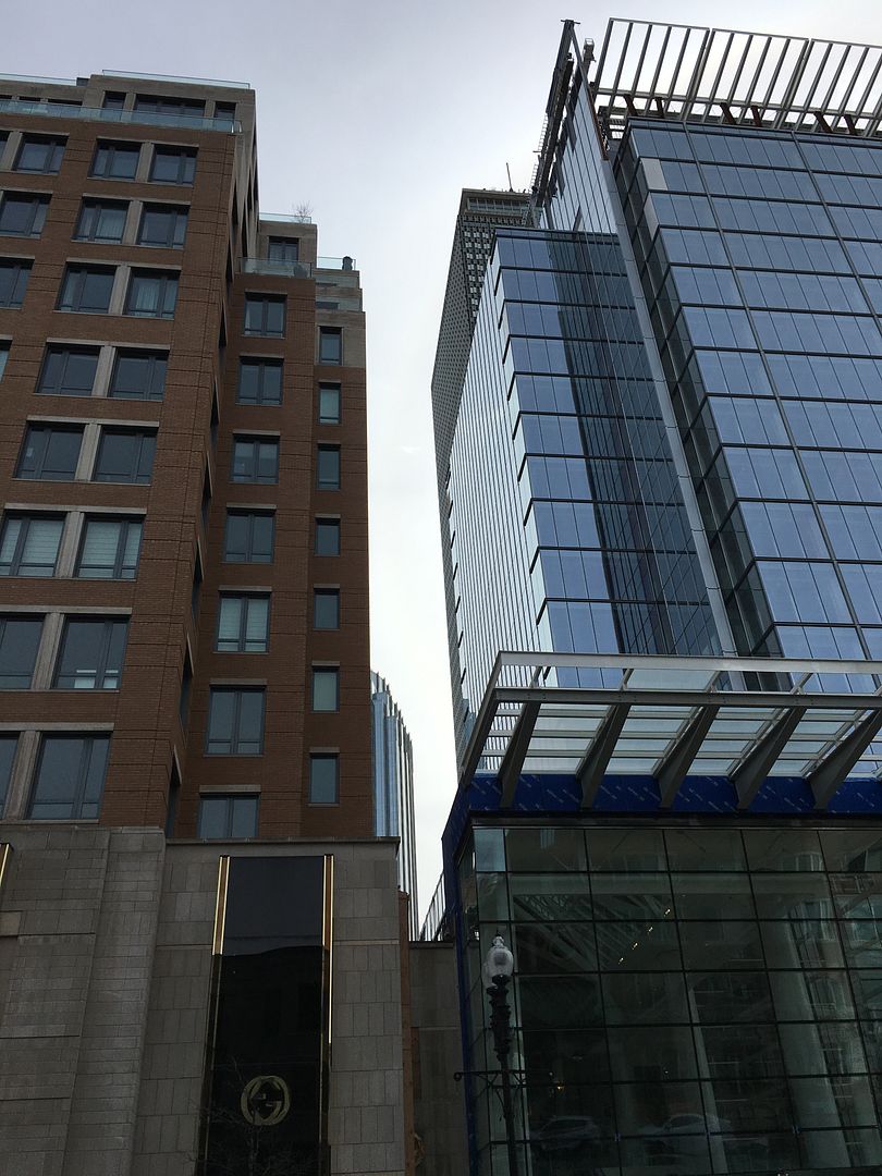
I dont hate it I'm just saying when I look at this in person it hurts the eyes more than Waterside place and Kensington. Sometimes things that are ugly are still easy on the eyes because they don't have too much clashing. Take any run of the mill 1970 box office tower from NYC vs most of the buildings built in Dubai. They both suck, but the 1970's tower is easier to look at because its just a box. The tower in Dubai is shaped like a palm tree, with a 400 foot swirling spire, a clock on one side, an lcd screen on the other, and gold windows. Waterside place actually doesn't look bad most of the time, only when you are standing at its door step and can really notice the small details. But back on topic this just has too much going on with crowns, windmills, exposed steel, different color glass, random bump outs on the glass. That being said the ground floor is going to be great and thats whats ultimately important.
Look at this building in the second picture posted on this page and tell me what is uglier than that in Boston that is in a spot that is as exposed (1MPD is about to be covered on all sides).
Look at this building in the second picture posted on this page and tell me what is uglier than that in Boston that is in a spot that is as exposed (1MPD is about to be covered on all sides).
citylover94
Senior Member
- Joined
- Oct 27, 2012
- Messages
- 1,140
- Reaction score
- 58
Okay I see it more now but I still think that it looks better than those other two, but I see where you are coming from now.
Boston02124
Senior Member
- Joined
- Sep 6, 2007
- Messages
- 6,893
- Reaction score
- 6,639
Brad Plaid
Senior Member
- Joined
- Jan 17, 2013
- Messages
- 1,310
- Reaction score
- 1,559
Look at this building in the second picture posted on this page and tell me what is uglier than that in Boston that is in a spot that is as exposed (1MPD is about to be covered on all sides).
500 Boylston and 101 Arch to name two.
timsox6
Active Member
- Joined
- Feb 16, 2013
- Messages
- 683
- Reaction score
- 0
Look at this building in the second picture posted on this page and tell me what is uglier than that in Boston that is in a spot that is as exposed (1MPD is about to be covered on all sides).
Northeastern's East Village.
jpdibenedetto
Active Member
- Joined
- Oct 23, 2012
- Messages
- 150
- Reaction score
- 0
Good from afar.. someone complete the rest.
I think what kills this for me is the entryway leading up to the rest of the glass. The variation in glass color make this look way stumpier than if it we're all one piece. I'm actually o.k with the entryway itself but when your up close it makes it look the same height as the Mandarin when in actuality it's much taller.
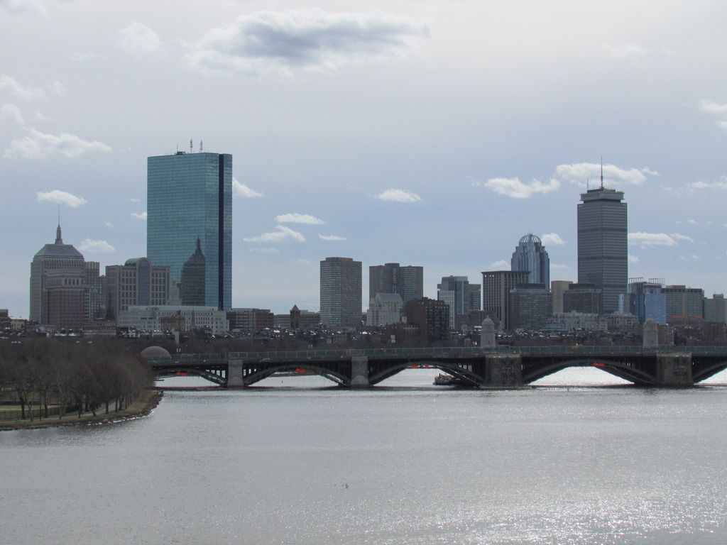
Hopefully we'll have some nice distinction of new Back Back Bay and Old Back Bay with the glass towers once FS, Trinity, and the New Hancock are in although idk how much impact the new Hancock building will have on the skyline when viewed from the above angle. Rant.

