Cambridge Infill and Small Developments

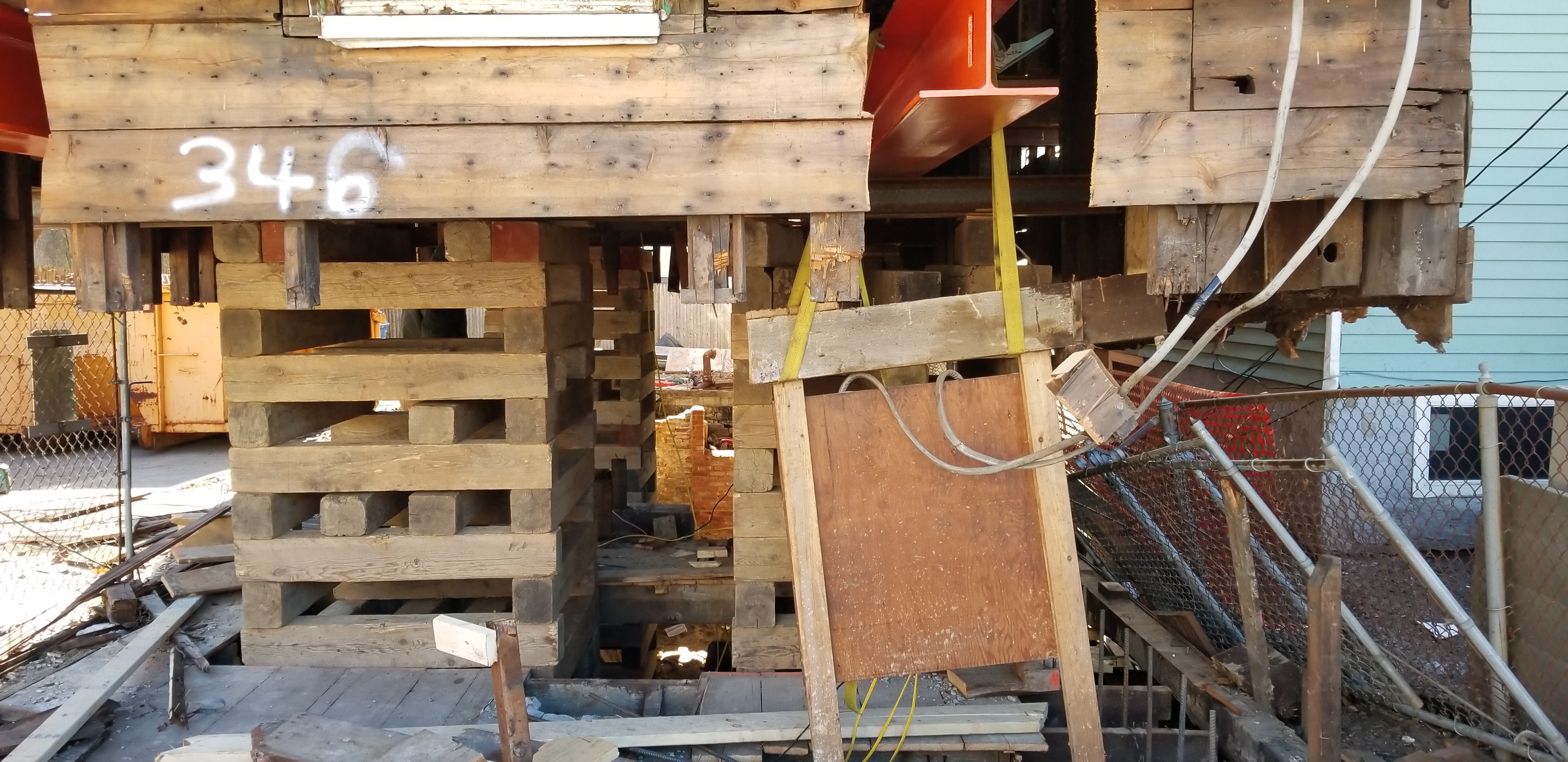
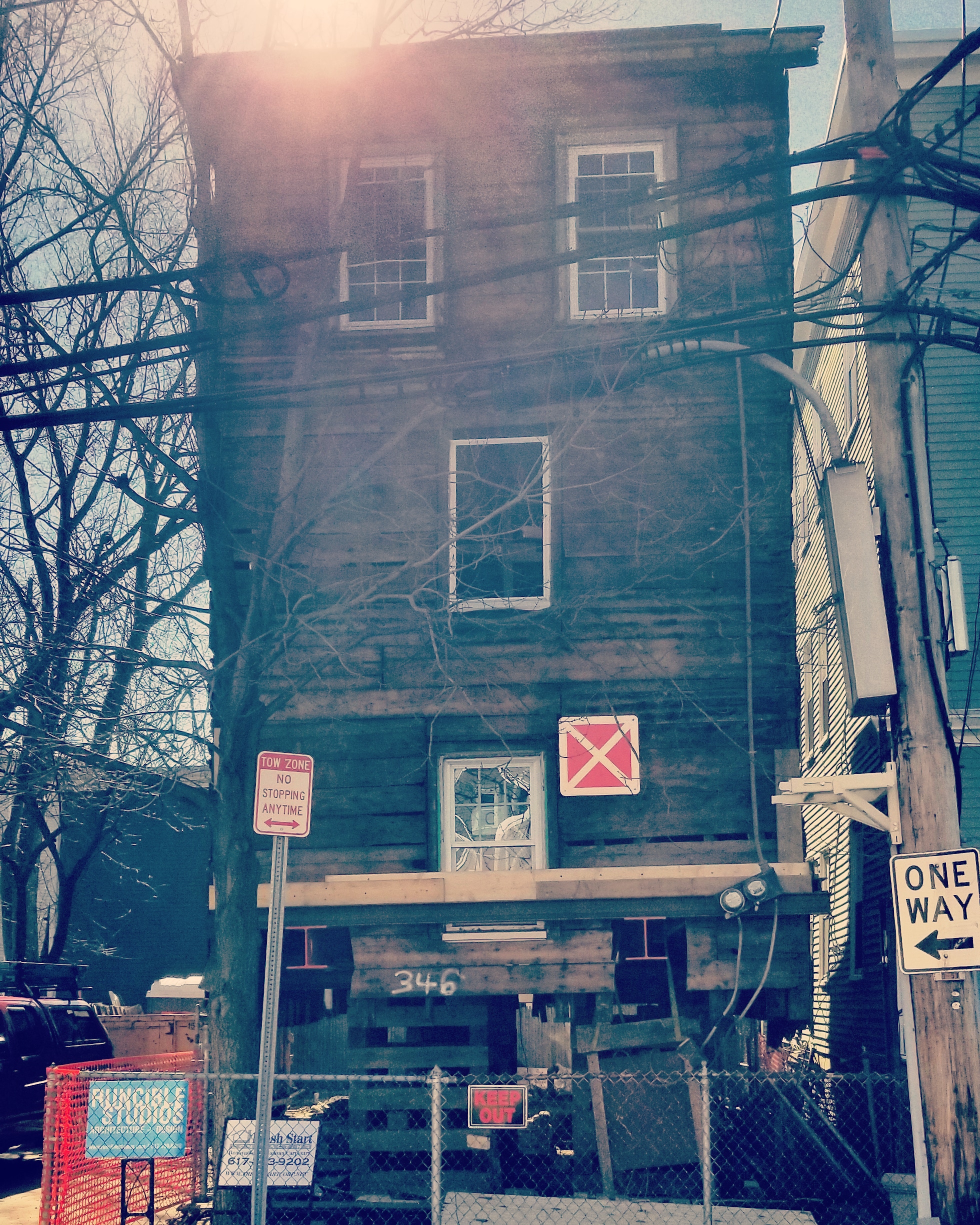
346-348 Allston St. Looks like a 1 story addition (apologies for the crappy pics)
IMG_20210303_101544_775.jpg
20210302_133339.jpg
 
^When I looked at the site up close, it did indeed look like they were prepping for foundation work
 
I've seen this done a few other times in Cambridge and it's sort of fascinating. I have a very hard time believing there's much historical relevance to it based on just street-viewing it (looks like every other plain triple decker with some cheap windows/siding), but who knows...

I thought I read on here awhile ago that this was done in order to maintain some zoning requirement. Where maintaining the existing structure grandfathers in some certain rules about the lot or something.
Yes, past discussions about several other houses being renovated / reconstructed in Cambridge have raised this point. This usually involves grandfathering lot occupancy, and/or the existence of little or negligible sideyard, and something never allowed under current zoning. The curious aspect of this particular house is that based on Google Streetview, half the lot (not visible in Subdivision's photo) is given over to a parking space(s). And the house itself is quite long, as if, over time, different owners kept adding to it.
See:
https://goo.gl/maps/yEE2C6y2i4tjvnReA

with the vinyl siding stripped off, the underlying wood in the photo looks Nineteenth Century, perhaps first half of that century. Can't tell whether they are preserving the entirety of the house, or only the box that fronts the street.
 
I'm really unsure about Frost. The front elevation is the worst. All those massing moves foregrounded by the historic building. They all feel like they're fighting for attention. Instead of an articulated joint between the old and the new, the new is shoehorned into the backyard and doesn't provide any meaningful backdrop or relationship to the front structure. You could take away either and expect the other to work just as well alone, if not better. I guess the color palettes are sort of similar? A big missed opportunity imo.

I appreciate the effort in some of the material choices though. The brick work and cornice are nice. Dark window cases do give off a "handsome" vibe. Wood as a secondary material is cool, but I'm really irked by the two different ways the boards are oriented. Instead of a single rule regulating them (following the proportions of the shape they fill, for example), they're applied differently on the brick and clapboard masses. The front elevation again shows the problem, where only one vertically oriented window is visible on the brick mass - the wood boards follow that orientation. But it's the only spot along this entire face (from what I can see) that follows that rule and looks like a mistake. You need to turn the corner and see the rest of the brick mass for it to make sense - as not a mistake.

Waiting to make a final judgement until the fences go down and the ground level is more revealed.
 
And that Beacon St monstrosity doesn't deserve any comment haha

The building looks like a student's first homework assignment for a Revit class. Everything from the monochrome grey pallete, to the awkward proportions and strangely large grids over the first floor doors, the simplified (but not tastefully simple) window door, and balcony design, the strange grid of panels on the facade, the semi-circle that's really half a 16-sided polygon, and its accompanying terrace on top that again is simple but not tastefully simple.

I walked by this on Sunday, and it's at such a strange patch-up phase of the job now. The bases of the walls are at different phases of completion, and none of them look like they were done with 100% confidence.
 
It’s amusing that the night view shows a replacement of the convenience store on the left side, but the day view doesn’t.
 
Not sure where to post this, but City of Cambridge recently posted a nice summary of most/all of the Kendall-area projects, including both private developments and city/street improvements:

Some of these are certainly large projects with their own threads, but others are smaller and perhaps folks weren't aware of them.
 
Last edited:
What the heck is going on with architecture these days?! I'm scratching my head about just about everything...
 
I always wondered what was up with this semi-stranded triple decker with the gratuitous amounts of pressure-treated decking in such a prominent location.


Usually I'm all for preserving things and I like the idea of adding affordable units here; in this case it'd be nice to demo this and purpose-build something that contributes more to the aesthetic of this nice and highly utilized square.
 

Back
Top