blade_bltz
Active Member
- Joined
- Jul 9, 2006
- Messages
- 808
- Reaction score
- 0
And a high school, but that's far enough away to not be visible in the photos.
Further proof that Ron Newman is a robot!
And a high school, but that's far enough away to not be visible in the photos.
Minor masterpiece
The Cambridge library is one of the best recent pieces of architecture in the Boston area. And it?s one of the best pieces of old architecture, too, because Rawn?s glassy new library stands beside the original Cambridge library of 1888, a minor masterpiece by architects Van Brunt and Howe that?s newly renovated by Ann Beha and Associates of Boston.
The two buildings, new and old, stand side by side - shoulder to shoulder, you might say - facing south in a green park, as if posing for a family photo. Just next door is Cambridge Rindge & Latin High School, which provides a ready supply of kids to hang out in both the library and the park.
Rawn?s glass wall is what you notice first. The architect claims it?s unique in this country. It?s modeled after recent technology in Europe and in fact was manufactured in Germany. It?s a double wall, a sandwich of two sheets of glass with a three-foot space between. This interstitial space contains shades and blinds, both of which move automatically with the sun to control heat and glare. The glass is perfectly clear, so that when you?re inside looking out, you feel you?re also in the park, and when you?re outside looking in, you can see all the way through the building. The goal was to create a library that would feel open and welcoming to everyone in the diverse community that is today?s Cambridge.
?I insisted on three rules,?? said Susan Flannery, the library director. ?One, you must see books immediately as you enter. Two, there must be operable windows. Three, there must be no children in the basement, where they?re too often tucked away.?? The children?s room here is on the third floor of the new wing, with furnishings by Beha that are meant to suggest (theming again) an aerial tree house with a leafy ceiling mural.
Flannery said she wanted to create a ?hybrid?? that would mix the qualities of a library and a retail bookstore. All books are on open shelves, and Flannery hopes to bring in students from the high school?s culinary arts program to sell baked goods.
As for the old library, it?s been treated commendably. Oak walls and ceilings were lovingly restored. So were the murals, created in 1934 by artists in one of the economic stimulus programs of the Roosevelt administration. (Will anything as memorable come out of the Obama stimulus?)
To make sure the old library would be used, Rawn and Beha agreed to site the teen lounge there, and also a dozen public access computers. Beha?s teen lounge is another gem, a high baronial loft, lit like a party space and filled with books (including comics) that were carefully selected to have absolutely nothing to do with the kids? course work.
Everything about the old library is rich and dark. Wrapping you closely in a warm blanket of architecture, it?s the opposite of the airy transparency of the new wing. Each building foregrounds the virtues of the other. Together they merge into a single building, neither wing trying to upstage the other.
I have only one reservation about this superb new/old building. The high-tech double-glass wall, with its sophisticated moving parts, may prove difficult to maintain in a public building in the United States. The wall was expensive, and both Rawn and the city of Cambridge think of it as a demonstration of a commitment to sustainability. Let?s hope the city keeps that promise.
Cambridge is famous for forcing any new development through a prolonged agony of citizen participation. The library was no exception. From beginning to end, its design and construction took 15 years. The final bill was $91 million, of which $10 million came from the state and the rest from Cambridge taxpayers. The library opens to the general public on Saturday.
Last May, Rawn?s firm was chosen by a national magazine as the best architecture office in the United States. Whether you buy that hype or not, these two new buildings are worthy additions to a region where we too often don?t aspire to architecture this fresh and thoughtful.
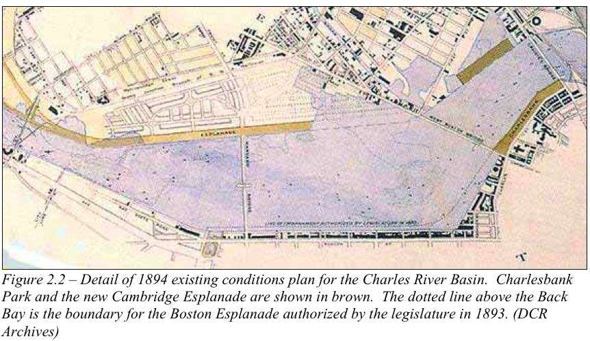
when the plan for this area was to develop into a second Back Bay.
