You are using an out of date browser. It may not display this or other websites correctly.
You should upgrade or use an alternative browser.
You should upgrade or use an alternative browser.
Canopy by Hilton (née Haymarket Hotel) | Blackstone St | Parcel 9 | Greenway
- Thread starter PaulC
- Start date
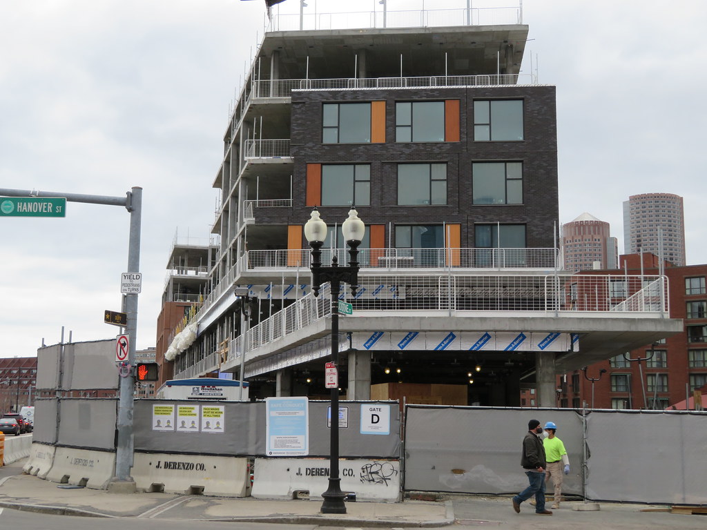
Yeah, this is built in a factory--that is supposed to mean better quality control. The brick mix is all over the place on these.
- Joined
- Jan 7, 2012
- Messages
- 14,172
- Reaction score
- 23,677
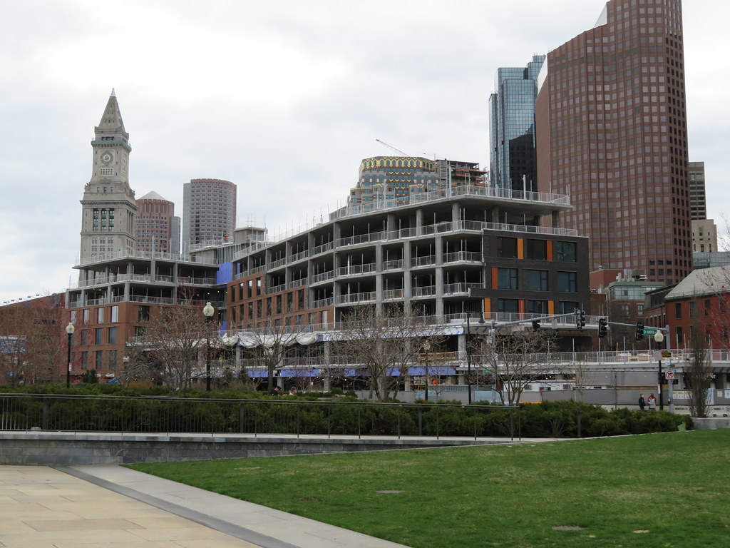
Looks much better in person even on a cloudy day.From this angle it's halfway passable

 IMG_4281 by Bos Beeline, on Flickr
 IMG_4283 by Bos Beeline, on Flickr
 IMG_4287 by Bos Beeline, on Flickr
 IMG_4289 by Bos Beeline, on Flickr
 IMG_4291 by Bos Beeline, on Flickr
 IMG_4294 by Bos Beeline, on Flickr
 IMG_4296 by Bos Beeline, on Flickr
The Greenway street wall does look good.
I'm still not a fan - the design and quality is just subpar for such a choice spot - but you're right, I'm happy to see this hole filled.
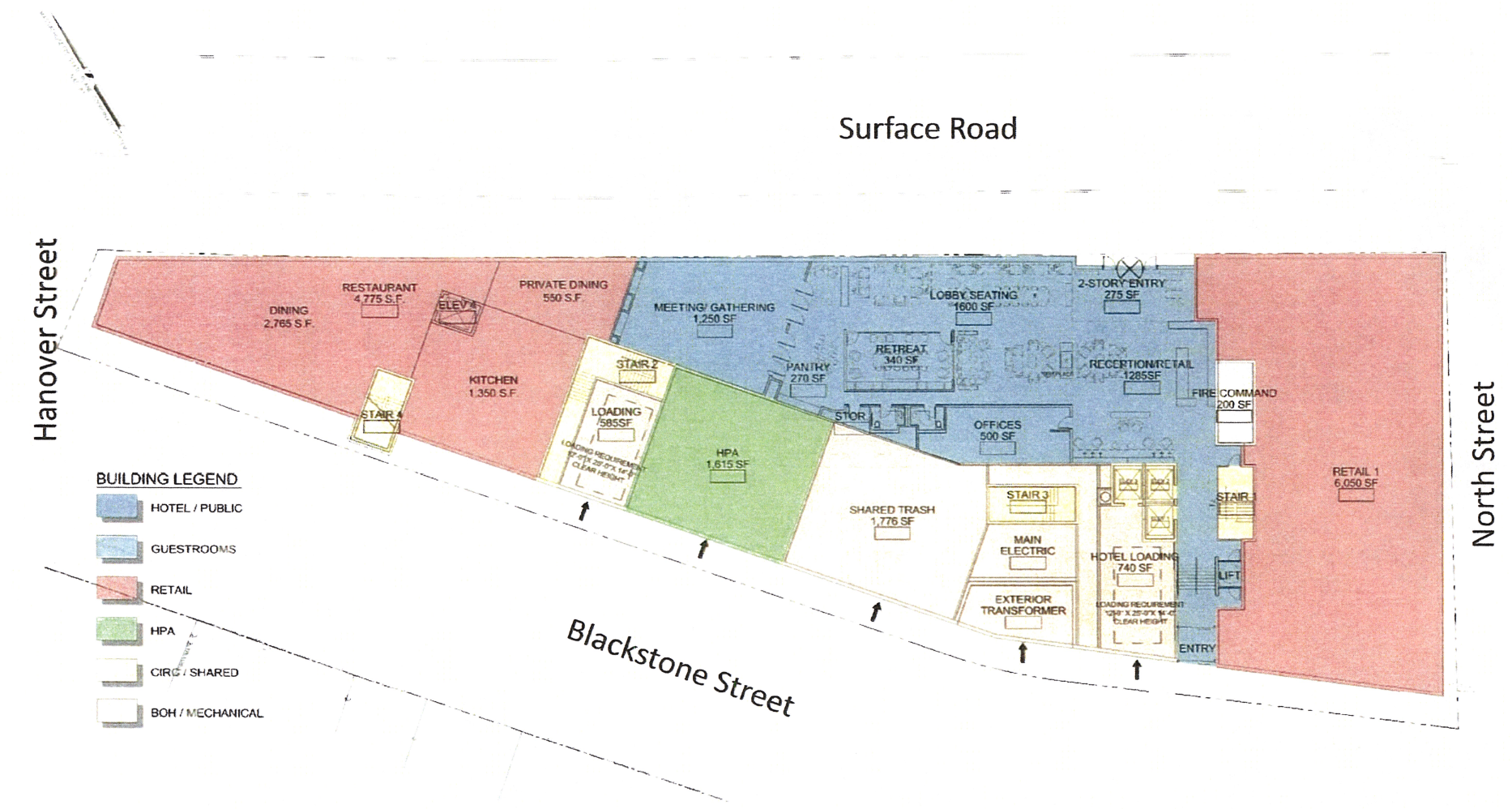
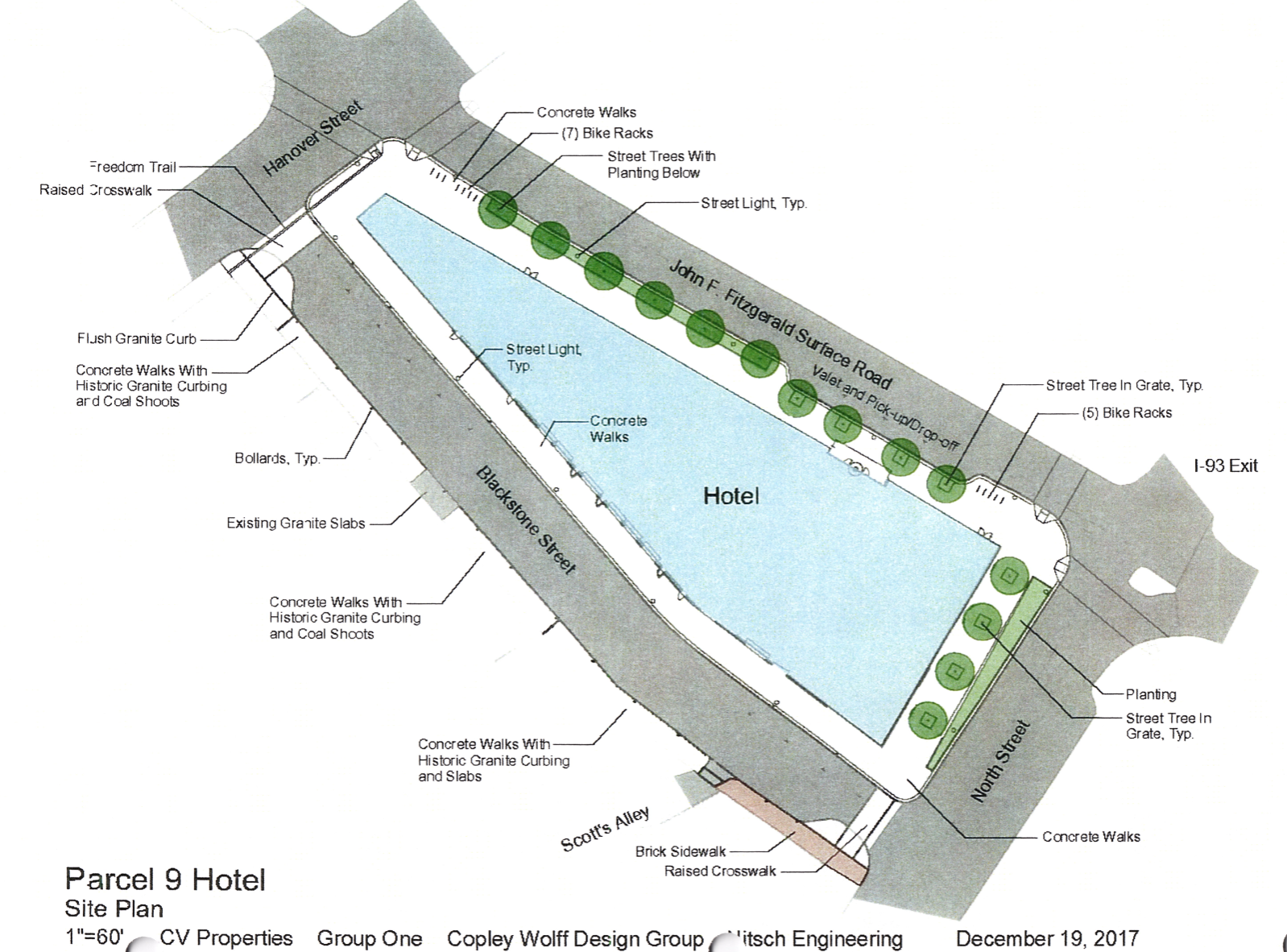
I'm still curious what the new outdoor market will "look" like here. Can't find any renders of the back side of the hotel.
Details from the 2018 approval:
"Approximately 1 ,615 square foot ground floor area off Blackstone Street that will be leased to the Haymarket Pushcart Association to accommodate storage and restrooms for their members. The ground floor of the building will also include restrooms accessible to the public as well as meeting space that can be made available for community use.... The Blackstone Street reconstruction will include new bollards to provide electrical service for members of the Haymarket Pushcart Association during the Friday and Saturday market days. Water service will also be provided from the hotel structure itself.
Landscaping:
(i)the raising of the finished grade of Blackstone Street along its entire length between North Street and Hanover Street so as to be level with the sidewalk adjacent to the building and thereby facilitate use of Blackstone Street by HPA vendors;
(ii) all associated utility relocation and installation work required by reason of the change in grade of the street;
(iii) all related earthwork and paving work;
(iv) the design, fabrication and installation of approximately fifty (50) permanent steel-reinforced stanchions along the length of Blackstone Street;
(v) the installation of adequate and appropriate exterior lighting and electrical power for use by HPA vendors (which may be incorporated into the new stanchions); and
(vi) the provision of outdoor hose bibs along the Blackstone Street facade of the Project for use by HPA vendors and the hotel operator.
Last edited:
Equilibria
Senior Member
- Joined
- May 6, 2007
- Messages
- 7,219
- Reaction score
- 8,728
Of all the buildings to ever exist, this is one of them.
I'm still not a fan - the design and quality is just subpar for such a choice spot - but you're right, I'm happy to see this hole filled.
For a 6 story building, I think the massing has some visually interesting elements and contributes to walling off the Greenway.
Im not a fan of the Haymarket side at this point — seems austere.
Life Coach Mike
Active Member
- Joined
- Aug 26, 2019
- Messages
- 322
- Reaction score
- 487
As with all fashion fads, it has reached the extreme end of its shelf-life. It's become the 'bell-bottoms' version of design (I can't even call it architecture). Yet I'm afraid to imagine the next fad. BTW I'm also choking on the unrelenting use of brick panels that show no imagination or detail. Enough please.Its the unaligned window pattern that really bothers me... I hate that trend so much.
kz1000ps
Senior Member
- Joined
- May 28, 2006
- Messages
- 9,140
- Reaction score
- 13,322
^^ “Let me tell you one thing. In this world we are living in, 98 percent of everything that is built and designed today is pure shit. There's no sense of design, no respect for humanity or for anything else. They are damn buildings and that's it."
-Frank Gehry, 2014
-Frank Gehry, 2014
Bananarama
Active Member
- Joined
- Mar 18, 2020
- Messages
- 605
- Reaction score
- 1,249
Great quote, and very ironic coming from him.^^ “Let me tell you one thing. In this world we are living in, 98 percent of everything that is built and designed today is pure shit. There's no sense of design, no respect for humanity or for anything else. They are damn buildings and that's it."
-Frank Gehry, 2014
stick n move
Superstar
- Joined
- Oct 14, 2009
- Messages
- 13,361
- Reaction score
- 23,947
Indeed it is, extremely ironic. A broken clock is right twice a day and the beekman in nyc and the grand in la are pretty iconic, but overall he has to be the worst “starchitect” of all time. Not even bad in like an artistic “you just dont understand” type of way, but bad as in it looks like a drunk teenager made some of his biggest projects.
Anyways this definitely isnt anything special, but at least its brick and not red grid panels like kenmore sq. Once complete it should fairly seamlessly fade into the fabric of the city and be pretty much forgotten while bringing the streetwall up to the greenway.
Anyways this definitely isnt anything special, but at least its brick and not red grid panels like kenmore sq. Once complete it should fairly seamlessly fade into the fabric of the city and be pretty much forgotten while bringing the streetwall up to the greenway.
Last edited:
bigpicture7
Senior Member
- Joined
- May 5, 2016
- Messages
- 4,043
- Reaction score
- 10,371
Great quote, and very ironic coming from him.
Sometimes being good at recognizing problems and being good at solving them are two separate skills.
type001
Senior Member
- Joined
- Jun 29, 2006
- Messages
- 1,838
- Reaction score
- 392
Overall, I am appreciating how this is looking but more impressed with how it's interacting with the general landscape around it. I absolutely respect the criticisms and realize that the other proposals would've made a more striking impression, but I like that this is keeping the current vibe alive in an area that I have been so fond of since I was a child.
Since Stick mentioned the Beckham, let me say that I have never liked it as a building, but it is an outstanding piece of engineering art.
Since Stick mentioned the Beckham, let me say that I have never liked it as a building, but it is an outstanding piece of engineering art.
Man, that brick blend is really awful. If I was doing construction in Boston I'd want to know who that sub is to be able to avoid them.

