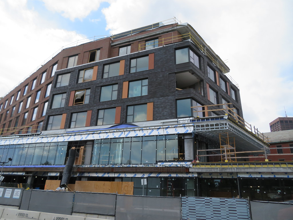
Canopy by Hilton (née Haymarket Hotel) | Blackstone St | Parcel 9 | Greenway

For better or for worse, that side of the building looks like it has been there for the last hundred years, just receiving a freshening. I guess that's the point. The right side though... umm... I guess I'll withhold final judgement til it's totally done, but I'm not a fan of the coloring/materials at this point.
 
20210502_161229.jpg
20210502_161302.jpg
20210502_161316.jpg
20210502_161209.jpg

Honestly in person it looks fine except for that mismatched square of black bricks in pic 1
 
Honestly in person it looks fine except for that mismatched square of black bricks in pic 1

I'm glad someone said it. That black square is pretty awful, but the rest of it is really inoffensive. Would it be great if it were better? Sure. Do we want to make settling for merely "inoffensive" a habit? No. But it's fine.
 
It’s the architectural equivalent of a land yacht. Trying too hard to occupy more space than it does.
 
Got drinks at the Canopy by Hilton in San Antonio last week and it was really well done. Much more striking architecture in the one down there, but also nice materials and attention to detail throughout which hopefully carries over to Boston's. Very much geared towards millennials.

2400x0.jpg


download.jpg
 
The solution for that apparently deliberately mismatched brick is to paint it.
 
Do we want to make settling for merely "inoffensive" a habit? No.

Bro that's been Boston's MO for at least a couple decades. Remember the Great Beige Precast Era of 2006? The "contuextualism" of the '90s?

Having said that I do agree with "Honestly in person it looks fine"
 
Last edited:
This looks absolutely fine in person, and with the next phases of the adjacent Gov Center Garage development, this won't stand out as boring.
 
Bro that's been Boston's MO for at least a couple decades. Remember the Great Beige Precast Era of 2006? The "contuextualism" of the '90s?

Having said that I do agree with "Honestly in person it looks fine"

Absolutely true. But this particular building isn't the hill I'd die on to protest the trend. It's a filler building that's fine in person and it's going to activate a long dead but very prominent space in the city.
 
Absolutely true. But this particular building isn't the hill I'd die on to protest the trend. It's a filler building that's fine in person and it's going to activate a long dead but very prominent space in the city.

Agreed. I saw it in person a month ago, wrote it's "halfway passable" and said nothing since. It's a building we'll all forget about three years down the road and it isn't worth getting worked up over.
 
If it was clad entirely in those red brick panels it would have been a perfectly average brick lowrise amongst a sea of anonymous brick lowrises. The shitty black panels really throw the whole thing off though. Not sure what happened there, hopefully the trim cleans it up a bit. Overall though its not hideous like some white precast staggered window lowrise abomination could have been, but its crappily average. Average is always better than turd, but it could have been a better average. The south face is much better than the north.
 
If it was clad entirely in those red brick panels it would have been a perfectly average brick lowrise amongst a sea of anonymous brick lowrises. The shitty black panels really throw the whole thing off though. Not sure what happened there, hopefully the trim cleans it up a bit. Overall though its not hideous like some white precast staggered window lowrise abomination could have been, but its crappily average. Average is always better than turd, but it could have been a better average. The south face is much better than the north.
Seems like a current fad in architecture is to arbitrarily throw in a different façade on part of a building to allegedly break up the monotony. Oftentimes that's worse than just going with the same façade throughout, as demonstrated here ^.
 

Back
Top