If it was clad entirely in those red brick panels it would have been a perfectly average brick lowrise amongst a sea of anonymous brick lowrises. The shitty black panels really throw the whole thing off though. Not sure what happened there, hopefully the trim cleans it up a bit. Overall though its not hideous like some white precast staggered window lowrise abomination could have been, but its crappily average. Average is always better than turd, but it could have been a better average. The south face is much better than the north.
 IMG_5266 by Bos Beeline, on Flickr
 IMG_5268 by Bos Beeline, on Flickr
 IMG_5269 by Bos Beeline, on Flickr
 IMG_5270 by Bos Beeline, on Flickr
 IMG_5278 by Bos Beeline, on Flickr
 IMG_5284 by Bos Beeline, on Flickr
 IMG_5289 by Bos Beeline, on Flickr
 IMG_5295 by Bos Beeline, on Flickr
 IMG_8057
 IMG_8061
 IMG_8064
 IMG_8067
 IMG_8072
 IMG_8071
 IMG_9770
 IMG_9773
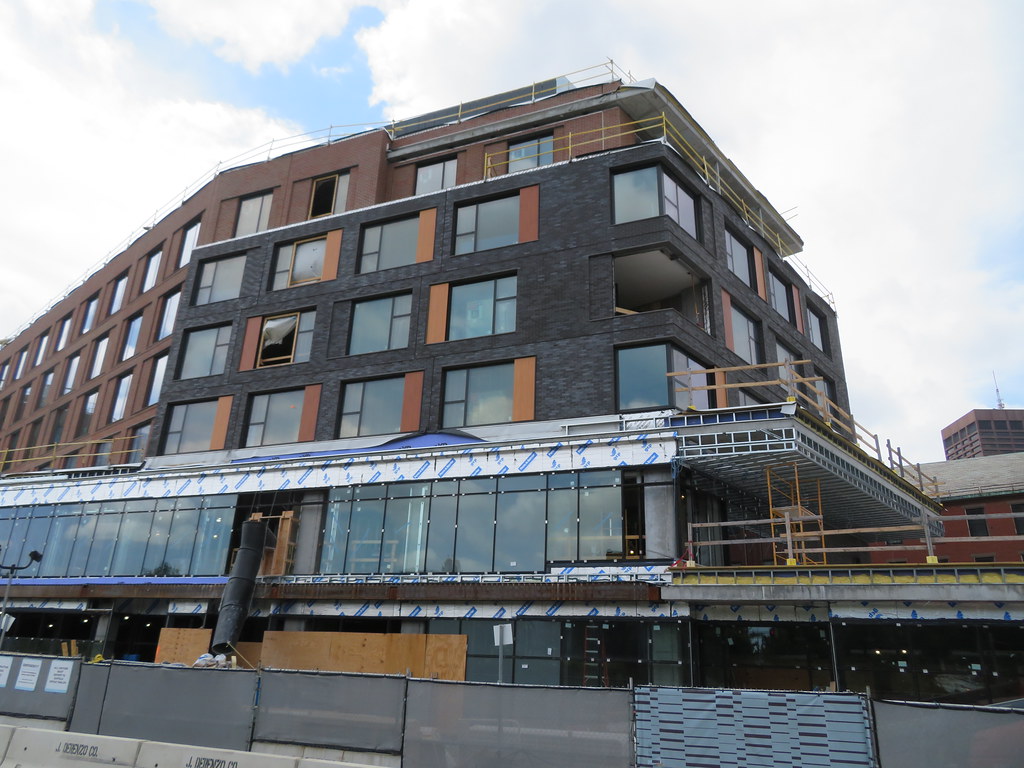 IMG_9777
 IMG_9779
 IMG_9778
 IMG_9781
 IMG_9788