You are using an out of date browser. It may not display this or other websites correctly.
You should upgrade or use an alternative browser.
You should upgrade or use an alternative browser.
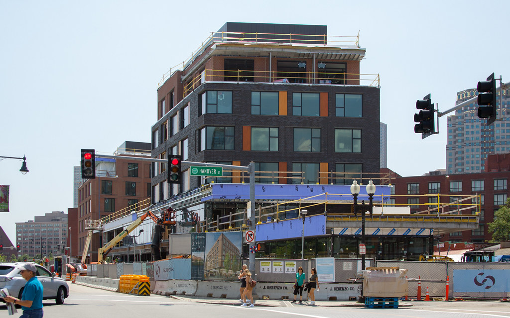
Canopy by Hilton (née Haymarket Hotel) | Blackstone St | Parcel 9 | Greenway
- Thread starter PaulC
- Start date
thing sucks.
Yeah, the last two Perkins and Will buildings in Boston (this and the Minecraft hotel in South Boston) are really not great. It's a shame, that used to be a good firm.
Everett too. Sweet!Worcester is building a lot in this sort of style.
I can't even tell who's being sarcastic anymore...
I am happy that there is a masonry finish, and hope that there is pressure on the neighboring block for the Bulfinch Triangle lab to do the same. It's simply a better transition into the North End, and better visually along the Greenway
I am happy that there is a masonry finish, and hope that there is pressure on the neighboring block for the Bulfinch Triangle lab to do the same. It's simply a better transition into the North End, and better visually along the Greenway
bigpicture7
Senior Member
- Joined
- May 5, 2016
- Messages
- 3,896
- Reaction score
- 9,518
I can't even tell who's being sarcastic anymore...
I am happy that there is a masonry finish, and hope that there is pressure on the neighboring block for the Bulfinch Triangle lab to do the same. It's simply a better transition into the North End, and better visually along the Greenway
One of my longstanding pet peeves with aB is that the criticism of quality/workmanship/fit-and-finish always gets commingled with general architectural critique. Yes, the two are sometimes related (i.e., architect overreaches by selecting a design that the budget is ill-suited for); but, by and large, its more constructive to separate them.
Here I no longer know who is crapping on the design vision and who is crapping on quality/finish and who is crapping on both.
Generally speaking I agree that brick is appropriate here.
- Joined
- Jan 7, 2012
- Messages
- 14,062
- Reaction score
- 22,726
 IMG_1511 by Bos Beeline, on Flickr
One of my longstanding pet peeves with aB is that the criticism of quality/workmanship/fit-and-finish always gets commingled with general architectural critique. Yes, the two are sometimes related (i.e., architect overreaches by selecting a design that the budget is ill-suited for); but, by and large, its more constructive to separate them.
Here I no longer know who is crapping on the design vision and who is crapping on quality/finish and who is crapping on both.
Generally speaking I agree that brick is appropriate here.
Totally agree about the confusion of design/quality in general. All stick built over podium buildings are not the same.
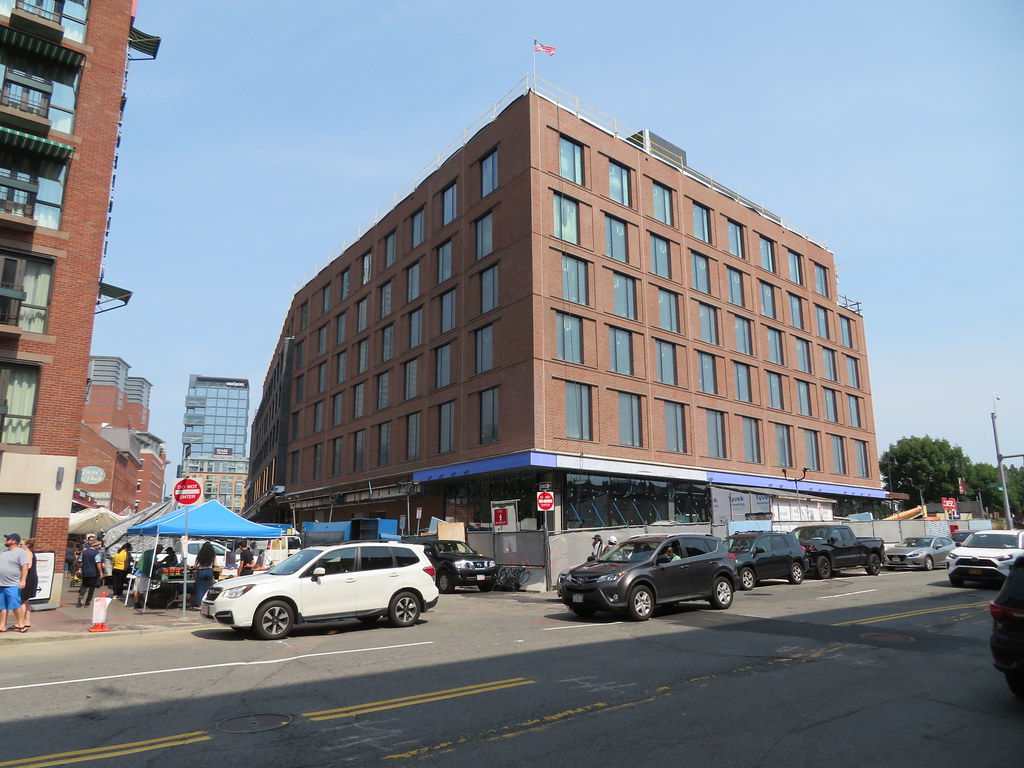
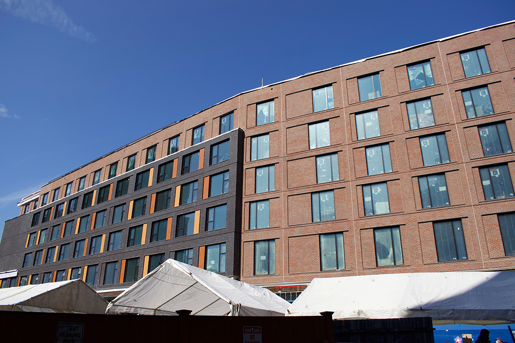
For my two cents, brick is appropriate here. Panelized brick is the less expensive way to do that, all of which is fine in the current expensive Boston construction world. My concern is how badly the brick panels are laid up. There seems to be so little attention to the blending and how those panels look. It is a simple quality control fail on the part of the architect. Most of those panels should not have left the factory.
The design is a sort of inoffensive contemporary that nods to the historic area. It's not great architecture, but it is perfectly competent and meets the requirements for the area and what the community asked for. Not everything can be a great stand out building (and shouldn't be) but there are some real fails in the construction here that are letting down the design.
RandomWalk
Senior Member
- Joined
- Feb 2, 2014
- Messages
- 3,315
- Reaction score
- 5,182
When the context is Ray Flynn’s Dock Square parking garage, it’s not the best thing to perpetuate.
- Joined
- Jan 7, 2012
- Messages
- 14,062
- Reaction score
- 22,726
 IMG_2402 by Bos Beeline, on Flickr
 IMG_2408 by Bos Beeline, on Flickr
 IMG_2411 by Bos Beeline, on Flickr
 IMG_2417 by Bos Beeline, on Flickr
 IMG_2419 by Bos Beeline, on Flickr
 IMG_2422 by Bos Beeline, on Flickr
 IMG_2423 by Bos Beeline, on Flickr
 IMG_2424 by Bos Beeline, on Flickr
 IMG_2426 by Bos Beeline, on Flickr
HelloBostonHi
Senior Member
- Joined
- Apr 17, 2018
- Messages
- 1,480
- Reaction score
- 4,113
stick n move
Superstar
- Joined
- Oct 14, 2009
- Messages
- 12,066
- Reaction score
- 18,807
Really not a fan of the black portion. The brick part looks perfectly fine, this would have been perfectly appropriate if it was just all brick and it would have faded into the surroundings and blended in great. Not sure why they couldnt have just went all brick, sometimes less is more.
Its still not finished yet so maybe when the ground floor is clad in black it will hopefully tie it in better, fingers crossed. The roof will be black too, so well see.
Its still not finished yet so maybe when the ground floor is clad in black it will hopefully tie it in better, fingers crossed. The roof will be black too, so well see.
- Joined
- Jan 7, 2012
- Messages
- 14,062
- Reaction score
- 22,726
 IMG_3830 by Bos Beeline, on Flickr
Brad Plaid
Senior Member
- Joined
- Jan 17, 2013
- Messages
- 1,310
- Reaction score
- 1,559
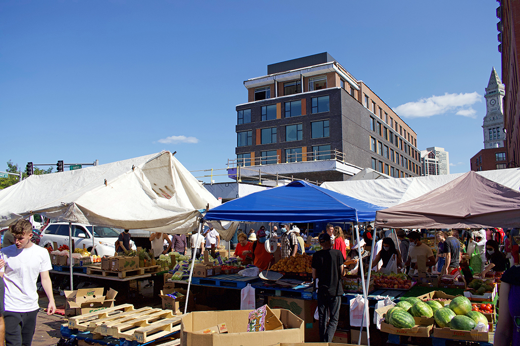
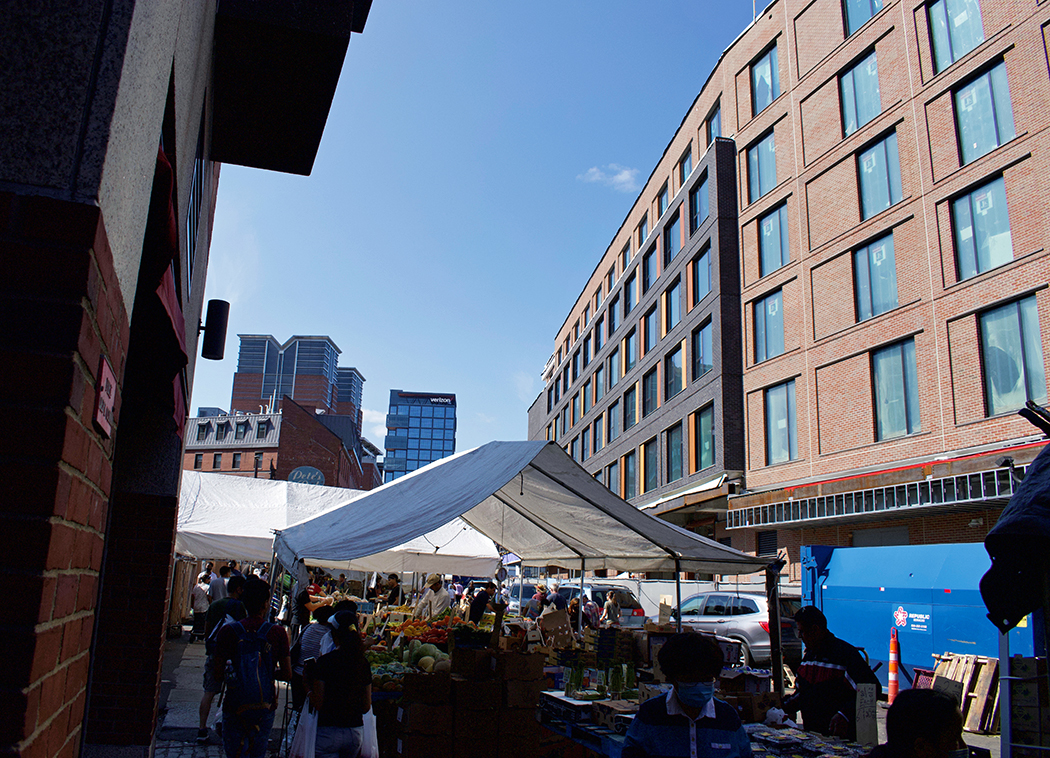
Most of the Blackstone elevation treats the street as a service alley not really engaging Haymarket but there is at least the glass section (restaurant?) that will have a market view.
HelloBostonHi
Senior Member
- Joined
- Apr 17, 2018
- Messages
- 1,480
- Reaction score
- 4,113
https://retailproperties.cbre.us/property/output/document/view/id:24071 leasing for the 3 restaurant/retail spaces
stick n move
Superstar
- Joined
- Oct 14, 2009
- Messages
- 12,066
- Reaction score
- 18,807
Having more retail/restaurants along the greenway is a welcomed addition. Its nice to see it filling in.
This seems to be hard to photograph. This seems to be because from the sidewalk out front you get a side on shot, and from across the street its blocked by trees from the greenway. Then once you can find an open shot its a wide building so kinda hard to get a full shot.
Maybe this is a good thing because it means its also hard to see so its going to really blend in and be anonymous from a far, and from up close it blends in as a brick facade. I know whenever I pass by this I feel like Im not really able to get a good view of it either.

