You are using an out of date browser. It may not display this or other websites correctly.
You should upgrade or use an alternative browser.
You should upgrade or use an alternative browser.
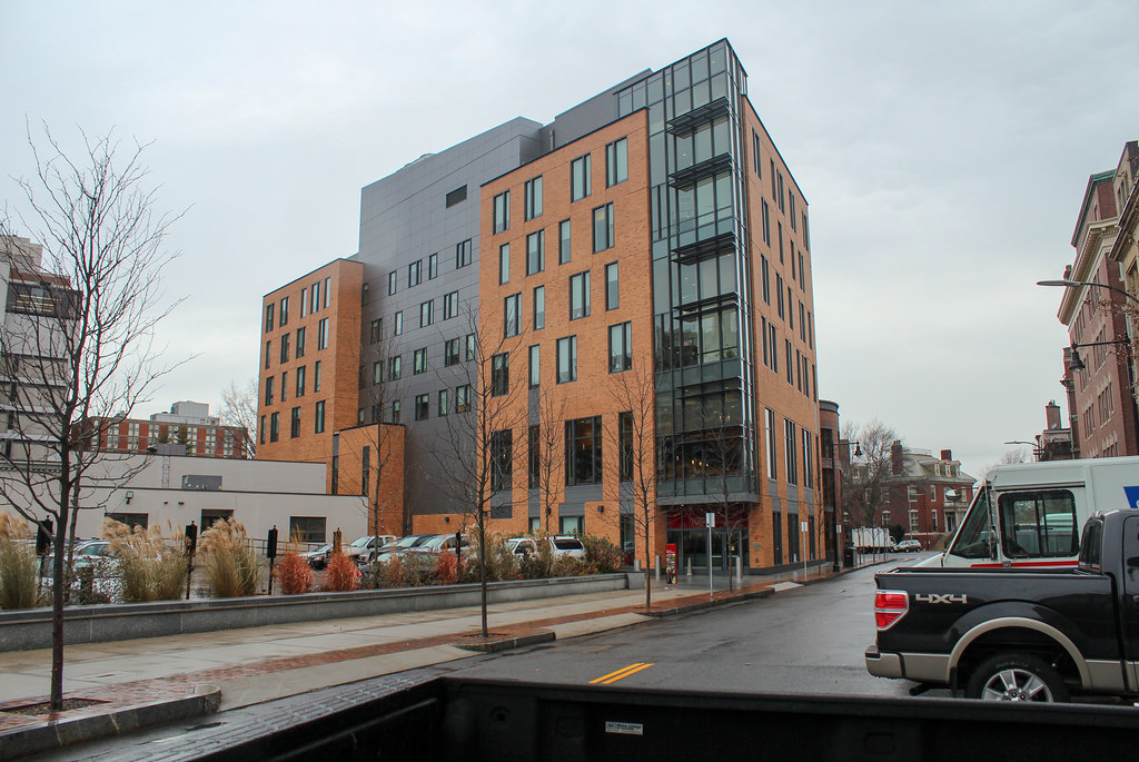
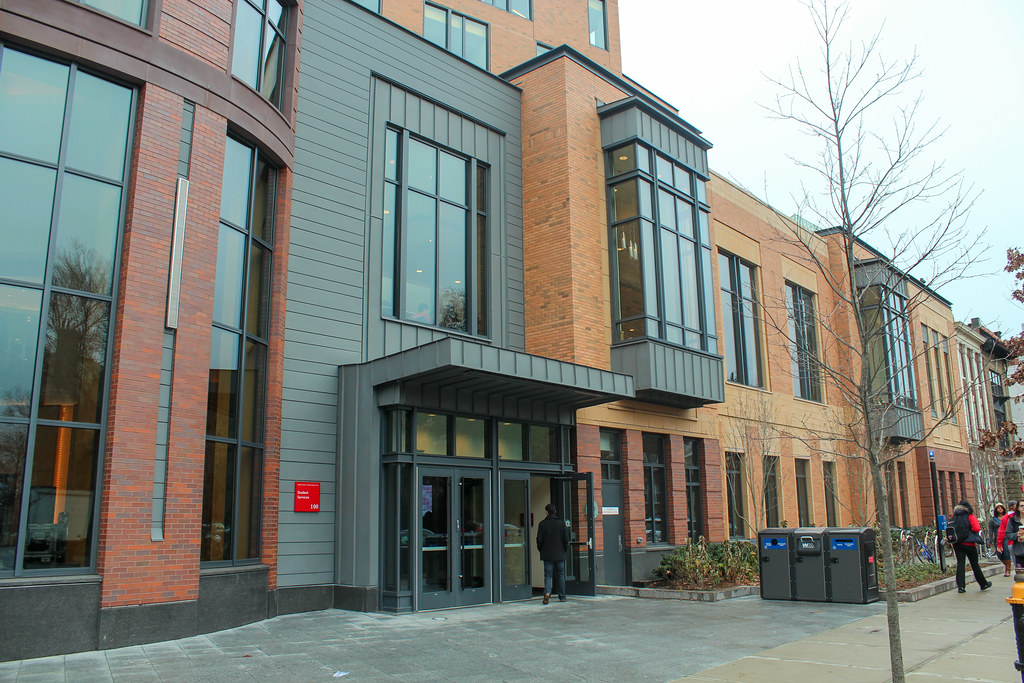
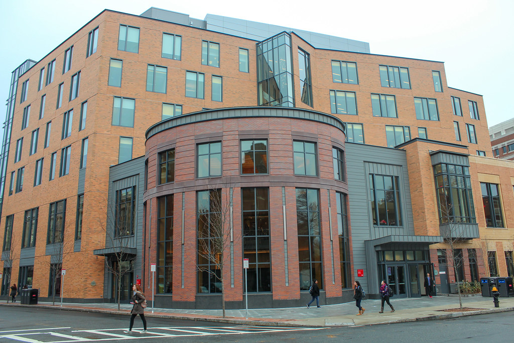
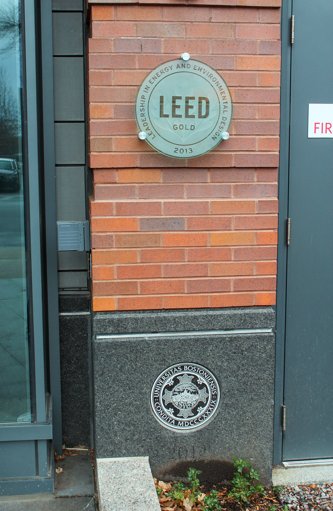
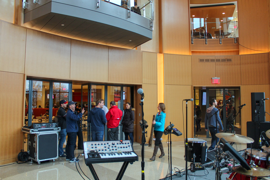
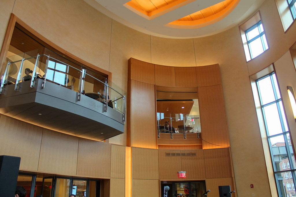
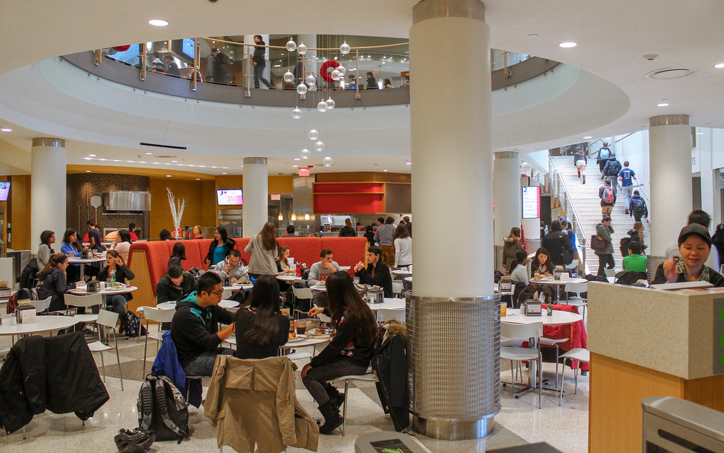
Center for Student Services @ BU |100 Bay State Rd | Back Bay
- Thread starter nico
- Start date
F-Line to Dudley
Senior Member
- Joined
- Nov 2, 2010
- Messages
- 9,556
- Reaction score
- 10,449
Re: B.U. East Campus Center (100 Bay State Rd)
I'm glad BU's starting to move away from all the Silber-era construction of brick and beige concrete. Damn near everything they built from the mid-80's to mid-00's has that vanilla sameness to it. I don't care one bit that this is B/B+ looks. It's different from its recent-construction surroundings without being jarringly different, and that works quite nicely as a change of pace.
I'm glad BU's starting to move away from all the Silber-era construction of brick and beige concrete. Damn near everything they built from the mid-80's to mid-00's has that vanilla sameness to it. I don't care one bit that this is B/B+ looks. It's different from its recent-construction surroundings without being jarringly different, and that works quite nicely as a change of pace.
Re: B.U. East Campus Center (100 Bay State Rd)
The new Law School expansion (currently underway) makes further strides to reverse the trend of architectural blunders made by the administration from the late 70s - early 2000s.
I'm glad BU's starting to move away from all the Silber-era construction of brick and beige concrete. Damn near everything they built from the mid-80's to mid-00's has that vanilla sameness to it. I don't care one bit that this is B/B+ looks. It's different from its recent-construction surroundings without being jarringly different, and that works quite nicely as a change of pace.
The new Law School expansion (currently underway) makes further strides to reverse the trend of architectural blunders made by the administration from the late 70s - early 2000s.
Downburst
Senior Member
- Joined
- Jul 20, 2012
- Messages
- 1,452
- Reaction score
- 347
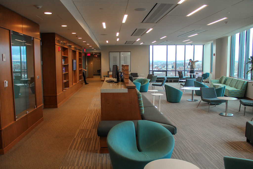
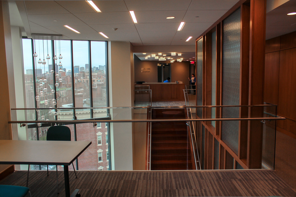
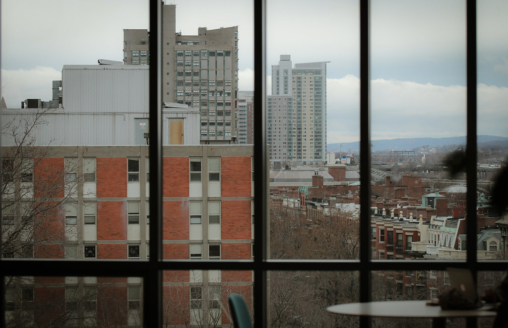
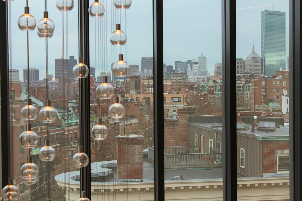
What a nice space! I quite like it, actually. It seems very warm and inviting.
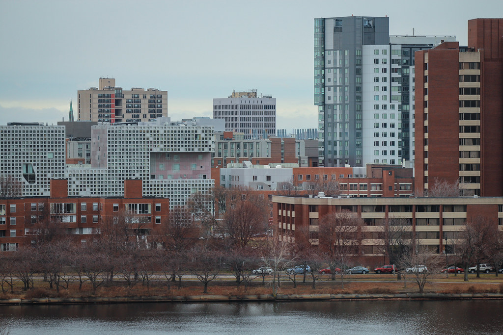
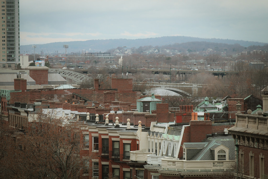
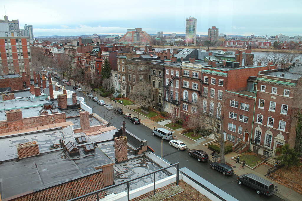
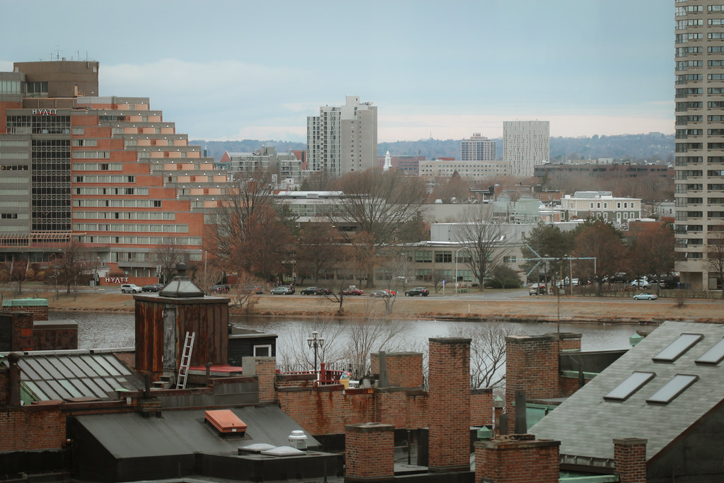
kz, I also have to say that these are my favorite photographs of yours to date. Yours are always incredible but these are really stunning.
kz, I also have to say that these are my favorite photographs of yours to date. Yours are always incredible but these are really stunning.
kz1000ps
Senior Member
- Joined
- May 28, 2006
- Messages
- 8,983
- Reaction score
- 11,813
Yes the interior actually was pretty darn warm and inviting. No complaints there.
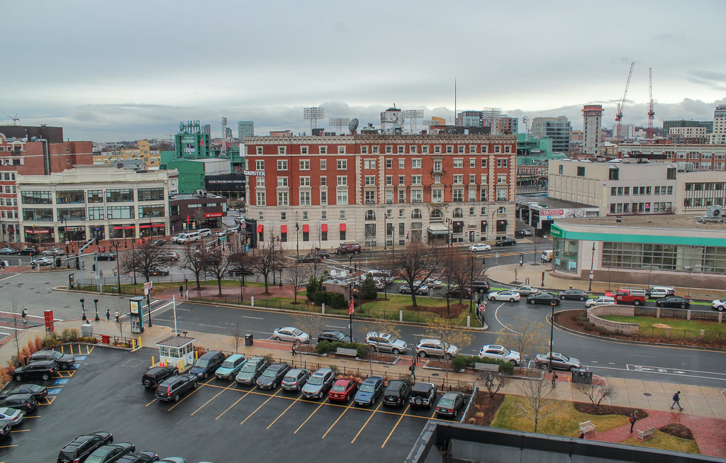
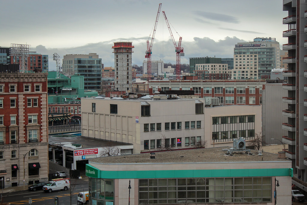
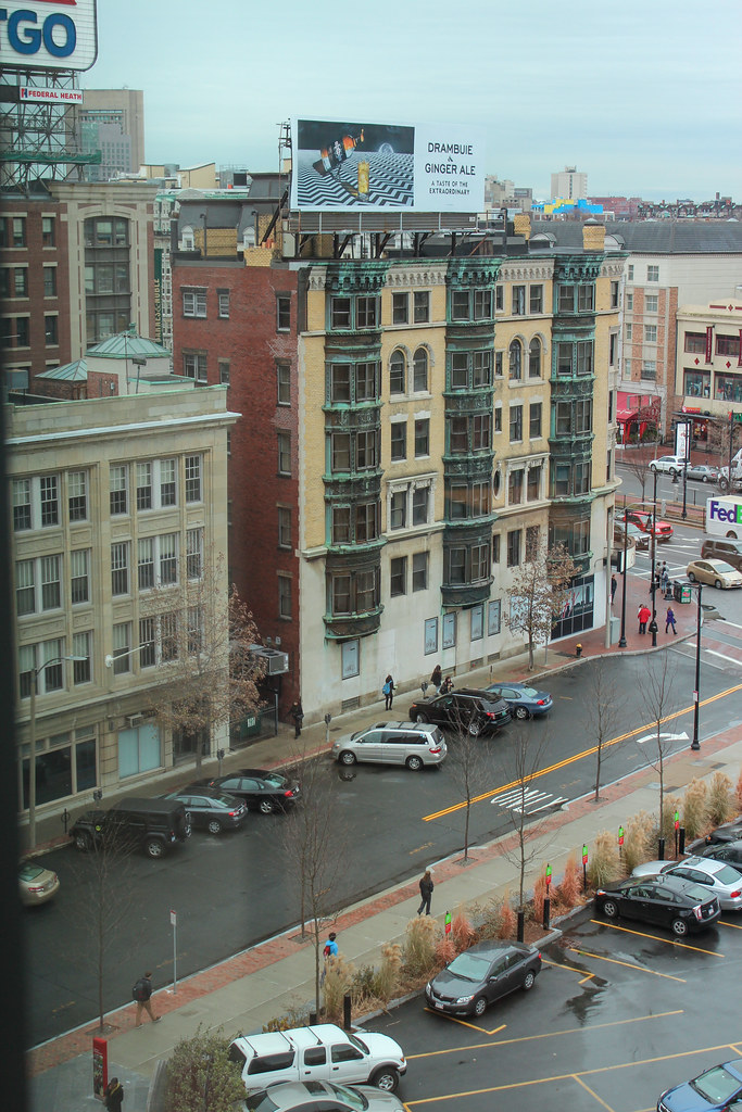
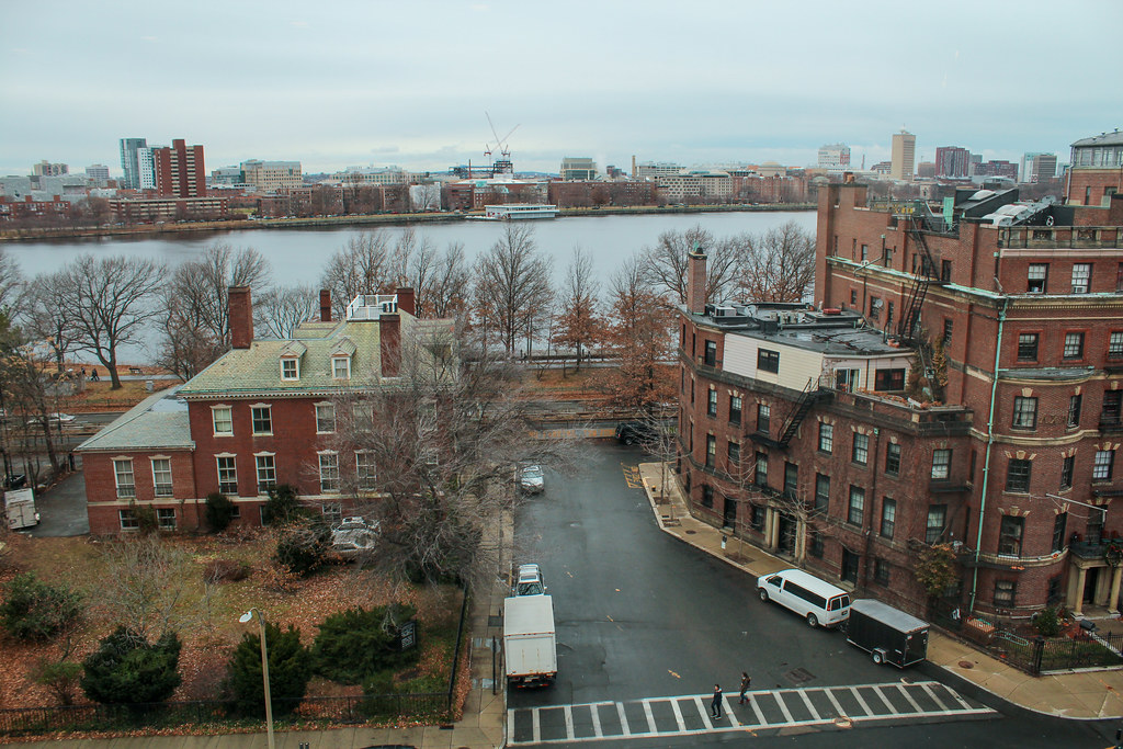
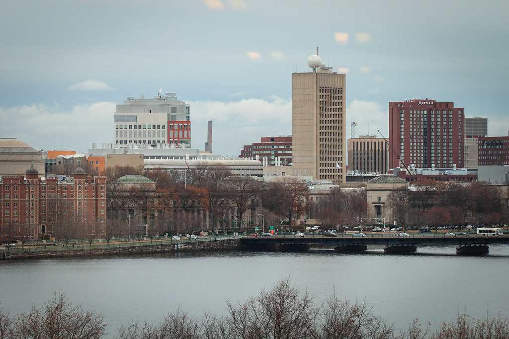
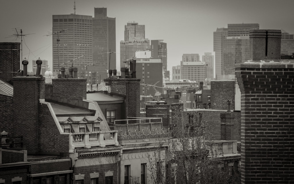
And thank you! I was actually thinking how I don't like these shots mainly because of how ugly grey/brown it is outside now (I also struggled mightily with the white balance on some of these) but to each his own. Either way I didn't intend to take ANY of these shots...it just sorta fell into my lap, serendipitous style, and those often make for the best shots
And thank you! I was actually thinking how I don't like these shots mainly because of how ugly grey/brown it is outside now (I also struggled mightily with the white balance on some of these) but to each his own. Either way I didn't intend to take ANY of these shots...it just sorta fell into my lap, serendipitous style, and those often make for the best shots
Yes the interior actually was pretty darn warm and inviting. No complaints there.
And thank you! I was actually thinking how I don't like these shots mainly because of how ugly grey/brown it is outside now (I also struggled mightily with the white balance on some of these) but to each his own. Either way I didn't intend to take ANY of these shots...it just sorta fell into my lap, serendipitous style, and those often make for the best shots
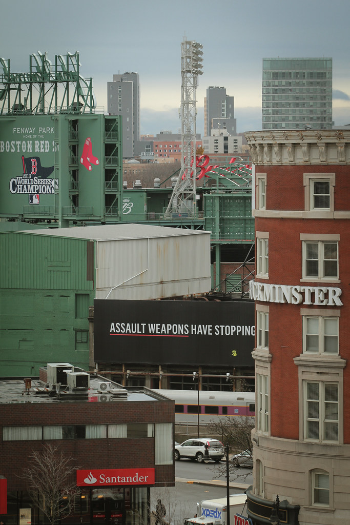
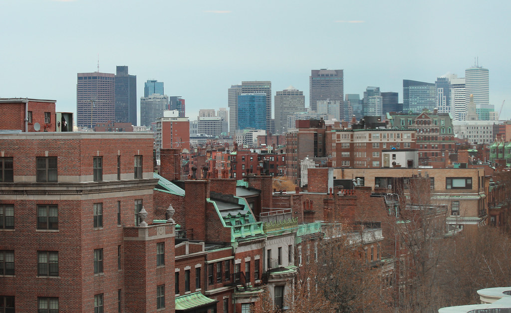
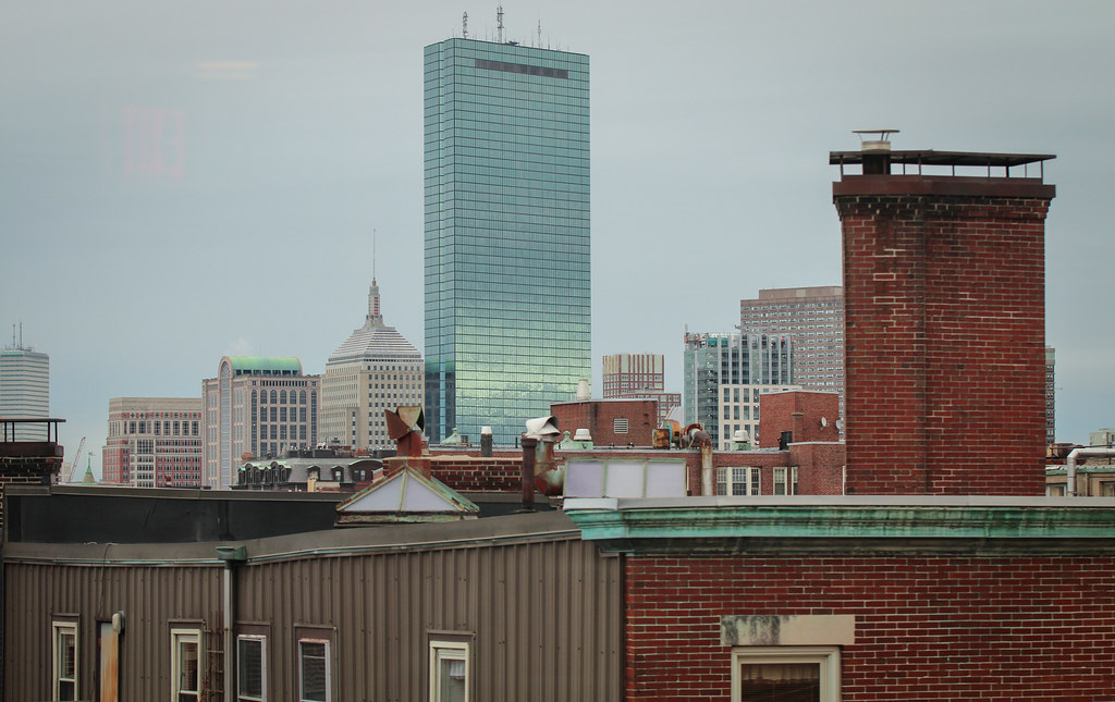
The dreariness really makes the orange bricks pop, even with such muted light.
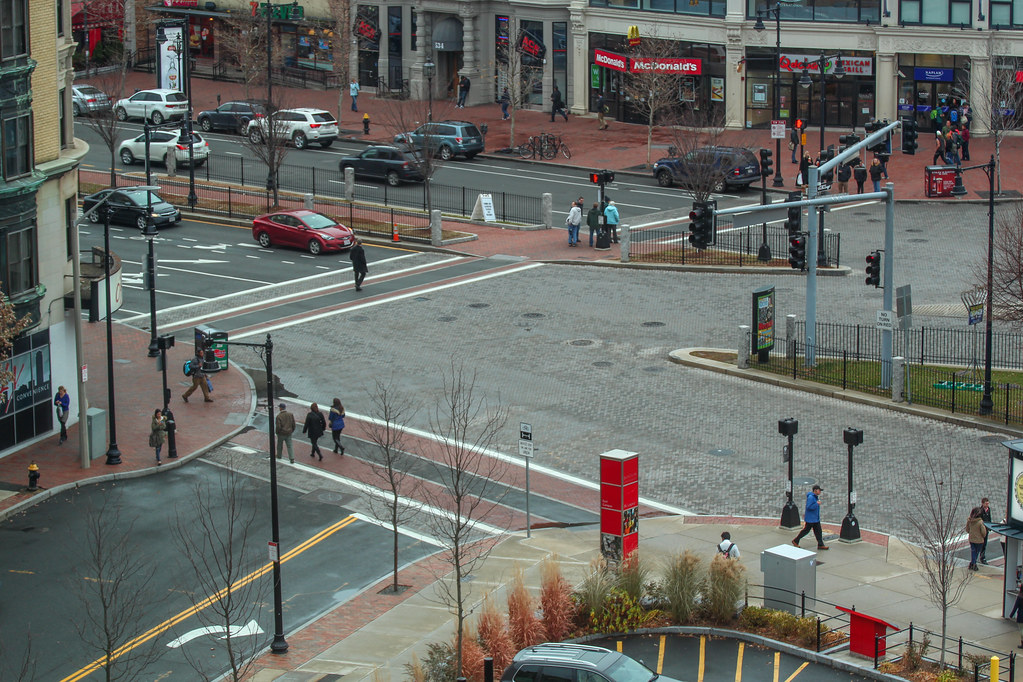
Does it look like the alley is getting use now that they prettied it up so much?
It was being well used by students as a path to and from points west. Is that what you mean?
Yes, for some reason I've had issues articulating anything as of late
- Joined
- May 25, 2006
- Messages
- 7,034
- Reaction score
- 1,875
And thank you! I was actually thinking how I don't like these shots mainly because of how ugly grey/brown it is outside now
That made me very nostalgic for my days living in the Fenway.
- Joined
- Sep 15, 2010
- Messages
- 8,894
- Reaction score
- 271
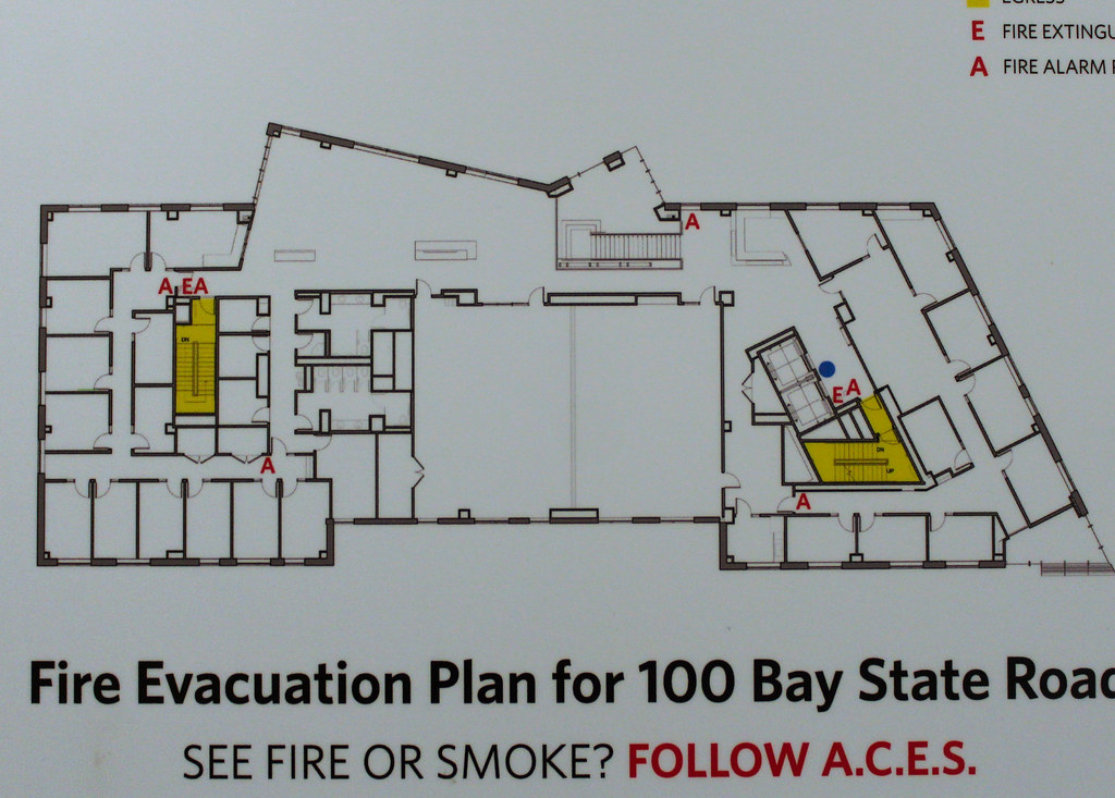
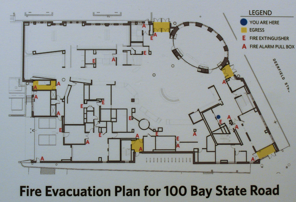
Thanks for including the floorplans, kz.
Ron Newman
Senior Member
- Joined
- May 30, 2006
- Messages
- 8,395
- Reaction score
- 13
Can non-students visit and eat in this building (like we can visit and buy food at the George Sherman Union)?
As a guest of someone perhaps, but there's a zillion turnstiles and card readers guarding each entrance to the food court area. It isn't wide open like Sherman.
Which is an absurd waste of money.
But they do take cash, so I dont see why not.

