Channel Center | Fort Point

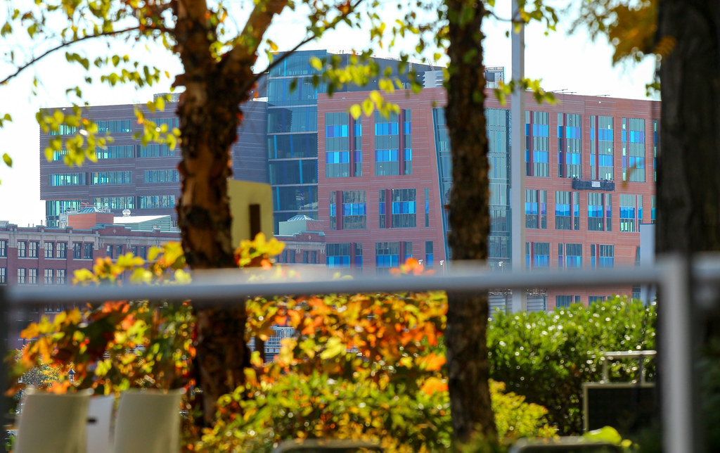
Also let me go on record and say I despise the bright blue panels on the redder part of the building. It looks like construction material, and I keep expecting them to remove it and expose the true (more conservative) material underneath.

We've literally spent years asking for this. I couldn't tell you how many times people have posted "The insulation looked more interesting than the finished facade."

We got exactly what we wanted with this one. As an added bonus, the architects even got innovative with precast.
 
The problem is the lack of consistency. You can see it with the glass on the left and right sides of Matthew's picture, as well as the multi-floor glass on the darker paneling on the left side of my picture. All (or none) of the glass should have had the blue panels. Instead, it looks like that one section just isn't finished, and never will be. It's probably even more visually confusing in person (at least from a few blocks off, since I have never actually been right up next to this building before, my camera just has a strong zoom).

9483062734_79481891b7_c.jpg

 
We've literally spent years asking for this. I couldn't tell you how many times people have posted "The insulation looked more interesting than the finished facade."

I do think this one's a bit of a hot mess, but I am one of the "we" in calling for insulation-color buildings, and I'm enjoying getting what I wanted. It isn't up to par with that other recent extrovert, the MassArt tower, but I really think our architects should be encouraged to play with color, even if it means there are some misses along the way.
 
I do think this one's a bit of a hot mess, but I am one of the "we" in calling for insulation-color buildings, and I'm enjoying getting what I wanted. It isn't up to par with that other recent extrovert, the MassArt tower, but I really think our architects should be encouraged to play with color, even if it means there are some misses along the way.

+1
 
Don't be so sure about the layoffs. When they were programming the new space and realized that a lot of people were telecommuting / working from home, they may have reduced the number of permanent seats and created a limited number of hot desks / hotel offices. I know of several companies that have drastically reduced rooftops and have not done major layoffs.


From what I hear, State Street is moving into here, and the workers are not too happy about it for 3 reasons. First, the accessibility is obviously a bit tougher than dtx (with less surrounding amenities). Second, supposedly it is going to be extremely cramped and the average workspace will be smaller. Third, there are 1200 workers to be relocated and the building fits 800, so many are expecting the company's 7th(?) major layoff in 5 years.
 
Don't be so sure about the layoffs. When they were programming the new space and realized that a lot of people were telecommuting / working from home, they may have reduced the number of permanent seats and created a limited number of hot desks / hotel offices. I know of several companies that have drastically reduced rooftops and have not done major layoffs.

I have heard from a source that they are, in fact, laying people off. However, they are only doing about 10-20 every few weeks, instead of a large bulk layoff, in order to avoid the bad publicity that comes with it. Supposedly they are trying to spread more workers around the country/world, rather than have such a large concentration in eastern Massachusetts.

Also, I heard that there are going to be tiny work areas, with a push to have people share the same small workspace, by having one work at home a couple days a week while the other uses the desk, and vice-versa. I cannot necessarily verify any of this information, but I'm just passing on what I was told.

Given State Street's recent history, I think you're being overly kind by giving them the benefit of the doubt here. Layoffs have become a key part of the company's strategy, and the majority of new hires are temporary/contractor status, without benefits of course. Although, in this case, they may successfully "hide" the layoffs from the general public.
 
I'm sorry guys but I hate this. Everything about it. So much.
 
that is one building? i always assumed it was two that is a pile of crap
 
The side with long horizontal windows (left in the last picture) is far and away the superior design... Wish that side faced the channel.
 
Heavy handed all around.

I am not sure what there is to like about this unless you just dig the "more is more" concept.

cca
 
Hah! Another fun project where, from page to page, the consensus opinion of this building does a 180.
 
Are they still planning on installing the LED artwork on the parking garage? Or has that been VE'd out?
 
The side with long horizontal windows (left in the last picture) is far and away the superior design... Wish that side faced the channel.

See I like the colorful side facing the harbor since I think the two design themes are equally junky, and since that's the case I'm happy letting the colorful side enjoy greater visibility where it can add some spice to the visual palette. But really it's one of those designs best appreciated while squinting as you go by at 30+ MPH.
 

Back
Top