Columbus Ave Student Housing | 10 Burke St | Northeastern University

20190312-174817.jpg


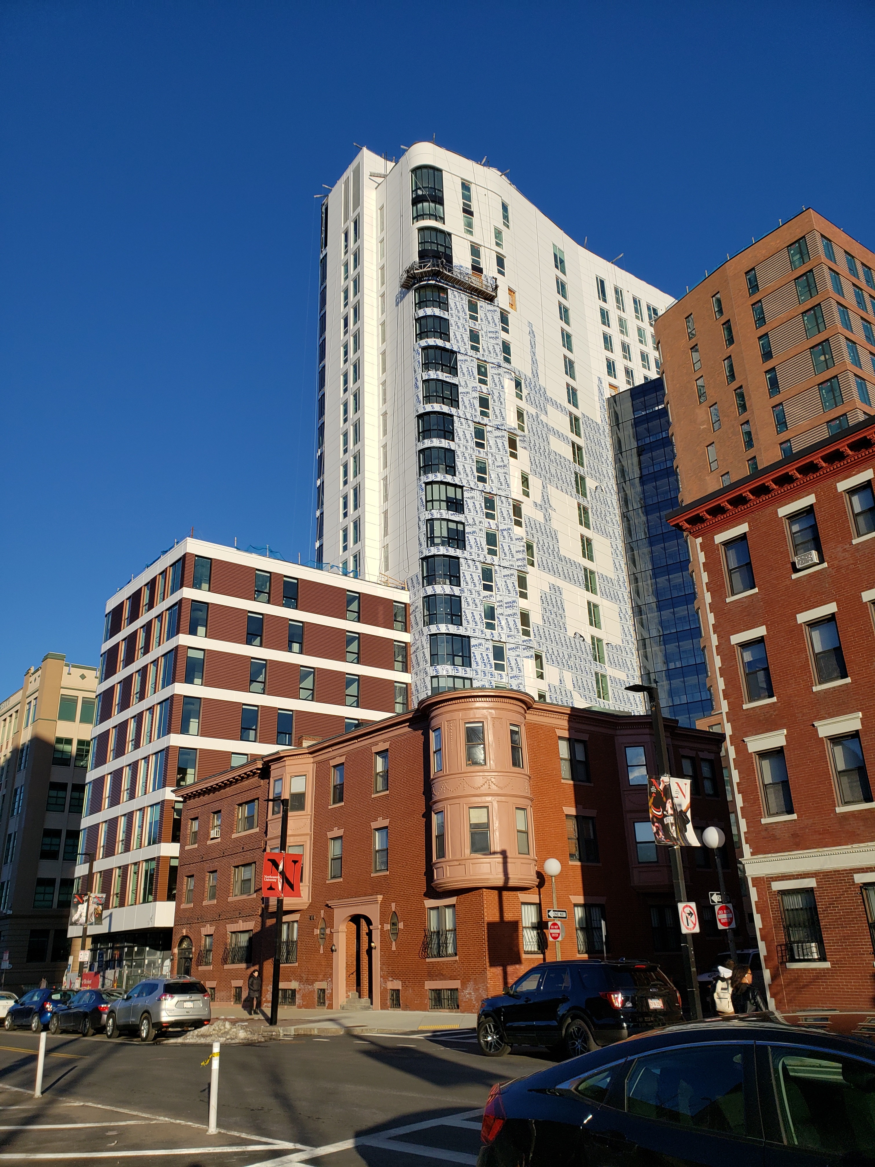
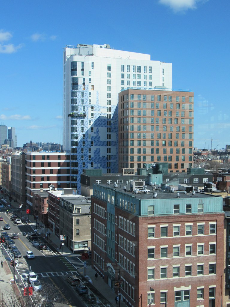
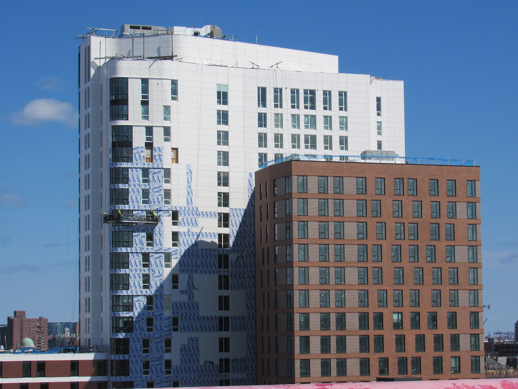
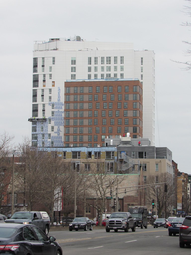
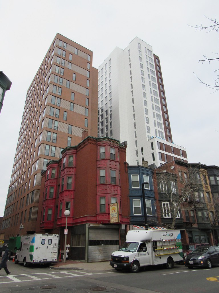
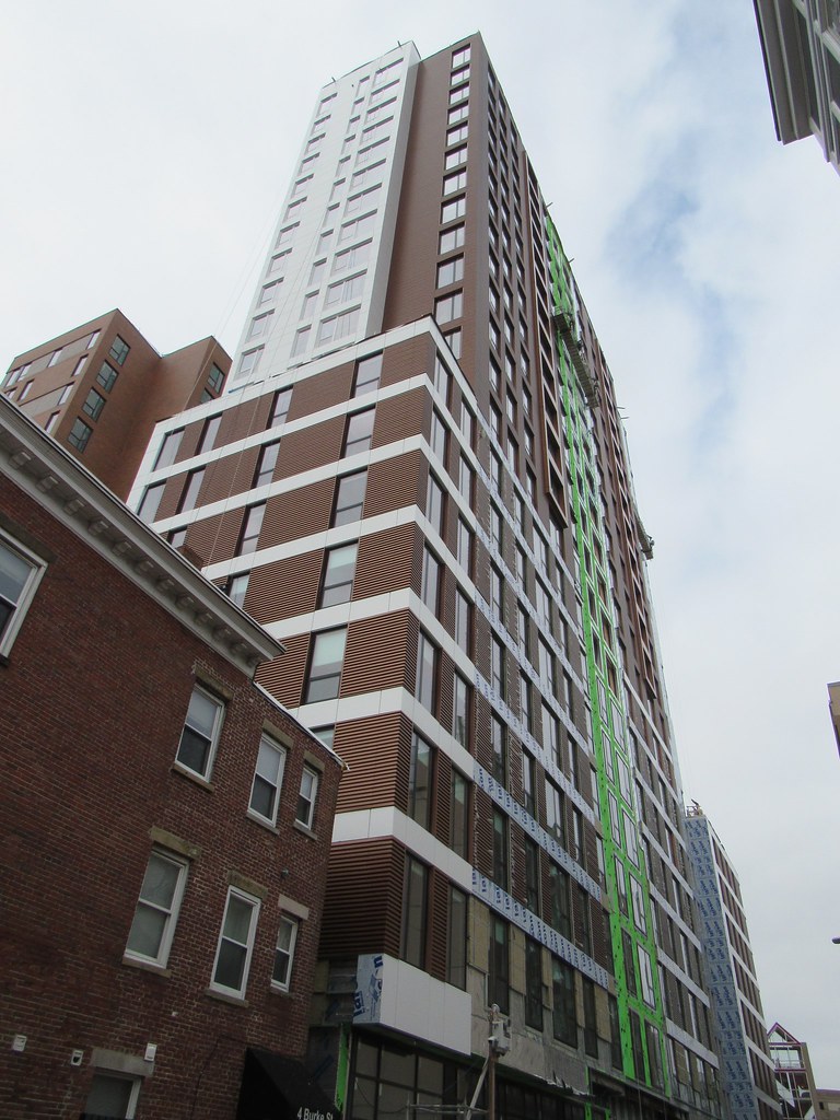
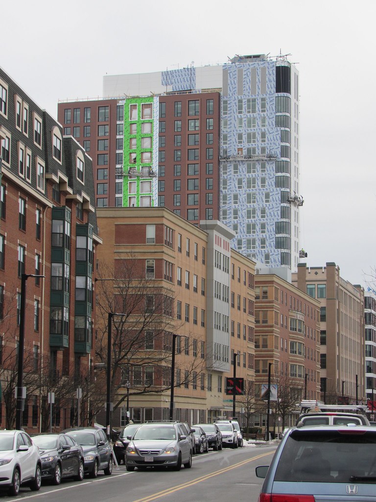
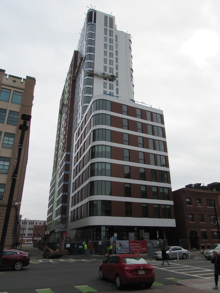
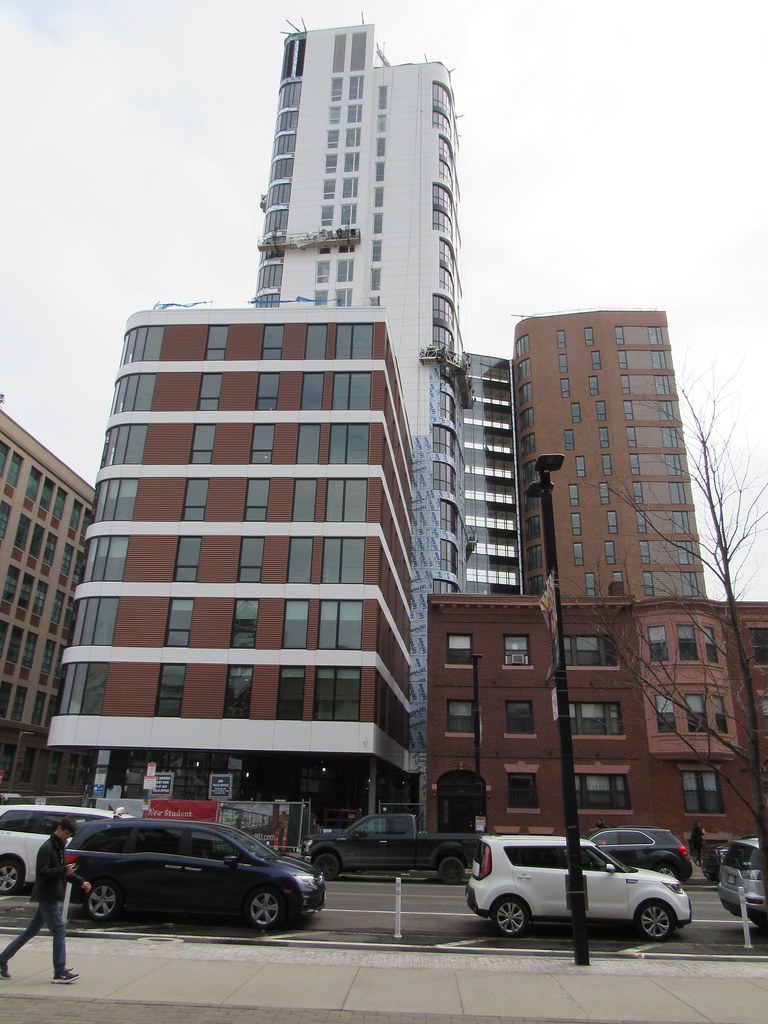
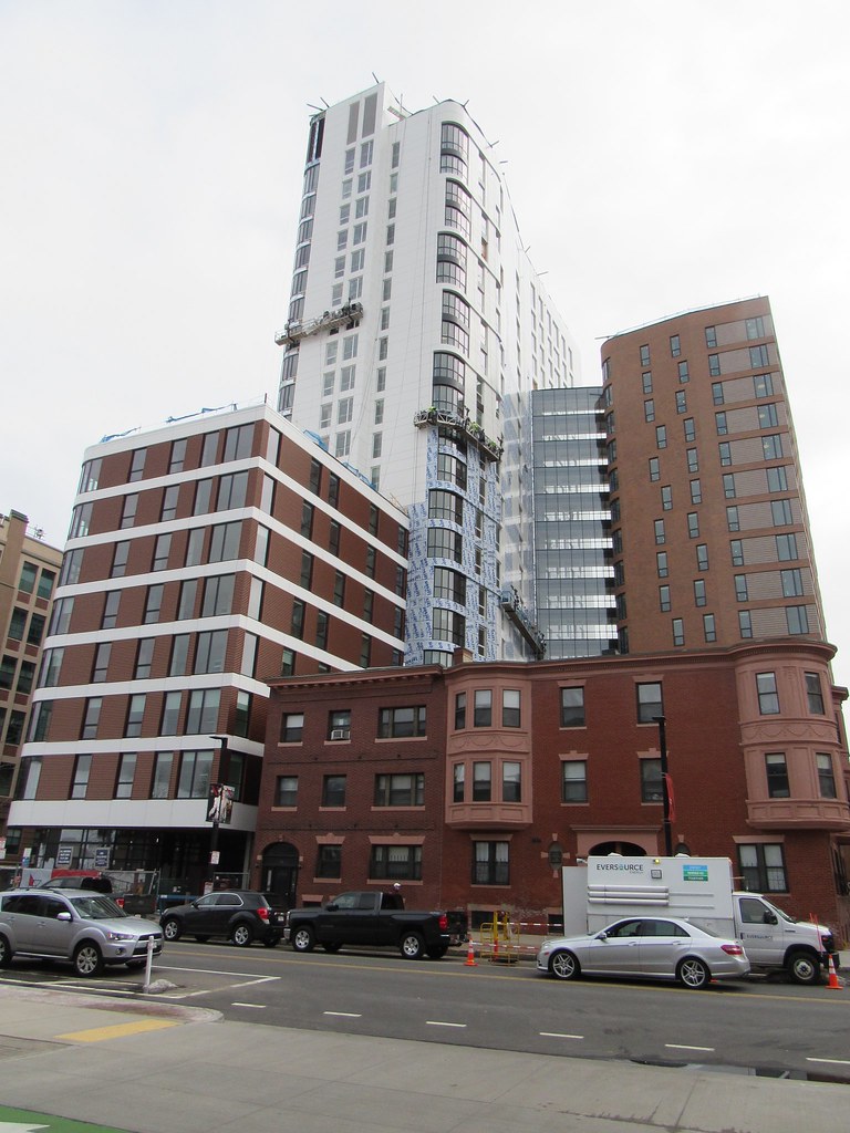
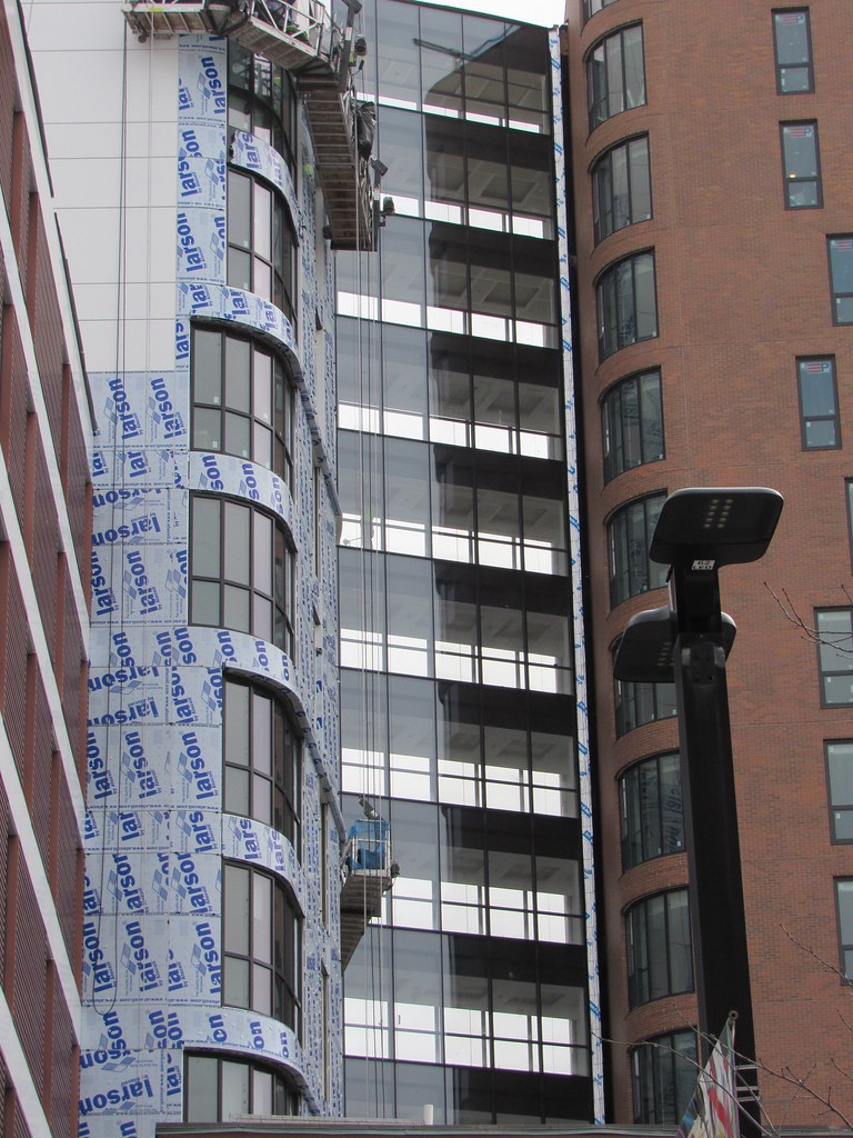
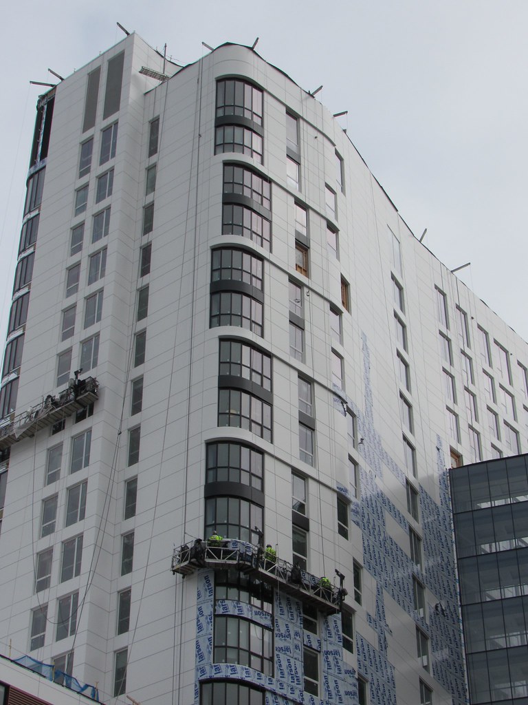
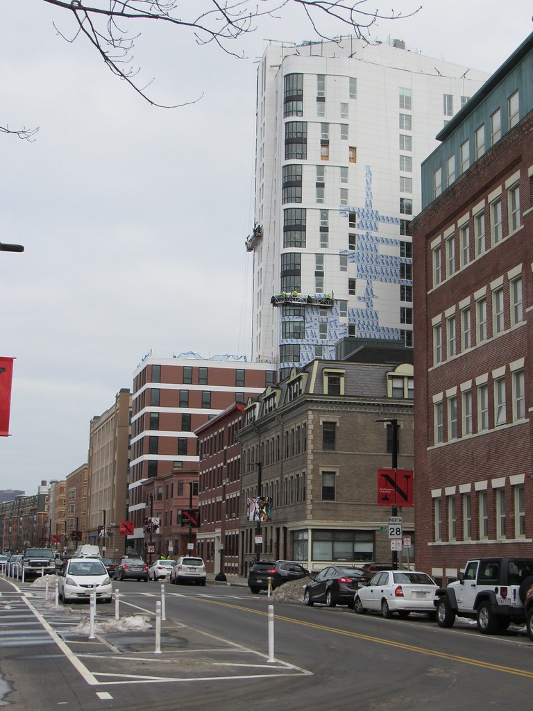
Exterior cladding is finally making progress, I don't know if I've ever seen a building move this slowly in putting up exterior cladding... One Dalton has managed to build and clad about 50 stories in the time they have done 8... Completely different scales of project I understand but the slow patchwork strategy of this building is just so slow, and there have been so many layers of multicolored insulation over the months too... I have photos of it half cladded in August 2018... 7 months later its still going
 
The white here gives me the feeling that there's wrapping paper over the paneling. I don't think I hate it but it feels a little off right now. I'm sure it'll grow on me.

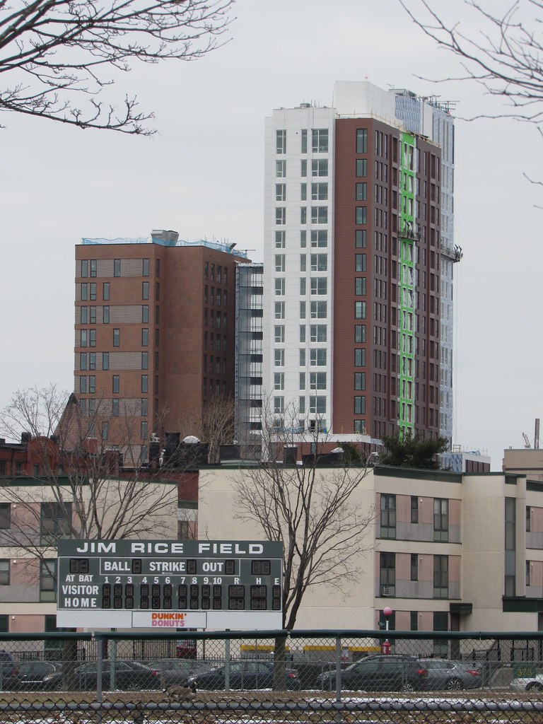
Also like to congratulate the designers on a very responsible massing. The shorter Columbus Ave volume fits in nicely, and the tower(s) step up to a good height. My other nitpick is that I wish the slim NW face of the tower, facing us in these photos, feels a little too solid and party wall-ish. It's vertical by virtue of its proportions but it has no real expression and is sort of blank for being the only part of this complex you can see from the other side of the tracks in the main campus.
 
I was just thinking that it looks like a hospital. It's definitely not a typical palette for residential structures.

Let's hope that they put in the red-stripe like they planned:
cBsvn9k.png


Then it will look like a hospital with a red stripe.
 
Thank you for all the pictures you take B, you do a great job. Love the South End/Roxbury sweep you made
 
Thank you for all the pictures you take B, you do a great job. Love the South End/Roxbury sweep you made

Thanks for the feedback. Much appreciated. Sorry it's taking a bit for me to get updates for all these projects. As the weather improves it will become easier.
 
20190315-172138.jpg


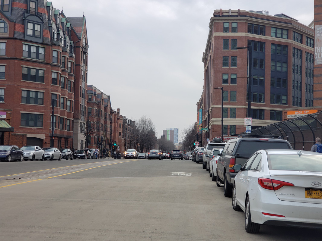
The prominence of this building is pretty incredible. This is from Back Bay Station but it's the same view all the way down into downtown.
 
The white part of the building screams "this is where our budget ran out".
 
Yes but will you like the brown? Obviously not as intense of a condition but the walls of a certain central artery tunnel come to mind...

To be clear, I know this will come down to a maintenance effort. As long as it's the shiny new thing on campus, the owner or the university will keep it looking tidy, but how long will that last?
 
IIRC the initial goal of ACC and NU was to scatter banners and/or LED screens on the vertical strip where the white facade is most apparent currently. Look back a few years/pages in the plans and you'll see what I'm talking about...
 
Yes but will you like the brown? Obviously not as intense of a condition but the walls of a certain central artery tunnel come to mind...

To be clear, I know this will come down to a maintenance effort. As long as it's the shiny new thing on campus, the owner or the university will keep it looking tidy, but how long will that last?

Nice. i never thought about washing a curtain wall until reading your post. In Miami it rains so violently, i wonder if this helps keep the pastels and whites nice. i do like the white here. Some type of dull Aluminum or Slate Grey Alucobond isn't high on people's color choices. But i think they would work fine here.

Maybe the owner vetoed a costly 'non red/brown' cladding into the budget.

i post about adding some color in the City, like if Longfellow and HT's redone in coral or dull pink + blue, navy or dark green. Nothing bright. but just some color. An Alucobond panel i'd love to see at Northeastern or MIT; Aluminum with a slight tint of green.

A color that must never appear on a college building; Ice Green Metallic!


^this is how I picture you, driving around in your dad's hand me down 1980 something beat up, cornball colored porsche
 

Back
Top