You are using an out of date browser. It may not display this or other websites correctly.
You should upgrade or use an alternative browser.
You should upgrade or use an alternative browser.
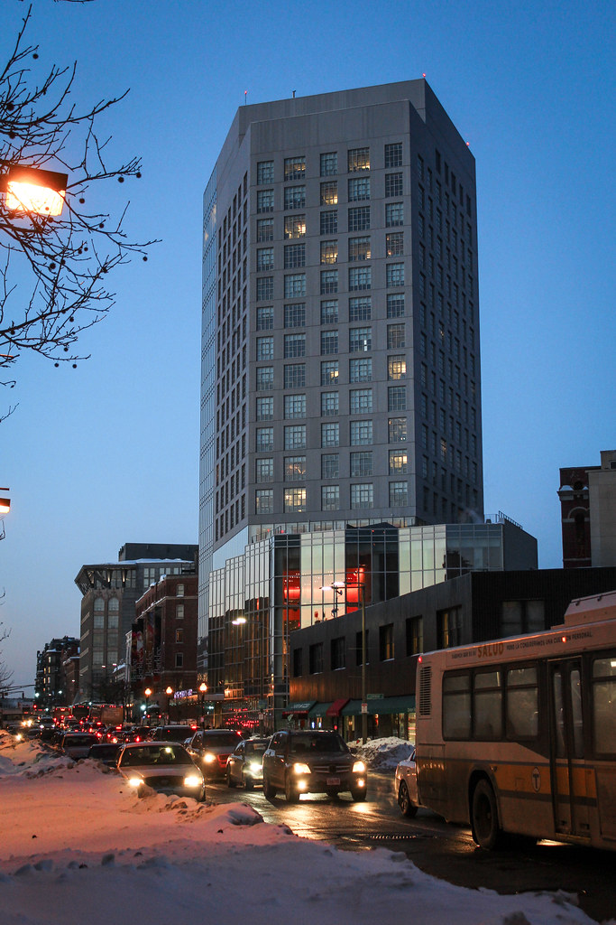
Dorm Tower @ Berklee College of Music | 168 Mass Ave | Back Bay
- Thread starter PaulC
- Start date
jpdibenedetto
Active Member
- Joined
- Oct 23, 2012
- Messages
- 150
- Reaction score
- 0
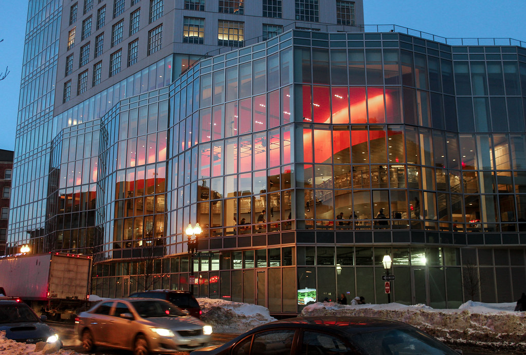
Nice shots. The lifeblood of ArchBoston runs despite the -10000000000000 temps. This building looks great at street level I'm really digging the reds. Wish the whole building was like this....
Nice shots. The lifeblood of ArchBoston runs despite the -10000000000000 temps. This building looks great at street level I'm really digging the reds. Wish the whole building was like this....
Looking at that last shot, I certainly agree with you about the levels 2-4 stories up.
However, street level????? Look again at that picture. It "looks great at street level"??????
- Joined
- Jan 22, 2012
- Messages
- 5,078
- Reaction score
- 1,661
However, street level????? Look again at that picture. It "looks great at street level"??????
It's retail isn't filled in yet.
- Joined
- May 25, 2006
- Messages
- 7,033
- Reaction score
- 1,865
I love that effect of the open space but I still think this building is hideous.
man, another sad building- and for one of boston's most vibrant institutions, too.
the red "caf" space seems to work really nicely. that ceiling is large, high, and red enough that even passing motorists get a quick surprise, which i think is quite lovely. unfortunately that thoughtful detail is about all this building has to offer.
a bit disappointing that robert campbell thinks that successfully organizing a client's program is for some reason particularly commendable; and nearly delusional in describing this building as "slim"
from a material point of view, the glazing is handsome but this must be one of the least fun facades for boston in recent memory. and for a music school?!
jpdibenedetto
Active Member
- Joined
- Oct 23, 2012
- Messages
- 150
- Reaction score
- 0
When I say street level knowing the retail isn't filled in I'm clearly referring to the two floors that are above the street.
Im trying to imagine if it would look better, just as bad or worse if it were double the height. Some buildings get better just by dint of shape. Like the jake wirth building (which actually is alright as is, but someone made a mockup of a taller one and it looked really good).
I'll be the contrary position:
I really like it. I thought it was going to be awful when I first saw the paneling and windows, but I love the weird industrial vibe that the tower gives off and the base is pretty neat. The tower looks good looking north up Mass Ave. Looking South from the Charles won't matter long term because this building is supposed to be blocked by another development at the Boylston/Mass Ave. corner.
I really like it. I thought it was going to be awful when I first saw the paneling and windows, but I love the weird industrial vibe that the tower gives off and the base is pretty neat. The tower looks good looking north up Mass Ave. Looking South from the Charles won't matter long term because this building is supposed to be blocked by another development at the Boylston/Mass Ave. corner.
- Joined
- Sep 15, 2010
- Messages
- 8,894
- Reaction score
- 271
I'll be the contrary position:
I really like it. I thought it was going to be awful when I first saw the paneling and windows, but I love the weird industrial vibe that the tower gives off and the base is pretty neat. The tower looks good looking north up Mass Ave. Looking South from the Charles won't matter long term because this building is supposed to be blocked by another development at the Boylston/Mass Ave. corner.
I agree with you. I like this tower, especially the base. The tectonics could be a bit more refined, especially where the two facade languages meet, but overall I enjoy the massing and industrial aesthetic. Those massive windows are extremely a-typical for dorms and they are a very strong design choice for both the interior and exterior environment.
- Joined
- Sep 15, 2010
- Messages
- 8,894
- Reaction score
- 271
Award-winning:
AIA Committee on Architecture for Education (CAE)
CAE Education Facility Design Awards
Award of Excellence: Berklee Tower; Berklee College of Music, Boston, Massachusetts / William Rawn Associates, Architects, Inc.
This 16-story mixed-use building creates a center of gravity and a strong identity for the Berklee College of Music campus. Most prominent is a 40 foot high performance/dining space that fronts onto a major Boston thoroughfare, showcasing student performances nightly. Twelve floors, housing 380 students plus a fitness center and music practice rooms, sit above the performance space. Six double height lounges on the residential floors help build community by linking two floors of students. In support of Berklee’s growing programs in music technology, two floors below grade house the largest recording studio complex in New England.
http://www.archdaily.com/771678/aia-announces-nine-education-facility-design-awards


Suffolk 83
Senior Member
- Joined
- Nov 14, 2007
- Messages
- 2,996
- Reaction score
- 2,402
That interior spot is pretty nice but the building as a whole? Please


