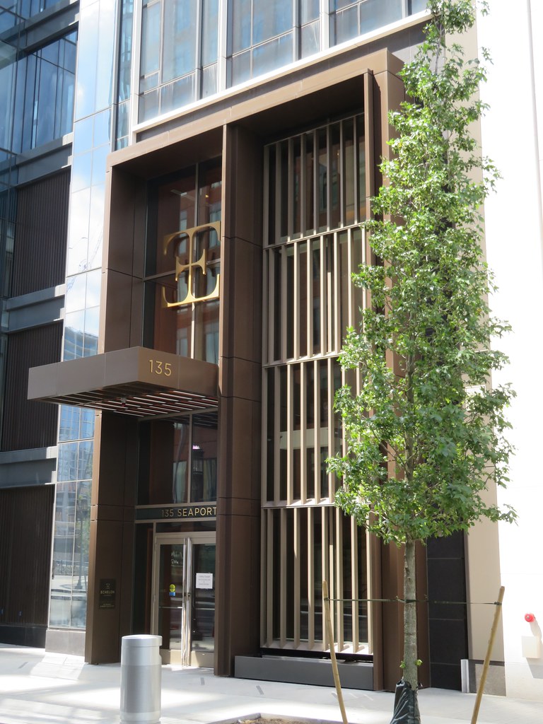
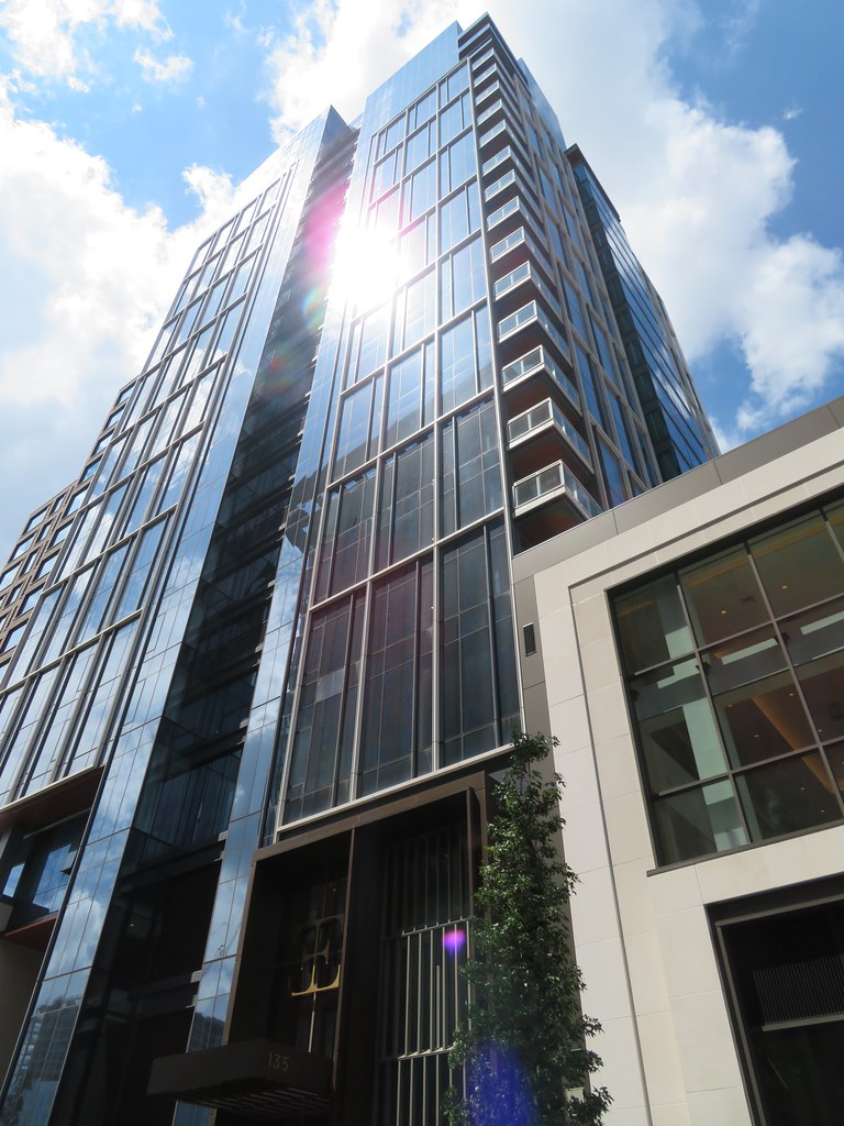
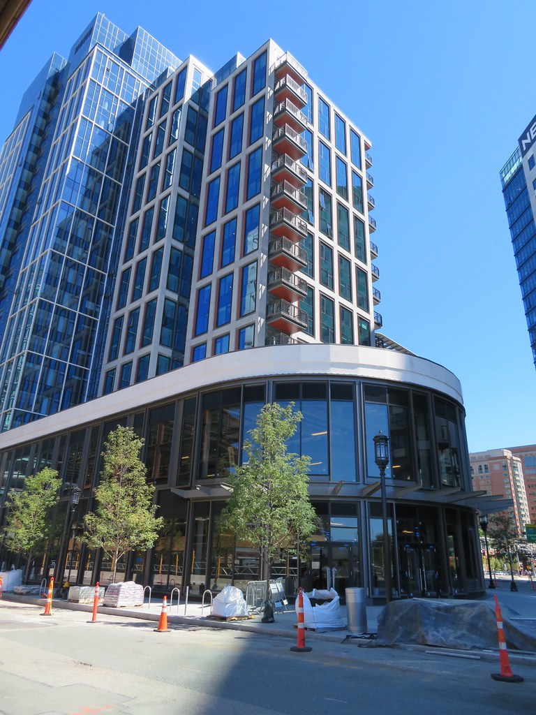
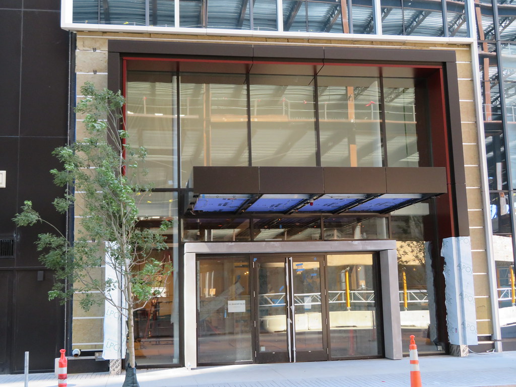
Echelon Seaport | 133-135 Seaport Blvd | Seaport

I agree with the critique of the generic blue glass boxes and the sense of impermanence. In that sense the Seaport will never be the Back Bay. I was thinking more of the pedestrian urban
experience than the architecture. Strolling along the Harborwalk from the courthouse to Pier 4 (and eventually the upgraded WTC and maybe someday Drydock 4) is — at least for me — on a par with strolling down the Comm Ave. mall or the Esplanade. The number and variety of public activities available (shopping, dining, entertainment, etc.) already compares favorably to Back Bay and will probably increase in the future (just pretend you've never heard of COVID-19). The proposed Summer St. Steps and Harbor Walk might (or might not, but let's be optimistic) turn out to be a pleasant mashup of Newbury St. and Quincy Market. I haven't been in the Seaport for over a year, but last time I was there I saw people strolling about who looked like they enjoyed being there, bad architecture notwithstanding. That sense of enjoyment provided by the built environment is where I think the Seaport could become the next Back Bay (again ignoring the Sword of COVID-19 hanging over our heads)
You're not wrong. The architecture is only half the puzzle. The urban design is what really completes it, and I commend the Seaport on that focus.
Just biked around there today actually and saw plenty of people walking the harbor.
 
Cladding the base

49974274133_823fd04c98_b.jpg
 
It's a nice choice for cladding and I think that the whole series of Echelon buildings are doing a good job at the base/ground level from what's been done so far.
 
I was waiting to hear some announcements about ground floor retail here for a while- I'm guessing with COVID there may not be a rush of retailers trying to come in.
 
Anyone know how often Google updates their 3D map view? That's where I've been spending way too much time the past few months doing some virtual exploring of the city.
It'd be nice to see and compare the Seaport developments in a more current state. This parcel is totally flat in the existing version.
 
Id like to know too it drives me crazy. I use apple maps which I like better and tried googling it before and couldnt find any info on update schedues. The top down satellite view is always more current but even thats getting pretty outdated now.
 
Last edited:
Anyone know how often Google updates their 3D map view? That's where I've been spending way too much time the past few months doing some virtual exploring of the city.
It'd be nice to see and compare the Seaport developments in a more current state. This parcel is totally flat in the existing version.
I know no one uses Bing maps but if you go into their aerial view then right click on something and select view birds eye they have some quite up to date stuff, just not nearly as slick to navigate around as the Google maps stuff. Microsoft has been doing a bunch of birds eye aerial photography for their new flight sim so its very up to date.

1.PNG
2.PNG
3.PNG
4.PNG
 
The courtyard has been opened (though still under construction) and I snagged a few shots while walking through. Just a few newer angles from what's been posted thus far. I'm quite disappointed that the photos don't really capture how it was being there on foot. These photos make it look a lot sadder than it really is.

IMG_5850.jpg
IMG_5851.jpg
IMG_5852.jpg
IMG_5853.jpg
IMG_5854.jpg
IMG_5856.jpg
 
A real shame that they won't be going with more permanent benches.. those look cheaper than what was originally rendered.
 
A real shame that they won't be going with more permanent benches.. those look cheaper than what was originally rendered.
Agreed... but I'm sure there will be a lot more programming coming to the courtyard and once all the retail fills in this is going to be a pretty cool little plaza.
 
Awesome!

But...

True to the aB spirit, I feel obligated to find something to nit-pick about, so...

Not too crazy about the mish-mash of styles in the seating and lighting. Wish they'd made more stylistically coherent choices.

oQYONSM.jpg


I wonder if this was the original intent or an ad-hoc response to the COVID situation.
 
Awesome!

But...

True to the aB spirit, I feel obligated to find something to nit-pick about, so...

Not too crazy about the mish-mash of styles in the seating and lighting. Wish they'd made more stylistically coherent choices.

I wonder if this was the original intent or an ad-hoc response to the COVID situation.

The seating is a real disappointment here.. The original renders showed permanent stone/concrete benches integrated with the hardscape/plaza. These look far cheaper and out-of-place. I can't imagine they'd do something like this as a short term solution while they have all the equipment and labor and access on site...
 
The seating is a real disappointment here.. The original renders showed permanent stone/concrete benches integrated with the hardscape/plaza. These look far cheaper and out-of-place. I can't imagine they'd do something like this as a short term solution while they have all the equipment and labor and access on site...


That's what I thought too, but didn't want to sound too critical. They do look cheap and out of place for such an upscale development. It's like going to a Michelin 5-star restaurant and being served dinner on a paper plate.
 

Back
Top