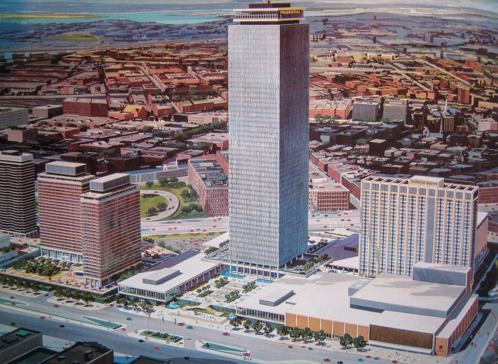
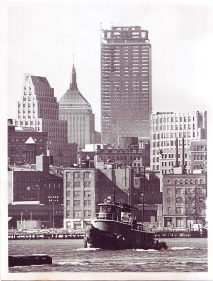
Evolution of the Prudential Center: 1954-1989

Too funny. That model was clearly pretty tall, I bet it even cast a formidable shadow.

A shot from the "early 1960's" from BostonStreetCars.com:

2548788_orig.jpg
 
Maybe the Prudential Tower, itself, could evolve by replacing its fifty year old facade. An article in today's Architect's Newspaper covers the transformation of Toronto's First Canadian Place which had its marble panels replaced with gritted spandrel glass. The article states that it, "preserved the tower's look while improving its performance". The building is 978 feet tall, the Pru is 907 feet tall. The Pru looks like it would be a tougher task, though.
Article at http://www.archpaper.com/news/articles.asp?id=7183

image_zpsd9af8186.jpg
 
^ Pru is only 750' tall architecturally. Top of antenna is 836'.
 
I would be in favor of a slight modification to the Pru similar to that. Replacing the faded panels with something fresh and bright as well as better performing windows would be a welcome change. The overall pattern of the facade should remain intact however; I love the Pru in that 'plain and awkard but really cute anyway girl' kind of way.
 
Right you are, datadyne007, somehow I phrased my "How tall" Google search incorrectly. I'm aware of how good the sources are on this forum.
 
Speaking of the Pru facade....when were the windows of the Pru covered in reflective film? I think it ruined the overall look...clear windows looked better than the silvered effect now in place. And I agree I'd like to see the panels spruced up somehow.
 
Speaking of the Pru facade....when were the windows of the Pru covered in reflective film? I think it ruined the overall look...clear windows looked better than the silvered effect now in place. And I agree I'd like to see the panels spruced up somehow.

Educated guess is during the energy crisis to reduce solar gain. I could be way off base though.
 
Um, what?

w87i2dS.png


This is from an article in today's Boston Globe, quoting Ben Mezrich (Burning Down the House, Accidental Billionaires, etc.).

"We live on the top floor of the Prudential Center ..."

Now, my first guess was that the article's reporter didn't get the quote right and that Ben meant he actually lives in one of the apartment buildings on the Prudential Plaza (note he says "Prudential Center, not Prudential Tower") but then I started to second guess myself.

And, coincidentally, I heard from someone else today saying there actually are some apartments in the tower.

This can't possibly be true, can it?
 
Too funny. That model was clearly pretty tall, I bet it even cast a formidable shadow.

A shot from the "early 1960's" from BostonStreetCars.com:
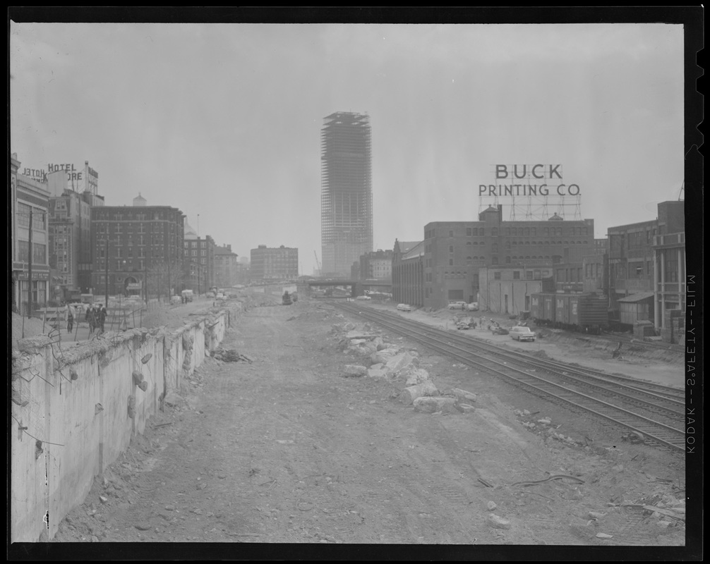
2548788_orig.jpg

I remember seeing that Buck Printing sign over the bleacher walls at Fenway when I was a kid (actually, I had forgotten it until I saw an old ballpark photo one day and was like. "I remember that!"), but I didn't know where it actually had been until now. This shows that the distinctive, older building beyond it is actually Jillian's, and the Buck Printing building is now Tequila Rain.
 
The non-enclosed shopping area was a terrible place, because the wind just whipped through it. Turning it into a mall greatly improved the entire Pru.
OMG What you said brought back memories... I just remembered how badd it used to be when the Prudential mall area was like a wind swept wind tunnel in the middle of the winter. And the doors used to slam shut behind you when they close from the wind. It was indeed awful it used to be soo cold and that wind used to downright sting your face.
 
Hi all, so I finally went and updated the original post -- got rid of all those missing images and put them on what I *hope* will be a much more stable image hosting service. Also in the process of going through the original files I turned up a few leftovers that never saw the light of day. Not sure why I overlooked them as they're all pretty sweet.

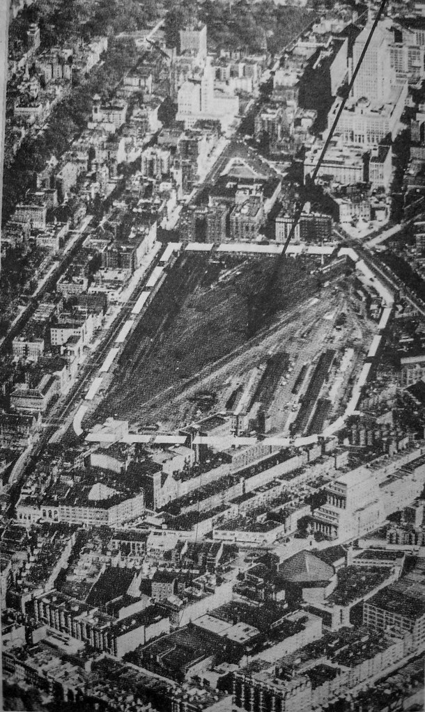
First, the site as it was circa 1954:

25746730154_79538c3cee_b.jpg


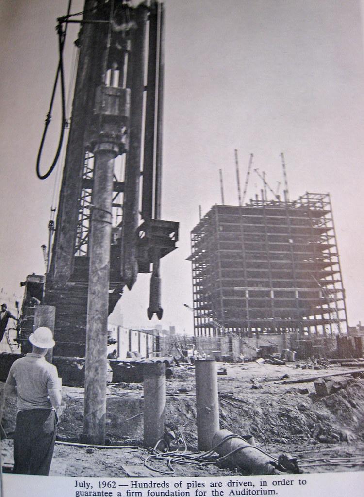
1962:

25746730934_67d7b6626a_b.jpg


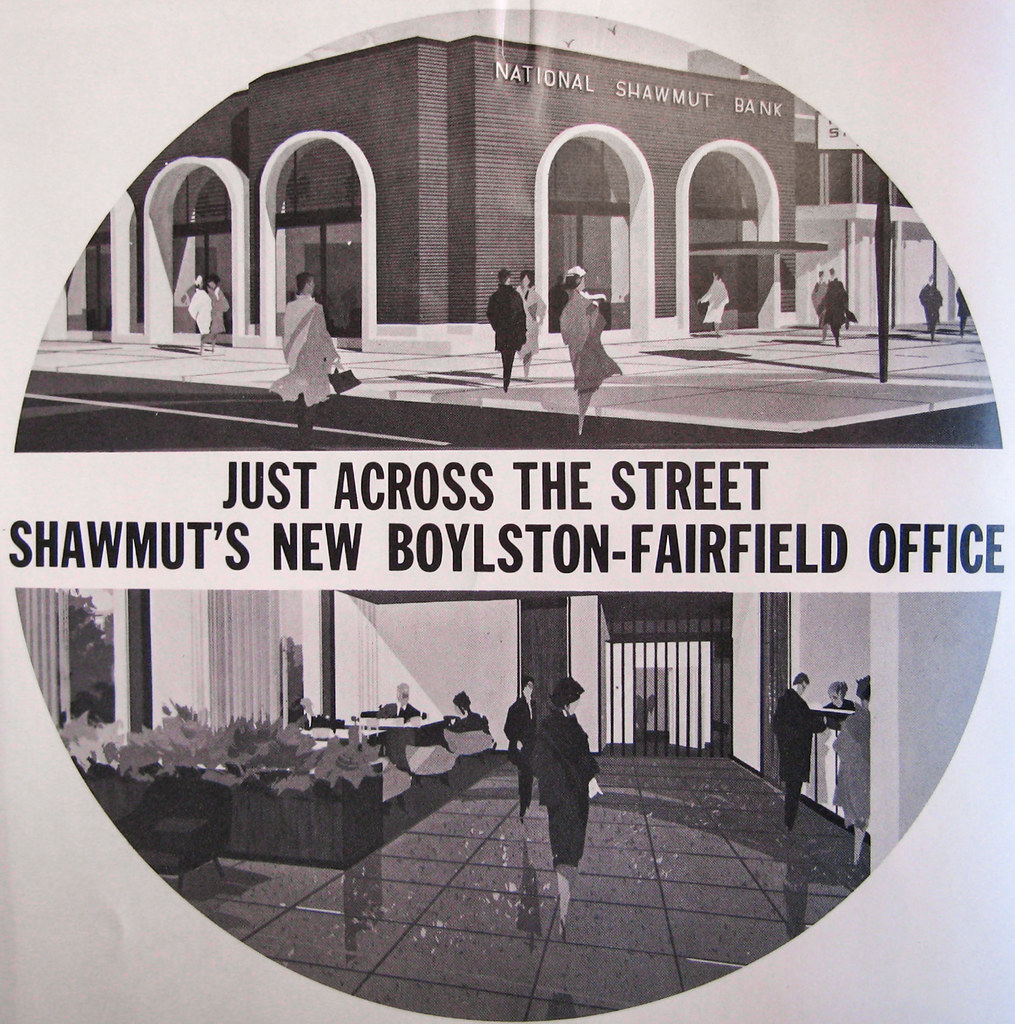
The new Shawmut Bank across the street:

26351589755_52647e6042_b.jpg


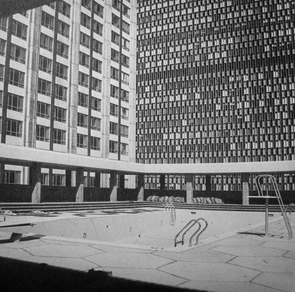
The Sheraton's pool before they put a roof over it:

26285355331_4e8145501f_b.jpg


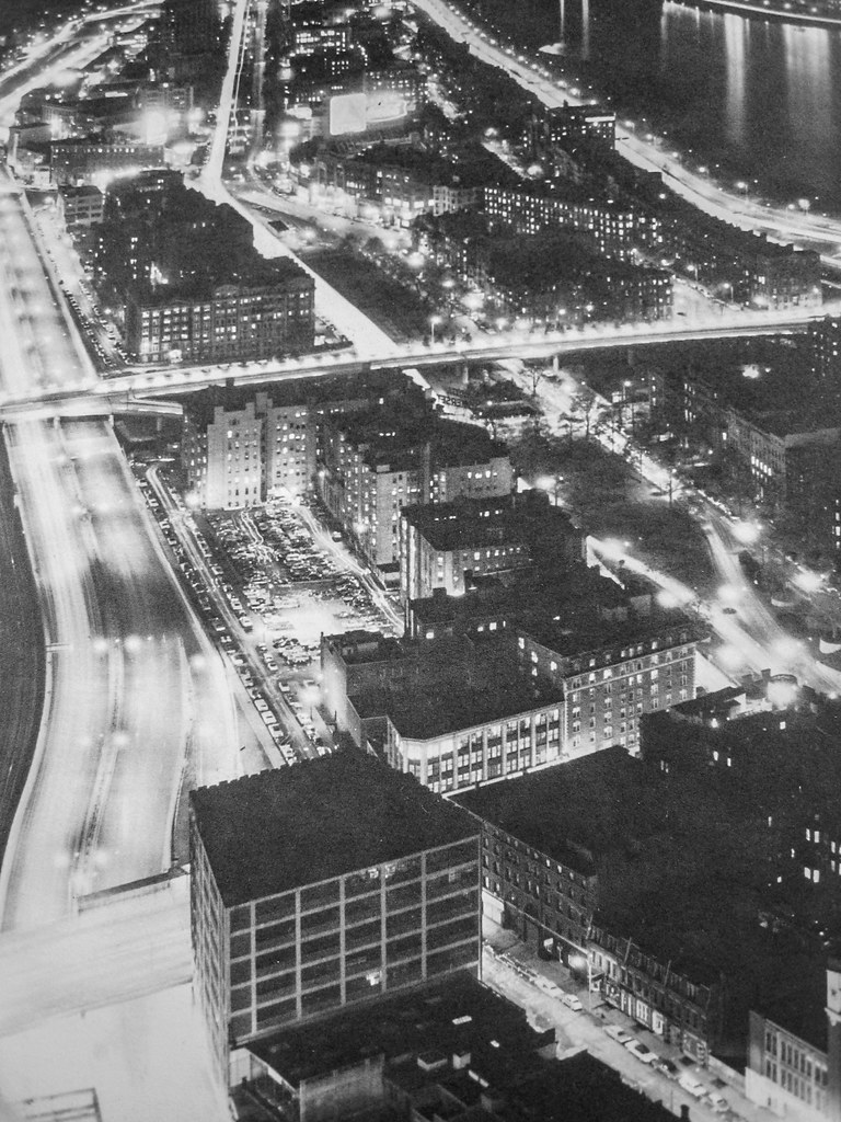
1960s aerial looking towards Kenmore:

26285354991_de5c08dd58_b.jpg


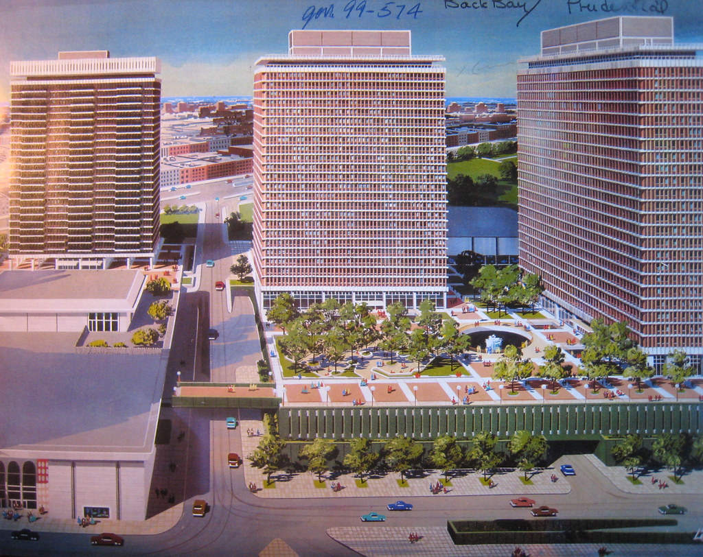
Circa 1963 rendering for phase 2 aka the "east sector", which consisted of the three apartment towers and the Lord & Taylor:

26259191682_6b4ce5ee8e_b.jpg


Circa 1968:

25746724664_addd6e3c33_h.jpg


And for convenience's sake, I dumped all these images (this post and the initial one) into an album on Flickr: https://www.flickr.com/photos/27672048@N00/albums/72157666455345990
 
Last edited:
Thanks kz for updating & preserving one of the best posts on this site (& my favorite) ever.
 
You got it! Trust me, I had been meaning to fix it up for years and years.
 
Thank you for the memories.... My grandmother had a friend (Yetta) who lived in the apartment towers back in the late 60's. It was quite the complex, my grandmother loved to go visit her because she loved her place! :)
 
Was the Hynes originally supposed to be more of an arena type thing? The circular shape in the original proposals looks something like that.
 
Was the Hynes originally supposed to be more of an arena type thing? The circular shape in the original proposals looks something like that.

Not sure, but remember that Hynes was originally the War Memorial Auditorium, with about 40% of the building given over to said auditorium, complete with stage, balcony seating and the like. So it's possible in those earliest iterations that they were thinking of going exclusively with a theatre-in-the-round/arena setup. Then again it was always going to be a city-run convention center, so I'm not sure why they'd forgo on the general convention space.

It's also entirely possible that they included those in the renders for no other reason than to help sell it to the public...you know, get some sexy space age vibes going on.
 

Back
Top