You are using an out of date browser. It may not display this or other websites correctly.
You should upgrade or use an alternative browser.
You should upgrade or use an alternative browser.
Fan Pier Developments | Seaport
- Thread starter stellarfun
- Start date
^ This. Oh, so this.
Can we have this rule for "the Greenway will be perfect when the trees grow in," too?
Greenway gonna be a lush paradise in 2042...can't wait
whighlander
Senior Member
- Joined
- Aug 14, 2006
- Messages
- 7,812
- Reaction score
- 647
Greenway gonna be a lush paradise in 2042...can't wait
Just Likethe Esplanade -- Gotta bury the highway -- Oh wait we did -- Nevah Mind :=}
Boston02124
Senior Member
- Joined
- Sep 6, 2007
- Messages
- 6,893
- Reaction score
- 6,639
from Dorchester

Officejab
Active Member
- Joined
- Nov 30, 2011
- Messages
- 133
- Reaction score
- 0
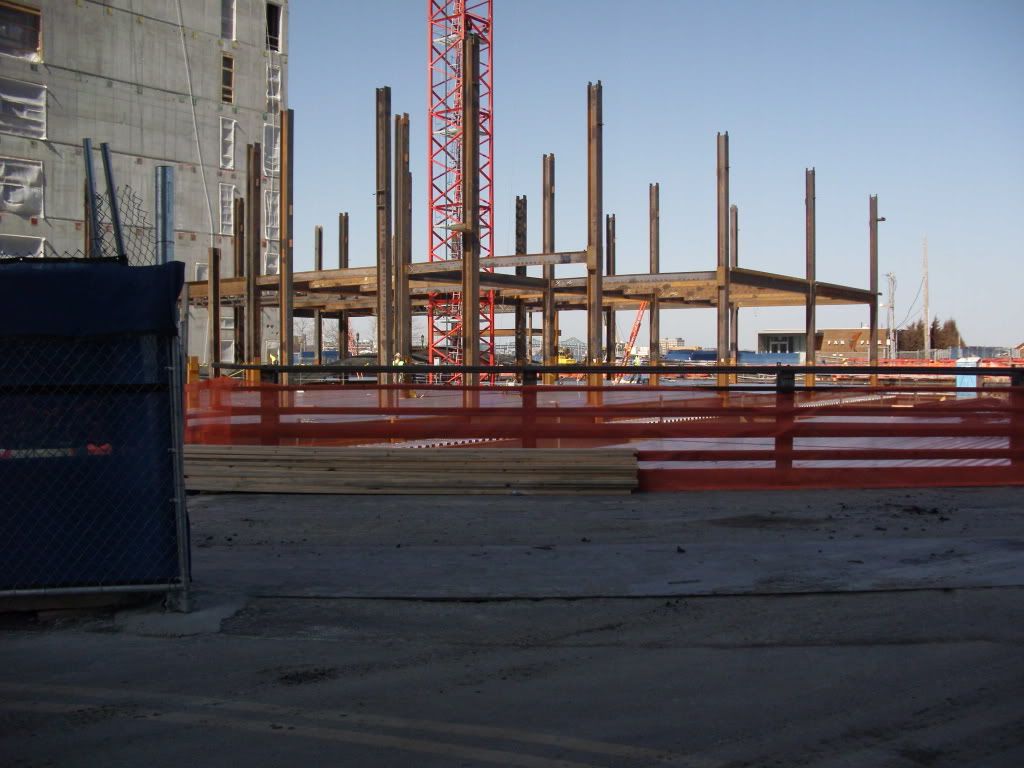
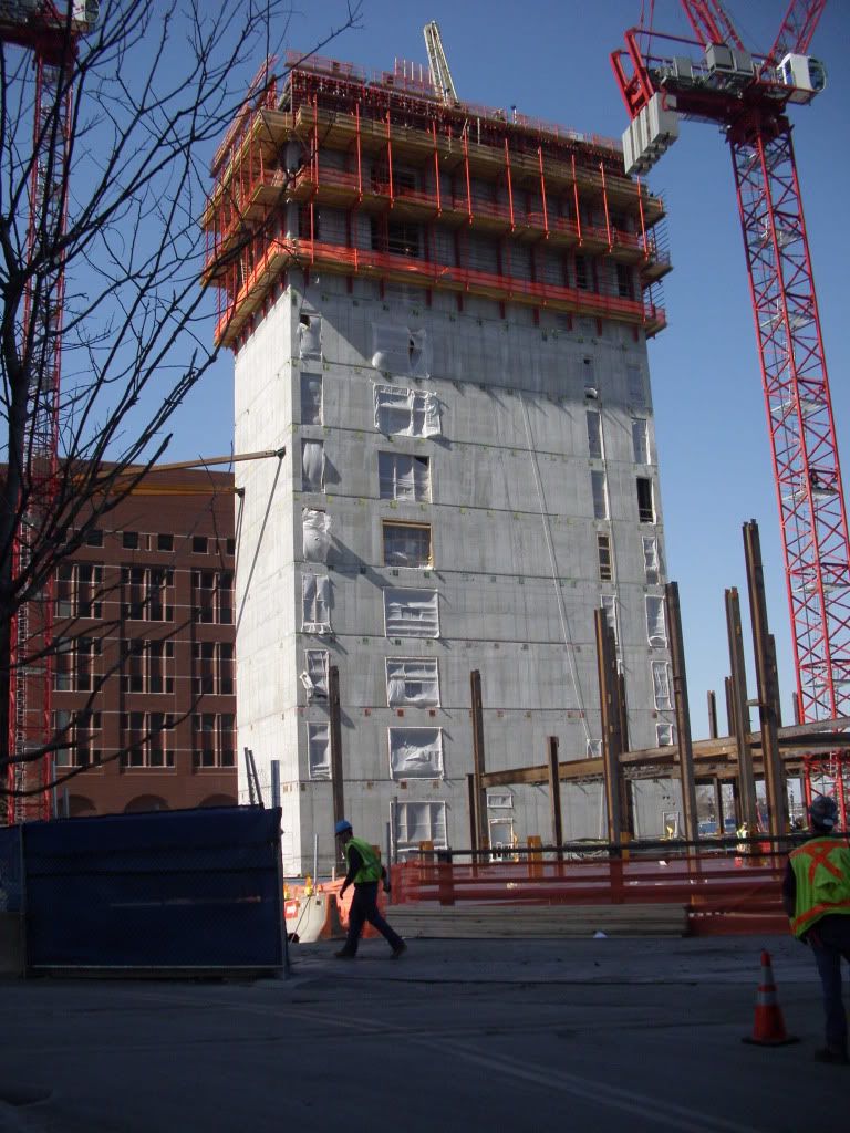
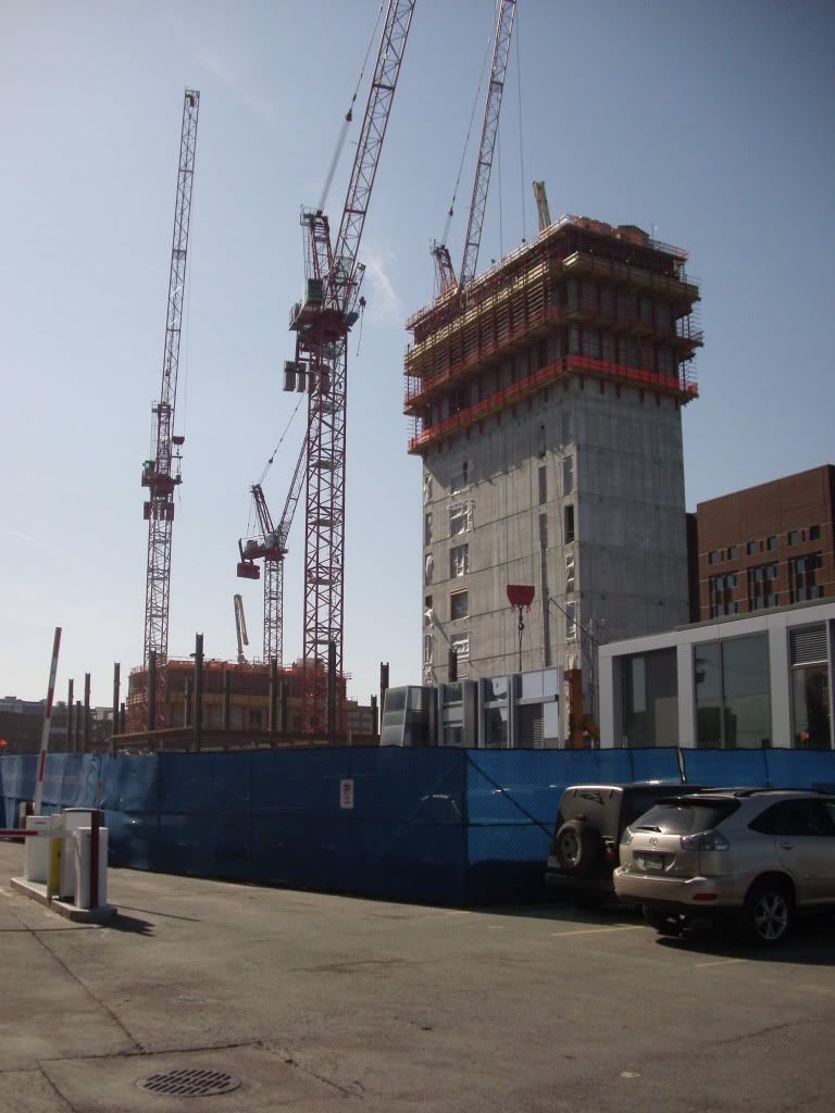
I passed by the work site earlier this afternoon and I was amazed by the amount of process. The core on 50 Northern Ave. was up to the fourth floor and 11 Fan Pier Blvd. core was up to the eleventh, while steel work was at ground level.
- Joined
- Sep 15, 2010
- Messages
- 8,894
- Reaction score
- 271
I passed by the work site earlier this afternoon and I was amazed by the amount of process. The core on 50 Northern Ave. was up to the fourth floor and 11 Fan Pier Blvd. core was up to the eleventh, while steel work was at ground level.
Hot damn! Build, baby, build!
Can't wait to see these for myself when I get home. =)
whighlander
Senior Member
- Joined
- Aug 14, 2006
- Messages
- 7,812
- Reaction score
- 647
Cranes Cranes
With apologies to Rogers and Hammerstein Carousel
Cranes is bustin' out all over!
The streets aren't sleepin' anymore!
All the Ram trucks chase the lunch trucks
All determined there'll be new towers
and the folks aren't even keepin' score!
All
On acounta it's Cranes in March, March March
Just because it's Cranes in the Hub
SeamusMcFly
Senior Member
- Joined
- Apr 3, 2008
- Messages
- 2,050
- Reaction score
- 110
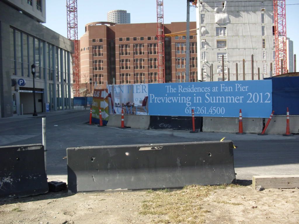
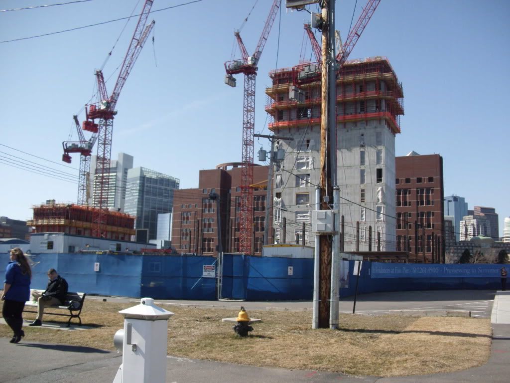
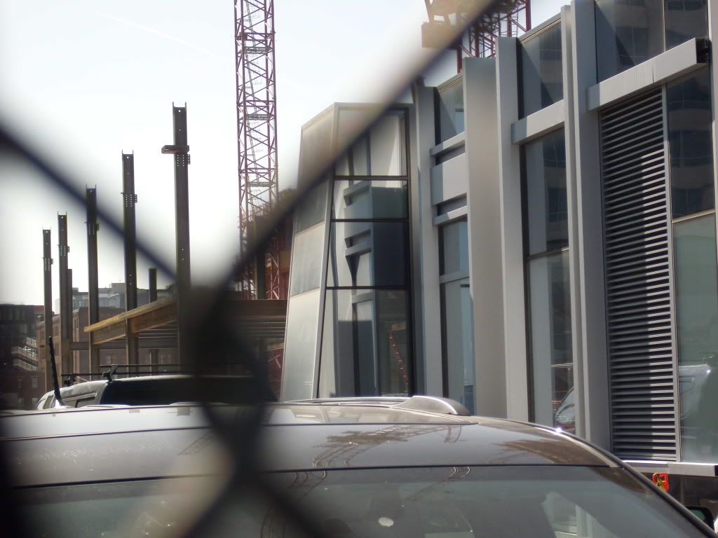
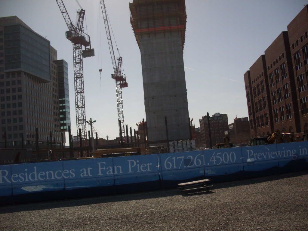
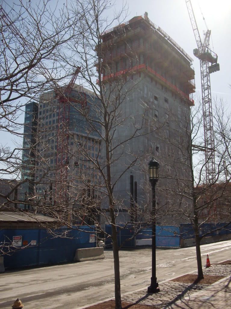
Some from yesterday. Hooray for nice weather. But the wind led me to breaking my headphones...

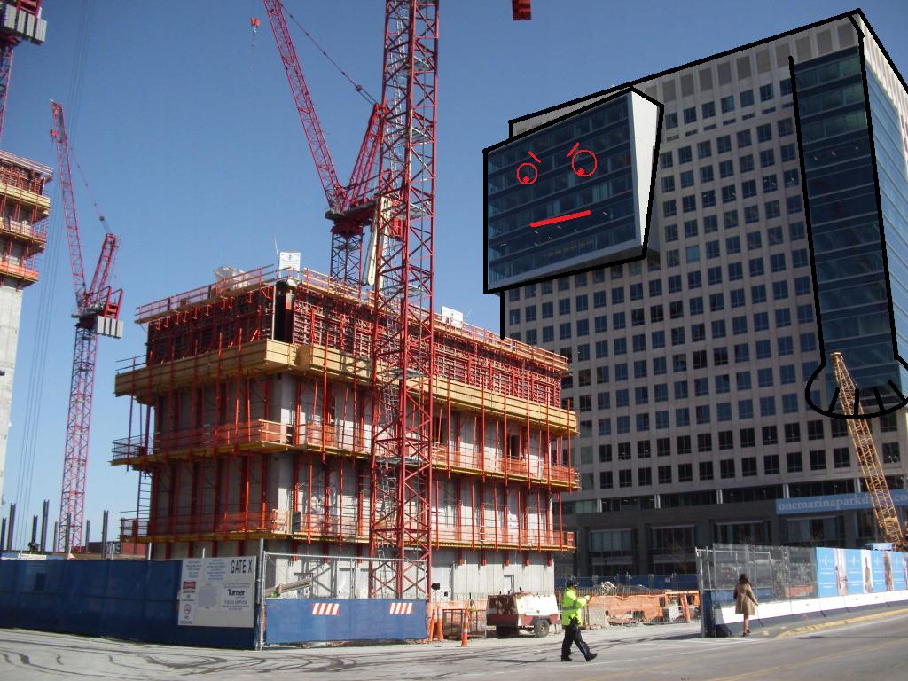
Mock ups.
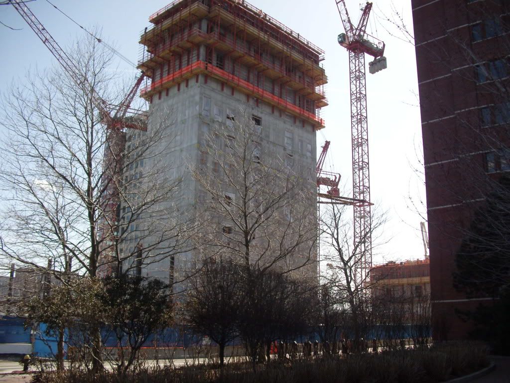
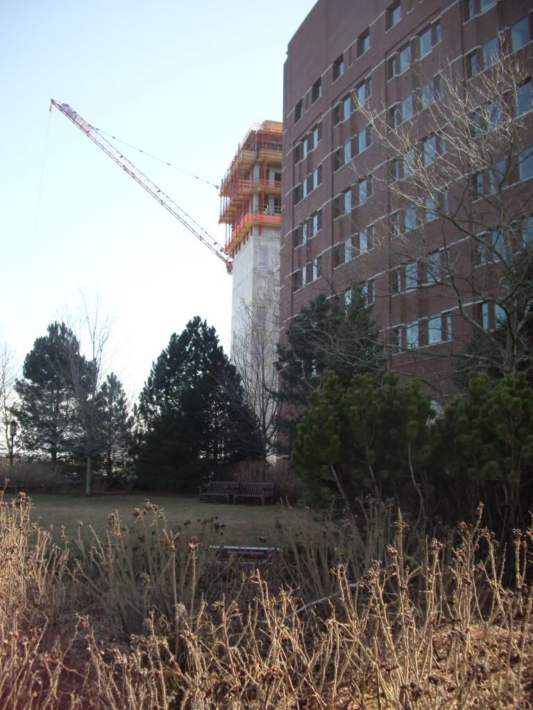
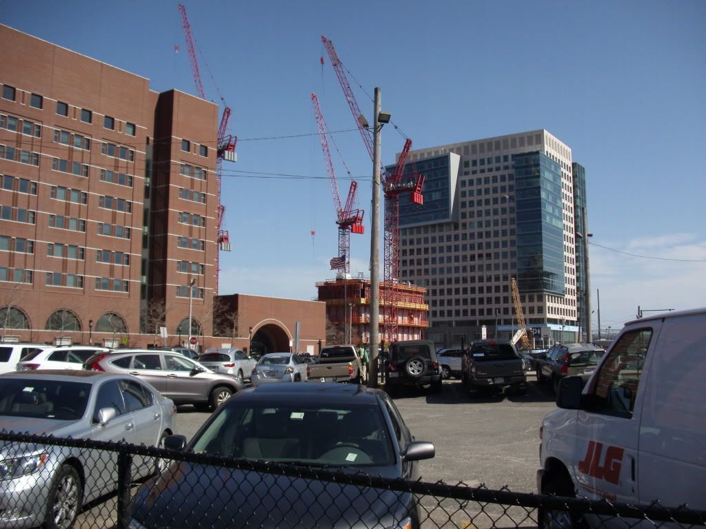
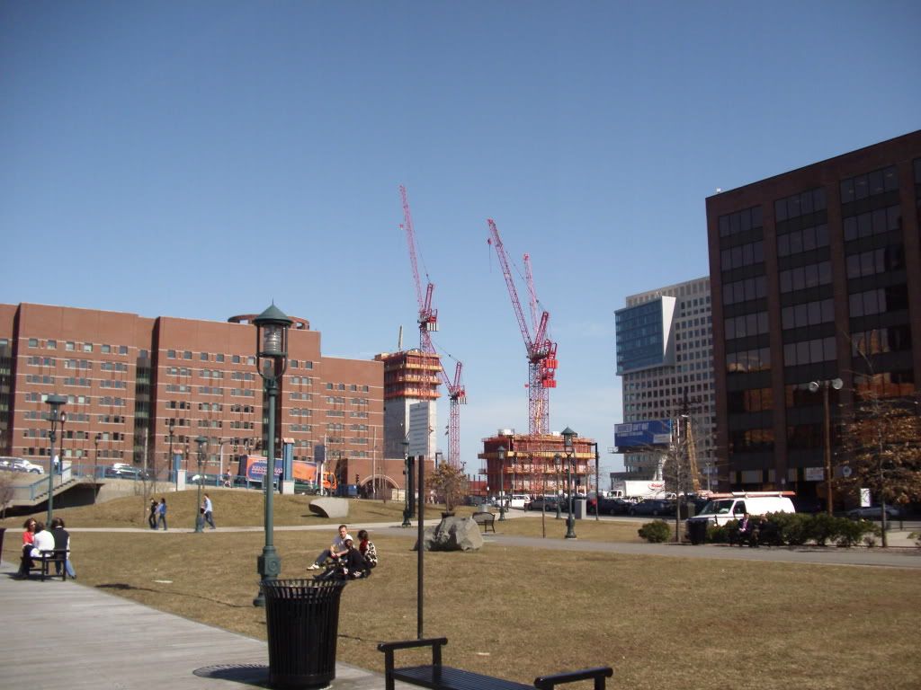


Mock ups.


BostonUrbEx
Senior Member
- Joined
- Mar 13, 2010
- Messages
- 4,340
- Reaction score
- 130
found5dollar
Senior Member
- Joined
- Aug 27, 2007
- Messages
- 1,149
- Reaction score
- 404
i would assume so based on the above image of the skin mock up:Are these still the best/latest renderings?

Boston02124
Senior Member
- Joined
- Sep 6, 2007
- Messages
- 6,893
- Reaction score
- 6,639
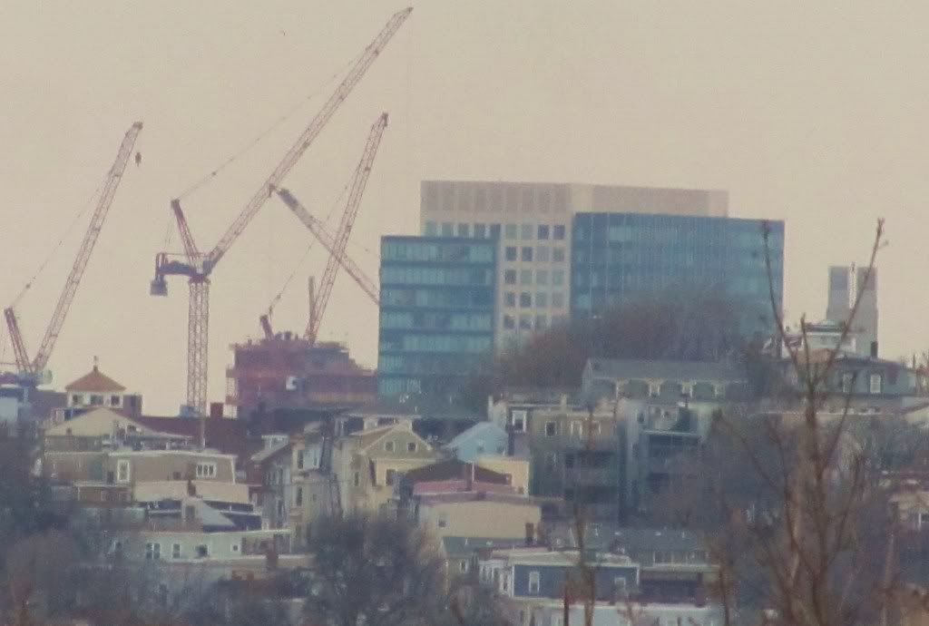
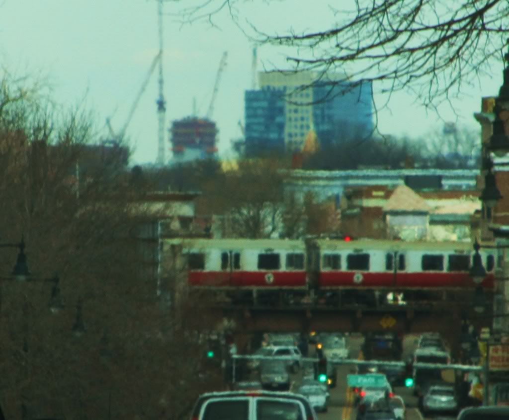
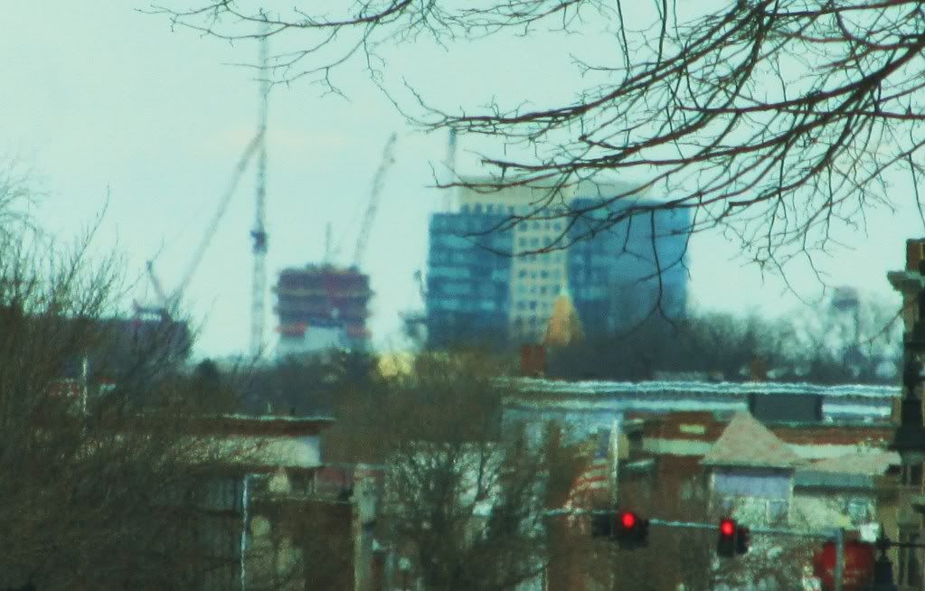
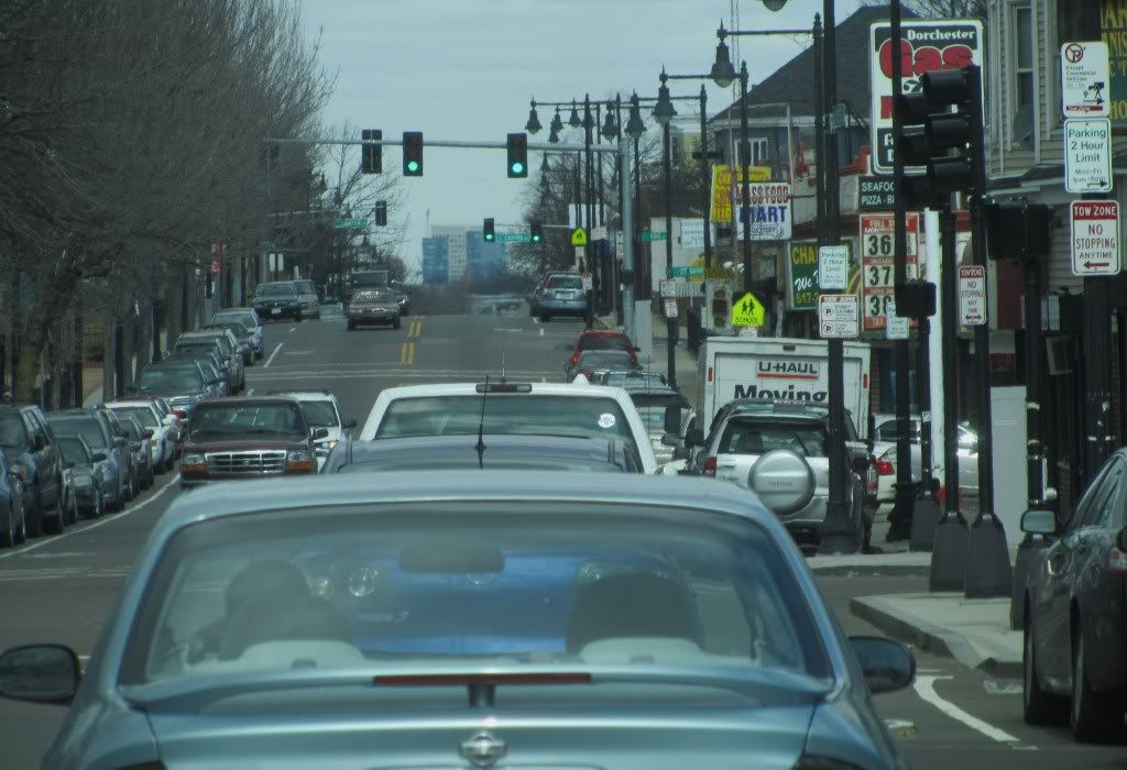
today from Dorchester ave a little past Ashmont station
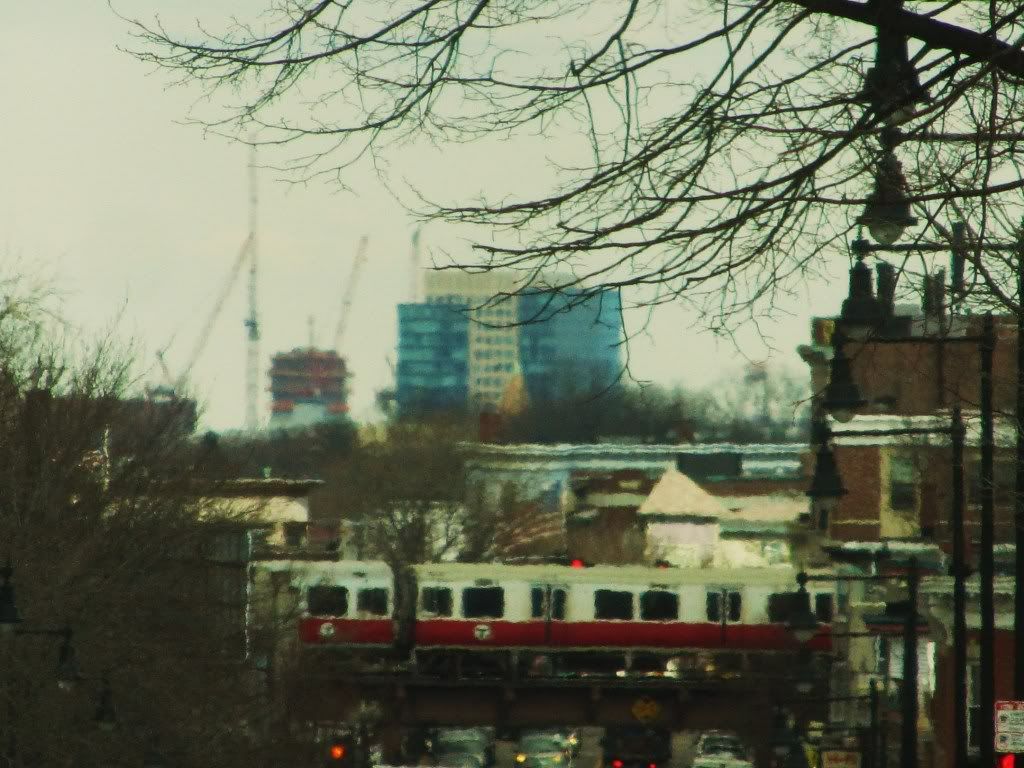 Red line from Fields cor.


- Joined
- Sep 15, 2010
- Messages
- 8,894
- Reaction score
- 271
Oooh I like the skin!!
stick n move
Superstar
- Joined
- Oct 14, 2009
- Messages
- 12,093
- Reaction score
- 18,872
Beton Brut
Senior Member
- Joined
- May 25, 2006
- Messages
- 4,382
- Reaction score
- 338
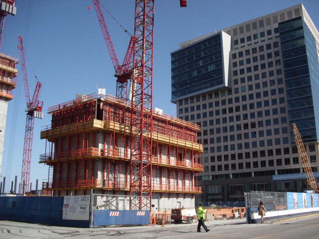
50 Northern Avenue looks like a massing model for the Center for Life Sciences. 11 Fan Pier Boulevard looks like a tubby, misshapen Saltonstall Building.
Please pass the NoDoz...
Please pass the NoDoz...
Agreed, BB.
The interplay between these two buildings is overwhelmingly awkward. There's the uneasy space that opens up a few stories aboveground when the setback kicks in on building that's in the foreground in the above photo (btw, do these buildings have names or any separate identities, or will we always be referring to one or the other as "the one in the foreground/background"?).
Then there's the fact that the building in the background in the above pic has the unfortunate horitzontal panelling that screams "Welcome to the 80s!" and looks like a layer of skin shed by the Tip O'Neill Building or the Westin Copley Place. Really, what were the architects not thinking here?

