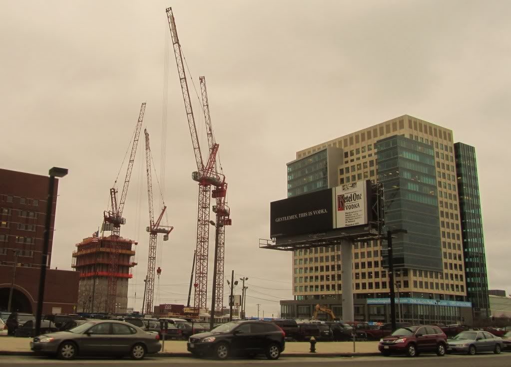
It's funny that I went to the BRA a long time ago for a class trip, the person they had speak to us talked about how one building per block was a bad model for making vibrant streets.
Goose -- its all relative:
how big is the building and how long is the block, are all the blocks the same or are they varried
how wide is the street and -- what are the ground floor accesses, etc.
Thing the old New England Life Building on Bolyston and Newbury -- when it was just a unitized office monolith -- the Boylston side was not great but it was OK as the street is wide and there are a lot of large buildings -- the Newburry side was terrible especially in comparison to the proximate other side of the street which is much more varied and pedestrian friendly
When it was re-done into the Newbry -- a mix of office and retail with several entrances it improved -- especially on the Newburry side
from their website
http://www.thenewbry.com/forms/buildingforms_panel.php?int_top_id=9&key_left_id=-1
Connecting Boylston and Newbury Streets and comprising nearly an entire city block, The Newbry is far more than a building—it’s a retail and office destination, a grand structure of elegance in Boston’s Back Bay, and the ultimate location for office tenants.
Strategically located in the heart of the city’s premier retail and business destinations, The Newbry marks the crossroads of commerce and convenience and delivers one of a kind benefits for professionals. Sophisticated or cutting edge, subtle or bold, The Newbry is redefining Boston’s Back Bay...
Unique, 60,000 SF floorplates with high ceilings, internal lightwell and oversized windows, providing exceptional natural light and dramatic views of Boston, The Back Bay and Copley Square...
The main lobby’s limestone walls and marble floors have been restored to their original condition. Fluorescent lighting added in the early 1960’s has been removed from the gilded, coffered ceiling and replaced with new Art Deco light sconces on pilasters along the lobby perimeter....
The coffered ceiling has been restored with gold leafing plus new coffers cast from the existing to fill in the removed light fixtures....
The lobby was further enhanced by the removal of an existing security fence checkpoint and replaced with an Art Deco-inspired reception desk made of bubinga wood, naval brass and etched glass installed...
On the newly renovated office floors, the building provided new common area restrooms finished with granite countertops, stainless steel decorative panels and ceramic tile floors and walls....
All painted fiberglass storefronts are comprised of an intricate polished brass storefront system with starefire glass, creating a dramatic entrance to the retail spaces and tying in closely with the ceiling and perimeter trim located in the building’s grand entrance....
The building office elevator interiors were recently renovated in a similar manner to the lobby reception desk....
As a result this enhanced original 1940’s elevator cabs with interiors made of bubinga wood paneling, naval brass trim and stamped metal panels. The ceilings and floor finishes were upgraded to match the Art Deco styling of the cab interior....
The building telephone system is comprised of a new state-of-the-art telephone system. The recently upgraded system is redundantly fed by two new fiber optic feeds originating from two separate telephone switch stations and enters the building at diverse locations.....
http://www.thenewbry.com/forms/buildingforms_panel.php?int_top_id=9&key_left_id=-1
