Fenway Center (One Kenmore) | Turnpike Parcel 7, Beacon Street | Fenway

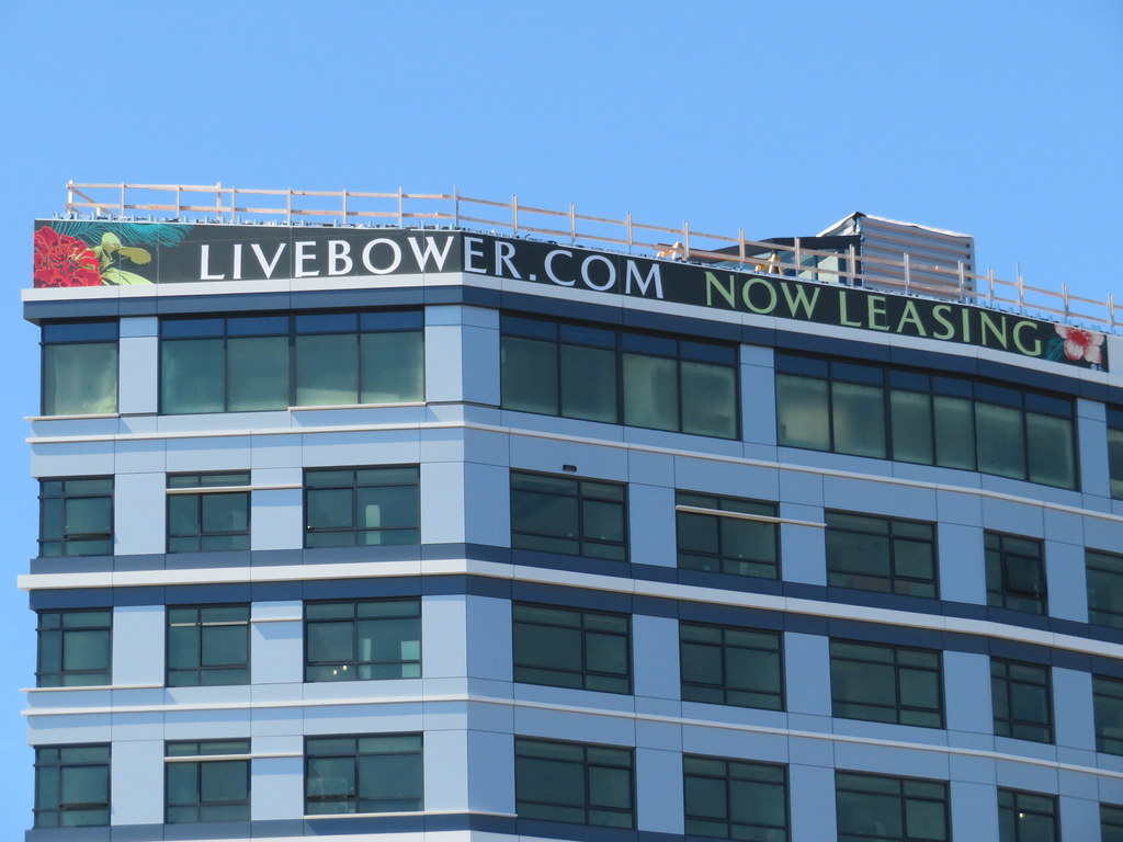
That roof/mechanical covering that looks like siding is UGLY.
 
Both of these buildings are a mess. The low rise looks a lot like the hotel in the seaport near summer street- that thing is in the running for ugliest building in Boston, its horrid
 
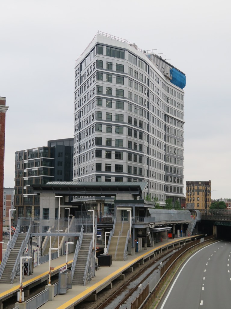
Still more visually interesting than the taller tower where from exposed tyvek to finished cladding nothing changed visually.
 
Still more visually interesting than the taller tower where from exposed tyvek to finished cladding nothing changed visually.
Yeah people are being unnecessarily hard on something that isn’t even completed and/or is much better than the alternative.
 
50060617172_b3a2db7168_b.jpg


50059806413_467e01dd58_b.jpg
 
A second huge air rights project just up the road — the long-planned Fenway Center complex — is also on track to start work soon, its lead developer, John Rosenthal, said Friday. The $1 billion project has money in hand to build its vast deck over the Pike, he said, has filed for a building permit and is finalizing terms of its deal with MassDOT.

“We expect to start construction on our foundation and deck in August,” Rosenthal said. “I’m still pinching myself.”


If you told me a few years ago that this project would actually start construction in the best of times, much less during an economic panic...
 
This is one of the worst facades Ive ever seen. The color is horrible and the horizontal elements look slapped on.
 
I've been following this thread since it was created and scrolling through all of the construction photos (although not always with the most scrutinizing eyes). Today is the first time I noticed that the facade on the taller of the two buildings is the final product. I just assumed it was insulation and awaiting cladding. Woof.
 
I have an irrational hatred for this project, in part because I have to see it so often.
Such a mangled design of limp massing moves, incoherent facade rhythms, and cheap-looking materials. I hate hate hate those little triangle fins that stick out at the corners, like the last remnant of any architectural idea. The blue and white stripes remind me of one of those canvas belts.
 
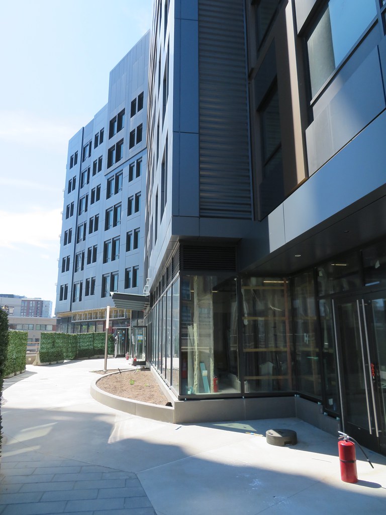
The construction fencing around the shorter building has all been taken down, so you can now walk right out on the new plaza and push your face to the windows. The taller building is still fenced off, but probably won't be for too much longer.

The street level changes here are impressive. Tons of retail space (nearly two full floors!), a new landscaped deck over Lansdowne Station, and a new cut-through connecting Beacon to Ortiz. This corner used to be a total no-man's-land, but this project does everything right to bring life here. Now they just need the neighbors (Fenway Sports Group, a commercial REIT, and BCH/Scape) to step it up as well.

Yeah, the facades are lousy, but this is definitely one that is better up close than from afar. I'll take that over the opposite any day.
 
Last edited:
You people complain way too much! Nobody trying to build over the Pike is going to put up the Taj Mahal during Phase I. The money and ROI just isn't there. Nothing wrong with this development which has livened up a dead space.
 
You people complain way too much! Nobody trying to build over the Pike is going to put up the Taj Mahal during Phase I. The money and ROI just isn't there. Nothing wrong with this development which has livened up a dead space.

Picking the right combination of facade panel colors isn't the Taj Mahal. This building will literally make people nauseous.

FWIW, the name appears to be "Bower Boston" on the taller one. Maybe rename this thread and split off the Phase II, or vice versa?
 
I have an irrational hatred for this project, in part because I have to see it so often.
Such a mangled design of limp massing moves, incoherent facade rhythms, and cheap-looking materials. I hate hate hate those little triangle fins that stick out at the corners, like the last remnant of any architectural idea. The blue and white stripes remind me of one of those canvas belts.

I think it would look better without the blue. Trying too hard, maybe?
 
You people complain way too much! Nobody trying to build over the Pike is going to put up the Taj Mahal during Phase I. The money and ROI just isn't there. Nothing wrong with this development which has livened up a dead space.

No issue with it as a development. This area sorely needs it, so I'll take what we can get. But being cheap doesn't mean it needs to have a facade like that. The random trim arrangement is intentional, but is so water-ed down they should have just gone with a clean grid. There's actually a small portion on the inner side of the short building that is clean and handsomely arranged, but the rest is so poorly done.

Also, while this is a good step, it's still basically an island. The parking lot to the east is pretty vast and separates it from the block. And then the Yawkey lot right to the south... Not a great place to be just yet, especially with all the road noise from the pike and Beacon (the new intersection looks to be an attempt to slow/quiet that down). But hopefully it fills in over time.
 

Back
Top