Fenway Center (One Kenmore) | Turnpike Parcel 7, Beacon Street | Fenway

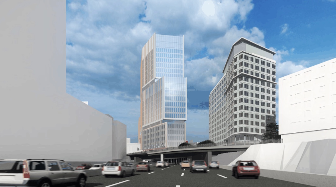
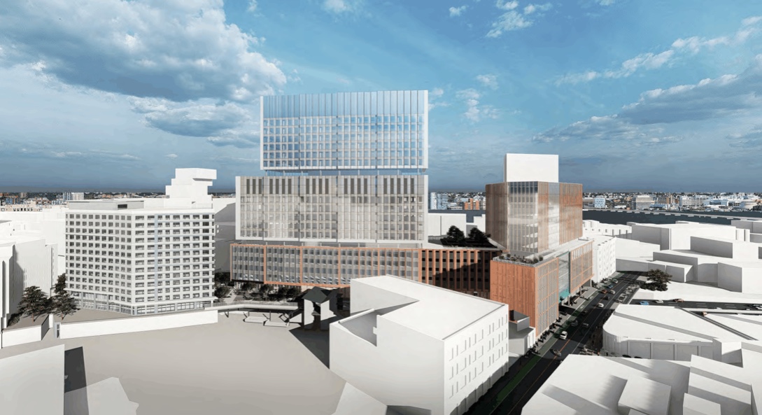
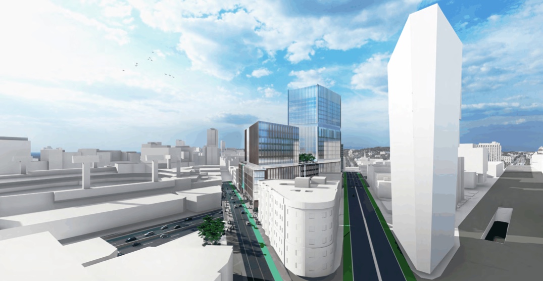
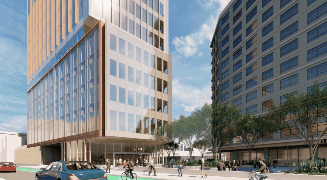
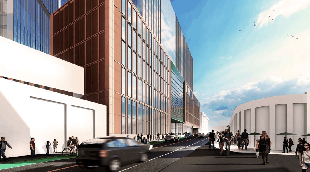
I don't comment often but this new design is a huge step down from the last iteration. I wasn't a big fan of the wide massing to begin with, but I understand the economics of building over the pike require a certain square footage. The dark color of the tower and dark metal on the lower mechanical floors is incredibly foreboding. The new, red façade on the Brookline Street side loses all of the human scale and congruency that the previous design contained. I can't believe this is what they "heard."

I gotta agree with this. The design I could take or leave but the street level interaction is much worse with the new design.
 
I gotta agree with this. The design I could take or leave but the street level interaction is much worse with the new design.

That may also be a factor of the computer graphics. There's a whole slew of difference between those two sets - not the least being the total sweeping of any visible life (human, auto, pet, trees etc) and bleaching of the roads/sidewalks in the second set.

I'm going to go Pollyanna here and just hope that it was more a factor of the computer graphics and it being more of "massing" illustration the second time around........The first one is really jazzed up to show a garden of Eden.

.
 
Last edited:
Love it when something comes down and polarizes the group like this. I'm into it personally:
  • The Brookline Ave front feels like a present-day take on our old buddy down the street Holiday Inn Brookline (image from before it lost its affiliation and its red paint job). That building maybe isn't for everyone but I know it has some fans on here. This will be color with continuity, and not just some patchwork of shaded tiles like we're seeing on Phase 1 right now. I also think there should be a lot less new brick in the 2020s, faux or otherwise. Brick shouldn't be hard to find if you're looking for some around here.
  • Love the copper accent too, and have you all seen the full presentation? Page 51 here shows a whole tunnel of green through to the deck over the train station. Phenomenal sense of neighborhood context without going overboard.
  • I can take or leave either of the high-rise concepts but this one feels more honest than the earlier version, which in the renders was straining for a airy slimness that simply isn't going to be possible with such a chunker. The biggest one will be a little bit shorter than the Pierce and significantly wider. You can't vertical-stripe your way out of that massing; it will have nowhere to hide. This set of renders feels like an admission of that (see especially the view from Cambridge in the presentation).
  • Put me down for "just build it" too. I don't begrudge the discussion here but certainly don't want to see another time-consuming trip to the drawing board. We have an economic window here to get this one done and you'd hate to see another cycle end without any progress on the Pike air rights. Samuels seems like he can do it at Parcel 12; hopefully John's new mates can do it here too.


I like (well enough) the one on the left and I hate the one on the right. So of course, we are going to end up with the one on the right.

One of my biggest issues with Boston lately is the ridiculous glut of buildings between 200'-299'. It's the buildings that break that 300' barrier outside of the main downtown/Back Bay skylines that really stand out. Everything else blends into the crowd. So whenever something like this chops out the part of it that would actually cause it to stand out, it's a huge disappointment for me. (EDIT: I guess it still breaks 300', but probably lost at least 30'+ between iterations)

Plus, there has to be a pretty thin line between profitability and unfeasibility when it comes to these air rights parcels. We haven't successfully built one in the city since the 1980's! So I guess it's like, why chop down a project that's already straddling that line to begin with? The new proportions are absolutely ghastly.
 
Street level is terrible now... I like the red/black thing they got going on though.
 
Yeah I love the first iteration. Why was this building chopped? They chopped the size.. and the amazing street-level action they had ready. A little disappointed.
 
Taken today from inside the Fenway Target store
E195D474-14AE-4810-9285-4A348B300DBB.jpeg
8EC8A978-966F-4410-B2D4-8335D1B1123A.jpeg
 
Yeah I love the first iteration. Why was this building chopped? They chopped the size.. and the amazing street-level action they had ready. A little disappointed.

Because they used the BCDC comments as an excuse to value engineer and save some money. They likely never intended to build the other version.
 
I really like this, especially the way they connect the pedestrian portal thematically to Fenway Park's architecture.
 
The renders a couple of days ago made it look like they cut more height, but 337' in Fenway is nothing to scoff at and probably about 10' higher than any of us originally expected. So I mostly rescind my complaints about that aspect.
 
I like it.

Wish they were a little more ambitious with the landscaping. That could've been a nice walkway, but I fear it will turn into an empty and wind-swept walkway.

Yeah not crazy at all about the landscaping. It looks too concrete-y, and something you would see in a financial district. Very shawty design there. But I guess its better than what is there.
 
Im sure it looks worse from the sky in renders than it will in person. The ground level renders dont look too bad.
 
Yeah not crazy at all about the landscaping. It looks too concrete-y, and something you would see in a financial district. Very shawty design there. But I guess its better than what is there.

It's not bad on its own merits but when you compare to the far more thoughtful Parcel 12 (even post-value engineering) it's kind of weaksauce.
 
Im sure it looks worse from the sky in renders than it will in person. The ground level renders dont look too bad.

Eh, parts of this are really lazy, IMO.

1582764380446.png
1582764409016.png

1582764494461.png


The stretch with the most potential is rather barren, and the design of the plaza opening up looks like it wasn't quite thought out that much, like they just put some random shapes together with circles and called it a day. Usually there's some apparent logic or design details that I can appreciate, despite not having training in landscape architecture, but I'm really struggling to see it here.
 
Is that going to be a bus lane and bike lane if its going to be that wide? or just put some deliniators in if there's that much space for the bike lane
 
Is that going to be a bus lane and bike lane if its going to be that wide? or just put some deliniators in if there's that much space for the bike lane

Renders aren't often accurate with regard to infrastructure layouts. Bike lane and lane configuration are often more solidified in the engineering docs we don't often get to see.

If there's a wide bike lane there as the render suggests, then it could possibly be 2-way bike lane, which I believe has to be 8 feet wide, a shared bus and bike lane as you suggest, or there could be an un-illustrated divider.
 

Back
Top