You are using an out of date browser. It may not display this or other websites correctly.
You should upgrade or use an alternative browser.
You should upgrade or use an alternative browser.
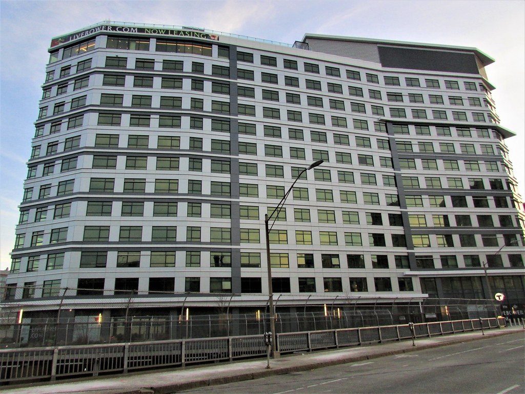
Fenway Center (One Kenmore) | Turnpike Parcel 7, Beacon Street | Fenway
 IMG_7071
 IMG_7075
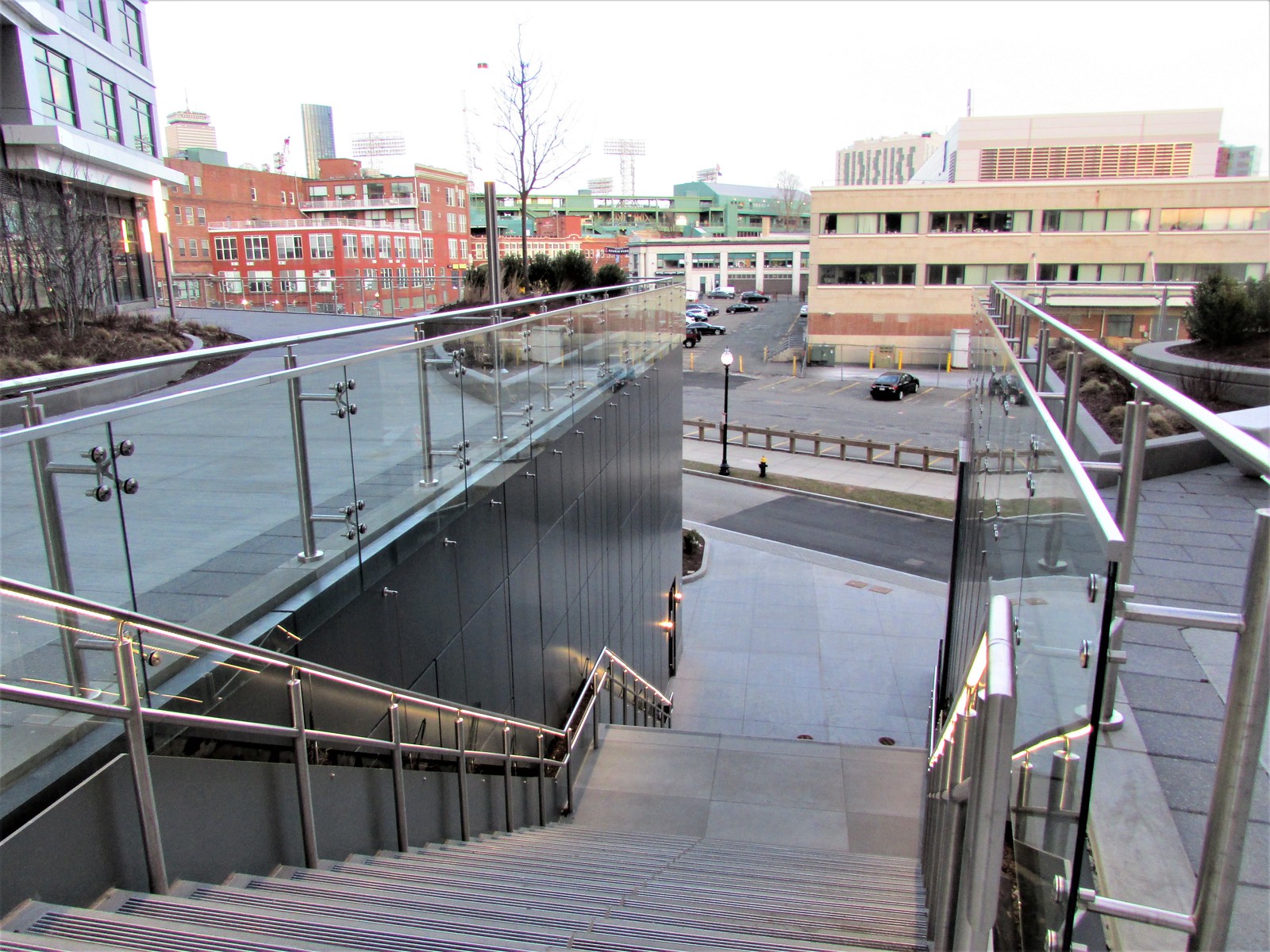 IMG_7078
 IMG_7079
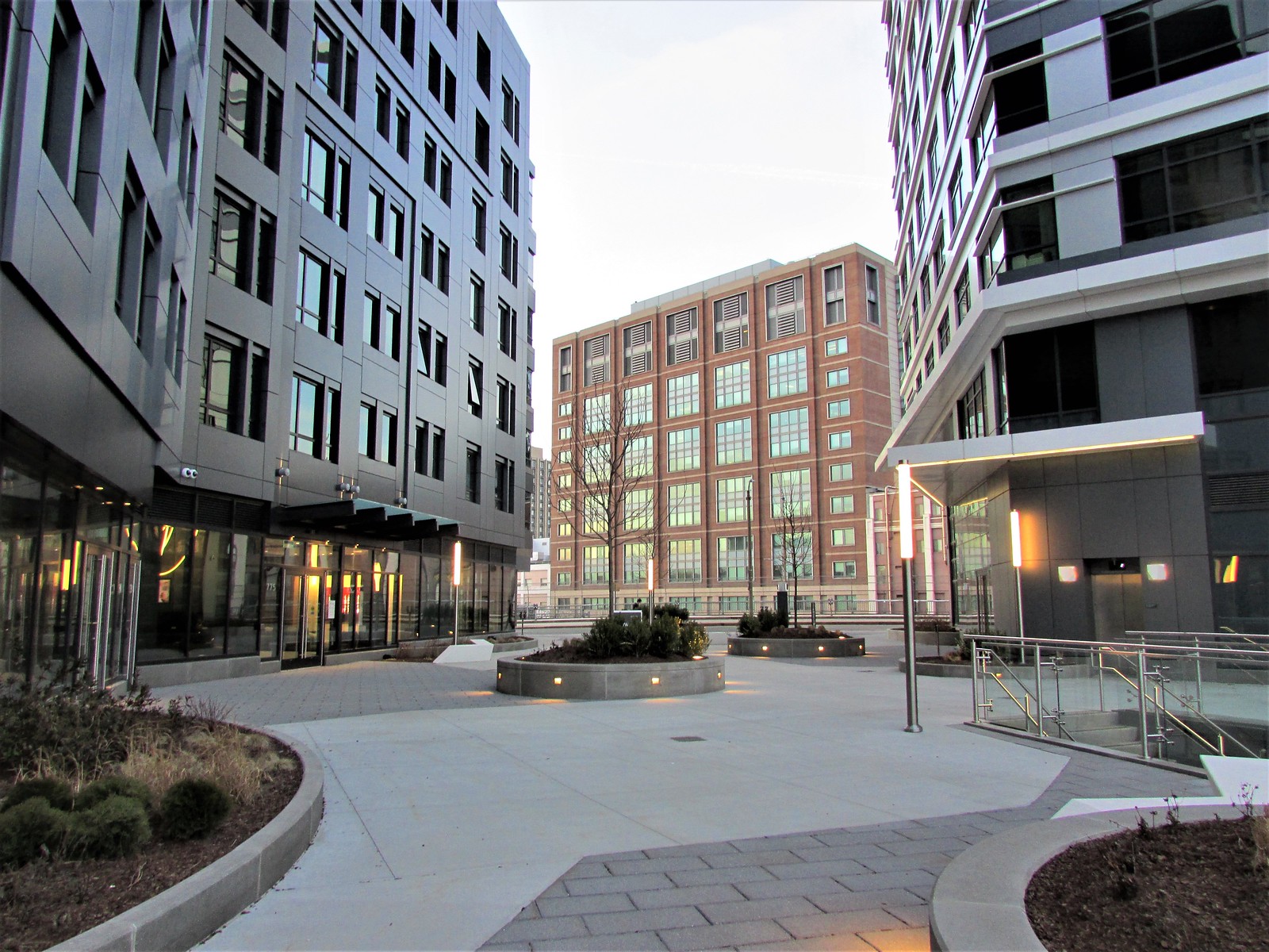 IMG_7080
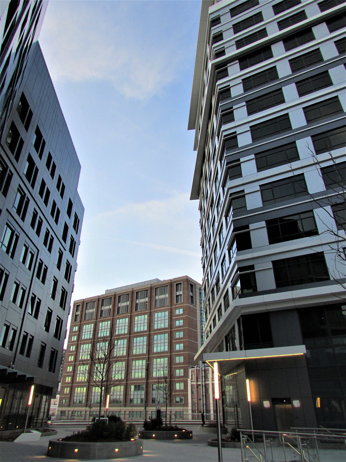 IMG_7081
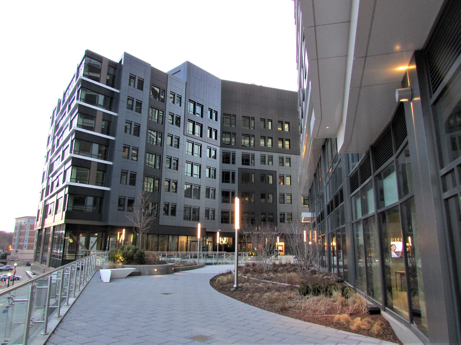 IMG_7086
 IMG_7096
3/23 Part 2 - Buildings. See Part 1 above for Landscaping.
 IMG_7062 by David Z, on Flickr
 IMG_7064 by David Z, on Flickr
 IMG_7083 by David Z, on Flickr
 IMG_7085 by David Z, on Flickr
 IMG_7090 by David Z, on Flickr
 IMG_7105 by David Z, on Flickr
 IMG_7112 by David Z, on Flickr
 IMG_7114 by David Z, on Flickr
 IMG_7115 by David Z, on Flickr
IMG_7062 by David Z, on FlickrIMG_7064 by David Z, on FlickrIMG_7083 by David Z, on FlickrIMG_7085 by David Z, on FlickrIMG_7090 by David Z, on FlickrIMG_7105 by David Z, on FlickrIMG_7112 by David Z, on FlickrIMG_7114 by David Z, on FlickrIMG_7115 by David Z, on Flickrnavigator4
Active Member
- Joined
- Aug 5, 2015
- Messages
- 227
- Reaction score
- 98
I don't see the over-Pike portion starting? Lets get it going before the post-COVID traffic resumes.
FormFollowsBudget
Senior Member
- Joined
- Jan 15, 2015
- Messages
- 2,318
- Reaction score
- 4,106
I don't see the over-Pike portion starting? Lets get it going before the post-COVID traffic resumes.
Still has to get approval through BCDC. Expect it soon, probably...
Equilibria
Senior Member
- Joined
- May 6, 2007
- Messages
- 7,230
- Reaction score
- 8,760
BCDC:
How do green walls typically do with diesel fumes?


How do green walls typically do with diesel fumes?
JumboBuc
Senior Member
- Joined
- Jun 26, 2013
- Messages
- 2,808
- Reaction score
- 1,995
That link is a 47-55 LaGrange NPC.BCDC:
How do green walls typically do with diesel fumes?

FormFollowsBudget
Senior Member
- Joined
- Jan 15, 2015
- Messages
- 2,318
- Reaction score
- 4,106
Jesus they're not even being subtle about it anymore..

Architecture loses it's relevance trying to become relevant for Instagram. Maybe it works for marketing for a hip hotel room, but a public walkway?
Luckily I'm seeing no spaces that wannabe-LA-influencers will want to flaunt to for a photo and then leave for the few months it's cool, but having our design leaders dictate more inauthentic spaces that provide mere 'moments' and likes is, put simply, just sad.
Jesus they're not even being subtle about it anymore..
View attachment 11670
Architecture loses it's relevance trying to become relevant for Instagram. Maybe it works for marketing for a hip hotel room, but a public walkway?
Luckily I'm seeing no spaces that wannabe-LA-influencers will want to flaunt to for a photo and then leave for the few months it's cool, but having our design leaders dictate more inauthentic spaces that provide mere 'moments' and likes is, put simply, just sad.
I mean, I'm no fan of the obsession with making everything "Instagram-able," but I also appreciate efforts to improve the aesthetic and experience from a pedestrian standpoint. The problem is often execution - duplicating the "What Lifts You" mural in Keene, NH is certainly inauthentic. But making a place "Instagram-able" by taking advantage of a location's unique view of the skyline, being thoughtful about planting trees/flowers/bushes, or using varied materials and textures is better than simply going with the cheapest/easiest solution (even if the "Influencers" constantly posing are obnoxious). It's not all B.S., it's just that the bad examples are glaringly obvious.
FormFollowsBudget
Senior Member
- Joined
- Jan 15, 2015
- Messages
- 2,318
- Reaction score
- 4,106
I mean, I'm no fan of the obsession with making everything "Instagram-able," but I also appreciate efforts to improve the aesthetic and experience from a pedestrian standpoint. The problem is often execution - duplicating the "What Lifts You" mural in Keene, NH is certainly inauthentic. But making a place "Instagram-able" by taking advantage of a location's unique view of the skyline, being thoughtful about planting trees/flowers/bushes, or using varied materials and textures is better than simply going with the cheapest/easiest solution (even if the "Influencers" constantly posing are obnoxious). It's not all B.S., it's just that the bad examples are glaringly obvious.
Taking consideration of views/context and creating a beautiful place is a central crux of architecture. I'm not dismissing that. Writing out that they wish for instagram-able moments implies that it's a priority. There are numerous critiques on these kind of Instagram-focused spaces and their lack of attention to function and beauty, an ironic representation of the wasteful and lipstick-on-a-pig nature that thrives on Instagram.
I think the "Instagram-ability" of a place should be a side effect of good design, not a project goal. If you're a designer with a conscience working on a space that you expect a lot of people to move through and around, you design with that in mind. Adding the Instagram caveat adds artificiality to the project goal and cheapens the value architects provide, IMO.
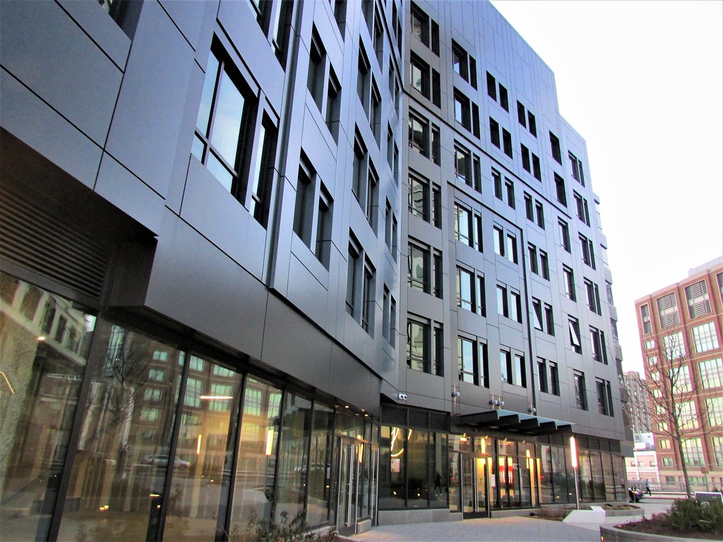
I like the results overall, except that everything is so monotonously gray. Even more than NEMA in the Seaport. Is gray the current "in" color with architects?
kz1000ps
Senior Member
- Joined
- May 28, 2006
- Messages
- 9,187
- Reaction score
- 13,720
I like the results overall, except that everything is so monotonously gray. Even more than NEMA in the Seaport. Is gray the current "in" color with architects?
You haven't noticed? Architecture, interior design, fashion, even vehicles.... grayscale is king. We've been in a 50 shades of gray design universe for almost a decade now (and it feels even longer).
Ha! Would you believe I haven't? I'm the kind of guy that could go out to dinner and sit for two hours across the table from you eating and chatting, and if you called me when you got home and asked me what color shirt you were wearing or whether you were wearing glasses, the odds are excellent that I'd have no idea.

RandomWalk
Senior Member
- Joined
- Feb 2, 2014
- Messages
- 3,793
- Reaction score
- 6,820
The white patches look like the beginning of a player piano roll.
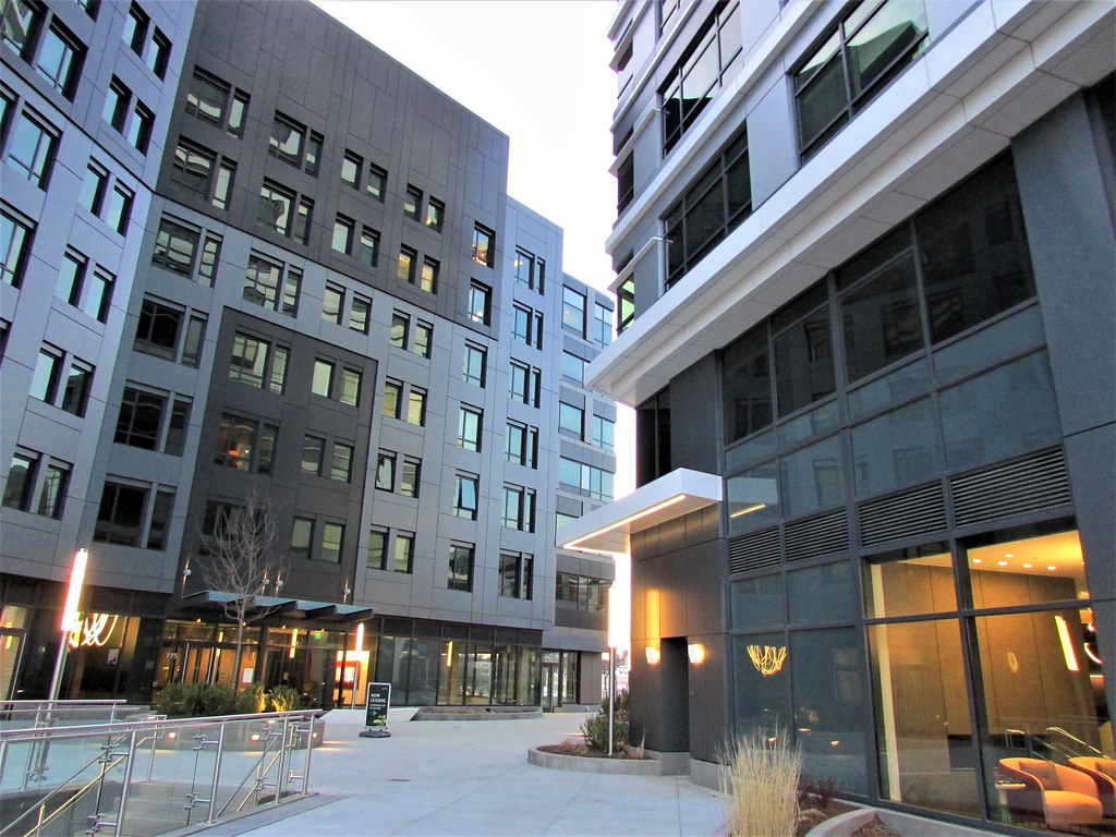
In low light, viewed from the central courtyard (XEC's pics above), this place doesn't look too bad.
Who? Me? Where? What pics?
Who? Me? Where? What pics?
Sorry, wrong attribution, you commented on DZ's photos. Thanks DZ
In low light, viewed from the central courtyard (XEC's pics above), this place doesn't look too bad.
That last pic, in broad daylight, is an aesthetic kick to the face. Not knocking KZ's photographic abilities.
Agreed. That facade, in its astonishing lack of textural depth, looks like the set-up to a visual gag from a Zucker Brothers movie--some kind of "breaking the fourth wall" kind of scene wherein the characters are interacting with what is supposed to be a solid and authentic 3-dimensional building structure--but when one of them merely touches it with their finger, the whole cheap flimsy 2-d set collapses, reminding the audience that the movie is just a movie, being filmed on a Hollywood sound stage.
We are truly staring at the abyss of VEd precast panel Alucobond hell... and it's ravening for our architectural souls.
Charlie_mta
Senior Member
- Joined
- Jul 15, 2006
- Messages
- 5,150
- Reaction score
- 7,779
Yeah, it does basically look like a cardboard box with cutesy designs drawn on it.Agreed. That facade, in its astonishing lack of textural depth, looks like the set-up to a visual gag from a Zucker Brothers movie--some kind of "breaking the fourth wall" kind of scene wherein the characters are interacting with what is supposed to be a solid and authentic 3-dimensional building structure--but when one of them merely touches it with their finger, the whole cheap flimsy 2-d set collapses, reminding the audience that the movie is just a movie, being filmed on a Hollywood sound stage.
We are truly staring at the abyss of VEd precast panel Alucobond hell... and it's ravening for our architectural souls.