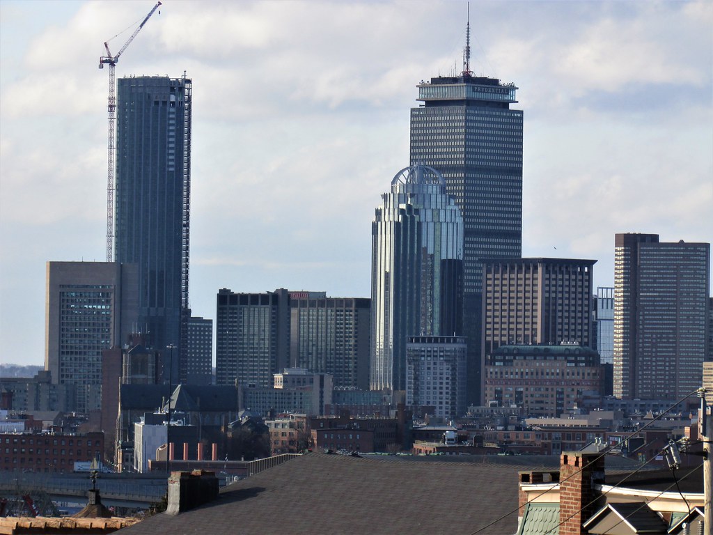
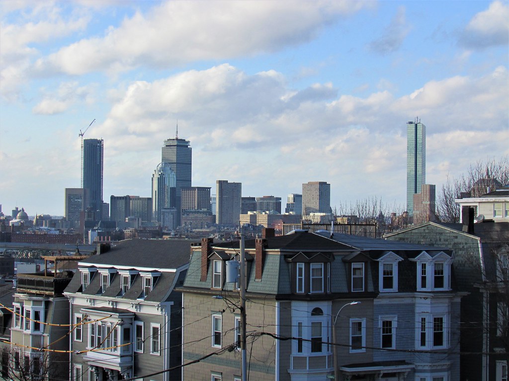
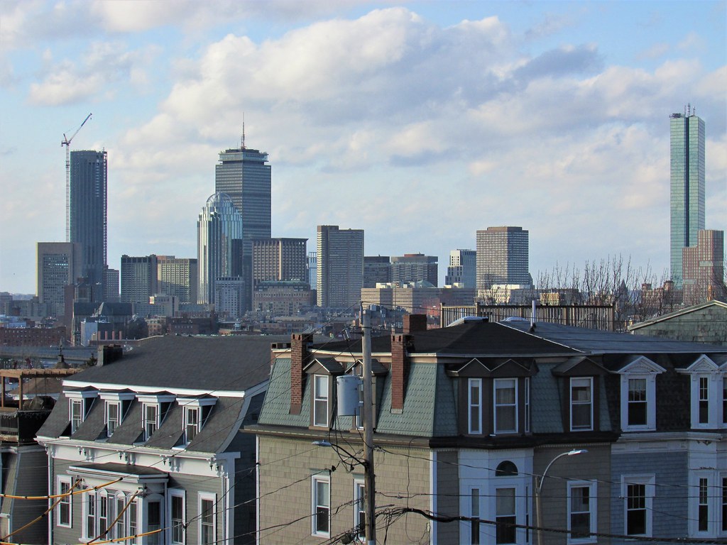
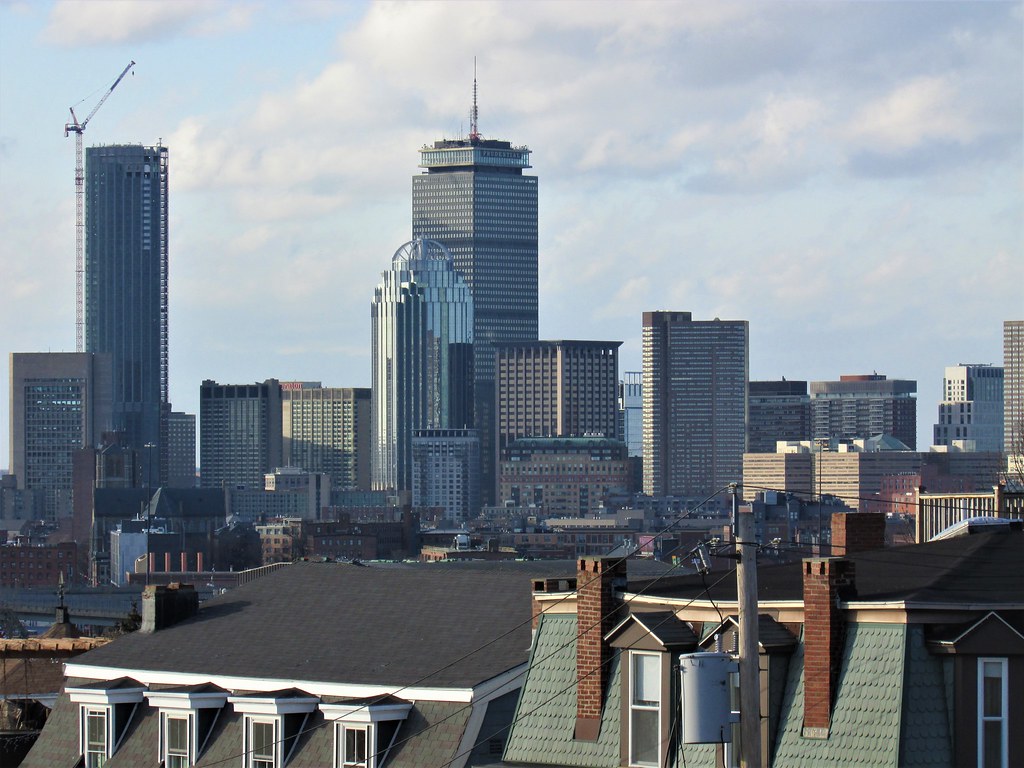
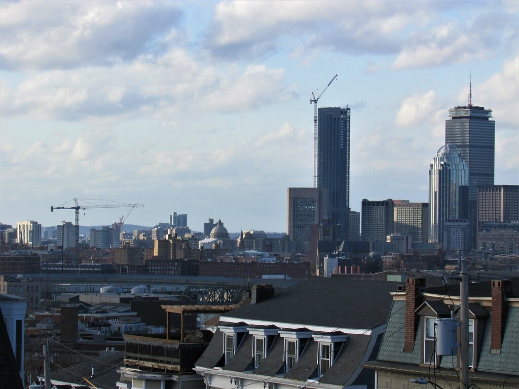
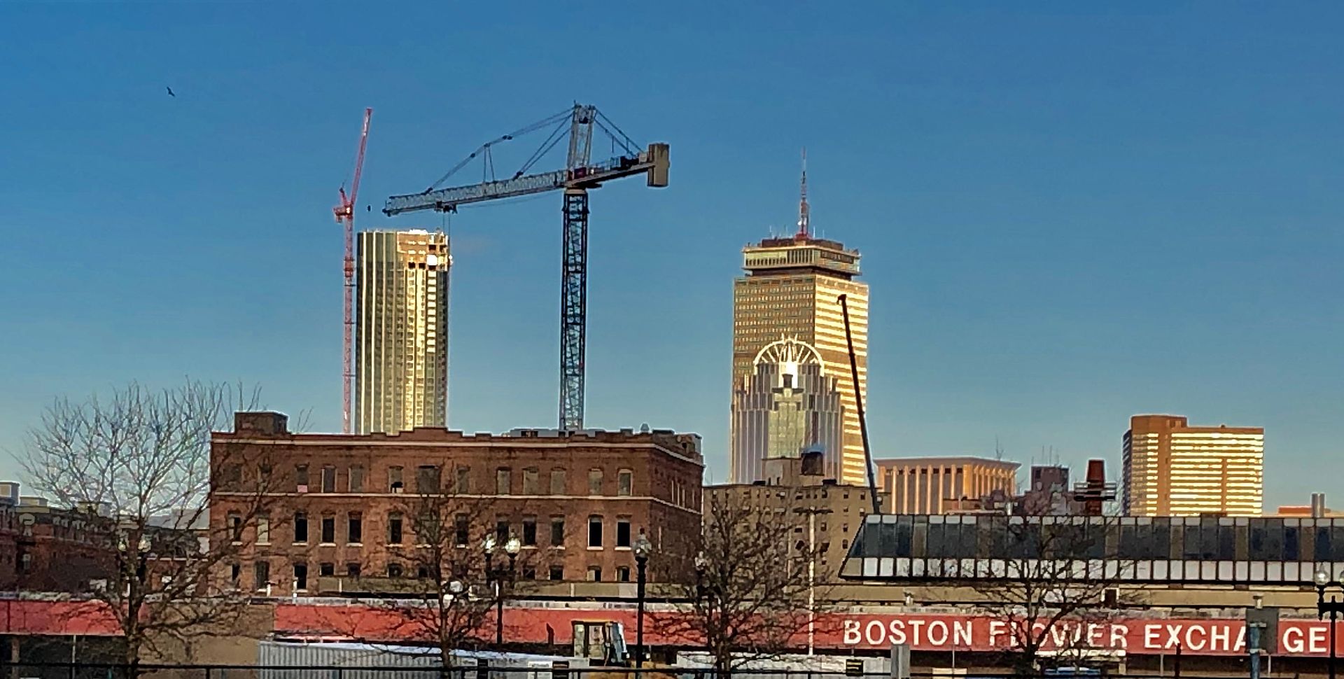
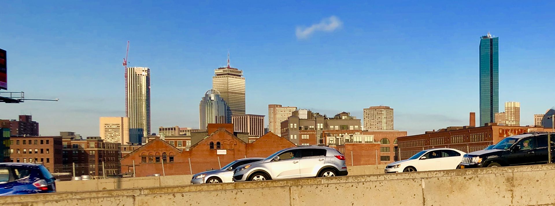
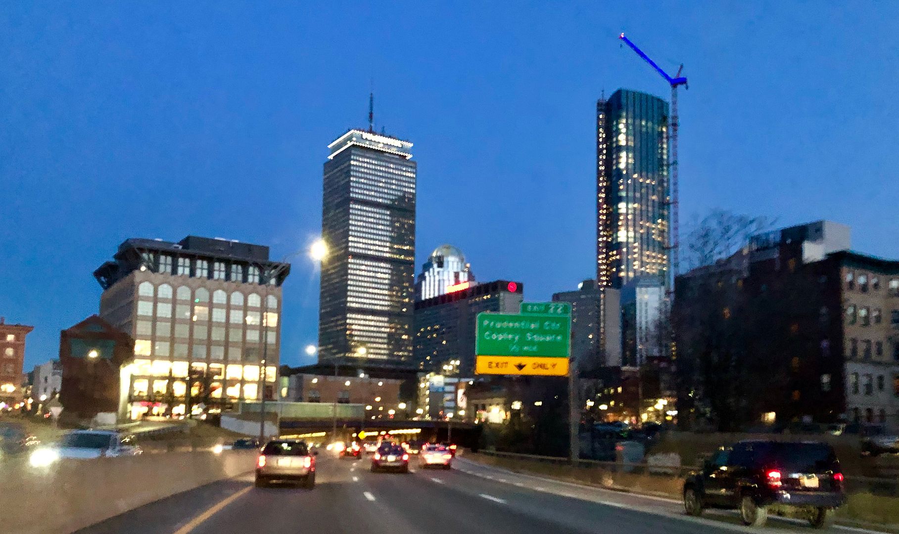
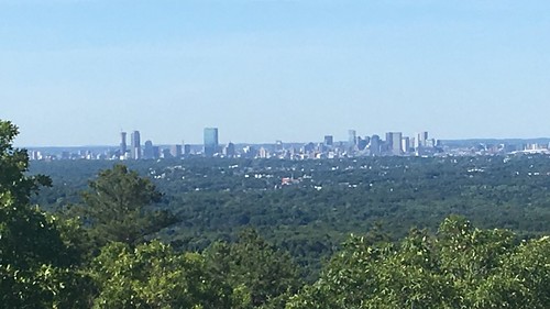
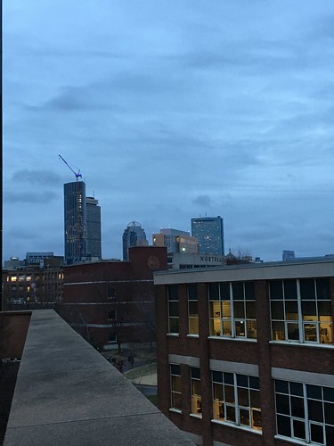
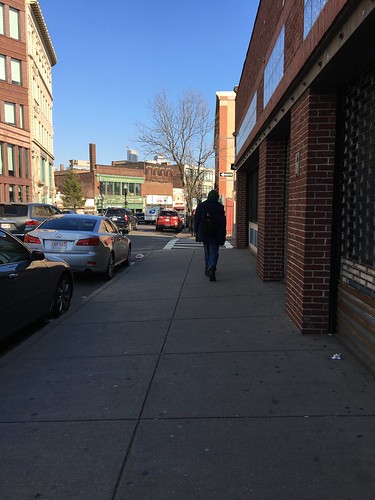
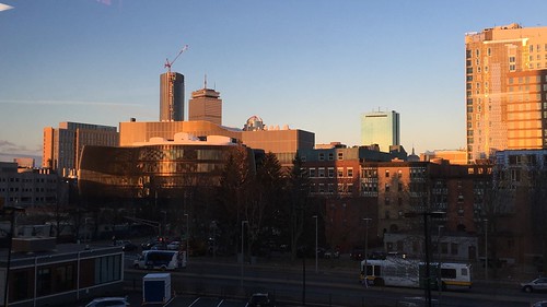
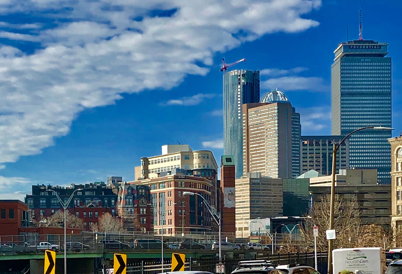
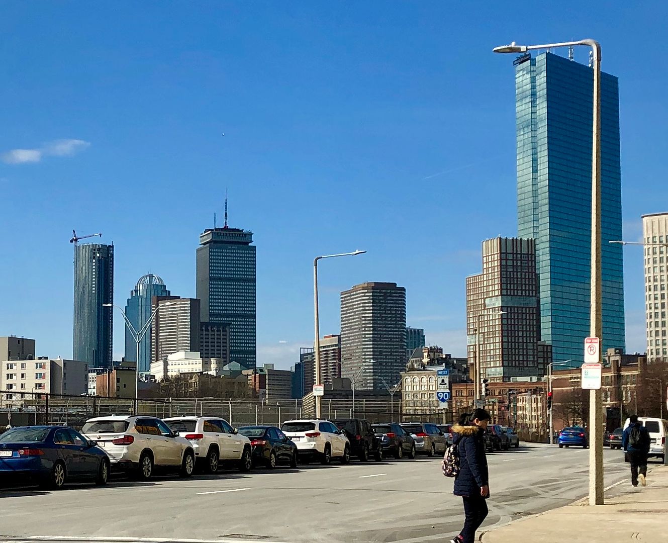
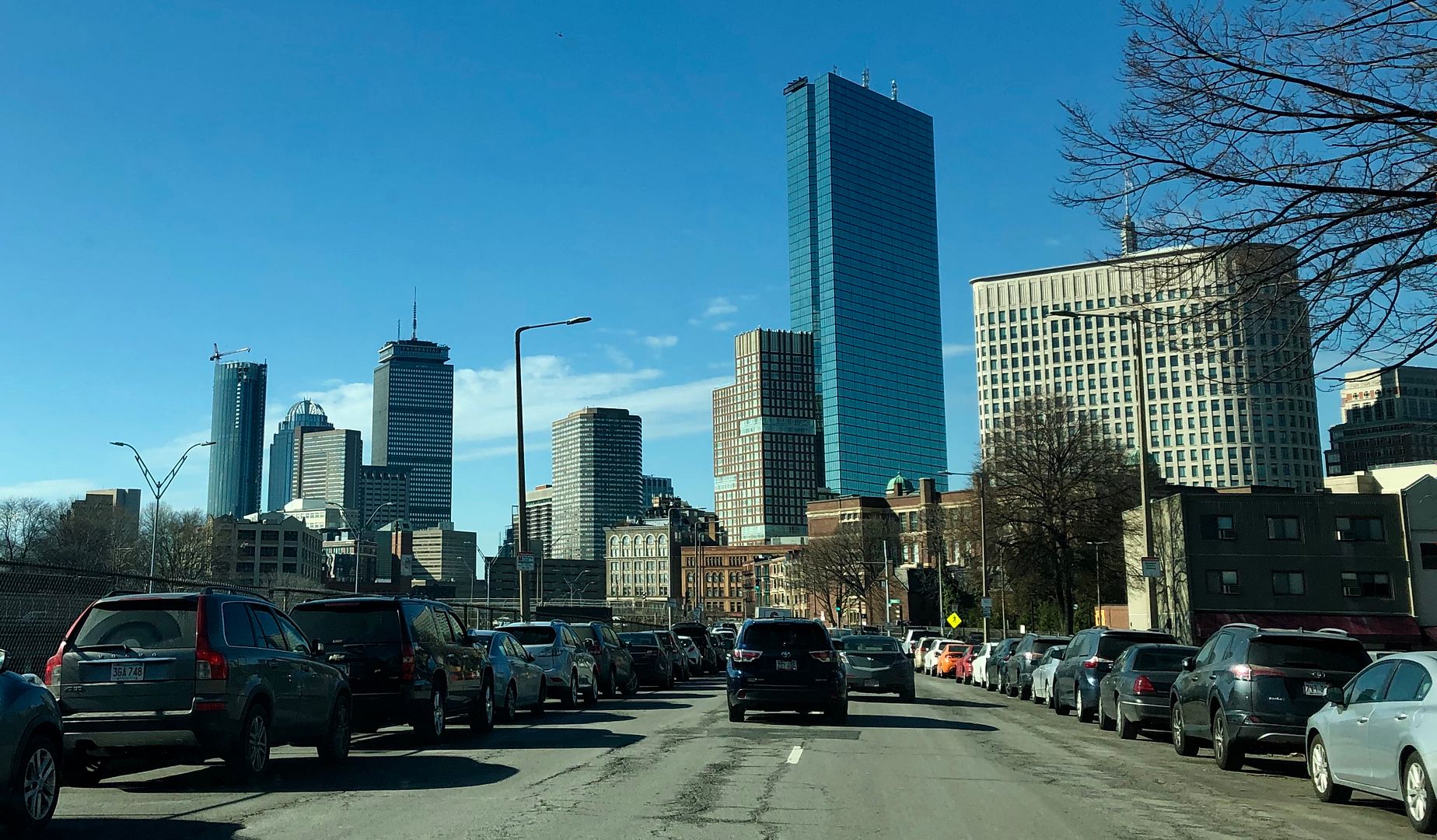
Four Seasons Tower @ CSC | 1 Dalton Street | Back Bay

Y'all mofos are crazy. B? B+? Must be the dampness of Boston winters or something.

The buildings in #4007 are some of the tallest and most spectacular buildings u/c on the planet. Not a real comparison. More realistic comparisons are in my hood. There are 2 condo buildings going up nearby, 1 900' and 1 1,000' and friends who have checked out condos in there were unimpressed. Starchitects designed the outside and people ohh and ahh, but the 2-br units are $6M with odd layouts, and the fixtures / kitchens / bathrooms are slightly better than Home Depot quality.

I think this building is awesome for Boston, it is elegant and looks as good / better than the renders. It makes an impact.

Might this be a function of high quality = heavier weight of materials, and the cumulative loads become too great?
 
Y'all mofos are crazy. B? B+? Must be the dampness of Boston winters or something.

The buildings in #4007 are some of the tallest and most spectacular buildings u/c on the planet. Not a real comparison. More realistic comparisons are in my hood. There are 2 condo buildings going up nearby, 1 900' and 1 1,000' and friends who have checked out condos in there were unimpressed. Starchitects designed the outside and people ohh and ahh, but the 2-br units are $6M with odd layouts, and the fixtures / kitchens / bathrooms are slightly better than Home Depot quality.

I think this building is awesome for Boston, it is elegant and looks as good / better than the renders. It makes an impact.

I absolutely agree--we shouldn't compare Boston buildings to NYC buildings (or buildings in 30+ other cities), but when one invokes "world class," that's the comparison being suggested. I like the building well enough--it's a nice addition to Boston but few out-of-towners are going to ohh and ahh any more than a $6M apartment is going to have "slightly better than Home Depot-quality" fixtures. We can like Boston without the hyperbole.
 
I mean you have to compare this to other 750 footers. Were a height restricted city, so thats just what it is, but comparing to 1200 footers is unreasonable. Of course theyre going to be more iconic, you have room to fit spires and dramatic aspect ratios. For a 750 footer this is great. It is fairly simple but that can be a good thing like the Hancock. I agree its not one of the new world beaters but it is very nice with its rounded corners, 3 sides, cuts creating the lines thaat extend to the crown. Its great in its understatedness and attention to detail like the rounded glass panels creating the corners. It looks simpler than it really is which is the mark of good design. I think this and Winthrop center are perfect in the way that both are great designs where one excells through understatedness and the other through boldness.
 

do you objectively consider the Pru to be "A-quality" level design, or are you factoring in history, nostalgia, etc.?

as a building i think it's aggressively dull and it's been maintained (on the exterior) pretty poory, with the only real "win" being the crown (and only b/c boston has so few). with it's history and all the memorable "go sox" etc. moments, i'm fond of it, much as i would be the ugly old family dog, but grading it w/o emotion i'd say it's C+ at best.

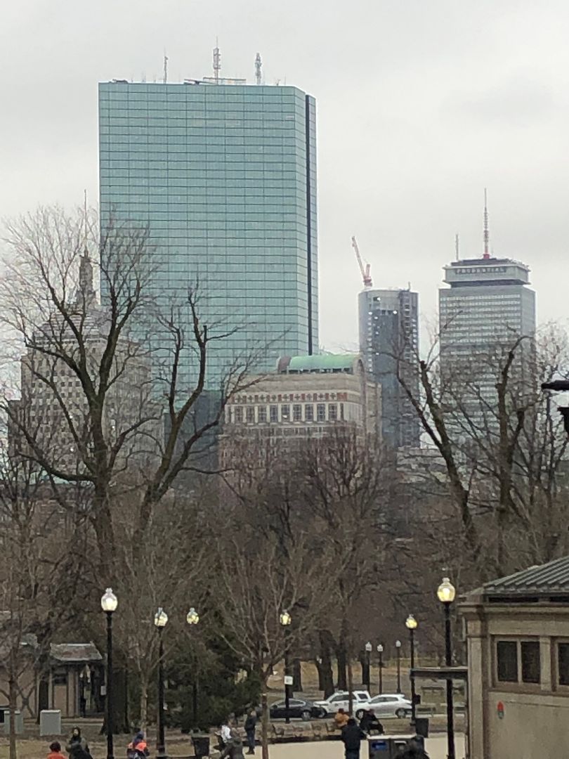
I dunno about Odurandia but I really really love the Pru. It's very unique and shows off a sort of mid 20th century Modernism that we really lack around Boston.

The skin on it is awesome and very detailed (but definitely not maintained).

Oddly enough I think the crown kind of takes away from the Pru... I never saw it in person pre-Crown, but I like it more from the pictures I've seen.
 
Yea the pru facade is surprisingly intricate and detailed for what resembles any other grey box from a distance. I love the Pru, it also keeps a level of grittiness to an otherwise very cleaned up and polished city these days. Adding glass towers is great, but they look better with something to contrast against.
 
i agree it's unique and very much a part of Boston's identity. i do, in fact, like it. i just wouldn't give it an "A" on design alone.
 
In the Deep South the Pentecostals fight with the Baptists who fight with the Fundamentalists who fight with the Charismatics, who break bread with the Black Churches who clash with the Church of God who fight with the Assembly of God who in all, can't stand Jehovah's, Seventh Day Adventists, and Mormon folk.... who all in turn, hate the Catholics, Unitarians & Methodists (srsly; they should all get a room)....
do you objectively consider the Pru to be "A-quality" level design, or are you factoring in history, nostalgia, etc.?

as a building i think it's aggressively dull...

The forum may argue on significant points such as 1 Bromfield 709' vs 410' vs not at all, or 5 stories vs 10, or 12 vs 18 vs 21 (for Seven Channel Center). But, there are true/not outlandish things we can say about the Prudential Bldg (no one's feelings hurt)....

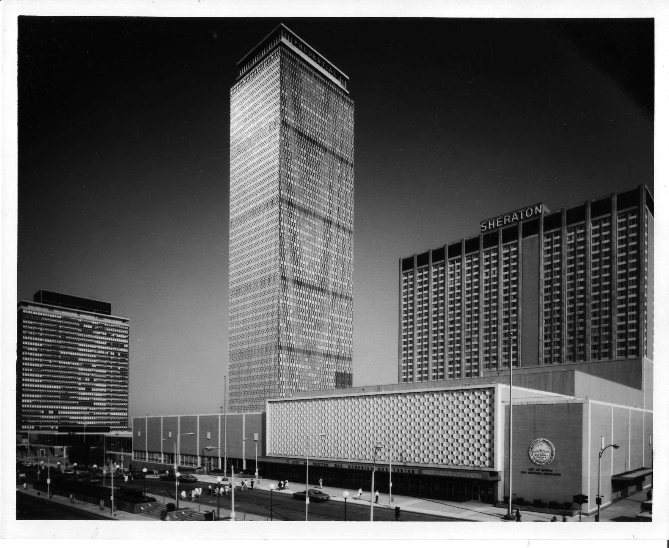
1. The Pru if scaled for 1964 grade: A++
2. Pru scaled for 1964 tower height upon completion; 10th tallest in the world.... grade: A
3. tallest in the world outside of NYC.... A/A+
believe it or not;
4. The Pru is the most beautiful >200m skyscraper built in the 1960s;
seeing is believing!!
5. The Pru ranks in the top 10 'modernist' towers of the 1950's/60's.
6. Hell if it isn't the most beautiful thing from the 1960's; (bring 'em on)!!
i'm certain Brut has a few serious contenders. in any case grade; A
7. Scaled for historical significance, + bringing Boston out of the Dark Ages!!
8. Standing tall and proud as a true shining moment of Urban Renewal in Boston!! grade A
9. Pru passes the test of time of 50's/60's ('pick 'em' with Van der Rohe's ~520' Seagram Bldg) grade; A+
10. the design is very respectable by any historical standard for skyscraper construction! grade; A-!!
11. The Pru co-shares w/ the JHT the title; "is Boston!" grade; A!!


If it were maybe, ~770' i think it would look better, and earn an A+

Much taller, might be subtraction by addition for the Back Bay itself.

*A few tall neighbors; approved towers up incl, Copley Tower....
the Midtown Motel site getting a >500'.... maybe the south side of the Hines parcel, or the east end of the Sheraton site getting a 600' addition are real possibilities, and would complete an iconic Back Bay, with the Pru looking less alone, & more spectacular than ever!

Yes, the Pru safely earns a grade of A.

I dunno about Odurandia but I really really love the Pru. It's very unique and shows off a sort of mid 20th century Modernism that we really lack around Boston.
The skin on it is awesome and very detailed (but definitely not maintained)....

maintained (on the exterior) pretty poory....

True.


*We are fortunate to live in a City where great things can and do happen.
 
I always thought the Pru looked better without the antenna. Not sure how you could give it an A though. I mean at least it's not as ugly as the one in Chicago.

25779496303_ea0fe60ff5_o.jpg
 
^^^^^ Loving that first photo. Thanks for all your recent photos. I'm really getting home sick.
 
The Old Ugly Prudential should be torn down and replaced with a more modern 1200 foot Prudential building.
 

Back
Top