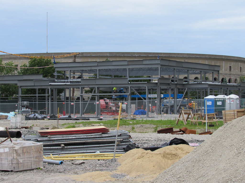
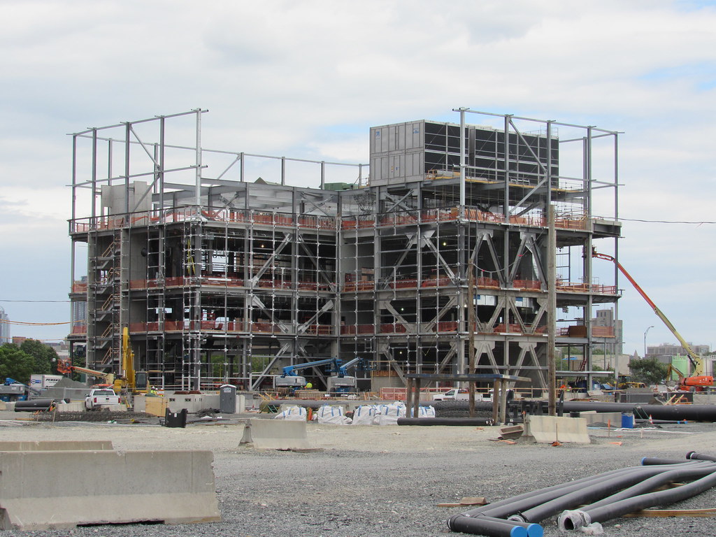
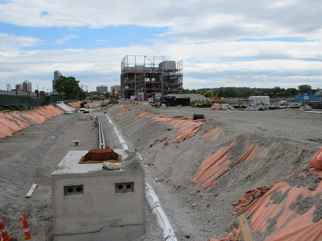
Harvard - Allston Campus

Your going to love this when it is done. Leers Weinzapfel are great designers. It will be a new landmark.

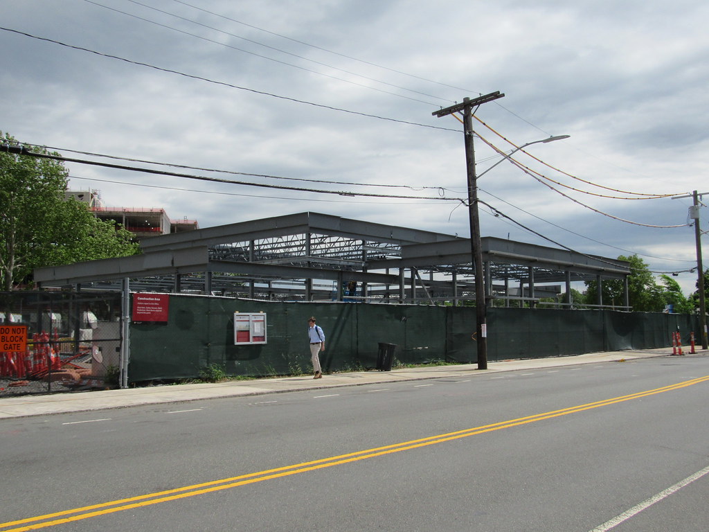
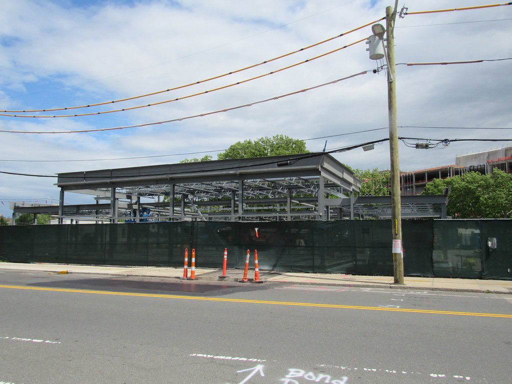
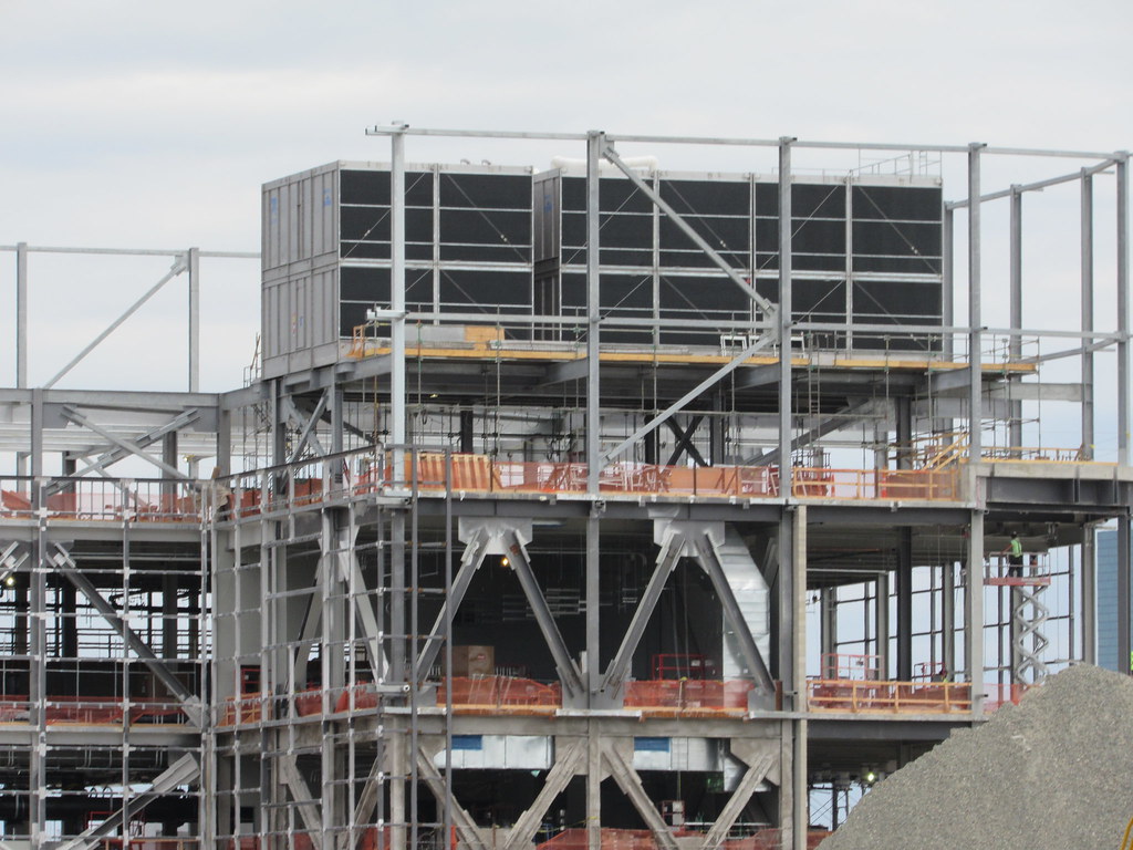
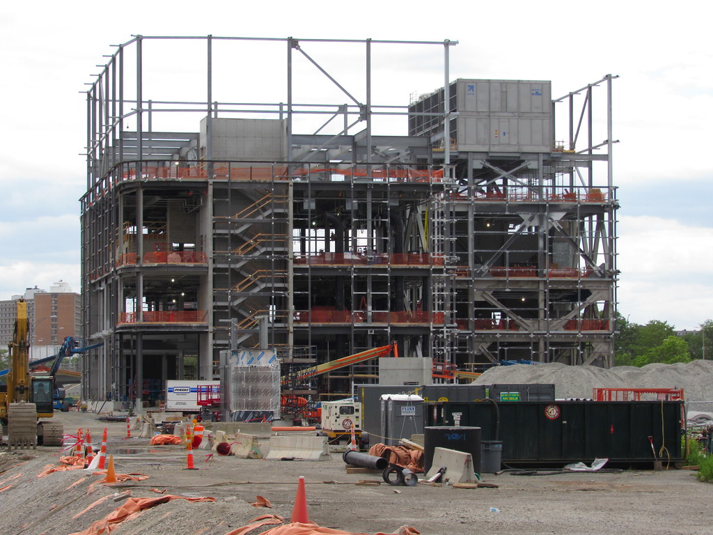
Not a real core because its not an "occupied" building. Just equipment. The non-structural steel is structural. Its holding up the screen wall that will keep us from having to look at the garbage that has to go on a roof like this.

Dont get too AB on us. This one will be a winner.

cca

Oh, yes. I've seen the renderings and am familiar with LWA's other energy projects--they've carved out a nice niche in that area. It's going to be great to see it there all by itself for many years before the stuff around it starts going in.

But I'm also enjoying how unusual it looks during construction, because we don't often see energy plants going up. So the unusual floor to floors or the empty corner where a huge tank will live make it a very evocative construction site.
 
Your going to love this when it is done. Leers Weinzapfel are great designers. It will be a new landmark.

Dont get too AB on us.

Not getting too aB! Just commenting (not judging!) on its unique appearance in this fleeting moment :)
 
i need yours all's expertise to learn what i will probably never understand.

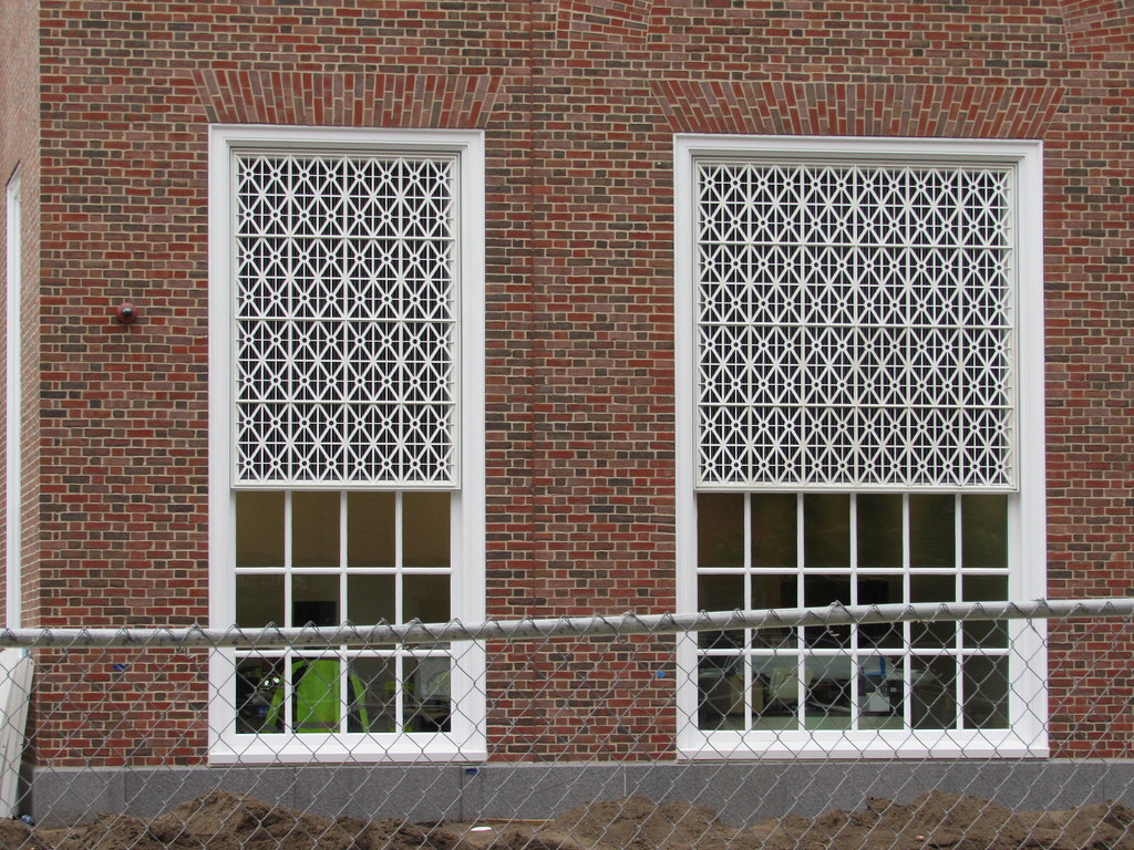
about that real nice/better than the usual mix of color of bricks.... why does this type of thing appear

to be avoided at projects like 110 Broad St or others that are near historical bldgs/ neighborhoods?

The only exceptions i can think of are Rowes Wharf and the Lovejoy Wharf cuad.

is 'faux Bulfinchy' not allowed, or just too costly?

why, why, why?
 
Faux-lonial.

Why not a forthrightly modern building that uses brick in a Flemish bond?
 
Client: "We want something that looks like what you'd expect to find on the business school campus of Harvard University"
Architect: "Done."

Most of the time an aesthetically pleasing building blending in with its surroundings is the height of architecture.

And sometimes a building that looks like a giant shoe or a polaroid camera or a giant penis is kinda funny and makes you go 'huh'. But mostly when every building looks to be the center of attention it just looks like crap that you can't wait to take down.
 
With respect to this building, Harvard may have learned a lesson, when students and others in the Harvard community objected to the proposed design for an addition to one of the 'river houses'.

So while you may not like Stern's choices (I believe this is a Stern building) those who pay the bills apparently do.

See original and revised designs for Winthrop here.
https://news.harvard.edu/gazette/story/2015/11/an-update-for-winthrop-house-renewal/
___________________
Same donor as the HBS hall, but its colder in Ithaca

IMG_8059.jpg


26805432_10155878804320132_5928426984581182768_n.jpg
 
Last edited:
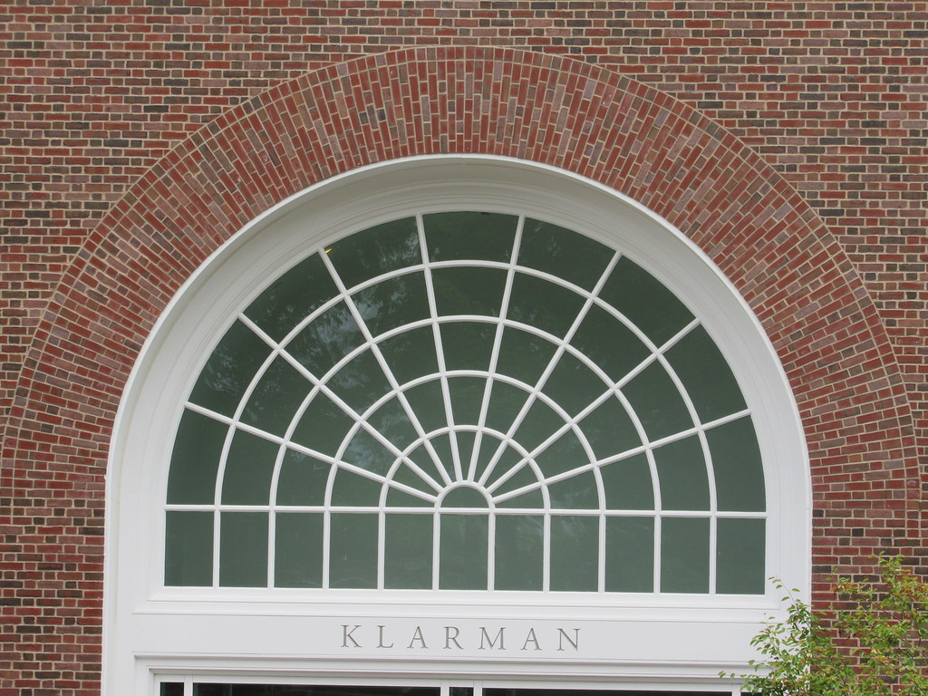
Cornell's Klarman is an abomination. They took a beautiful, civil-war era limestone building and glassed it up in the worst way.
 
Isn't the art lab supposed to be temporary? That looks rather permanent.
 
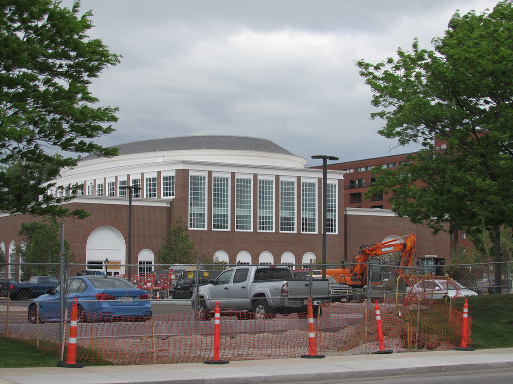
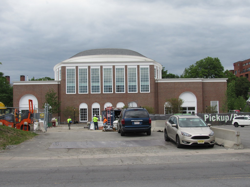
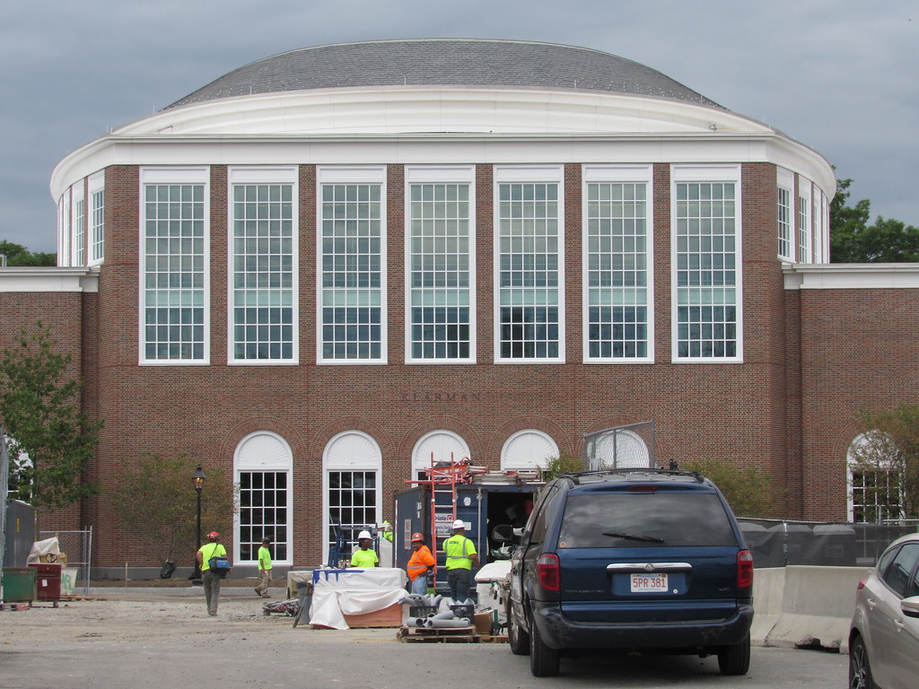
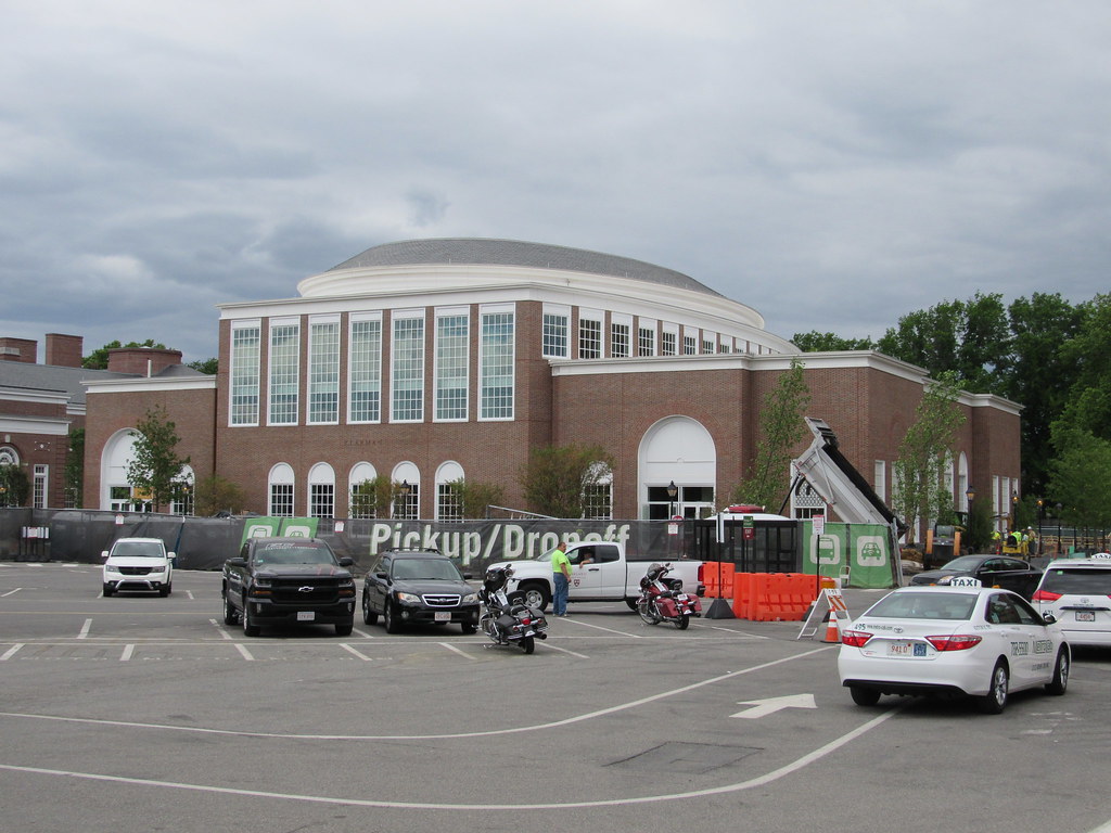
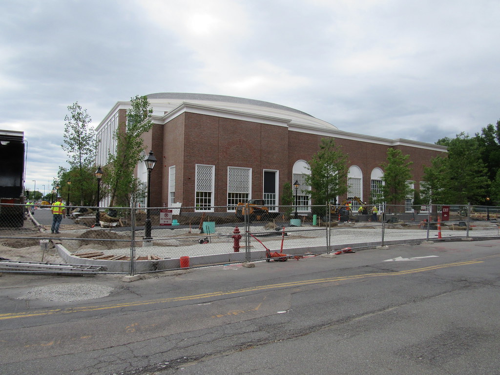
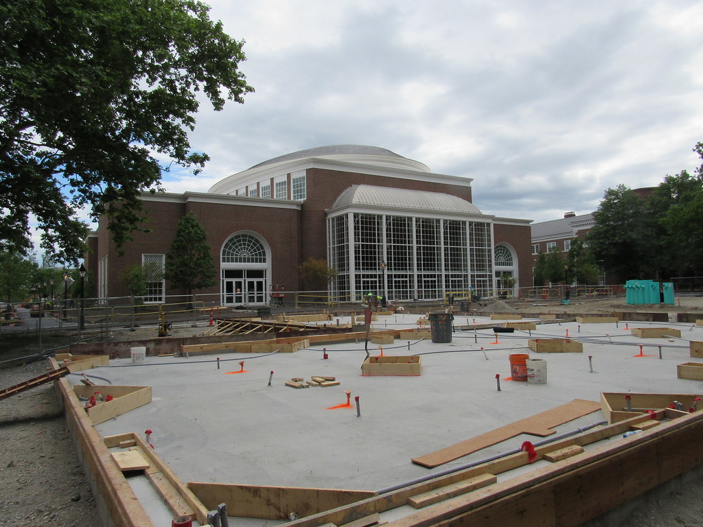
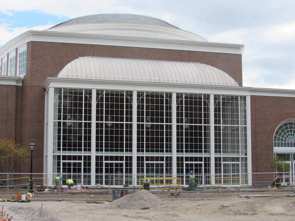
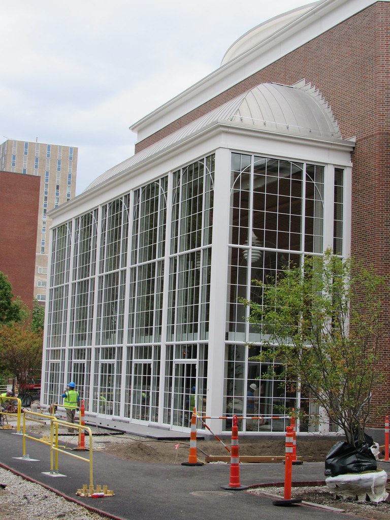
It's funny, you'd think it was Stern, but actually that is our own William Rawn doing his best Stern imitation. It is bland, but, that's what they like at HBS. The HU buildings around Allston are much more interesting and I'm fine with that. The problem I see is one that we see on a lot of newer Federalish buildings, it looks a little too big for its style. There are certainly large Federal buildings but this one looks a bit like someone photocopied the plans on 125% and built it that way.

With respect to this building, Harvard may have learned a lesson, when students and others in the Harvard community objected to the proposed design for an addition to one of the 'river houses'.

So while you may not like Stern's choices (I believe this is a Stern building) those who pay the bills apparently do.

See original and revised designs for Winthrop here.
https://news.harvard.edu/gazette/story/2015/11/an-update-for-winthrop-house-renewal/
___________________
Same donor as the HBS hall, but its colder in Ithaca

IMG_8059.jpg


26805432_10155878804320132_5928426984581182768_n.jpg
 
i need yours all's expertise to learn what i will probably never understand.

about that real nice/better than the usual mix of color of bricks.... why does this type of thing appear

to be avoided at projects like 110 Broad St or others that are near historical bldgs/ neighborhoods?

The only exceptions i can think of are Rowes Wharf and the Lovejoy Wharf cuad.

is 'faux Bulfinchy' not allowed, or just too costly?

why, why, why?

https://resources.troweltradessupply.com/what-is-waterstruck-brick

The distinctive brick of New England is expensive, and I don't think there's too many producers of this type of brick left. I personally wish we could see more of it in new buildings.
 
Harvard Klarmen is Bill Rawn. Vander said it best. "forgetable" which is strange from Rawn. I have to believe this was very donor driven design choices. You could say that the architect should have walked away but you do NOT walk away from any job ever. Its a no win for them though because this is not a project to be proud of.

Cornell Klarmen Hall is Koetter Kim. It is also a bit of a tortured solution. Also remember that this project was designed in late 90 and sat on the shelf for a very very long time.

cca
 

Back
Top