You are using an out of date browser. It may not display this or other websites correctly.
You should upgrade or use an alternative browser.
You should upgrade or use an alternative browser.
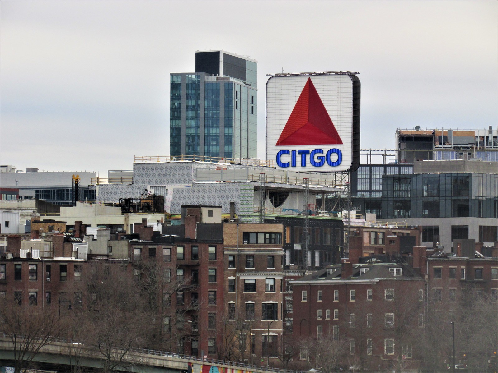
Kenmore Square North (WHOOP) | 533-541 Commonwealth Ave | Fenway
- Thread starter 12345
- Start date
- Joined
- Jan 7, 2012
- Messages
- 14,062
- Reaction score
- 22,728
 IMG_5820 by Bos Beeline, on Flickr
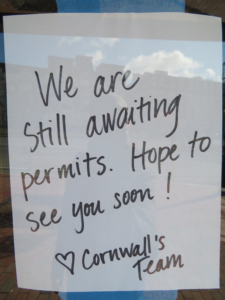 IMG_5818 by Bos Beeline, on Flickr
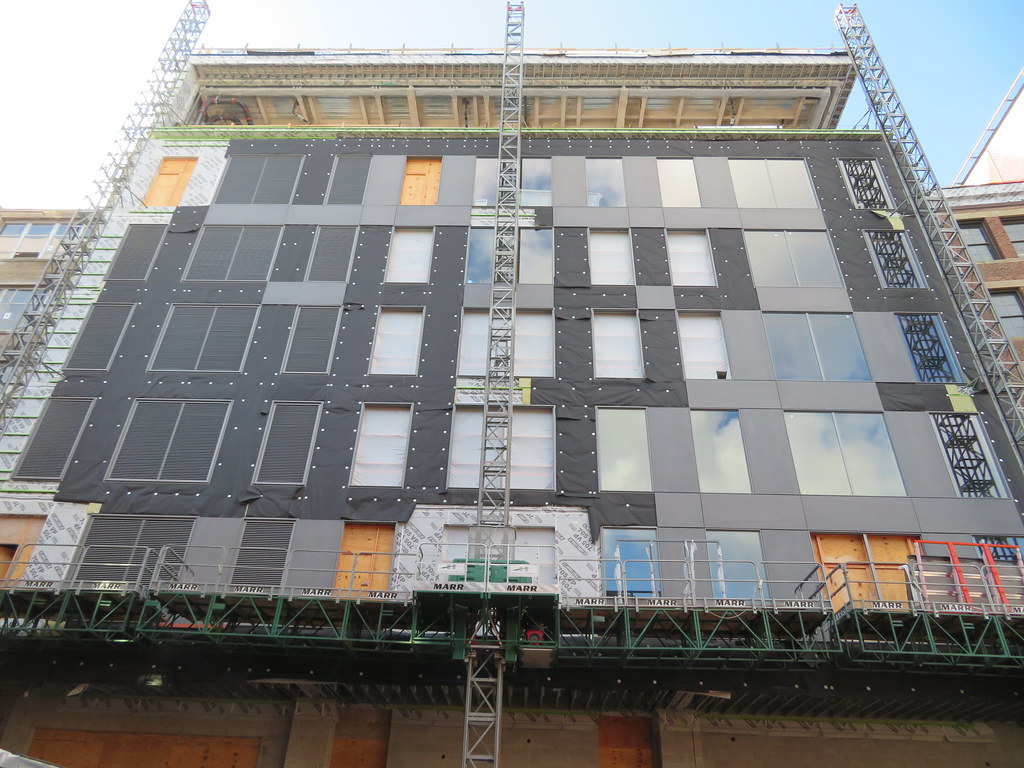 IMG_5815 by Bos Beeline, on Flickr
 IMG_5817 by Bos Beeline, on Flickr
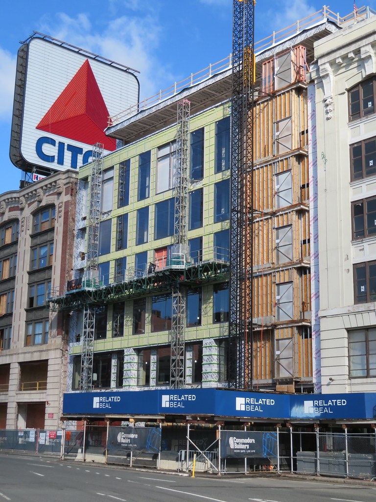 IMG_5819 by Bos Beeline, on Flickr
 IMG_5823 by Bos Beeline, on Flickr
stick n move
Superstar
- Joined
- Oct 14, 2009
- Messages
- 12,078
- Reaction score
- 18,845
Whoops they did it again.
RandomWalk
Senior Member
- Joined
- Feb 2, 2014
- Messages
- 3,317
- Reaction score
- 5,188
So this developer is just mooning the square and flipping off the Citgo sign. Very on brand for the college-age clientele.
Charlie_mta
Senior Member
- Joined
- Jul 15, 2006
- Messages
- 4,556
- Reaction score
- 6,475
The decline of western civilization right there ^. One imagine-less, offensively ugly grey and glassy blotch flanked by two grand and stately buildings from another century. Yeah, I know, labor and materials cost, but I still think we can do better within the constraints of today.
And this from the developer of Hudson Yards???The decline of western civilization right there ^. One imagine-less, offensively ugly grey and glassy blotch flanked by two grand and stately buildings from another century. Yeah, I know, labor and materials cost, but I still think we can do better within the constraints of today.
RandomWalk
Senior Member
- Joined
- Feb 2, 2014
- Messages
- 3,317
- Reaction score
- 5,188
Heck, even repeating the rhythm of the windows on the surrounding buildings would be an improvement.
- Joined
- Jan 7, 2012
- Messages
- 14,062
- Reaction score
- 22,728
 IMG_6885 by Bos Beeline, on Flickr
 IMG_6882 by Bos Beeline, on Flickr
 IMG_6884 by Bos Beeline, on Flickr
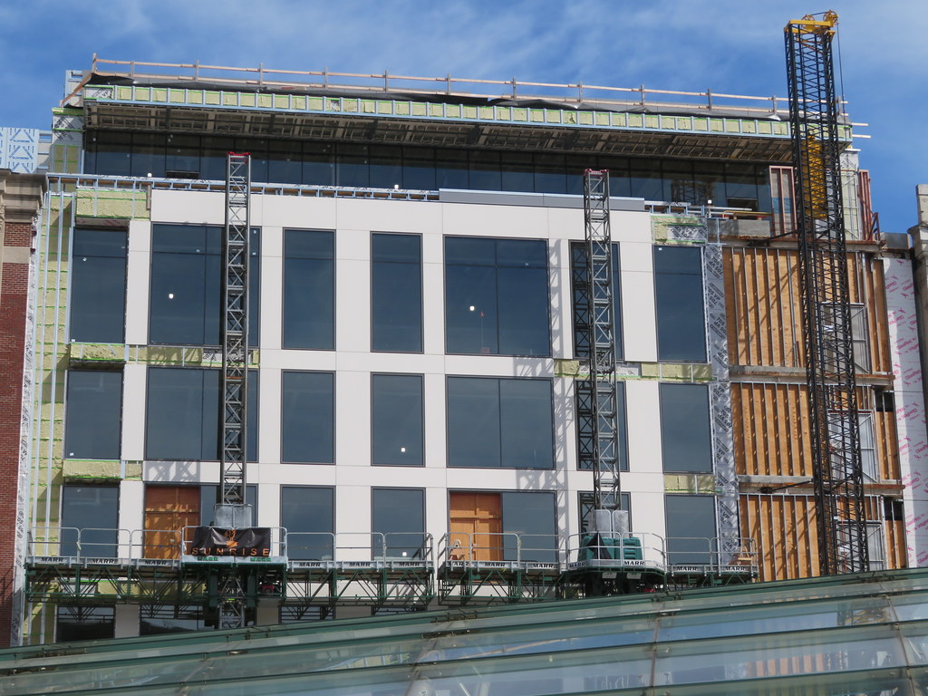 IMG_6887 by Bos Beeline, on Flickr
 IMG_6900 by Bos Beeline, on Flickr
 IMG_6888 by Bos Beeline, on Flickr
 IMG_6898 by Bos Beeline, on Flickr
Last edited:
- Joined
- Jan 7, 2012
- Messages
- 14,062
- Reaction score
- 22,728
 IMG_8518 by Bos Beeline, on Flickr
 IMG_8511 by Bos Beeline, on Flickr
 IMG_8510 by Bos Beeline, on Flickr
 IMG_8514 by Bos Beeline, on Flickr
 IMG_8515 by Bos Beeline, on Flickr
 IMG_8524 by Bos Beeline, on Flickr
 IMG_8513 by Bos Beeline, on Flickr
 IMG_8523 by Bos Beeline, on Flickr
 IMG_8525 by Bos Beeline, on Flickr
RandomWalk
Senior Member
- Joined
- Feb 2, 2014
- Messages
- 3,317
- Reaction score
- 5,188
Sigh… well at least it’s no Whoop, big or otherwise.
Charlie_mta
Senior Member
- Joined
- Jul 15, 2006
- Messages
- 4,556
- Reaction score
- 6,475
If anything ever looked like a grey cardboard box with cutout cellophane widows, this is it.
HenryAlan
Senior Member
- Joined
- Dec 15, 2009
- Messages
- 4,184
- Reaction score
- 4,450
I don't understand why they felt the need to mess with this block at all. What they are building doesn't appear to be functionally much different from what was there. But aesthetically, they've completely ruined things. Contrast that with WHOOP, which at least replaced a fairly useless, low rise building.
RandomWalk
Senior Member
- Joined
- Feb 2, 2014
- Messages
- 3,317
- Reaction score
- 5,188
I assume they are making the block a single floor plate. That may make them more leasable.
Camberville
New member
- Joined
- May 20, 2013
- Messages
- 54
- Reaction score
- 149
I feel like there's a marketing opportunity here for them somehow to add an S on the end that blinks on and off when the visiting team makes an error.

 IMG_0080
 IMG_0132

