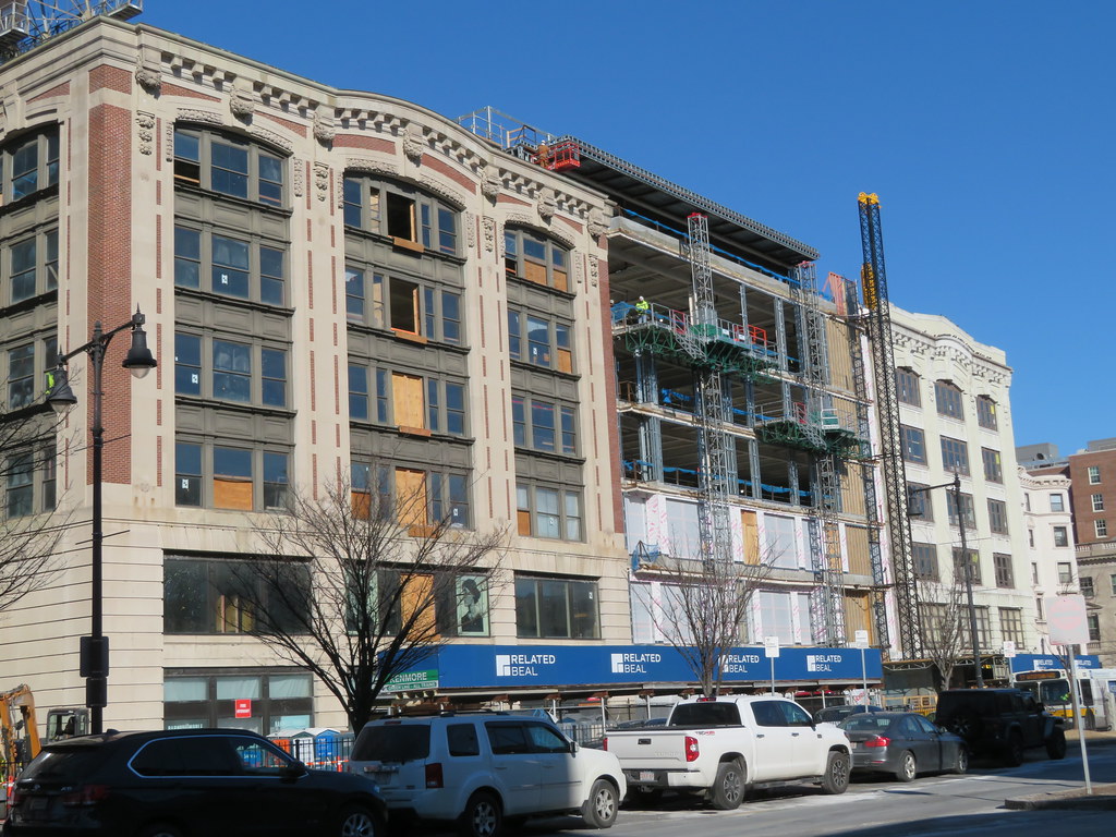
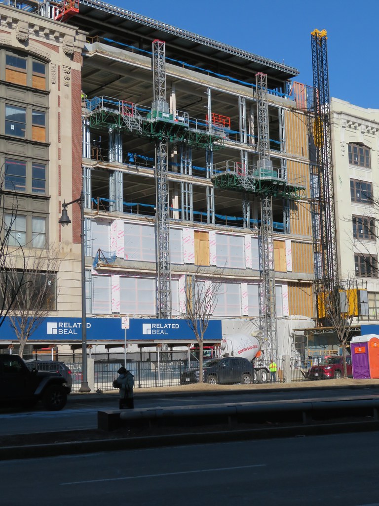
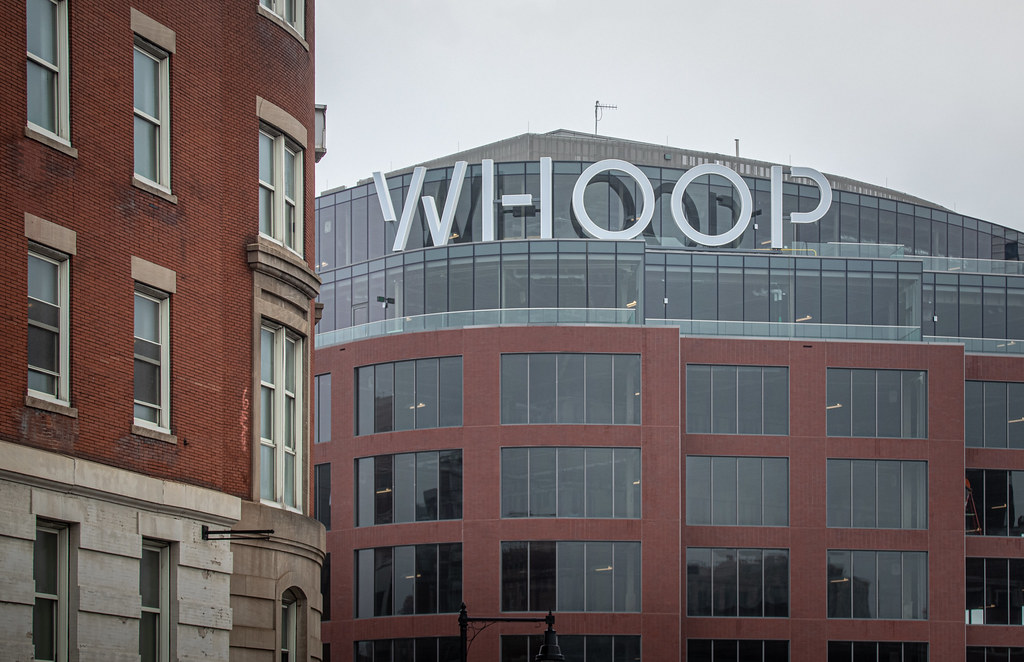
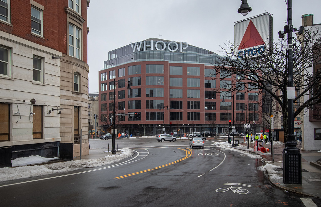
Kenmore Square North (WHOOP) | 533-541 Commonwealth Ave | Fenway

The developer was caught using a cheaper plastic material than the approved design specified, and the colors were more garish than the renders showed. Ultimately, Mayor Menino forced them to spend 1.9 million to replace the plastic with cast stone, repaint, and fix up some of the dormer details.
 
Too bad they werent forced to go with a copper roof like in the render.
 
i think it's largely about what it replaced. at least that's my main beef with it. that and it's weird to have a rt 128 office park aesthetic in the middle of kenmore square.
That's definitely an issue in terms of the Deerfield building. But the other, Beacon St. buildings that this replaced were really pretty awful. As for the office park aesthetic, I disagree. Show me a building in an office park with street level activation. My biggest beef with the building is that they didn't even try to make the faux brick work look real, but even that is maybe just me allowing traditionalism to fog my vision. I mean, we all know that there is no true masonry buildings anymore, why clad it to pretend it's something it isn't?
 
That's definitely an issue in terms of the Deerfield building. But the other, Beacon St. buildings that this replaced were really pretty awful. As for the office park aesthetic, I disagree. Show me a building in an office park with street level activation. My biggest beef with the building is that they didn't even try to make the faux brick work look real, but even that is maybe just me allowing traditionalism to fog my vision. I mean, we all know that there is no true masonry buildings anymore, why clad it to pretend it's something it isn't?

I think jury is still out on the facade material. Overall I like the building, but I think people are right about the brick feeling cheap. I do wonder how it will age tho, right now its brand new brick. Once it gets some grime and develops a bit of patina it will probably look better. That will take a couple years.
 
As for the office park aesthetic, I disagree. Show me a building in an office park with street level activation.

i thought it had been determined that there isn't to be any street-level retail/entertainment/food/bar type stuff in the whoop building. if i'm wrong, then sure -- you have a point (it still looks like an office-park bldg to me, though).
 
I've said it before and I'll say it again (altered photo originally from Beeline):

51828296415_e45e11397c_c.jpg
 
The developer was caught using a cheaper plastic material than the approved design specified, and the colors were more garish than the renders showed. Ultimately, Mayor Menino forced them to spend 1.9 million to replace the plastic with cast stone, repaint, and fix up some of the dormer details.

From Hotel Commonwealth to Whoops in 2 decades:
Spanish philosopher George Santayana is credited with the aphorism, “Those who cannot remember the past are condemned to repeat it.

.
 
This reminds me of one of the "airport business villages" you see sprout up around some airports. O'Hare has a bunch of it.

So does the Zurich Airport - although the architecture there is of much higher quality than the perfectly named WHOOP House's.
 
The injury was the crappy design and execution. The insult added to the injury was that stupid sign: its content, its size, its font, and its color. I get the feeling of bile crawling up my throat every time I see this assemblage.
 
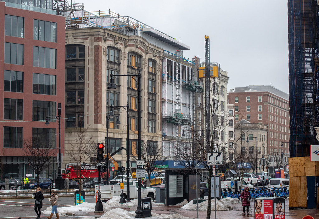
What is happening on the other side of the street?
 
What is happening on the other side of the street?

across the street is an example of people restoring a vaguely historic building, rather than razing it and replacing it with another whoops pile of vomit.
 

Back
Top