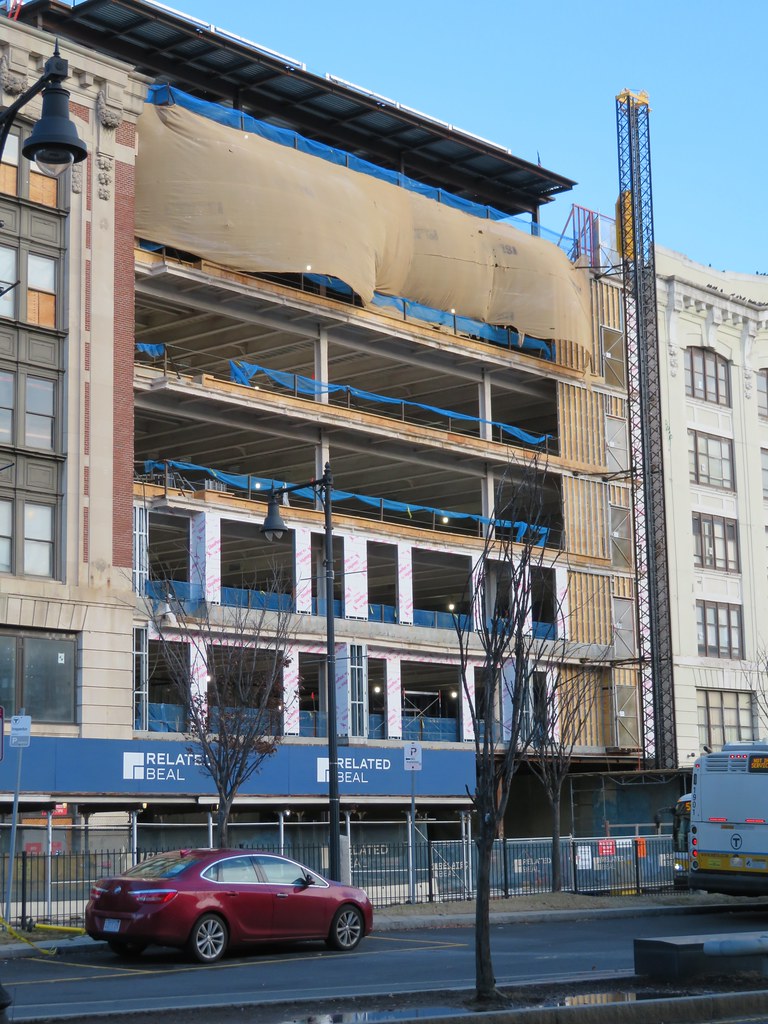
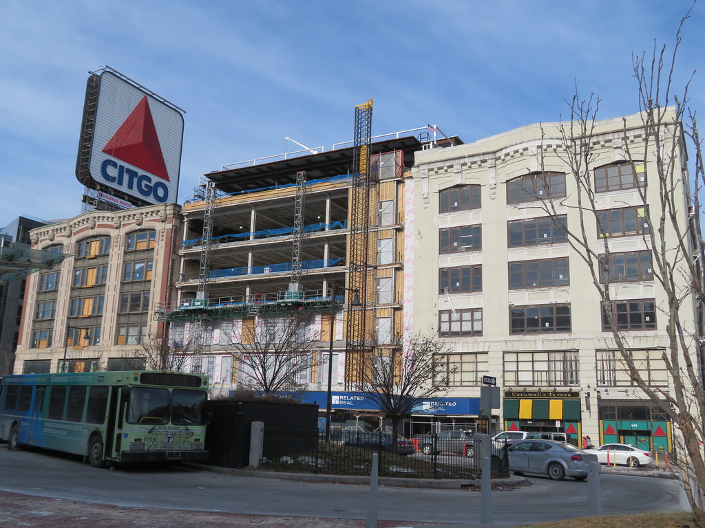
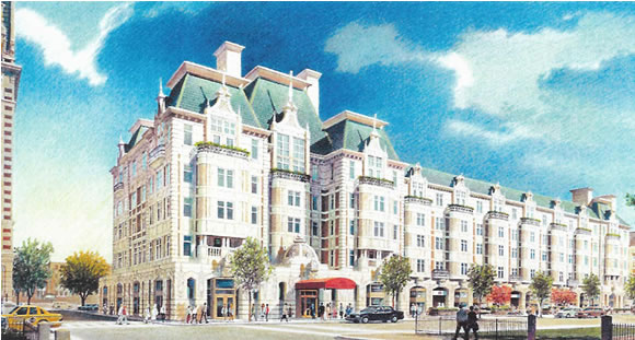
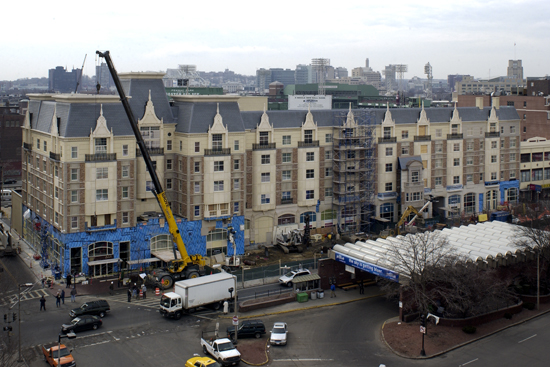
....and before someone chimes in with, "Hey, it's a lab building, it has to be that way", there SHOULDN'T BE A LAB on one of the most iconic corner lots in all of Boston, surrounded by hotels, student dorms, restaurants and entertainment venues. We haven't run out of room in Somerville, Allston/Brighton, Chelsea, Watertown, etc. Hopefully, Mayor Wu does replace the BPDA and get someone in there who can respect the unique texture of this city and LEVERAGE it's uniqueness, while allowing EVEN MORE lab construction (I'm very pro-lab) in the right areas (and, yes, I'm looking directly at YOU, new lab building now stupidly proposed on the Greenway across the street from the new State Street HQ).
IMG_6723 by Bos Beeline, on Flickr
IMG_6722 by Bos Beeline, on Flickr
IMG_6740 by Bos Beeline, on Flickr
IMG_6742 by Bos Beeline, on Flickr
IMG_6747 by Bos Beeline, on Flickr
IMG_6707 by Bos Beeline, on Flickr

 IMG_8728 by Bos Beeline, on Flickr
 IMG_8727 by Bos Beeline, on Flickr
 IMG_8723 by Bos Beeline, on Flickr
 IMG_8725 by Bos Beeline, on Flickr
 IMG_8730 by Bos Beeline, on Flickr
 IMG_8729 by Bos Beeline, on Flickr
 IMG_8736 by Bos Beeline, on Flickr
 IMG_0378 by Bos Beeline, on Flickr
 IMG_0379 by Bos Beeline, on Flickr
 IMG_0383 by Bos Beeline, on Flickr
 IMG_0391 by Bos Beeline, on Flickr
 IMG_0385 by Bos Beeline, on Flickr
 IMG_0384 by Bos Beeline, on Flickr
 IMG_0389 by Bos Beeline, on Flickr
 IMG_0387 by Bos Beeline, on Flickr
 IMG_0395 by Bos Beeline, on Flickr
IMG_0395 by Bos Beeline, on Flickr


