Lovejoy Wharf | 131 Beverly Street | West End

This is another example (both Converse bldg & the residences) of how it's almost better NOT to try to match the existing architecture exactly, and instead, apply contrast-by-design. In the '80's/'90's we saw a lot of "trying to blend it with the old part" and it was disastrous (that and the fact that they always felt the need to use pastel window sash/framing - nothing worse than an old mill building rehabbed with pastel window frames). I'm very glad to see the return of bold, black window lines (here and elsewhere).

To echo everyone else: well done.

EDIT:
I realized as I said this that the building next door (TripAdvisor, etc) borders on the pastel window frame rehab I was complaining about...eh...that one came out OK, but I still prefer the type of treatment this one got.
 
Last edited:
Another thing to note, they clearly used top quality materials in the new building. The ground floor window and door framing materials really highlight the level of quality materials used. They did not value engineer this project into bland monotony.
 
See, I actually prefer the old building, but this is nice as far as new construction goes.

Plus, the added density is always a good thing.
 
sure the architecture of the old building was great, but it was in terrible condition and an eyesore coming into Boston.

Plus the haborwalk is a huge improvement.
 
All things that could have been repaired without razing the building.

The Converse building was an eyesore too.

But whatever, the new building is fine and could have been much, much worse.
 
All things that could have been repaired without razing the building.

The Converse building was an eyesore too.

But whatever, the new building is fine and could have been much, much worse.

Statler -- the "Converse" -- aka Submarine Signals Building -- was a historic structure

The other building was just infill [late 19th / early 20th C] warehouse -- it probably could have been saved -- but at enormous cost for very minimal gain
 
I understand the reasoning behind why they did what they did. It's perfectly sound.

I just think the old building was more aesthetically pleasing than the current.

Sadly, developers rarely seek out my opinion when planning their projects.

At least we got the added density. Que sera.
 
The old always looked like London Dockland in an old Sherlock Holmes movie. It was cool! But this is nice too.
 
From Sunday

28513889151_730db65034_c.jpg


27976306683_f88c016b03_h.jpg


28307810960_e08204829c_h.jpg


28559398876_31b0080cdf_h.jpg


28559390696_425d7b1f75_h.jpg


28559378346_c6a2ae2d06_h.jpg


28559368886_6e7f1ed87a_h.jpg


28307756090_6ce7761409_h.jpg


28307749810_7a3497ac57_h.jpg


28591992555_4be220fc4f_h.jpg


28591986845_28992a60c4_c.jpg


27975008824_d990c3f834_h.jpg


27974843534_5febf5cf61_h.jpg


27974995124_67d91f5d9a_h.jpg


28559460356_b9ea75eb42_h.jpg


28559469436_e6a2a774d9_h.jpg


28513858601_91e31120a9_h.jpg


28513868211_81e34e068b_h.jpg


28513878171_7b6d6c6a4a_h.jpg
 
I'm impressed. That waterfront looks amazing. I love the trend of new projects becoming inviting public spaces.
 
Last edited:
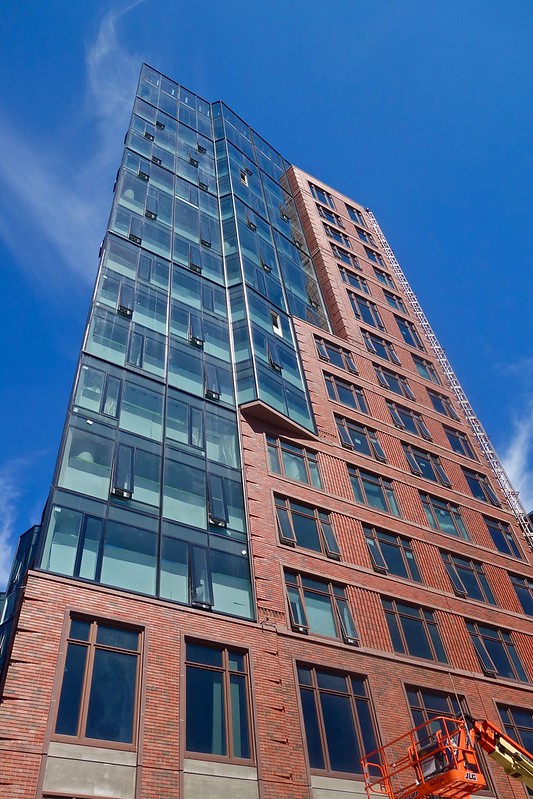
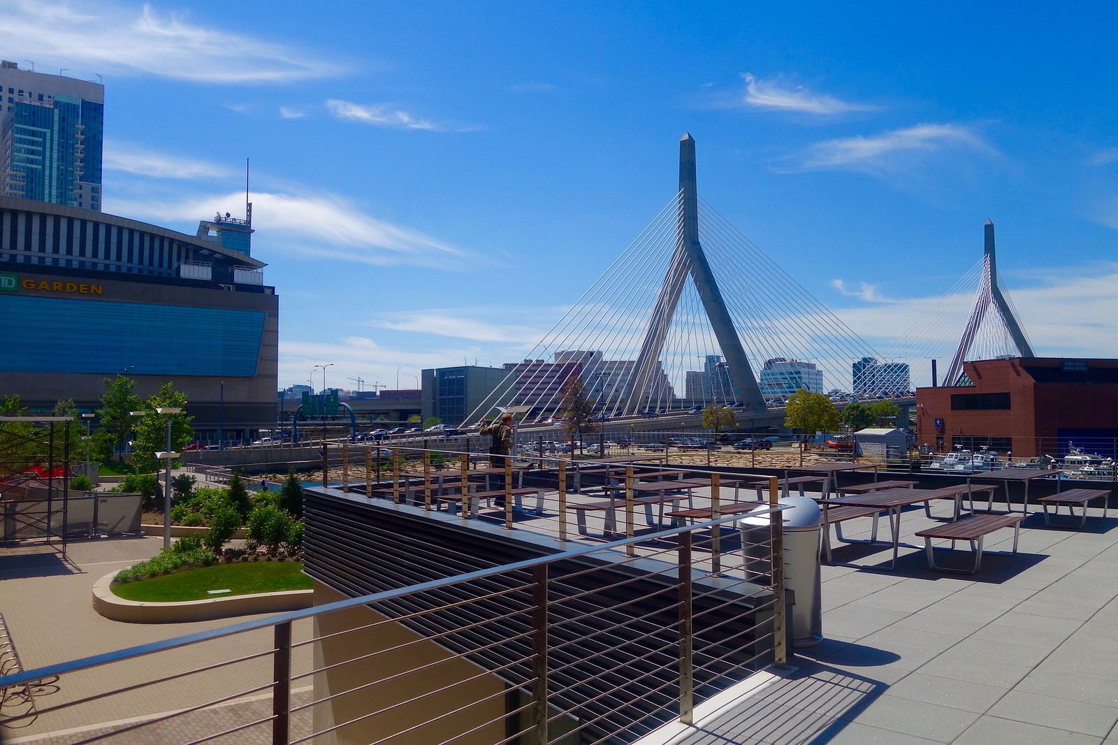
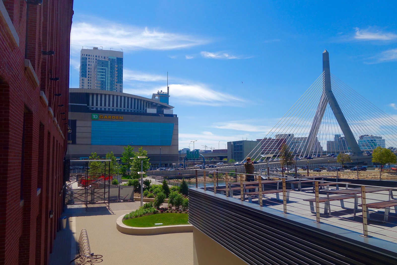
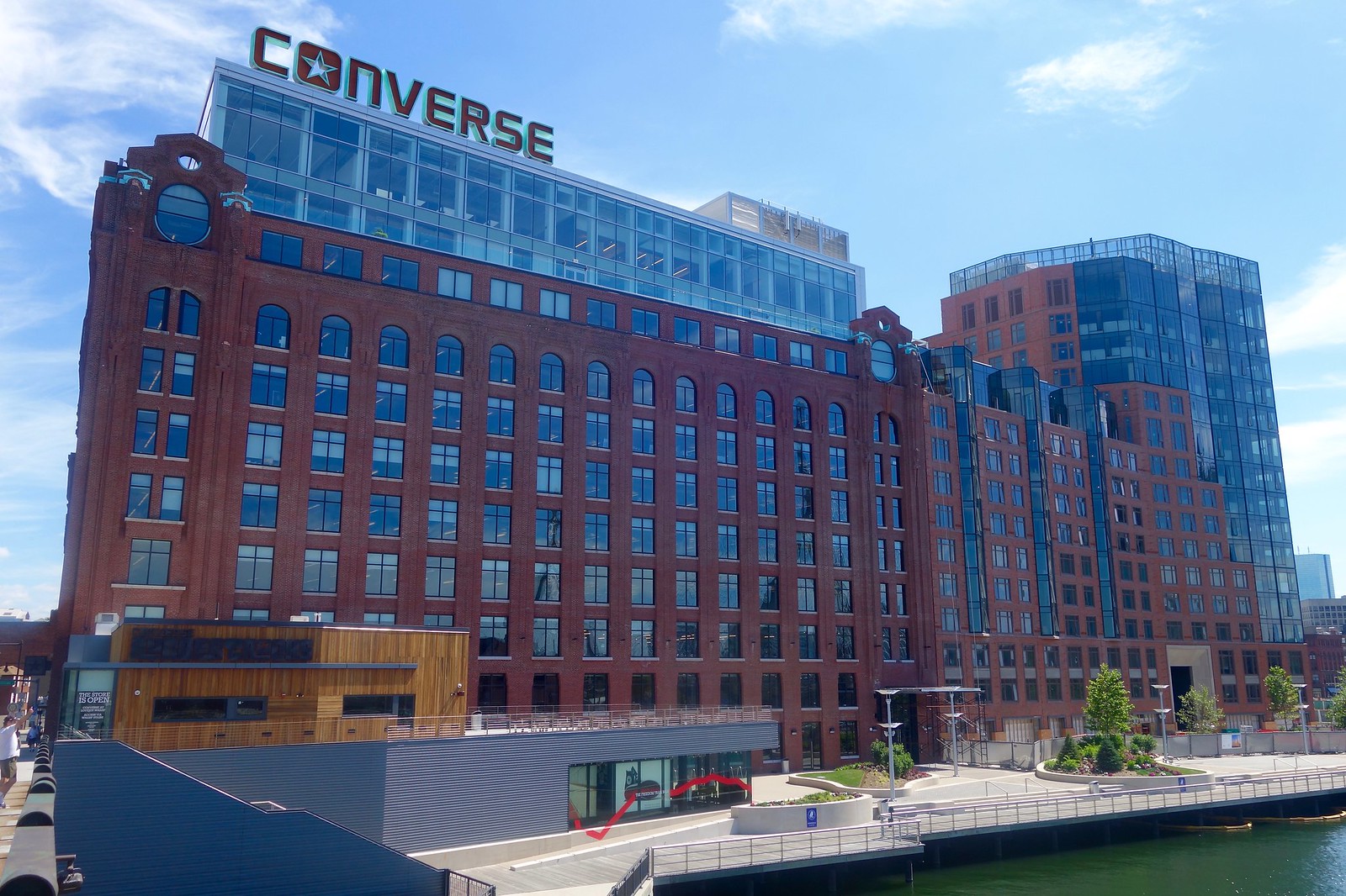
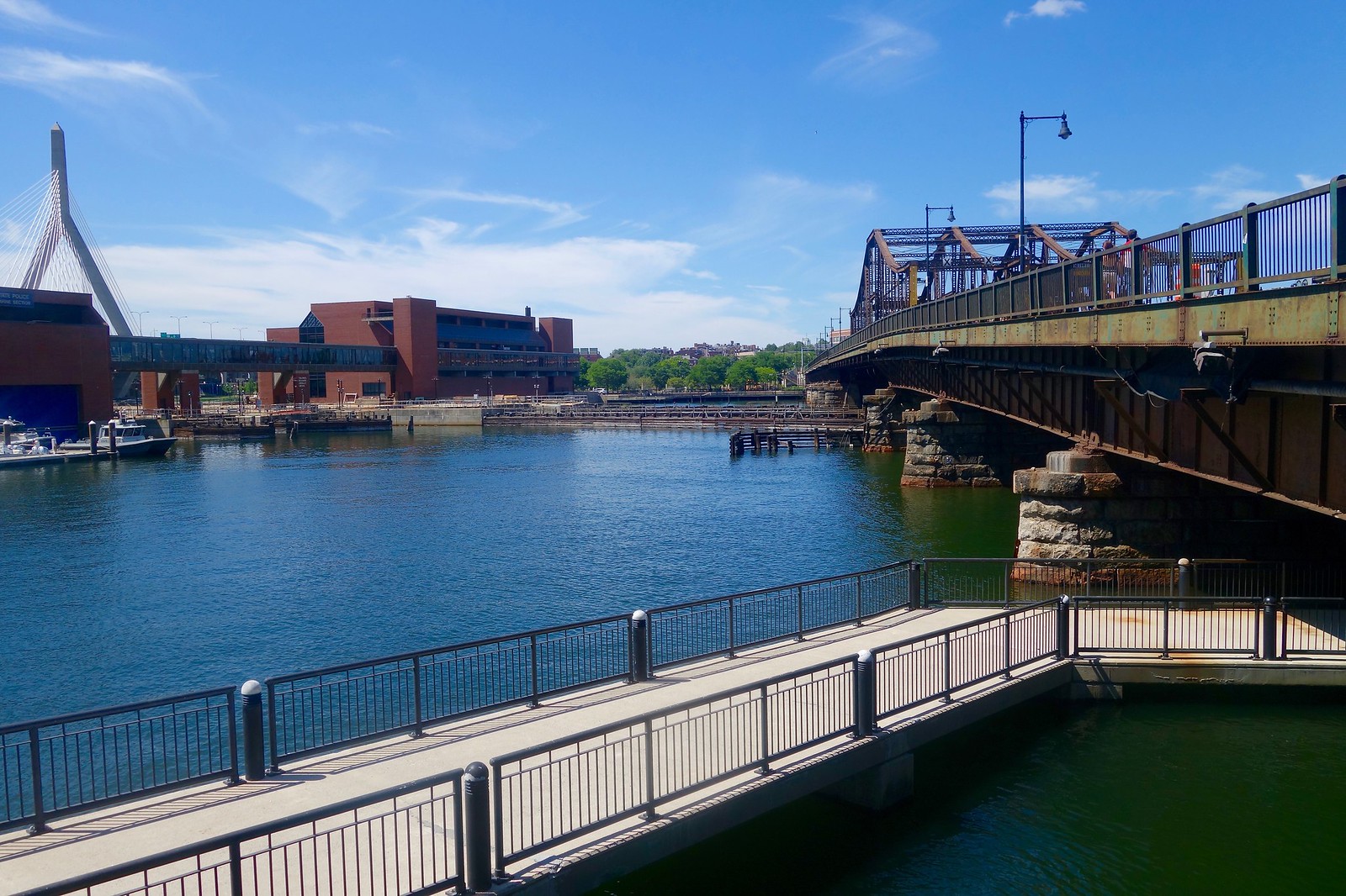
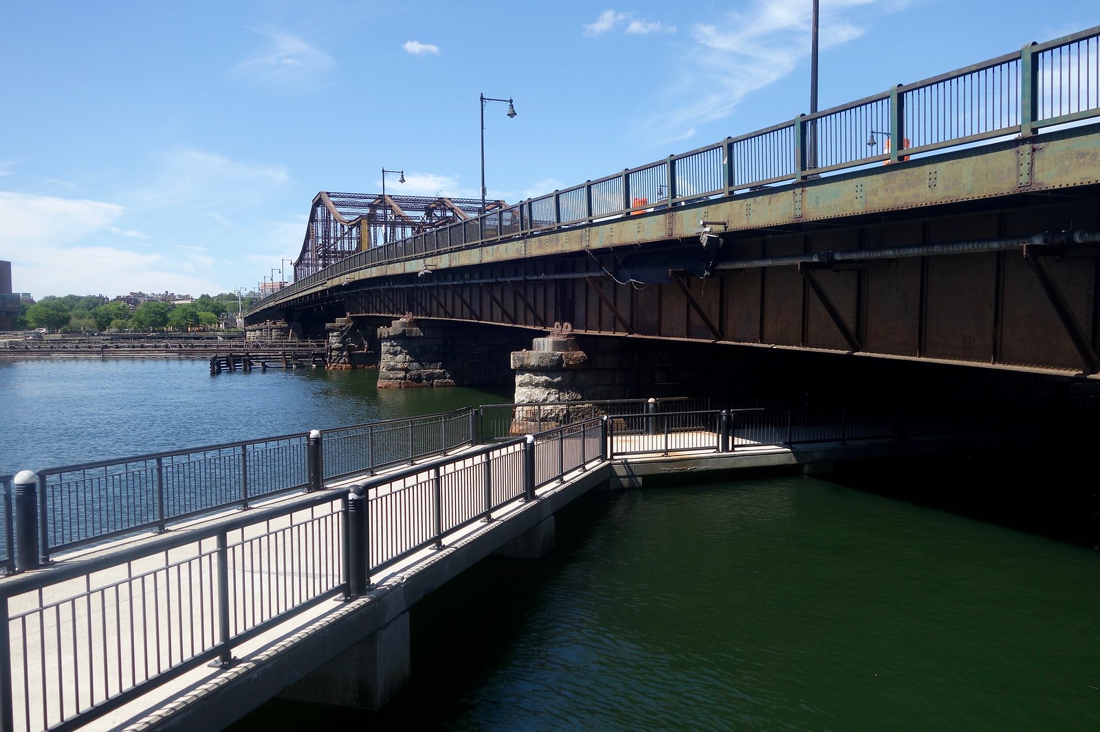
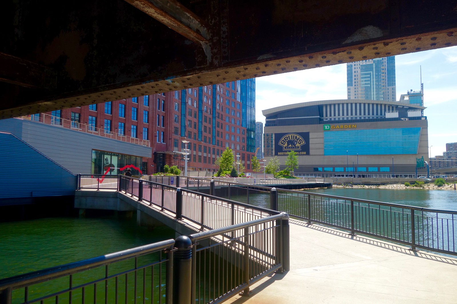
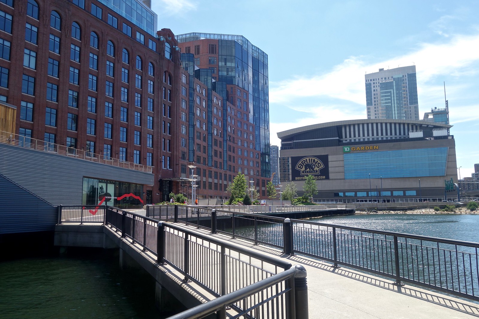
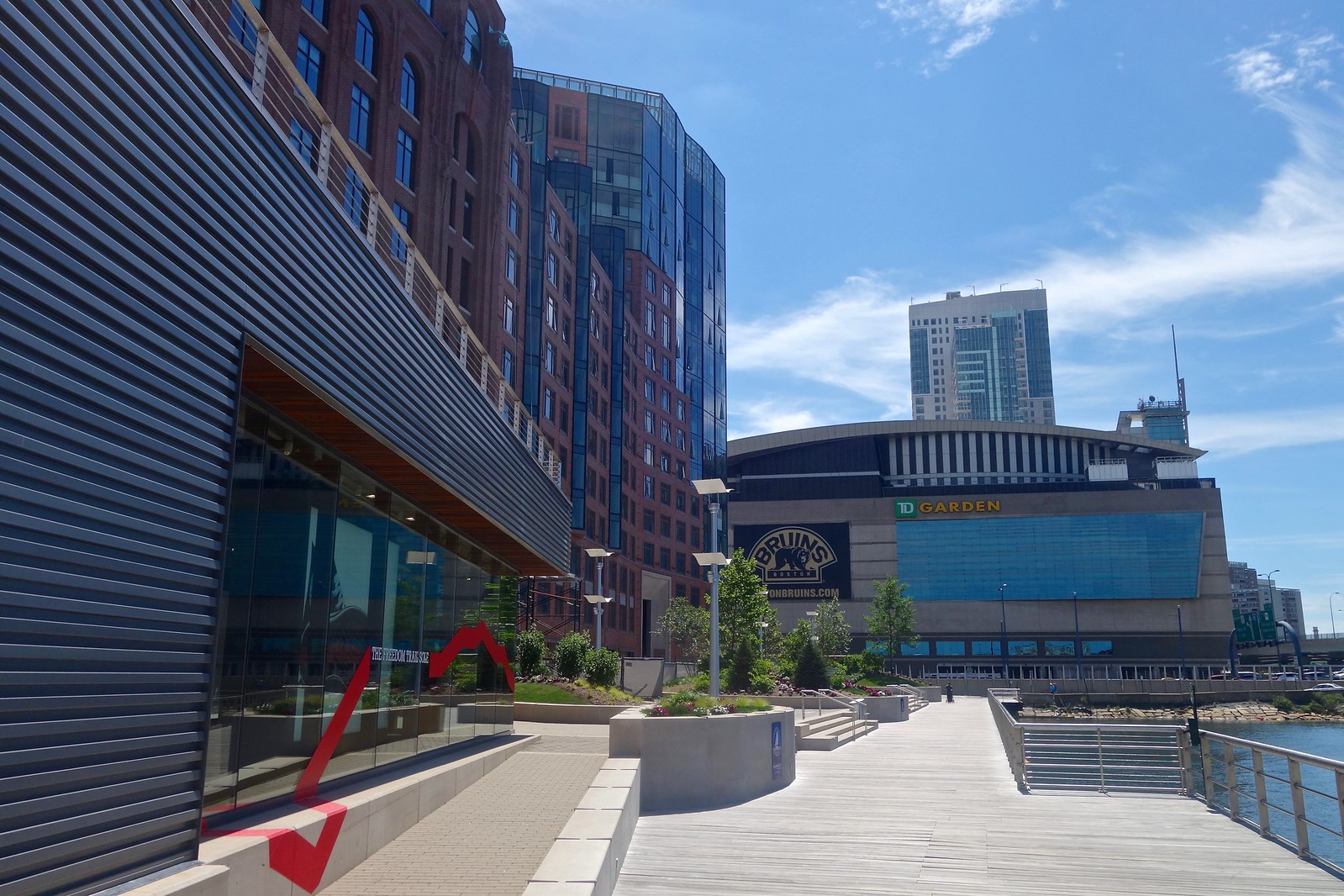
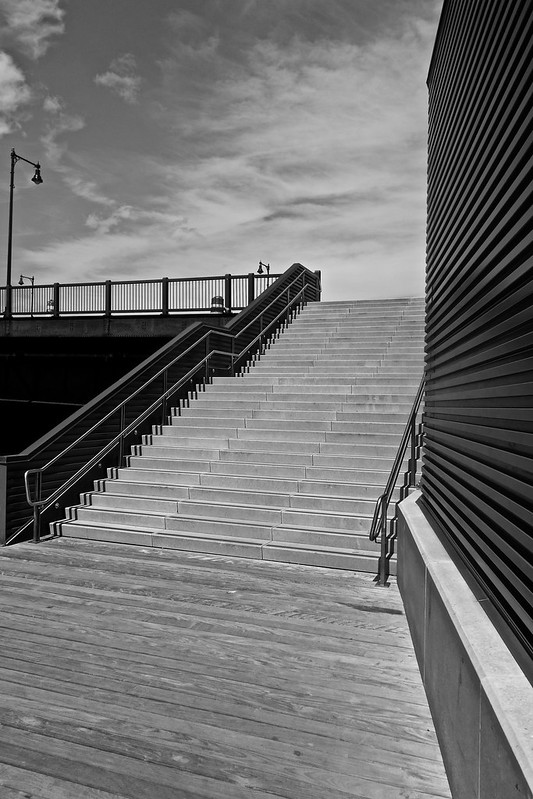
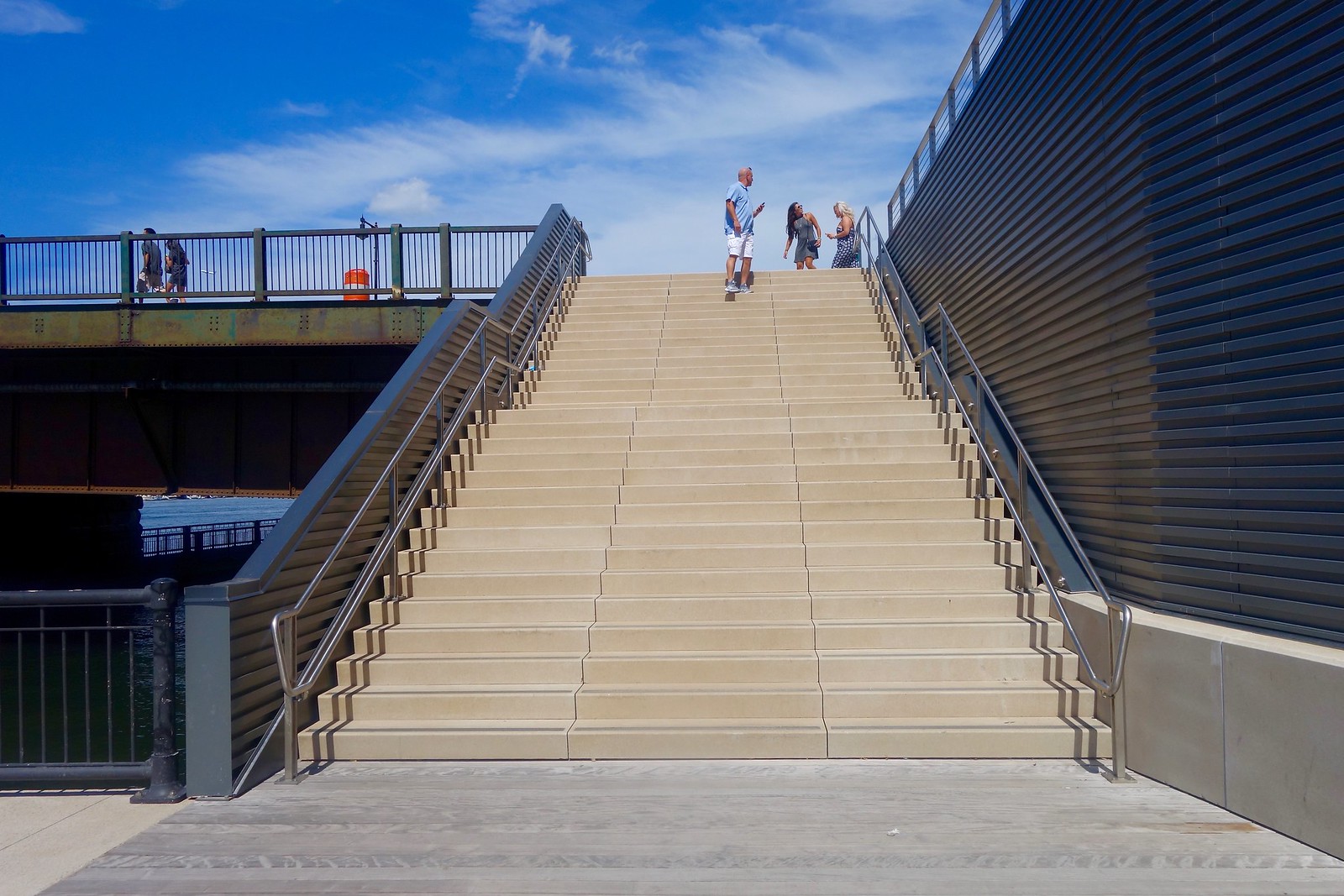
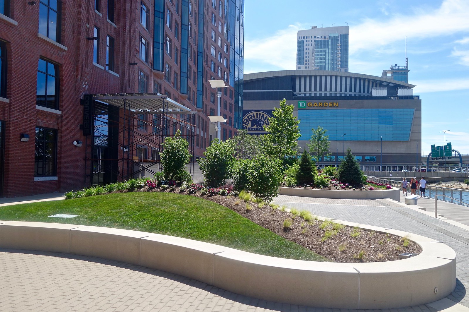
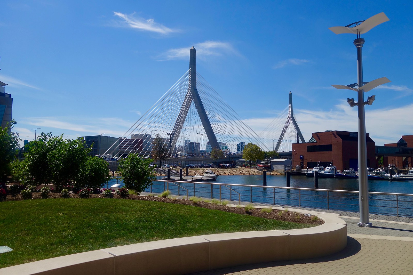
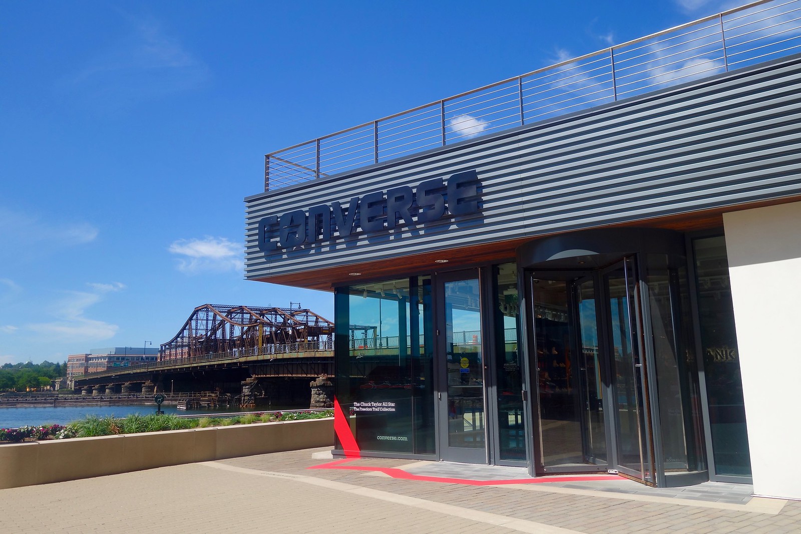
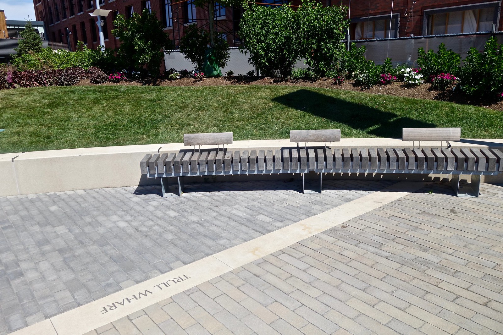
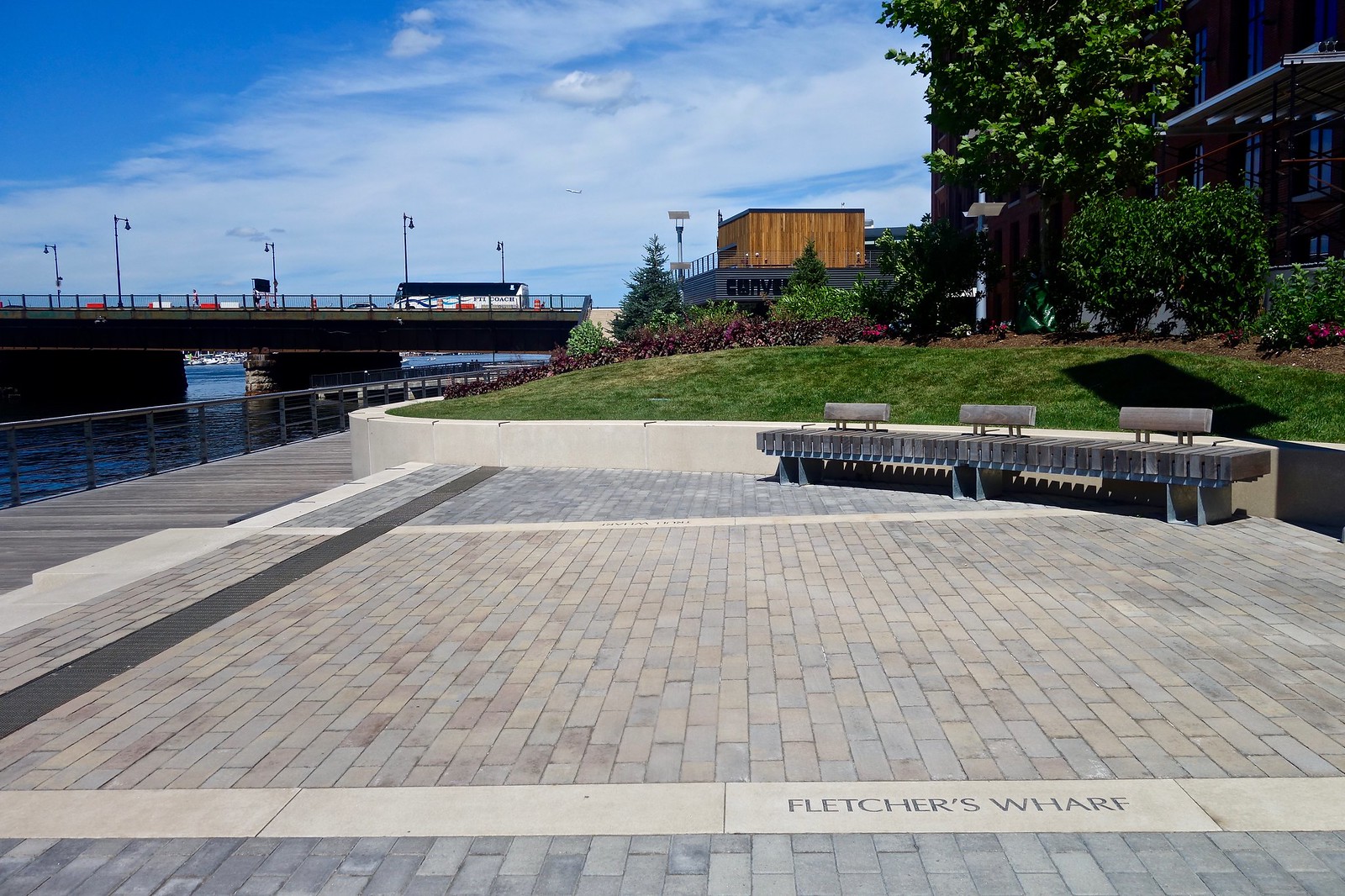
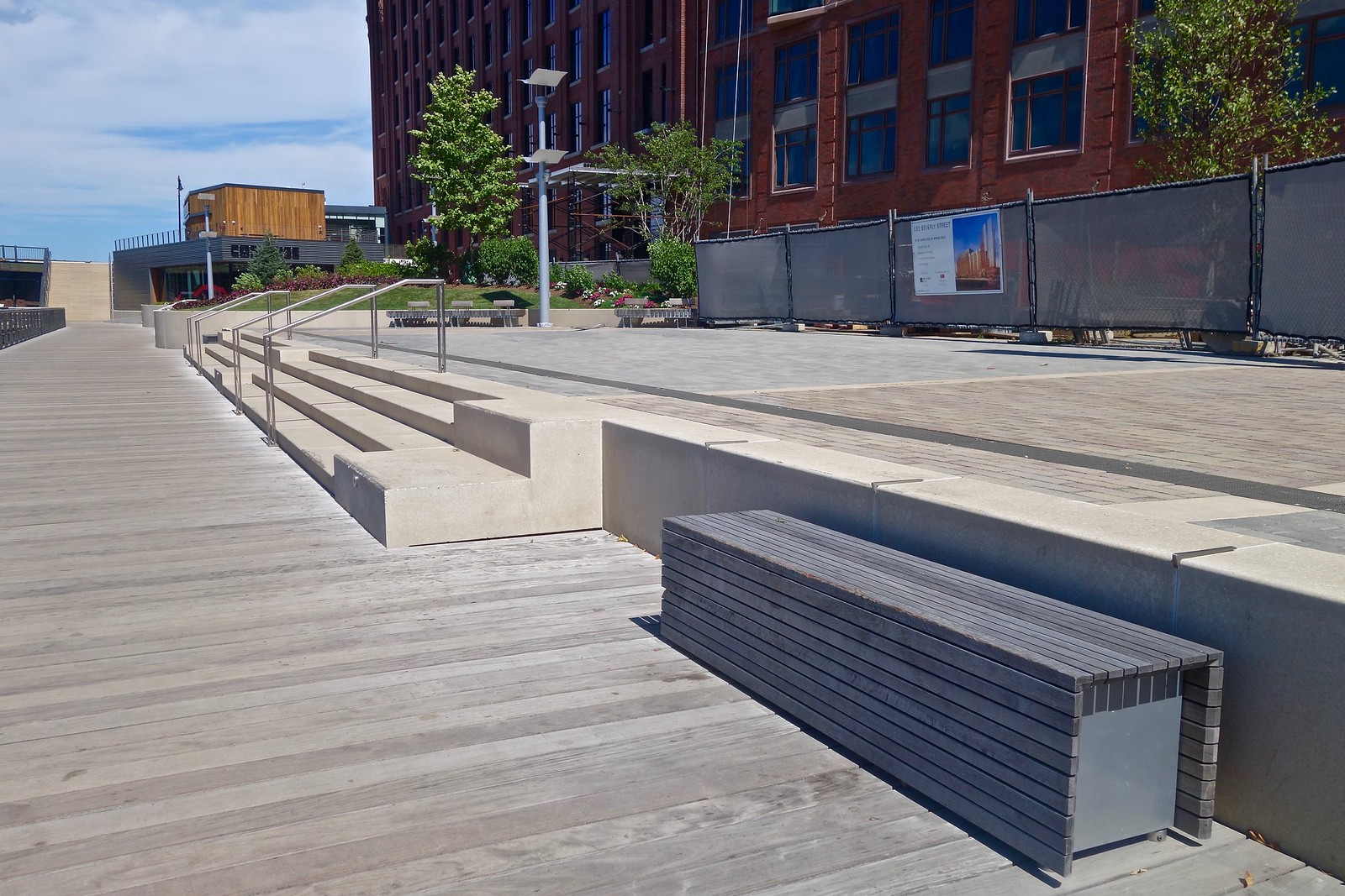
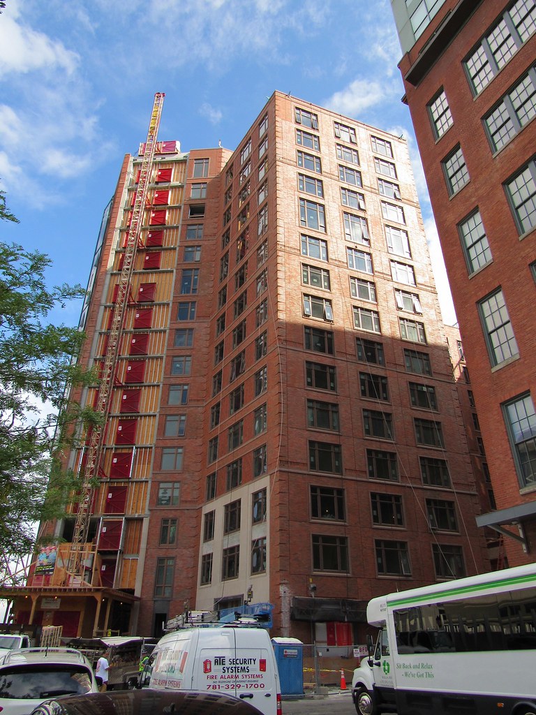
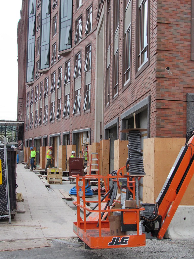
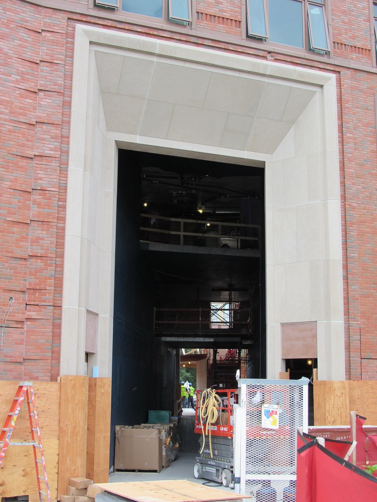
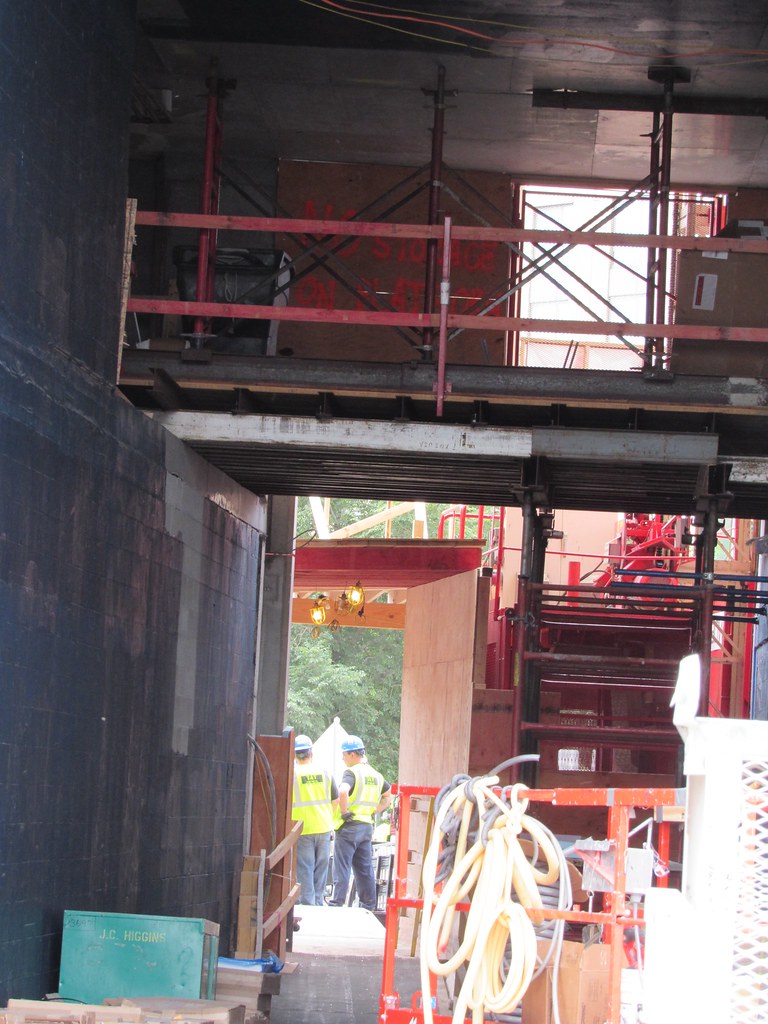
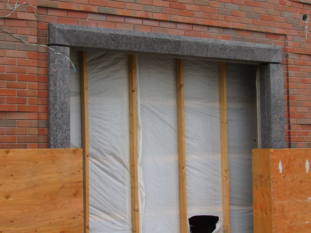
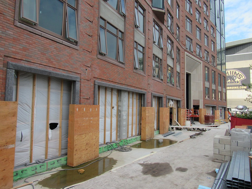
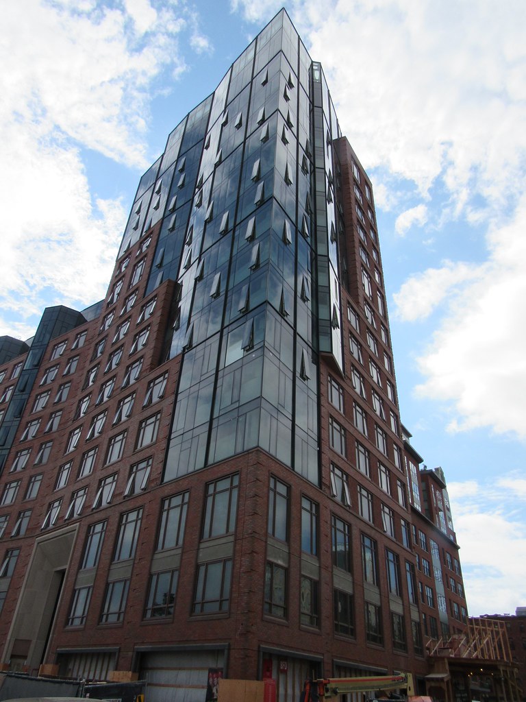
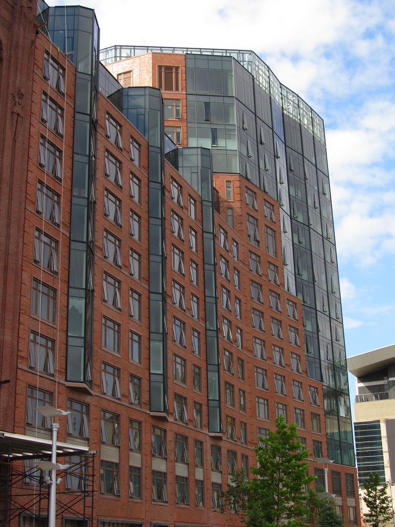
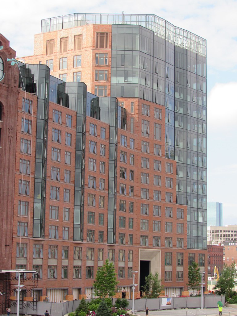
Its like a switch was flipped. For a few years everything was boring and uninspired and all you would hear is complaints, rightfully so. I cant really think of exactly when it started but all of a sudden everything is inspired, engaging, tasteful, and appropriate for the context. Maybe it was atlantic wharf even though waterside place and a few others slipped through after, but its like all of the problems new development had almost vanished. Street level interaction, great massing, quality materials, contextual colors, interesting shapes, human scaling, is all the norm now rather than the exception. Its so good to see this after years of waiting for it to happen. It used to be years between quality developments, now its like every single one is trying to outdo the last. Boston is going to be a very different city after this latest construction boom, but in a good way. Most projects are either infill or built into the fabric rather than destroying it. The parts of the city that make this a great place still remain, and the pieces that make it greater are doing just that.
 
I just saw this render on skyrisecities and I thought I would post it because I don't remember seeing it on here. It looks like there might be nighttime lighting on this building.

22030-76200.jpeg
 
I love that this and the converse sign are lit. Some people dont like too much signage but converse is as american as it gets and it looks badass. This development is a 100% win in every way. Theres going to be a lot of lighting in this area with NST, this, and the td office tower lit crown and spire.
 
10 years ago, this site was a wreak. Now, it's a perfect joining of old and new, in every respect. Bravo to the developers!
 

Back
Top