You are using an out of date browser. It may not display this or other websites correctly.
You should upgrade or use an alternative browser.
You should upgrade or use an alternative browser.
Mandarin Oriental | 776 Boylston St | Back Bay
- Thread starter LeTaureau
- Start date
czsz said:It's the darker color that irks me. I thought we were going to get some kind of beige or cream...the deeper orange screams Miami, and cheapens the texture of the materials, at least from afar.
Yes, because Boston is really in need of more beige.
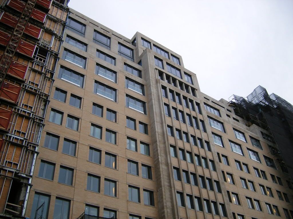
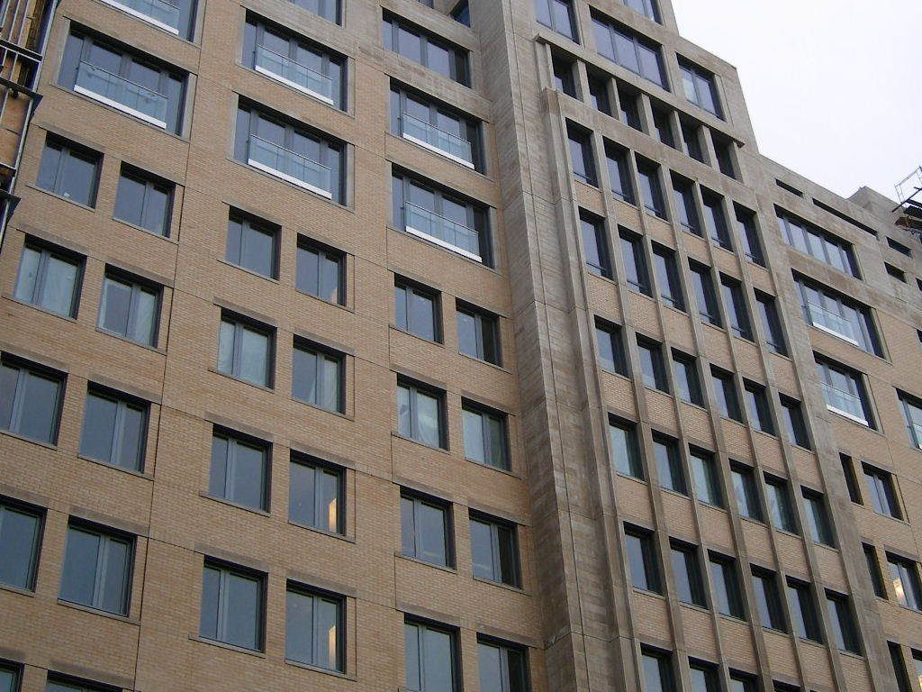
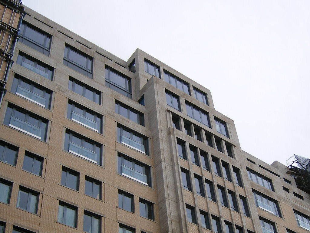
The 'orange' is brick. I want to reserve judgment until its done, HOWEVER, right now the top 'beige' part (which i believe is stone) looks unfinished to me. At first glance in the sunlight it actually looked like gray concrete...
The lower, brick part, actually looks significantly better than I expected in real life....
To recap, top=bad, bottom=exceeded expectations, however I'm reserving judgment.
The lower, brick part, actually looks significantly better than I expected in real life....
To recap, top=bad, bottom=exceeded expectations, however I'm reserving judgment.
RandySavage
New member
- Joined
- Apr 28, 2007
- Messages
- 10
- Reaction score
- 0
^ I actually think the reverse. The top looks okay because the material resembles limestone or even marble. The brick is mediocre. Overall, the facade reminds me of a newly built, really nice public high school.
- Joined
- May 25, 2006
- Messages
- 7,064
- Reaction score
- 1,990
RandySavage said:Overall, the facade reminds me of a newly built, really nice public high school.
Very true. I think the problem here is this building was trying too hard to be modern but fit in with the Back Bay. We needed something that really stood out, which this being Boston, was not something we were ever going to get.
briv
Senior Member
- Joined
- May 25, 2006
- Messages
- 2,083
- Reaction score
- 3
I was by here this afternoon and I find the final product very disappointing.
It seems the Mandarin pulled the old switcheroo. Even though all the latest renderings clearly show a facade clad in in stone or some stone-like material, both buildings are in fact clad in brick.
There are dark colored control joints plainly visible all over the place on the brick facade of the newly unveiled northern building, and in my opinion, it looks like shit. Very cheap-looking.
Does anyone wonder why they had that viel up so long? I seem to remember another building that did the same exact thing.
But it isn't quite a repeat of the Hotel Commonwealth -- although it is a huge letdown nonetheless. Im just amazed that they can advertise a clearly stone clad building and then turn around and give people a penny-pinching, poorly executed brick one instead.
And you wonder why no one trusts developers in this city.
stellarfun
Senior Member
- Joined
- Dec 28, 2006
- Messages
- 5,726
- Reaction score
- 1,586
briv said:I was by here this afternoon and I find the final product very disappointing.
It seems the Mandarin pulled the old switcheroo. Even though all the latest renderings clearly show a facade clad in in stone or some stone-like material, both buildings are in fact clad in brick.
There are dark colored control joints plainly visible all over the place on the brick facade of the newly unveiled northern building, and in my opinion, it looks like shit. Very cheap-looking.
Does anyone wonder why they had that viel up so long? I seem to remember another building that did the same exact thing.
But it isn't quite a repeat of the Hotel Commonwealth -- although it is a huge letdown nonetheless. Im just amazed that they can advertise a clearly stone clad building and then turn around and give people a penny-pinching, poorly executed brick one instead.
And you wonder why no one trusts developers in this city.
A December 2005 article in Boston magazine said that the facade would be limestone, brick, and granite. This was written as construction was underway .
http://www.bostonmagazine.com/articles/suite_dreams/
RandySavage
New member
- Joined
- Apr 28, 2007
- Messages
- 10
- Reaction score
- 0
From the west it doesn't look bad, particularly the upper, limestone floors. I don't mind this building. It's not a show-stopper, but when was the last time this town had one of those, if ever? It's par for the course by Boston standards.


Padre Mike
Active Member
- Joined
- Jan 27, 2007
- Messages
- 681
- Reaction score
- 1
I like what I see so far, but perhaps the "off-kilter" aspect of the building is due to:
1. It bends over backwards to squeeze itself into a long, narrow lot, with height restrictions and a "cut-through" to allow the apartments behind to have a view north;
2. It sits in architectural isolation from the Pru center (with it's buff colored paneling), and Lord and Taylor (with its newly painted buff brick) and has no immediate neighbor to its west;
3. The details of the building are not complete;
4. Ground-floor retail has yet to unite the building with its street scape.
The busy upper story design clearly is to provide as many corners/balconies as possible, as well as keep the building from resembling a stranded ocean liner. My guess is that it will be no less innocuous than Heritage on the Common or the Four Seasons (which has always looked unfinished without a proper cornice line!)
Ron Newman
Senior Member
- Joined
- May 30, 2006
- Messages
- 8,395
- Reaction score
- 14
Padre Mike said:2. It sits in architectural isolation from the Pru center (with it's buff colored paneling), and Lord and Taylor (with its newly painted buff brick)
Doesn't it have an indoor connection to both?
Actually, I didn't mean that the building is off-kilter, just the windows in the corner kz photographed. They don't align and leave big areas of blank wall. Looks very ungainly and doesn't "add up". CBT did the same misaligned windows shtick in the Clarendon, thought not so clumsily. Just clumsy enough to make you grind your teeth. And they did in their design for one of the Bulfinch Triangle parcels. Genius at work.
 Whew, do I have egg on my face! After posting the above I recalled the Clarendon is a Stern building, despite that misaligned window thing. I checked his site and sure enough it's his work. On the plus side, I came across two street-level renderings I hadn't seen before, which I'm posting on the Clarendon thread.