MassMutual | 10 Fan Pier Blvd | Fan Pier Parcel E | Seaport

Hey, don't y'all be hatin' on 1 Marina Park Drive, I work in that building. :) 
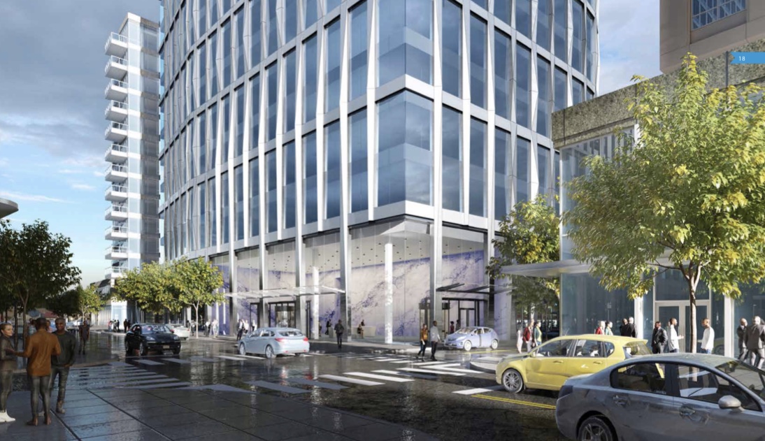
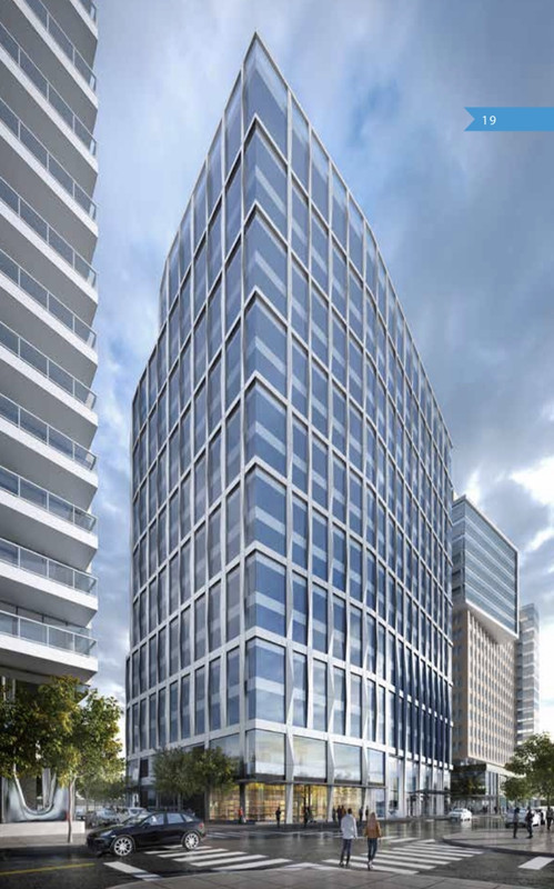
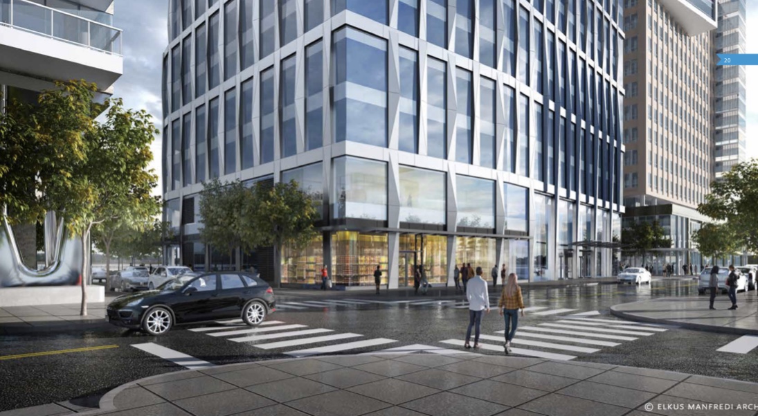
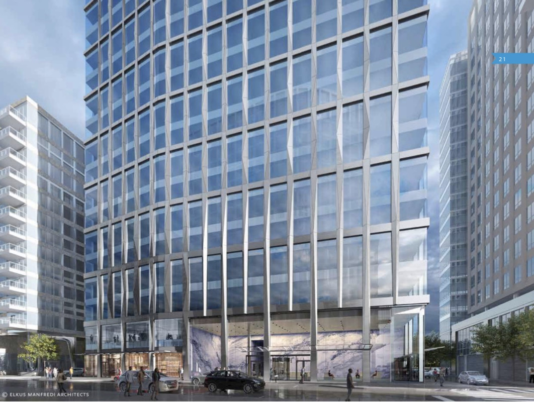
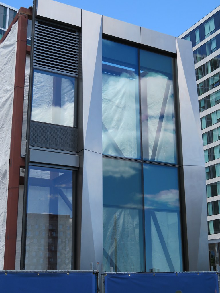
And sure, 10 Fan Pier Blvd is a nice design and all, but we're all sad because it's going to wreck our harbor view. (Though my desk is in the glass bumpout on the east side and the new building will only block my view a little.)
 
Last edited:
Another new company logo/sign coming to Boston:

MM-Boston-office-building.jpg
 
Another new company logo/sign coming to Boston:

MM-Boston-office-building.jpg

These renders frustrate me because:
1. The color/tone of the glass seems to rarely resemble the actual color used. Why is that?
2. I doubt there would ever be that volume of tree coverage as depicted.

Overall, even though this building includes some texture and some curves, I can imagine that it could still end up looking quite bland (I know, too early to judge). If it does turn out bland, then it just joins the other immediate bland neighbors like One Marina Park and the Vertex buildings, which would be unfortunate. Wait and see, I suppose.
 
Look to Martin's Park to see arboreal density.

I think I spy berms on the east side, and barriers on the north and west sides. The electrical vault is certainly not at street grade without protection from storm surges.
 
It'll be interesting to see what color the glass will actually be when a sampler gets put together. The renders show the building and existing surrounding buildings (One Marina Park and 50 Liberty Dr.) in blue but we all know that the color on those existing buildings are more shades of green.
 
Per the sampler, the glass is green similar to 50 Liberty and 1 Marina Park vs blue like the renders displayed. Seems like a lot of green.
 
Per the sampler, the glass is green similar to 50 Liberty and 1 Marina Park vs blue like the renders displayed. Seems like a lot of green.

So annoying. Should have been blue.
 
If you want a sustainable building with lots of glazing, unfortunately it comes with a greenish, blue tint.
 
So annoying. Should have been blue.

I would've been OK if they had gone a completely different direction as well, say an amber/bronze hue glass for example. Something that would've made the building stand out.
 
Last edited:
Why don't get get more of the amber/bronze? I just saw the sampler in person and the silver also looks darker - more like a light charcoal.
 
This will be a fine little tower. Proportions are ok, curves look good, and the faceted columns add some depth and rhythm.
 

Back
Top