coleslaw
Active Member
- Joined
- Oct 3, 2013
- Messages
- 596
- Reaction score
- 0
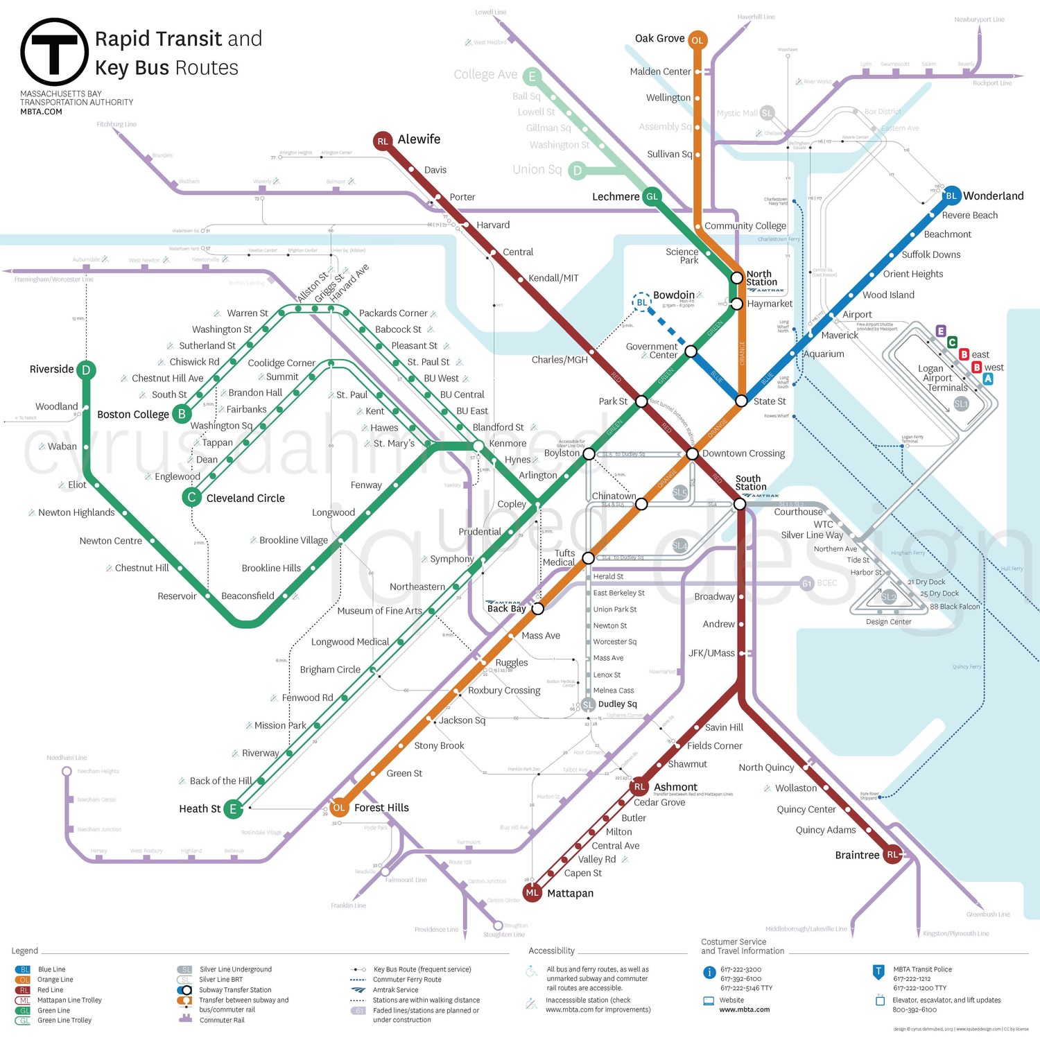
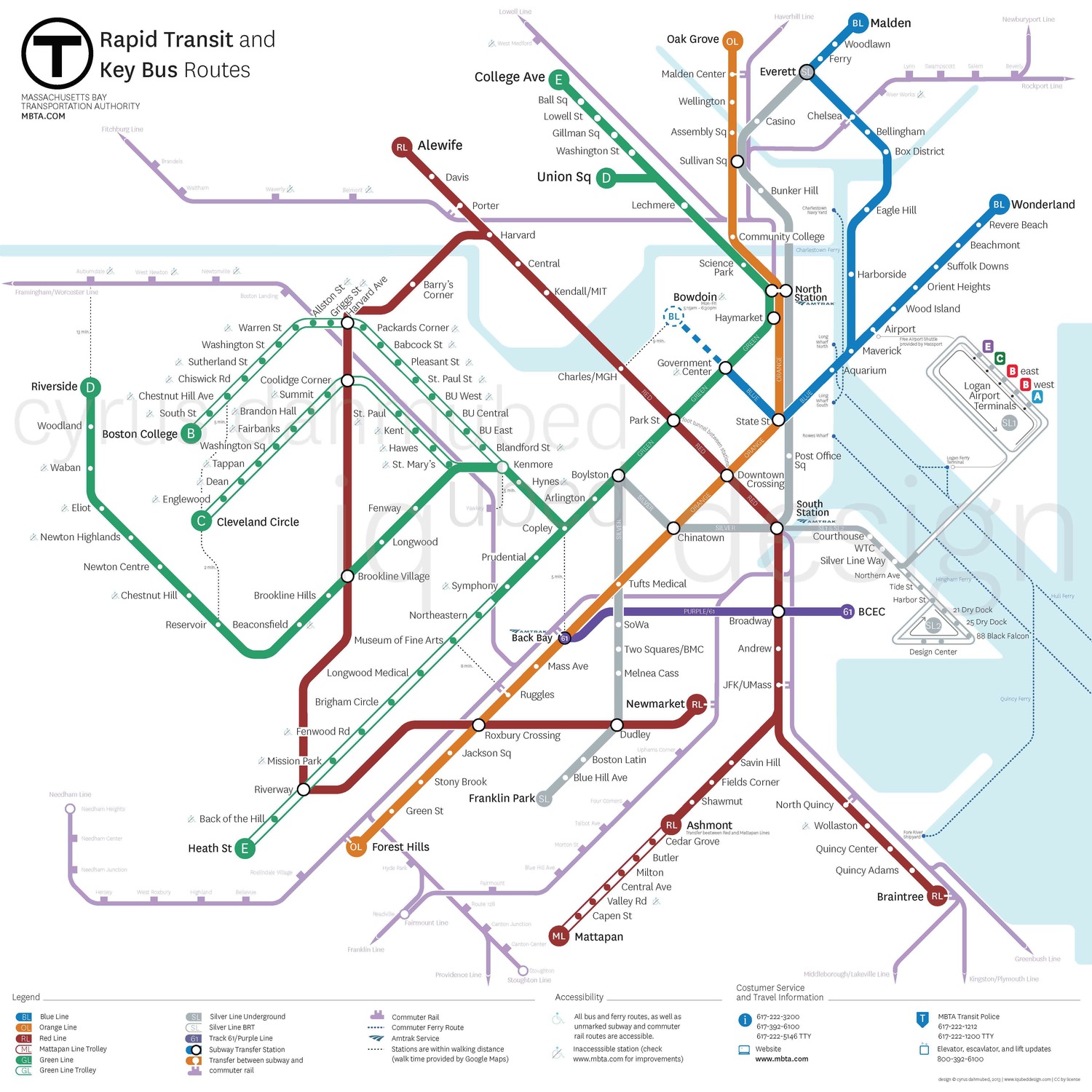
Why did it win?
According to the MBTA:
- Markers for all surface Green Line and Silver Line 2 routes;
- Clearer depiction of just how the Silver Line works downtown
- All lines now have a label with their colors, in addition to just being that color (My note: this is important for colorblind people)
- A more organized re-orienting of subway lines
- Skinnier bus routes, again, making for a cleaner map
there are so many problems, especially with scale (specifically forrest hills and heath street are in line, the green line distances are off, braintree is closer than Mattapan, downtown is huge) seems like it exacerbates all the geographical issues with the current map and adds a couple more for good measure.