Additional thoughts/questions:
I've used standard sans-serif Arial font, but it looks too stark to me. Any fonts you might additionally suggest? Also, not all fonts look great printed vertically or at 45 degrees (no matter what, I wouldn't be able to get in all the text straight and horizontal without making the font way too small.)
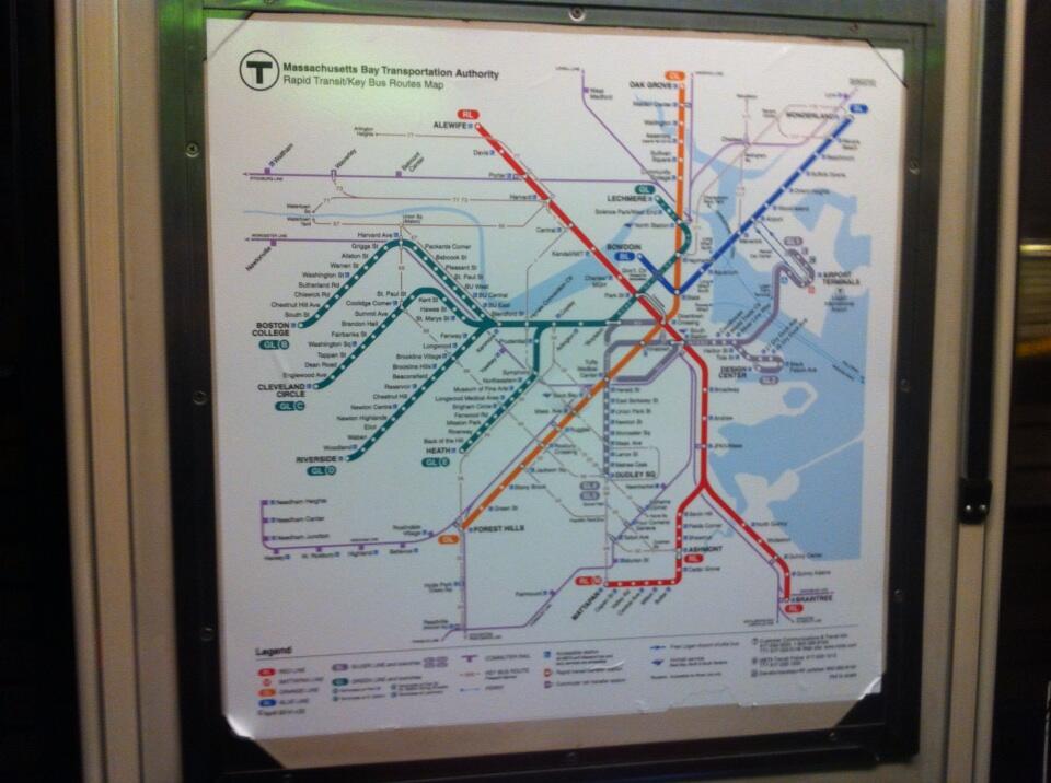
Realistically, how would you represent the SL Dudley? The route is inane, and makes the map look inane. I would need to free up a ton of space in the central diamond in order to represent it, which is something I specifically don't want to do in order to represent the proximity of those stations in relation to each other.
As you can tell, the GL branches are giving me problems. I know getting every station name on there should be a goal, but it's not going to be attainable in this format whee I'm prioritizing size of font and lines for clarity. Do you think an inset with all stations listed on every line would be worthwhile?
I experimented with only showing CR lines that show intra-urban connections that the T doesn't otherwise make. The two that came to mind were SS-BBY-Yawkey and NS-Porter. Of course that's a bit disingenuous and also starts to clutter things up. What do you think?
Finally, the buses - ugh. I tried bringing in, like the above philosophy, the buses that provide intra-urban connections like the 1 and 66 (so, for example, not Chelsea buses etc that go to other non-T destinations). Whatever I tried I couldn't figure out how to integrate it appropriately. What's best practice here?
Helvetica is the official MBTA font from the Cambridge Seven Assoc. motif. Arial is a poor, poor, poor knock-off that has all the scaling issues you note. Helvetica doesn't do that, so any pro-caliber designs or publication-grade renderings will use the real thing. Note that Apple's the only OS maker that ponies up the licensing fees and includes it by default. You're out of luck on Windows or Linux, but try searching for an open source faux-Helvetica font because there are far less-shitty workalikes out there than brain-damaged Arial.
SL Washington isn't going to work on every map. Neither will the key routes. You made the decision to show subway interconnections, which is probably a design choice that precludes any neat-and-tidy inclusion of the bus-only routes. That's not a problem if you're consistent about it. SL Waterfront is the only one with a fare-controlled transfer to begin with.
I wouldn't do the commuter rail lines beyond the Fairmount Line. For the same integrity-of-concept reason of only doing stuff that's on subway fare or subway fare control (only exception here being Zone 1 Readville, which is required if showing any other Fairmount stops). If stuff like inner Worcester stops or Track 61 get added later...of course put those on. But today the only one that jibes with the mobility choices you've made with this design is Fairmount. And anything more would be an overreach. Integrity of concept is crucial...the map gets all murked up if there isn't a unifying focus.
The official T system spider maps have rarely through history attempted to include every single GL branch stop. Especially on the B, C, E. I think it's justifiable on GLX because those are all fare-controlled, but since you are showing interconnections as an explicit choice I would stick to the key branch stops only. Maybe choose a small font size to make the labels fully consistent.
I'd also try to keep orientation of the labels consistent wherever possible. Typography's really important. Kenmore, the surface stops, the Ashmont Branch should read top-down like the downtown stops and attempt wherever possible to be angled at the same 45-degree angle instead of straight vertical. Avoid 2-line labels when you have the space (i.e. Wood Island, Assembly, SS...+ drop the Somerville from Union Sq.). Orient on the same side of the stop when possible (i.e. Harvard vs. all other Cambridge RL stops, Oak Grove and Wonderland vs. the rest of the Blue/Orange north stops, SL Way vs. the other Transitway stops). And use correct punctuation. Apostrophes and periods on Gov't Ctr., and anything with an "Ave." or "Sq.". Consistent spacing on the labels (see "Charles/MGH" vs. "JFK / UMass" with the slashes). Bring the Blue Line North Shore labels in closer to the stops, consistent with the others.
Make exceptions only when readable placement is impossible and it forces unresolvable conflicts with your basic design.


") ).
).