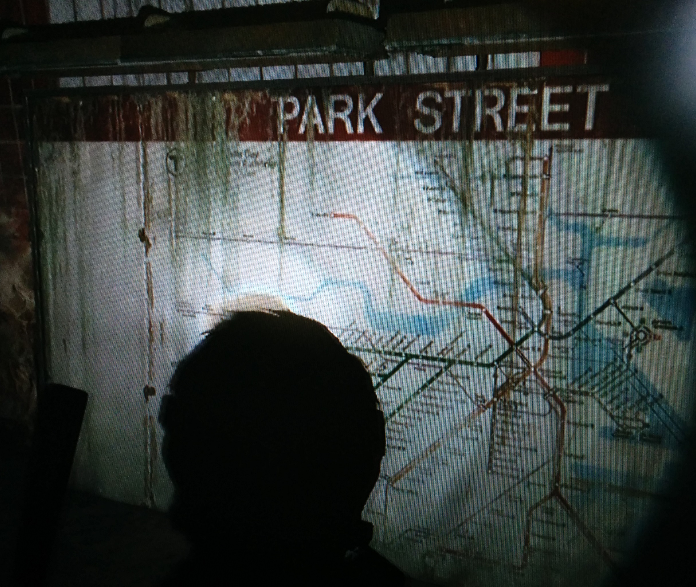
This is another persons map on the MBTA website, I think it's the best one.
Accessibility for the color blind?
I don't know why the T is so dead set on the color designation. They would probably have a problem with giving them number designation because I bet somehow in their minds they think that would be too confusing. But they like using the track numbers at Park St... like anyone realizes "track 1" or "track 2". I think they like to pretend their little green line subway is a real subway and they get to play these little games giving tracks numbers or something. I mean they make a bus out to be a train line and give it all this attention on the map, and it is ridiculous. The green line is a joke to begin with and should be torn out and turned to a regular bus line. A B line bus would be less to spend money on and could have higher frequency and 1 driver. The T is FUBAR, and should be closed down and rebuilt. FTW.