You are using an out of date browser. It may not display this or other websites correctly.
You should upgrade or use an alternative browser.
You should upgrade or use an alternative browser.
MIT East Campus - Kendall Square Gateway | Cambridge
- Thread starter Equilibria
- Start date
- Joined
- Jan 7, 2012
- Messages
- 14,072
- Reaction score
- 22,813
- Joined
- Jan 7, 2012
- Messages
- 14,072
- Reaction score
- 22,813
FitchburgLine
Active Member
- Joined
- Nov 5, 2013
- Messages
- 666
- Reaction score
- 403
tangent
Senior Member
- Joined
- May 11, 2012
- Messages
- 1,789
- Reaction score
- 68
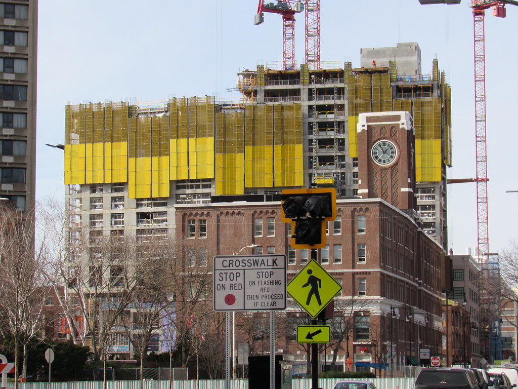
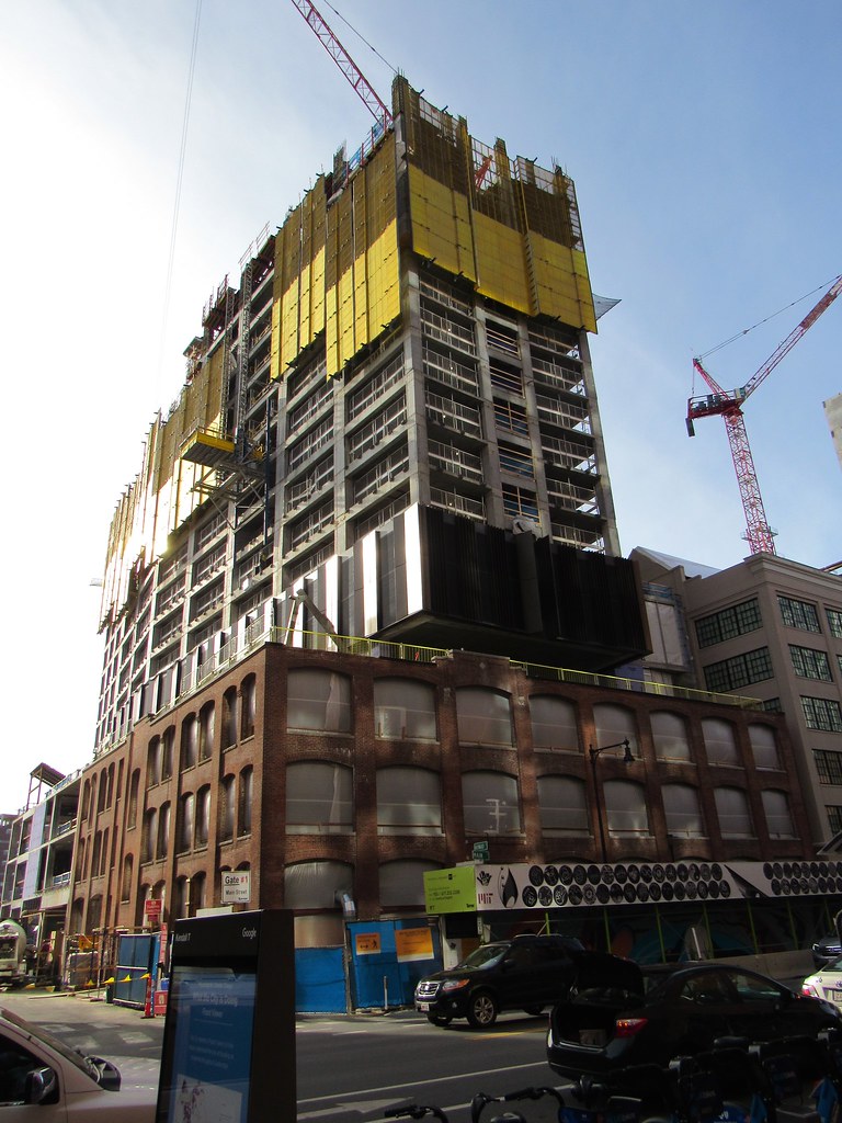
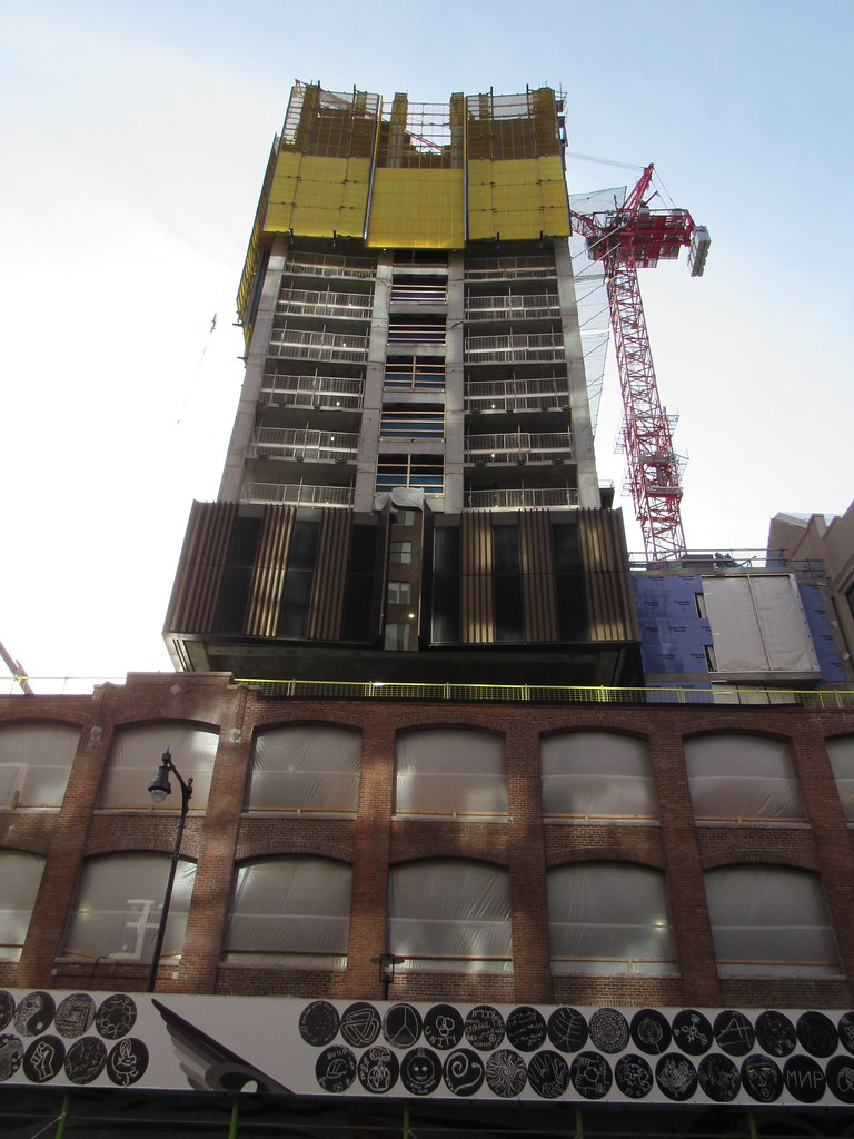
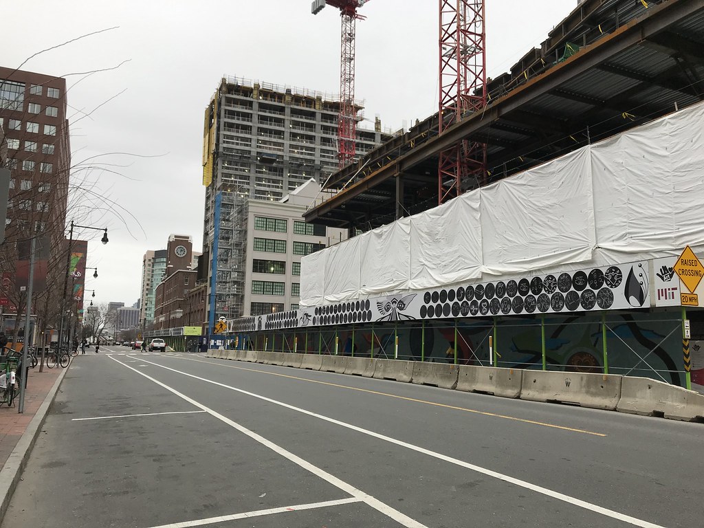
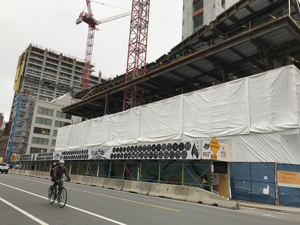
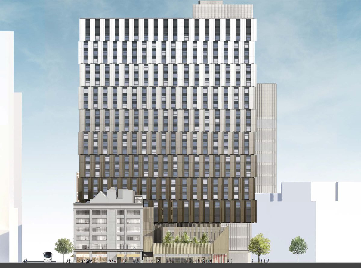
Mostly liking it. Was by there the other day. A bit concerned the first level of the facade looks way darker than the golden hued renders. The sunlight does sometimes seems to make it appear more golden, depending on the angle, but on the cloudy days it just appears much much darker than the renders.
Might contrast well with the other buildings. Just concerned that the size and darkness of the facade might be too much in real life.
...A bit concerned the first level of the facade looks way darker than the golden hued renders. The sunlight does sometimes seems to make it appear more golden, depending on the angle, but on the cloudy days it just appears much much darker than the renders.
Might contrast well with the other buildings. Just concerned that the size and darkness of the facade might be too much in real life.
It looks like the material gets lighter as the tower climbs so you're only seeing the darkest hue at the bottom.
WTF???
stick n move
Superstar
- Joined
- Oct 14, 2009
- Messages
- 12,139
- Reaction score
- 19,055
Plus the first 2 floors have black mech screens where windows will be above that.
tangent
Senior Member
- Joined
- May 11, 2012
- Messages
- 1,789
- Reaction score
- 68
It looks like the material gets lighter as the tower climbs so you're only seeing the darkest hue at the bottom.
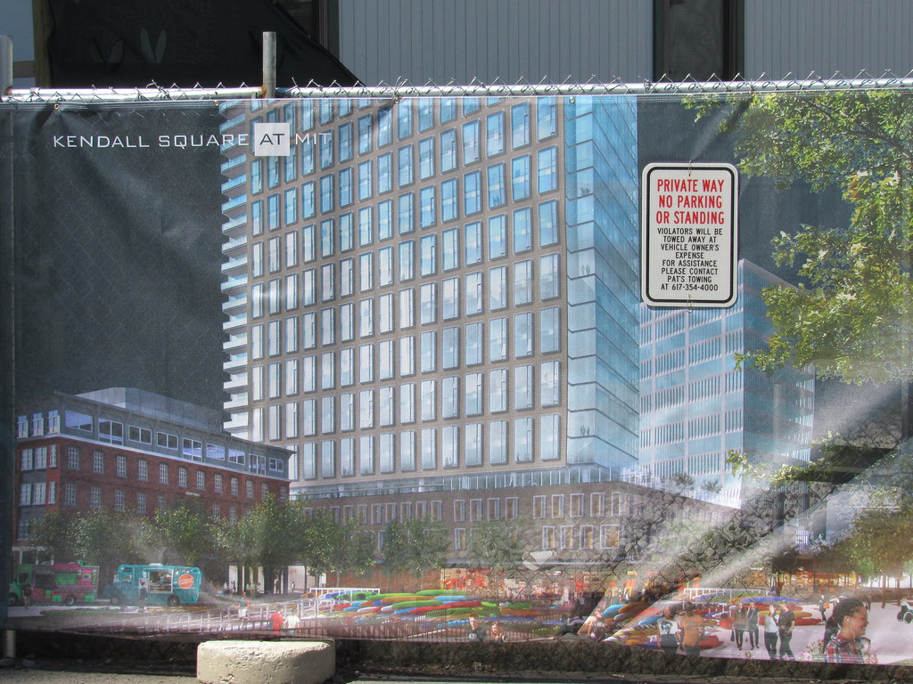
Still ... On the renders it looks darker at lower levels but not as black as it is looking in real life:
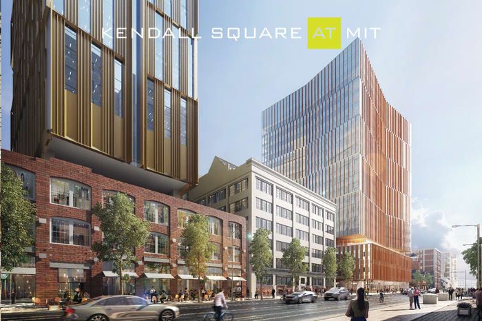
Maybe it was a change. Still I guess it is really just the first level which now seems to be black between the gold vanes and then the upper levels will have windows where the dark panels are on that first level. Maybe I will like it better when a few more levels go up.
odurandina
Senior Member
- Joined
- Dec 1, 2015
- Messages
- 5,328
- Reaction score
- 265
bigpicture7
Senior Member
- Joined
- May 5, 2016
- Messages
- 3,906
- Reaction score
- 9,547
What about "noma"/grad school apt tower??
It is a highly active construction site. Last photo post was here (from Nov):
http://www.archboston.org/community/showpost.php?p=335072&postcount=362
What about "noma"/grad school apt tower??
There is a new render with a slightly different design than what you posted. I found Beeline's pics below on page 15 of the thread.
Gameguy326
Active Member
- Joined
- Aug 18, 2015
- Messages
- 390
- Reaction score
- 98
It's not a grad school tower, it's market apartments.
Suffolk 83
Senior Member
- Joined
- Nov 14, 2007
- Messages
- 2,996
- Reaction score
- 2,403
So worse then? Cool
Gameguy326
Active Member
- Joined
- Aug 18, 2015
- Messages
- 390
- Reaction score
- 98
So worse then? Cool
Yeah, it sucks. I don't know why, when we have a completely unaffordable neighborhood where all for-profit institutions are building luxury housing, MIT decides that their contribution will be more of, what is effectively, luxury housing. I asked one of the people on the MIT team about this a while back at one of their information / community input things. He dithered between trying to tell me it wasn't luxury housing, explaining it was the only way to make a profit, and just generally not knowing what he was talking about. Those things were a sham anyway - they were never listening to the community, just trying to make it appear as though theywere.
tangent
Senior Member
- Joined
- May 11, 2012
- Messages
- 1,789
- Reaction score
- 68
So worse then? Cool
You mean the facade/architecture... yes, I like the older render. Newer bumpy design is an regrettable change.
bigpicture7
Senior Member
- Joined
- May 5, 2016
- Messages
- 3,906
- Reaction score
- 9,547
^ The project's CoUrbanize site has a clearer image of the latest Bldg 1 residential tower's facade:
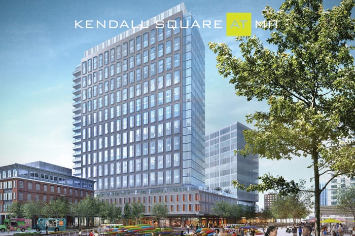
Also seemingly an update (at least to me) is the rendering of Bldg 3 (directly behind the historic brick/clocktower bldg):
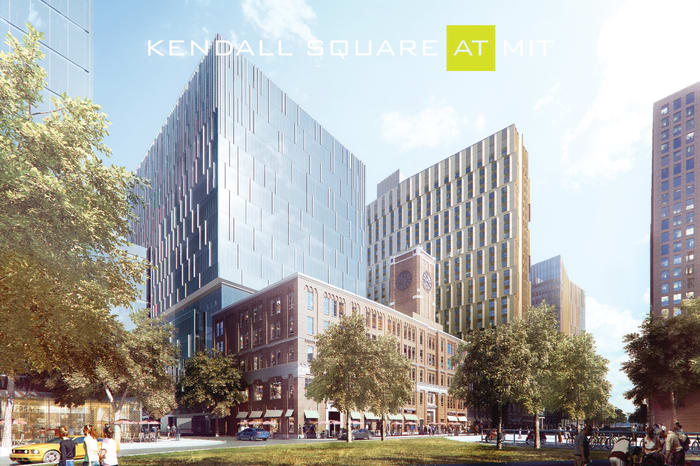
(at least there will be a diversity of facades in Kendall)
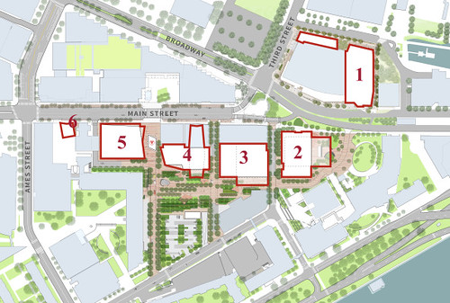
To refresh everyone's memory:
pixelsand8
Active Member
- Joined
- Mar 16, 2013
- Messages
- 467
- Reaction score
- 2
You mean the facade/architecture... yes, I like the older render. Newer bumpy design is an regrettable change.
More than regrettable, it's a piece of shit, a slabby version of that turd on Mass and Main. If you are gonna say "fuck you" by building another luxury tower at least give us something to look at rather than say "double fuck you" in the form of another value engineered piece of crap designed for no reason other than to extract profit. Is MIT really that hard up for cash?
Yeah, it sucks. I don't know why, when we have a completely unaffordable neighborhood where all for-profit institutions are building luxury housing, MIT decides that their contribution will be more of, what is effectively, luxury housing. I asked one of the people on the MIT team about this a while back at one of their information / community input things. He dithered between trying to tell me it wasn't luxury housing, explaining it was the only way to make a profit, and just generally not knowing what he was talking about. Those things were a sham anyway - they were never listening to the community, just trying to make it appear as though theywere.
Dying to hear what his argument was. "Well it's not luxury it's just market rate which just happens to be 4k/month for a studio! Like aw shucks, if there is profit to be made we gotta do it, ya know, capitalism and all, it's not like MIT as an institution has any agency or power or influence or money or anything resembling the creative capacity for unique and intelligent thought! We're just slaves to the system like the rest of you all!"
RandomWalk
Senior Member
- Joined
- Feb 2, 2014
- Messages
- 3,332
- Reaction score
- 5,265
First floor of glass is now up on building 4.
odurandina
Senior Member
- Joined
- Dec 1, 2015
- Messages
- 5,328
- Reaction score
- 265
Yeah, it sucks...... they were never listening to the community, just trying to make it appear as though theywere.
More than regrettable, it's a piece of shit, a slabby version of that turd on Mass and Main. If you are gonna say "fuck you" by building another luxury tower at least give us something to look at rather than say "double fuck you...."
it's not like MIT as an institution has any agency or power or influence or money or anything resembling the creative capacity for unique and intelligent thought! We're just slaves to the system like the rest of you all!"
BU and MIT are off the charts for flaunting the ugliest epic garbage around. There was a poster who gave a hero's effort to poetically 'hype' MIT's architectural aplomb, and significance to Cambridge/Boston.
*one January day in 2017, Whigh posted his last, and dropped from the face of aB
never to be heard from again. His departure was eerily abrupt.


