MIT Expansion Plans | MIT/Kendall Square | Cambridge

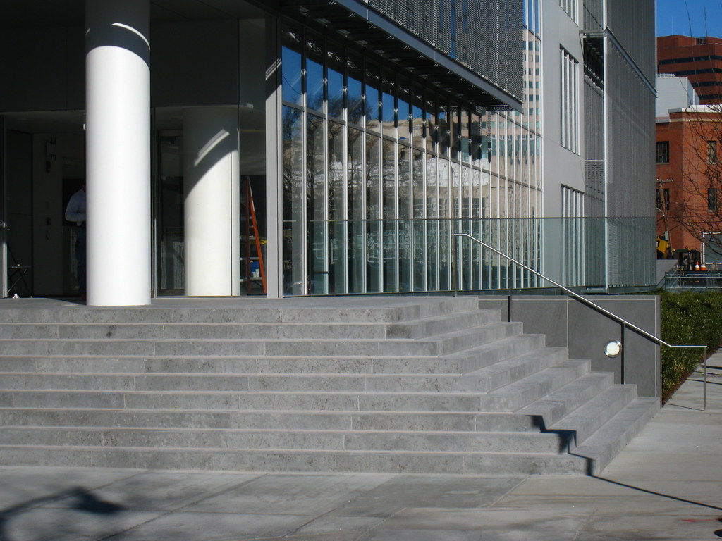
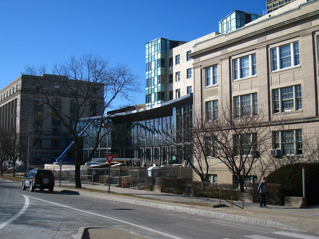
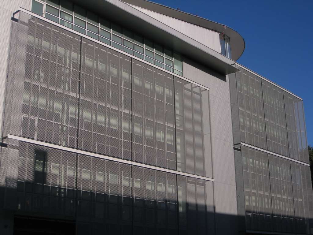
Ugh, what is with this horrific trend of putting up screens or bars over otherwise decent glass buildings? It seems to have spread like wildfire since the completion of the NYT Building.

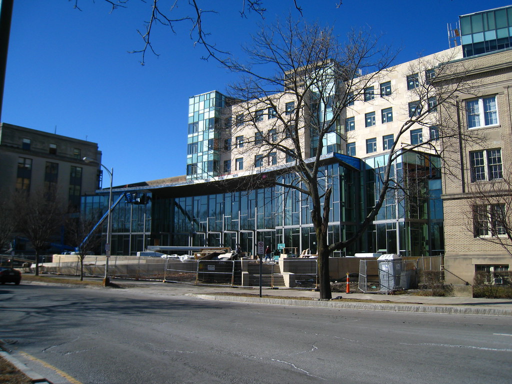
I think it reflects sun = less use of A/C
 
I'm sure there were far less ugly ways to do that...

Like, for example, not building out of glass to begin with...
 
MIT_Hack_091809.jpg


Whether you know it or not, you've just been Rickrolled.
 
I sent this to a friend of mine. This is his reponse:

Would you believe they got the notation wrong, too? Eighth notes need to be joined by bars if they're grouped together like that, and the "give you up" part is not in quarter notes. The first two notes take up three beats, so they'd be dotted quarter notes, and the "up" lasts three beats on its own, so it would be a half-note and a quarter note tied together, I believe. I'll DL the sheet music and see.

Geek? Yes, yes I am. :)
 
Well if we wanna get technical...

..the "give you up" part is not in quarter notes. The first two notes take up three beats, so they'd be dotted quarter notes

...is wrong. They should be dotted eigth notes.
 
This is what happens when a notable engineering school's prank society fails to include audio or acoustic engineers, or at least the token Emo group, in their chicanery.
 
Yup. Five lines, four spaces.

Oh, and looking it over again, they even got the first four notes wrong -- they should be sixteenth notes, not eigths. So basically the only note they got right was the very last one.
 
^ Sorry ablarc, didn't see your comment first time 'round.

Yes, I emphatically suggest they stick to science, just as I should stick to music and armchair architecturing. I already pointed out how they got almost all the rhythmic values wrong, and looking over the pitches they wrote, they also got notes number 2, 3 and 5 wrong. And that's not taking into account what key they attempted to write it in, since no sharps or flats or even a clef are given. To top it off, my band played a show there Friday, and let's just say the student sound guys were less than satisfactory. (Video of the entire show can be found at fredfest.mit.edu .. we're at the end).

But I digress!

Here's the Media Lab's south facade on Friday:

img1060ft.jpg


west:

img1073ea.jpg


and the east courtyard:

img1074rp.jpg
 
Fumihiko Maki has succeeded in creating a softened take on Thom Mayne. Not that that's any reason to like the aesthetic.

I expect this building will have ice-issues in the winter.
 
Yup. Five lines, four spaces.

Oh, and looking it over again, they even got the first four notes wrong -- they should be sixteenth notes, not eigths. So basically the only note they got right was the very last one.

so... what song is it?

name that tune...
 
Why do you hate it so much Van?

The most obvious offense is the color, or complete lack thereof. The metal mesh window covering seems like a cheap afterthought, and what is with the random curvy hat? The whole building looks like a glorified tool shed. BB mentioned Thom Mayne and having just toured his new Cooper Union building I can safely say this isn't even a bad knock off, this is the box it came in.

What I think really pisses me off is this seems to be the distilled low-point for the contemporary "sciency" building which all new hospitals and science centers seem to be modeling themselves after. This building makes the rest of Kendall Sq look edgy and sophisticated [that isn't a good thing].
 
so... what song is it?

name that tune...

Have you not heard of Rick Rolling? It's all described in the Globe article, or you could just go to Youtube and type in "rickroll" and see what happens :)
 
At the corner of Ames and Amherst, the Media Lab expansion is well-hidden from Kendall Sq., and pretty much everything else. Hardly a building site that would help shape the architectural ethos of Kendall Sq.

The Koch building is at the corner of Ames and Main St, and you can't see the Media Lab from that intersection.
 
Last edited:
Not sure what that building has to do with Morphosis...I certainly don't see a particular resemblance.

I'm thinking the gray will look friendlier once it is filled with more colorful goings on inside, and when it is surrounded by trees.
 
Both Morphosis buildings and this buildings main architectural moves are based in the machine asthetic AND they rely heavily on the scrim or screen as texture.

Having said that. The cooper union building is one of the most exciting urban buildings I have be exposed to is MANY MANY years. Its up there with the Morgan Library addition, and the American Folk Art Museum. All are wonderful in their own ways. This aint that. Not by a longshot.

One thing to remember. This MIT design is at least a decade old, it was probably very contemporary when the design was approved.
 
First up, the Media Lab:

4352864256_d3a13d9708_b.jpg


4352119315_51f56ce3dd_b.jpg


And the main attraction, the Sloan School of Management:

4352109109_b8552e73c6_b.jpg


4352847156_6fb25584c4_b.jpg


4352100033_52844f1b06_b.jpg


4352102627_cbf9f12de8_b.jpg


4352849922_7ae8998dd9_b.jpg


4352105131_d2ec2a59e8_b.jpg


4352106413_2d05083a1b_b.jpg


4352114647_bd84b5bab9_b.jpg


4352861616_f5b1dd8339_b.jpg


4352862514_b7642a40d4_b.jpg


4352859672_b656e1856c_b.jpg
 

Back
Top