kz1000ps
Senior Member
- Joined
- May 28, 2006
- Messages
- 8,983
- Reaction score
- 11,829
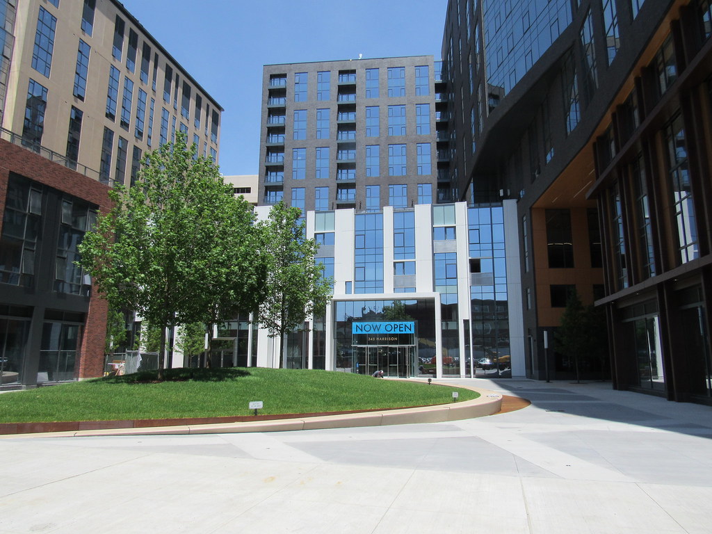
A chaotic mess for sure, but I don't love it like you kind of do. To me, it looks like a much more extreme example of franken-building architecture than the Seaport Square buildings. I can picture the decision makers literally picking whatever available materials and colors are left from a bin and applying to these buildings. Jarring. But we'll see.
To quote Mr. Show with Bob and David, this thing is a "blustery hooplah"
One one hand, I wish it'd be simpler, but on the other hand the only part that is simple -- the flat black brick -- is really gross in how cardboard-y it looks, so I don't know. It's not awful, but it's self-consciously trying way too hard.


