You are using an out of date browser. It may not display this or other websites correctly.
You should upgrade or use an alternative browser.
You should upgrade or use an alternative browser.
Mixed Use Complex | 345 Harrison Ave | South End
- Thread starter 12345
- Start date
Beton Brut
Senior Member
- Joined
- May 25, 2006
- Messages
- 4,382
- Reaction score
- 338
Ill say that it is solidly good urban-ism
I'll grudgingly agree. It's a good result from a city-sponsored design imperative (from Kairos Shen's reign of incompetence) that we'd do well to migrate away from going forward.
ok architecture, and on balance on can call this legitimately good. Not great, but good.
There are some design gestures here that I like, and others I could do without. I'll never get used to seeing them forced into juxtaposition. I've compared this practice to an extortion letter; here's an example composed by a competent writer.
cadetcarl
Active Member
- Joined
- Sep 11, 2012
- Messages
- 432
- Reaction score
- 31
I think it's bad in the way that you can't make an album out of all singles. I'm also on record as not liking many of the individual things being tried here, but smashing them all together does not help at all. The architecture is mostly trash.
I agree that it's good urbanism, if we limit the scope of the term to massing, density, and appropriateness of use.
I agree that it's good urbanism, if we limit the scope of the term to massing, density, and appropriateness of use.
atlantaden
Senior Member
- Joined
- May 31, 2006
- Messages
- 2,606
- Reaction score
- 2,750
One of my favorite developments yet! Lovin the angles, the pass throughs, the various colors and textures and design elements, the glass, the nooks and crannies, the lighting, everything. Something new and different to see around every corner.
Beton Brut
Senior Member
- Joined
- May 25, 2006
- Messages
- 4,382
- Reaction score
- 338
^ An apt comparison, given the scale.
odurandina
Senior Member
- Joined
- Dec 1, 2015
- Messages
- 5,328
- Reaction score
- 265
It's slightly extravagant. Could pass for a shopping mall in Ontario, CA, but falls far short of how egregious it could have been. NO RETARDED alternating window floors, 90 degree cantilevered puke windows, ridiculously proportioned balconies or setbacks.
raised the bar via eminence of absence.....
raised the bar via eminence of absence.....
Last edited:
stevebikes
Active Member
- Joined
- May 14, 2013
- Messages
- 277
- Reaction score
- 103
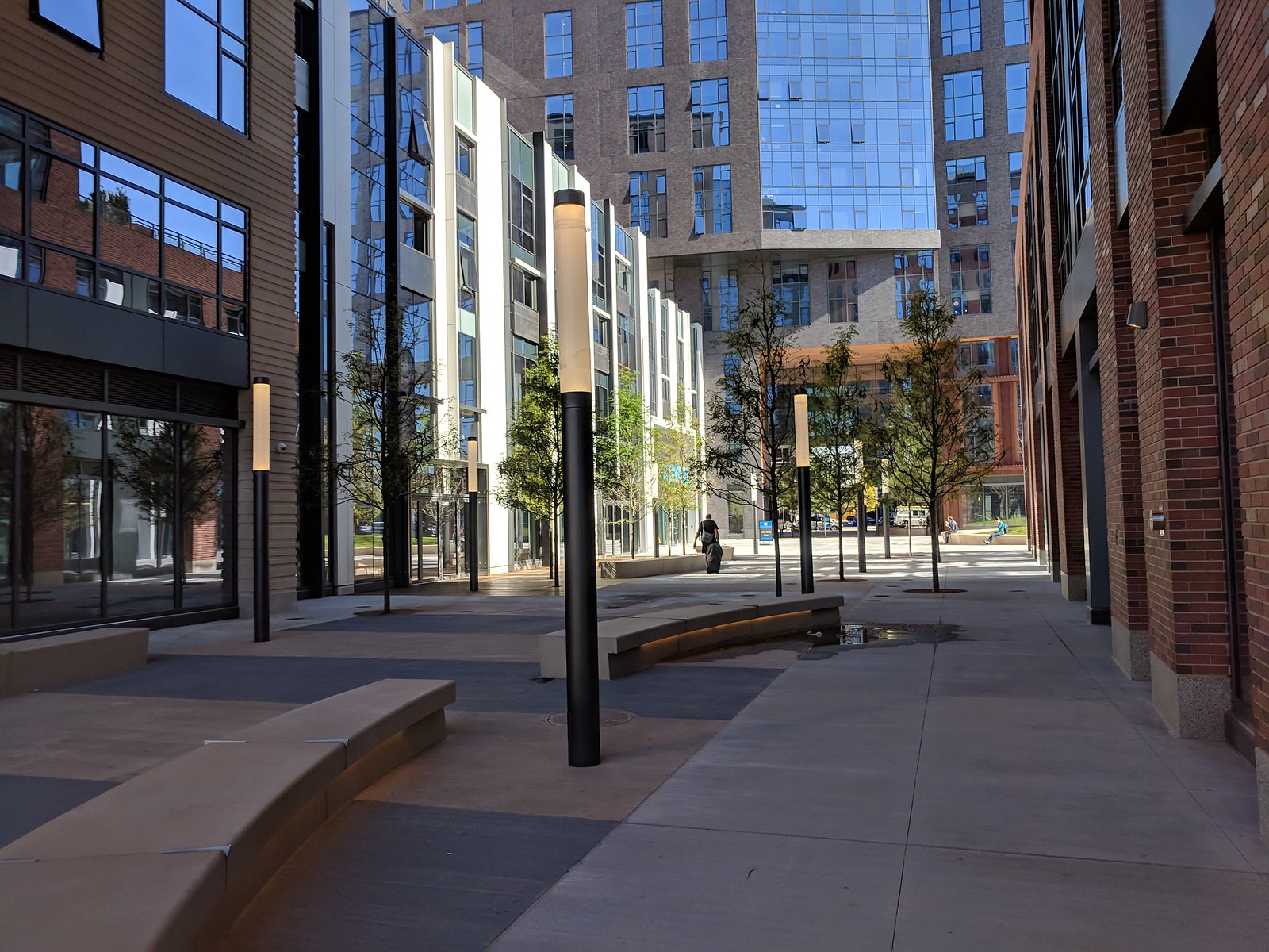
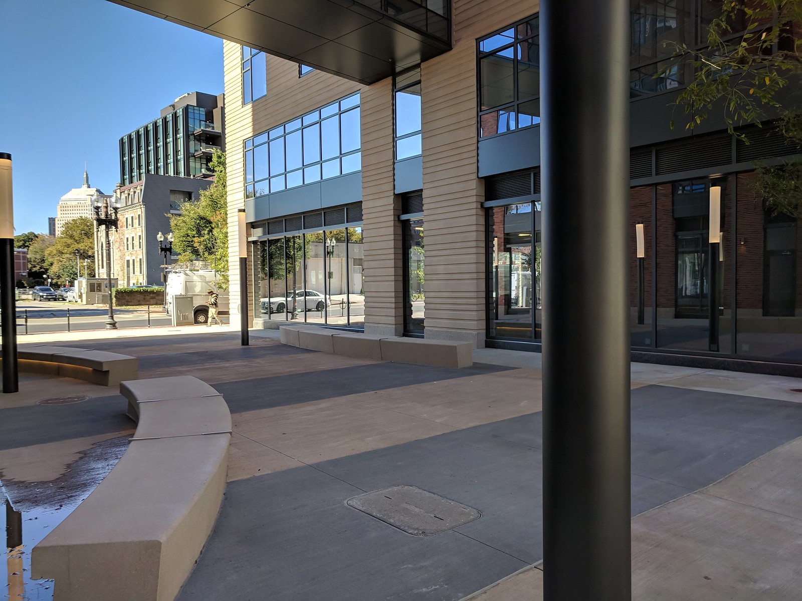
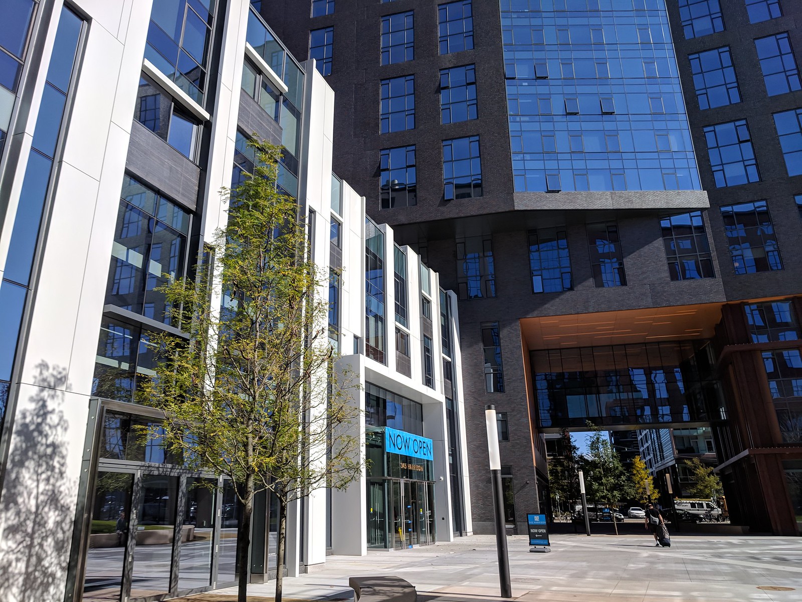
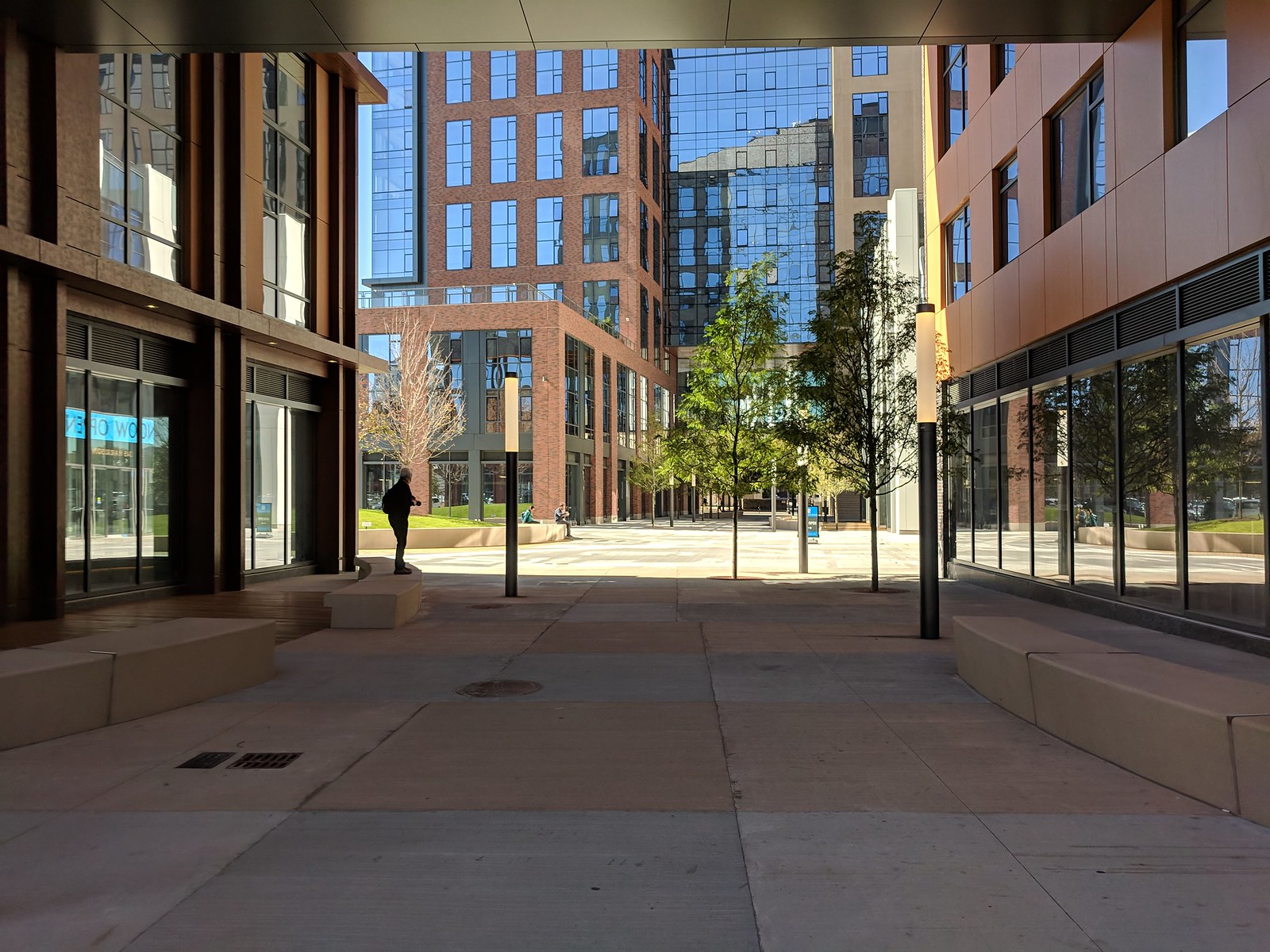
Friday at lunchtime. A couple of people were eating their Sweetgreen salads here.






atlantaden
Senior Member
- Joined
- May 31, 2006
- Messages
- 2,606
- Reaction score
- 2,750
Real nice pics of a great project. Thanks.
