- Joined
- May 25, 2006
- Messages
- 7,064
- Reaction score
- 1,990
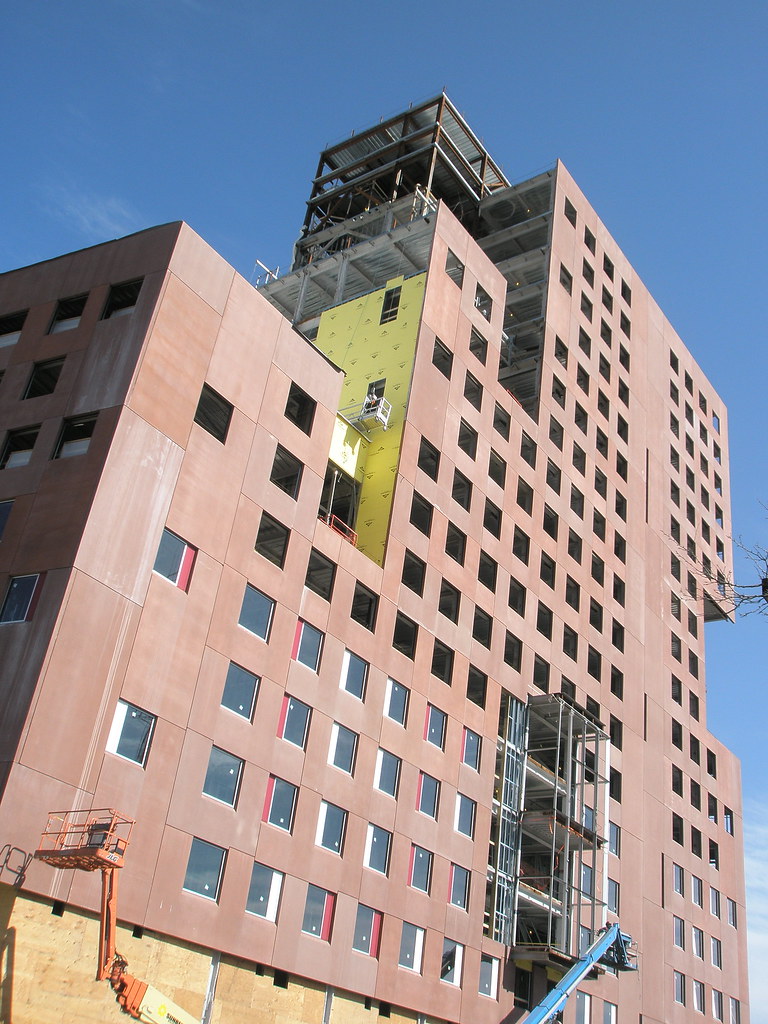
Renderings are just images. The red is staying, otherwise it would be white or whatever color it was in the renderings.
I'm not sure why, but my immediate reaction to that photo is "Yuck!"
Aren't the surrounding buildings mostly red-brick brownstones? Northeastern should at least try to make their building fit in, in style if not not in scale.
This hulk is beginning to make the projects across the street look good.
This Building also reminds me of Harvards dorm building on Storrow Dr.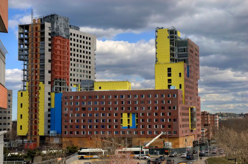
moments ago