Omni Hotel @ BCEC | Summer St | Seaport

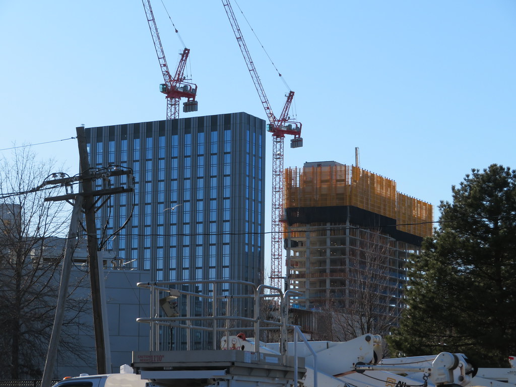
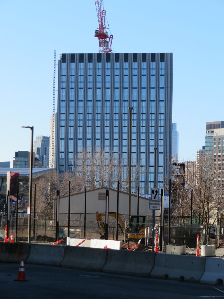
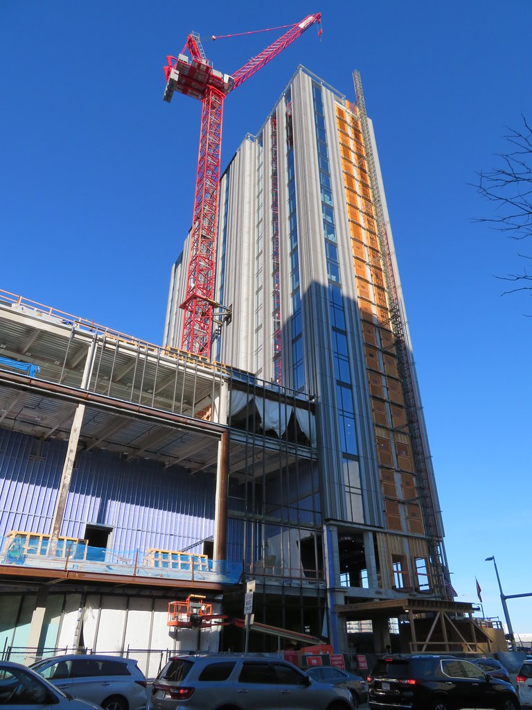
Im gonna go on record as saying this is the nicest “seaport supertall” out of all of them. The high aspect ratio along with quality materials really makes it shine. Other “towers” in the seaport have nice materials but are fat, or are thin but have a cheap facade... this checks all the boxes. Huge win.
 
From 2/2/2020

IMG_0092 by David Z, on Flickr

IMG_0144 by David Z, on Flickr
DZH -- you have a most enviable perch

There are going to be 2 huge developments just across the Fort Point Channel to watch as well as the South Station Tower:
  1. Former GE HQ+
  2. Former Gillette Parking Lot
wont need much of a telephoto to get the details on their construction
 
4E551FF7-0F3C-49D1-9624-32B92BBE8C47.jpeg
 
Handsome, neat, striking, clean slab of a tower. Great perspective, which I hope doesn't get overshadowed by another building.
 
Let's all remember that the back part (in the above pics) is part of the Omni too. The nearly finished tower looks pretty great but most of the girth and mass will be in the other piece of this complex.
 
They actually went the opposite direction of soo many projects in Boston. So many developers add double height windows, colossal order, and take up every inch of the lot, leading to chunky stubs that are short and fat and look even shorter than they are.

Here they actually used all the tricks they could to make it look taller than it is, leaner than it had to be, and gave it attractive proportions. Instead of colossal order they went vertical stripes. Home run. Especially since it rises above the gap in the tunnel and will be the first building many people see up close as they visit the city.

Also, even aside from the proportions the materials are wonderful and high quality. Its great to see a street wall coming along on summer st as well. It just really checks all the boxes.
To be fair, isn't part of the reason for the vertical nature of the design the fact that it is a hotel, and not an office block. Offices want floor plate. Hotels want exterior rooms with windows.
 
Alright, I could do the research but anyone know, why is there the huge gap between the left portion and the right portion of the hotel? It can't be "oh, we didn't think we could rent those out ."

It's either, the buildings behind there, 505 Congress, wanted or demanded that the sun come through there, or the land isn't the same along that road, and the middle can't support a 20-storey building. No?
 
Alright, I could do the research but anyone know, why is there the huge gap between the left portion and the right portion of the hotel? It can't be "oh, we didn't think we could rent those out ."
Might be because that is where the ballrooms are.
 
The middle does support a 20 story building though. The left tower is L shaped.

omnihotel.0.jpg


Its a huge site. It appears that they just didnt want it to be a huge ugly wall taking up the entire site, so instead they broke it up into something that looks like multiple buildings. Its much more inviting and blends in much more when it has a similar massing to its neighbors than being a hulking mass taking up the entire enormous site. Its that simple really.
 
Last edited:
Alright, I could do the research but anyone know, why is there the huge gap between the left portion and the right portion of the hotel? It can't be "oh, we didn't think we could rent those out ."

It's either, the buildings behind there, 505 Congress, wanted or demanded that the sun come through there, or the land isn't the same along that road, and the middle can't support a 20-storey building. No?
JohnKeith -- Yes as someone said that's the place for the ballrooms and private exhibit area

But its also a matter of maximizing the rooms that you can sell an still have a big open ballroom

Given that the height of the building is constrained and that hotel guests like to be able to view things outside the windows you want to maximize the periphery of the towers as the middle is only good for back of the house stuff.

If you move the two towers too close to each other about one half of the windows end up staring into each other. Then you have to start rotating the towers relative to each other to provide clear views and given the dimensions of the lot the towers encroach on the ballroom necessitating an even more immense truss structure to keep the columns outside the ballroom.

I'm fairly sure that given the amount of money that they wanted to spend -- the 2 towers with the open center came out the best compromise
 
IMG_1044 by Bos Beeline, on Flickr

IMG_1052 by Bos Beeline, on Flickr

IMG_1057 by Bos Beeline, on Flickr

IMG_1063 by Bos Beeline, on Flickr

IMG_1065 by Bos Beeline, on Flickr

IMG_1066 by Bos Beeline, on Flickr

IMG_1067 by Bos Beeline, on Flickr

IMG_1074 by Bos Beeline, on Flickr

IMG_1068 by Bos Beeline, on Flickr

IMG_1071 by Bos Beeline, on Flickr

IMG_1077 by Bos Beeline, on Flickr

IMG_1076 by Bos Beeline, on Flickr

IMG_1082 by Bos Beeline, on Flickr

IMG_1088 by Bos Beeline, on Flickr

IMG_1091 by Bos Beeline, on Flickr

IMG_1095 by Bos Beeline, on Flickr

IMG_1096 by Bos Beeline, on Flickr

IMG_1117 by Bos Beeline, on Flickr
 

Back
Top